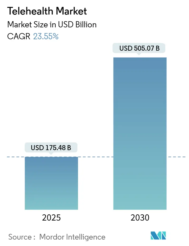
Healthcare is evolving at a breakneck pace, and among the most transformative shifts is the rise of telehealth. This digital frontier promises a future where medical care is more accessible, convenient, and tailored to individual needs, especially for our rapidly aging global population. By 2050, the World Health Organization projects that 22% of the global population will be over 60 years old, underscoring an urgent need for healthcare solutions that gracefully age alongside them. Telehealth, with its ability to connect patients with doctors from the comfort of their homes, offers an unparalleled opportunity to bridge gaps in care, particularly for those facing mobility issues, transportation challenges, or living in remote areas. It’s meant to simplify life, making healthcare easier and more convenient for everyone.
Yet, for a significant segment of this burgeoning older demographic, the reality of telehealth often feels less like a simple solution and more like an intricate maze without a map. Remember those afternoons spent patiently guiding a loved one through the basics of technology, perhaps teaching them how to join a video call or navigate a smartphone? The roles have, in many ways, reversed. While the promise of virtual care is compelling—offering everything from managing chronic conditions to virtual check-ins—its execution frequently falls short, leaving older adults hesitant, frustrated, and ultimately, underserved. Despite 52% of seniors being open to telehealth, a staggering statistic reveals that only 1% actually use it, highlighting a massive chasm between potential and practical application.
This isn’t merely a matter of older adults being ‘unwilling’ to adopt new technology; it’s a critical indictment of how these platforms are designed. If technology is supposed to simplify life, why does it so often feel alien to those who need its benefits the most? The answer lies in fundamental user interface (UI) and user experience (UX) failures. We’re talking about more than just minor inconveniences; these are design choices that actively exclude. In this in-depth analysis, we will dissect twelve critical areas where telehealth platforms are seriously struggling with user interface, causing seniors to throw up their hands and say, ‘Too confusing.’ We’ll explore why these design missteps occur and what needs to change to create truly inclusive digital health.

1. **Platforms with Overly Small Text and Icons**
One of the most immediate and pervasive frustrations encountered by older adults on telehealth platforms stems directly from visual design choices: the pervasive use of small fonts, tiny icons, and compact buttons. While these elements might appear sleek and modern to younger, tech-savvy designers, they represent significant barriers for seniors. As the context points out, ‘Small fonts, tiny icons, and compact buttons are common culprits in senior tech struggles.’ These seemingly minor details become major obstacles when compounded by age-related vision diminished vision, making basic interaction a strenuous exercise in squinting and guessing.
The challenge isn’t just about reading; it extends to interaction. Reduced dexterity, often associated with aging, means that precisely tapping a small button or navigating a tightly packed menu can be incredibly difficult, if not impossible. A platform designed with a minimalist aesthetic might look appealing, but if it demands pinpoint accuracy from a user with shaky hands, it fails its fundamental purpose. This oversight forces seniors to rely on external assistance or to abandon the platform altogether, undermining the very independence telehealth aims to foster.
While some platforms, like Apple, offer ‘Accessibility’ settings to enlarge text and adjust contrast, these crucial features are ‘often hidden.’ This highlights a fundamental design flaw: accessibility should not be an afterthought or a buried setting. Instead, for older users, these elements should be either the default or prominently featured, easily discoverable options. The principle that ‘Bigger Isn’t Just Better—It’s Necessary’ for this demographic is not a nicety but a core requirement for usability and engagement.
Ultimately, a platform that neglects these basic visual and tactile accessibility needs creates an immediate and unwelcoming user environment. It communicates, perhaps unintentionally, that the platform was not designed with their unique physiological changes in mind. For seniors already facing a learning curve with digital tools, encountering such fundamental usability issues right from the start can be an insurmountable barrier, cementing their perception that telehealth is simply ‘too confusing.’
Read more about: Beyond the Blue: 12 Surprising Facts and Untold Stories from Facebook’s Journey to Global Dominance

2. **Platforms with Complex, Non-Linear Navigation**
Beyond visual clarity, the architecture of a telehealth platform’s navigation system profoundly impacts its usability for older adults. Many struggling platforms present users with complex, non-linear workflows and convoluted menu structures that defy intuitive understanding. Instead of clear, sequential steps, seniors often encounter a labyrinth of options, sub-menus, and unexpected diversions, making a simple task feel like deciphering hieroglyphs. This issue is particularly pronounced when seniors need to access a virtual consultation, which, as a ‘2022 study found that nearly 40% of older adults faced challenges using telehealth platforms due to confusing layouts and poor usability.’
For older adults, who may experience cognitive changes or memory issues, a complicated layout is not just annoying; it’s a source of genuine frustration and confusion. They need to understand ‘how to integrate it, how to select a vendor, how to code properly’ just to get started, as Corey Howard, MD, founder and director of Physicians Life Centers, highlighted regarding implementing telehealth. Every extra click, every unclear label, and every unexpected pop-up adds to the cognitive load, making it difficult to remember where they are in the process or how to get back to a previous screen. This stands in stark contrast to the patient-centric experience that telehealth promises, instead creating digital hurdles that prevent access to care.
The solution lies in a commitment to ‘Simplify Navigation’ through ‘Linear workflows and clear instructions.’ Platforms designed for seniors, such as Jitterbug Phones, offer a powerful lesson: ‘They offer large buttons, a simple interface, and straightforward menus—proof that simplicity can coexist with functionality.’ Telemedicine applications must adopt a similar philosophy, prioritizing primary functions, minimizing secondary features to reduce cognitive load, and providing progressive guidance. This means guiding users step-by-step through tasks, using clear text labels, and offering dynamic prompts that anticipate their needs, rather than overwhelming them with choices.
An intuitive navigation system is not merely about making a platform ‘easy to use’; it’s about empowering older adults to confidently engage with their healthcare. When a platform’s design respects their cognitive processes and physical capabilities, it transforms a potentially bewildering experience into one that is manageable and beneficial. Without this foundational simplicity, many telehealth platforms will continue to alienate the very population that stands to gain the most from virtual care, trapping them in a cycle of confusion and missed appointments.
Read more about: Demystifying the ‘Average’: A Data Scientist’s Guide to Interpreting Cycling Distances by Age

3. **Platforms Lacking Robust Voice-Activated Controls**
The advent of voice-activated technology presents an immense opportunity to enhance accessibility, yet many telehealth platforms seriously struggle by failing to integrate robust and intuitive voice controls. While voice assistants like Alexa and Google Home are marketed as ‘easy to use,’ many seniors struggle with understanding activation phrases, setting up devices, or troubleshooting connectivity issues. This reveals a critical gap: the *potential* of voice as an ally remains largely untapped or poorly implemented in the context of telehealth, making systems feel less accessible rather than more so.
For seniors, voice activation can be a game-changer, mitigating challenges related to reduced dexterity, vision impairment, and the general complexity of screen-based navigation. Imagine trying to type out medical information or navigate a dense menu with trembling hands or failing eyesight; voice commands could bypass these physical barriers entirely. Apps like Pill Reminder, which use voice prompts to guide seniors through medication schedules, demonstrate the profound utility of this approach, making daily health management far more manageable and less prone to errors.
However, the struggle arises when platforms either omit voice functionality entirely or implement it in a way that is clunky, unreliable, or requires an overly precise command structure. The context highlights that ‘many seniors struggle with understanding activation phrases, setting up devices, or troubleshooting connectivity issues.’ This isn’t a problem with voice technology itself, but rather with its integration—if the voice commands aren’t intuitive, context-aware, or easily discoverable, they become another source of frustration instead of a solution. The nuance of a “trembling tone” might not be understood, or regional language variations might be ignored, further alienating users.
The path forward for telehealth platforms must involve a deeper commitment to ‘Voice as an Ally.’ This means designing voice interfaces that are not just functional but truly intuitive, adapting to various accents and speech patterns, and providing clear, audible feedback. The success of Google Assistant’s integration of regional languages in India, which ‘significantly increased user adoption among this demographic,’ offers a powerful blueprint. By allowing seniors to interact with technology in their native languages and through natural speech, platforms can dramatically reduce reliance on complex gestures or typed inputs, transforming the user experience from confusing to empowering.
Read more about: 2025’s Top Picks: Navigating the Road Safely and Comfortably for Aging Drivers with Advanced Assistance Features

4. **Platforms with Impersonal or Patronizing Design**
One of the more subtle yet profoundly alienating struggles in telehealth UI design is the tendency towards an impersonal or, worse, patronizing aesthetic and interaction model. Designing for dignity means crafting interfaces that respect users’ intelligence while addressing their needs, yet many platforms inadvertently do the opposite. When a system feels overtly simplistic, like a ‘special’ version of a device, it can make older adults feel infantilized, as if their cognitive abilities are being underestimated, rather than supported.
This isn’t about shying away from simplicity; it’s about the *manner* in which that simplicity is presented. A platform that reduces functionality or uses overly childish visual cues, under the guise of ‘ease of use,’ risks alienating its senior audience. It conveys a lack of respect for their life experience and intelligence, leading to a diminished sense of agency. The context directly addresses this, stating, ‘No one wants to feel patronized. The key is creating designs that respect users’ intelligence while addressing their needs.’ This is a delicate balance that many platforms fail to strike, often leaning too heavily into perceived limitations rather than leveraging existing capabilities.
Contrast this with successful approaches, such as Samsung’s ‘Easy Mode,’ which ‘offers simplified layouts without making the user feel like they’re using a “special” version of the device.’ This demonstrates that simplification can be achieved elegantly, preserving dignity while enhancing usability. The design should feel empowering, making complex tasks approachable without stripping away control or intellectual engagement. It should offer clear, concise language and intuitive pathways that invite exploration rather than restrict it.
The struggle here is rooted in assumptions about older adults’ tech literacy and preferences. A truly age-friendly design understands that seniors are diverse, with varying levels of digital comfort and technical aptitude. Therefore, a platform that respects dignity will offer flexible interfaces, clear communication, and adaptable features that can be personalized, rather than a one-size-fits-all, watered-down experience. Failing to ‘Design for Dignity’ means platforms lose not only usability but also the crucial trust and engagement of their senior users, contributing to the perception of technology as alienating rather than empowering.

5. **Platforms with Limited Multi-Sensory Feedback**
Effective user interfaces provide clear, consistent feedback, acknowledging user actions and guiding them through processes. However, a significant struggle for many telehealth platforms serving seniors is their limited or inadequate implementation of multi-sensory feedback. Relying solely on visual cues can be a critical oversight, especially for older adults who may contend with diminishing vision or hearing. The absence of auditory or tactile confirmations leaves users uncertain, second-guessing their actions, and ultimately, feeling lost in the digital environment.
The context explicitly emphasizes the need to ‘Integrate multi-sensory feedback (visual, auditory, and tactile)’ to enhance user engagement and satisfaction. For a senior patient, a simple ‘ding’ or a gentle vibration confirming a button press, or a clear voice prompt guiding them through an appointment booking, can make all the difference. Without these cues, an interaction that might seem straightforward to a younger user becomes fraught with anxiety for an older adult. Was the appointment booked? Did the video call connect? These questions linger when the system remains silent or offers only subtle visual changes that are easily missed.
Furthermore, multi-sensory feedback extends beyond simple confirmations to include crucial health reminders. Telehealth platforms should ‘enable user feedback for continuous interface improvements and service quality enhancement,’ and this includes ‘health reminders’ and ensuring ‘clear system feedback.’ This might involve voice or video communication options that confirm appointments, provide pre-session reminders, or even guide them through health literacy content. The lack of such comprehensive and redundant feedback mechanisms means platforms miss opportunities to build confidence and ensure critical information is received and understood.
When a platform fails to provide robust multi-sensory feedback, it not only creates usability issues but also erodes trust. Seniors need to feel secure in their interactions, particularly when their health is on the line. Ambiguous feedback can lead to errors, missed appointments, or a general reluctance to engage with the platform. By embracing a holistic approach to feedback—leveraging visual, auditory, and tactile cues—telehealth platforms can transform a confusing experience into one that is reassuring, reliable, and genuinely user-friendly for older adults.
Read more about: The Billion-Dollar Echo: How Savvy Brands Are Monetizing Nostalgia to Capture Hearts and Wallets

6. **Platforms with Poor Information Visualization**
Effectively conveying complex medical information in an easily digestible format is a cornerstone of good healthcare, and its failure represents a significant struggle for many telehealth platforms. For seniors, grappling with potentially numerous chronic conditions and a desire to understand their health data, platforms that suffer from ‘Poor Information Visualization’ create immediate and profound barriers. When information is cluttered, unintuitive, or presented without consideration for varied literacy levels, it actively hinders a patient’s ability to comprehend their health status, treatment plans, or even basic appointment details.
The challenge is particularly evident when seniors need to make appointments without knowing specific departments or doctors. A well-designed system, as suggested by the context, ‘can guide them by allowing them to select a body part on a rotatable and scalable 3D model for detailed observation’ and then ‘recommend relevant specialists.’ This kind of interactive, visual guidance transforms a potentially overwhelming task into an intuitive exploration. In contrast, platforms that present a long, undifferentiated list of specialists or confusing categorical menus force seniors into guesswork, increasing the likelihood of errors or disengagement.
Moreover, the visualization of personal health data—progress, goals, and medical reports—is crucial. Many platforms struggle by presenting this information in dense text, complicated charts, or jargon-laden summaries. The context specifies that ‘Users should have control over the amount of information displayed about doctors and be able to easily comprehend health data, progress, and goals through data visualization in user reports.’ This means allowing users to customize what they see, simplifying complex metrics into easily understandable visuals, and providing context for numbers. Without this, health data becomes opaque, preventing seniors from actively participating in their own care and understanding the implications of their choices.
The implications of poor information visualization are far-reaching. It impacts health literacy, confidence in understanding medical information, and ultimately, compliance with treatment plans. A platform that presents data in a confusing manner not only frustrates seniors but can also compromise their health outcomes by obscuring critical insights. By adopting principles of clear, controllable, and contextually rich data presentation, telehealth platforms can turn a source of significant struggle into a powerful tool for empowerment, ensuring that health information is truly accessible and actionable for older adults. The goal is to align health data visualizations with users’ literacy levels, ensuring that a fundamental aspect of digital care is truly understood by those who need it most.
Navigating the digital healthcare landscape can be daunting for anyone, but for seniors, it often feels like an obstacle course designed without their needs in mind. After dissecting foundational UI shortcomings, we now turn our gaze to further design oversights that continue to alienate older adults, from the absence of personalized experiences to critical gaps in support systems. Even platforms touted as leaders in the field often fall short, revealing that a truly age-friendly telehealth experience remains an elusive goal for many.
Read more about: Beyond Instinct: 14 Cutting-Edge Ways Pro Athletes Engineer Victory Through Data Analytics

7. **Absence of Personalized Settings**
One size rarely fits all, and in the intricate world of healthcare technology, a uniform approach often becomes a significant barrier, especially for seniors. Many telehealth platforms seriously struggle by failing to offer personalized settings, forcing older users into a generic experience that ignores their unique preferences, cognitive needs, and physical limitations. This oversight, as the AMA Journal of Ethics cautions, is a pitfall of “forcing one-size-fits-all implementations,” directly undermining the very principle of user-centered design.
Imagine a user unable to adjust font sizes or color schemes to alleviate visual strain, or to rearrange their homepage to prioritize frequently used functions. The context emphasizes that users should be allowed to “manage their health information, customize fonts and color schemes, and arrange homepage functions according to their individual needs.” This level of customization is not merely a convenience; it’s an accessibility imperative. Without the ability to tailor their interface, seniors are left grappling with a system that feels alien and unresponsive to their specific requirements.
The lack of personalized settings also extends to a broader failure in offering adaptable learning tools. Instructional videos and brief tutorials, specifically mentioned as crucial for helping elderly users “learn the interface more efficiently,” are often either absent or not easily discoverable. Platforms that neglect these features miss a vital opportunity to empower seniors, instead leaving them to struggle through a rigid system. This directly contravenes the need for flexible interfaces that “facilitate quicker access to desired functions.”
By failing to provide robust personalized settings, platforms inadvertently communicate that their senior users are an afterthought, rather than a primary demographic with diverse needs. This leads to increased frustration, reduced engagement, and ultimately, a lower adoption rate among those who stand to benefit most from telehealth. Customization is the key to transforming a bewildering digital tool into a supportive, personal health companion.
Read more about: The 2025 MINI Cooper: A Deep Dive into Modern Reinvention and Driving Dynamics

8. **Inadequate Caregiver Support Integration**
The journey through healthcare, particularly in later life, is often a shared one, involving family members or dedicated caregivers who play an instrumental role in managing appointments, medications, and general well-being. Yet, a striking deficiency in many telehealth platforms is their inadequate integration of caregiver support. This oversight creates a fragmented experience, leaving seniors and their support networks struggling to coordinate care effectively, despite the clear benefits of collaborative health management.
The context explicitly highlights the need for applications to “enable seniors to grant partial access to family members or caregivers.” This critical feature fosters a sense of security and provides “simple social connection options that help them stay in touch with family, friends, and healthcare providers.” When platforms fail to build in such functionalities, caregivers are often relegated to the sidelines, unable to easily join virtual visits or access vital medical records, even with patient consent. This transforms what should be a seamless care team into a group of individuals working in isolation.
Furthermore, a truly senior-friendly telehealth platform should offer “resources and training for caregivers” to help them assist older adults with using the technology. Without this support, caregivers themselves face a steep learning curve, potentially hindering their ability to facilitate telehealth for their loved ones. The absence of such integration means that platforms are missing an opportunity to leverage a crucial support system, leaving seniors to navigate complex digital environments with insufficient assistance.
The impact of this deficiency is profound. It can lead to missed appointments, communication breakdowns, and increased stress for both seniors and their caregivers. By neglecting to integrate robust caregiver support, telehealth platforms exacerbate feelings of loneliness and anxiety, instead of mitigating them through compassionate, connected design. Embracing features that allow for secure, consented caregiver involvement is not just a convenience; it is a fundamental pillar of comprehensive, age-friendly digital care.
Read more about: Unlock Greater Independence: Essential Low-Cost Home Accessibility Upgrades for Safer Living

9. **Insufficient Health Literacy Tools**
For older adults, understanding complex medical terminology, deciphering health reports, and navigating treatment plans can be a significant challenge, a challenge compounded by interfaces that lack adequate health literacy tools. Many telehealth platforms seriously struggle in this area, presenting information in ways that assume a level of digital and medical savvy that many seniors simply don’t possess. This gap in design can directly impact a patient’s ability to engage with their care, understand their condition, and comply with medical advice.
The context underscores this issue, noting that “many elderly users are unfamiliar with technology and exhibit cognitive differences.” To address this, telemedicine apps “should offer tutorials, active help, and training specifically designed for older adults.” These tools are essential for assisting seniors in “navigating the system effectively despite cognitive and physical challenges.” Without tailored guidance, the digital interface becomes another hurdle, rather than a bridge, to better health understanding.
Moreover, the crucial aspect of health data visualization must “align with users’ literacy levels.” As discussed earlier regarding poor information visualization, health reports and progress tracking often appear in dense text or complicated charts, baffling seniors rather than informing them. Platforms struggle when they fail to translate this data into easily digestible formats, missing the opportunity to build “positive correlations” between a senior’s attitude towards online health information, their confidence, understanding, and motivation.
When telehealth platforms neglect to integrate comprehensive health literacy tools, they inadvertently create an environment where critical health information is inaccessible. This isn’t just about making the platform easier to *use*; it’s about making the *information* within it easier to *understand* and *act upon*. By investing in tailored tutorials, simplified explanations, and literacy-aligned data visualizations, platforms can empower seniors to become more informed and confident participants in their own healthcare journey.
Read more about: Avoiding Financial Fouls: 12 Critical Finance Areas to Master Post-Career for Savvy Individuals

10. **Specific Usability Challenges in Teladoc Health**
Even platforms that are widely recognized and frequently used can present significant usability challenges for older adults, and Teladoc Health is no exception. While celebrated for its 24/7 availability and broad scope of services, the platform’s user interface can be a source of frustration for seniors. As the context directly states, one of Teladoc’s notable cons is that “Some seniors may find it tricky to use without help,” and a preference among some for “in-person visits for a more personal touch.” These aren’t minor quibbles but indicators of deeper UI/UX struggles.
The ‘trickiness’ for seniors often points to underlying issues with navigation, text size, or the cognitive load required to complete tasks. Despite offerings like chronic condition management and mental health support, if the entry points to these services are obscured by complex menus or small, indistinguishable icons, the benefits remain out of reach. For a demographic experiencing diminished vision and dexterity, an interface that demands external assistance to navigate fundamentally contradicts the promise of independent, convenient care.
Furthermore, the desire for a “more personal touch” suggests that Teladoc’s digital interactions, despite their efficiency, may lack the warm, friendly interface and compassionate language that can “mitigate feelings of loneliness and anxiety” for older users. An interface that feels too clinical or impersonal can deter engagement, especially when dealing with sensitive health issues. The human element, though delivered digitally, needs careful consideration in design to resonate with senior users who value connection and reassurance.
Teladoc’s struggle highlights that even robust functionality isn’t enough without a meticulously crafted, age-friendly user experience. The challenge lies in translating comprehensive services into an interface that feels intuitive, supportive, and respectful of seniors’ unique needs. Without addressing these specific usability hurdles, the platform risks leaving a significant portion of the older population feeling underserved and reluctant to fully embrace the convenience Teladoc offers.

11. **Specific Usability Challenges in MDLIVE**MDLIVE, another prominent telehealth platform, offers a range of convenient services from doctor consultations to prescription refills, yet it too grapples with specific usability challenges that can deter older adults. The context points to these struggles directly, noting “Some users have trouble with technical glitches,” that the platform “Lacks specific programs for seniors,” and that “Therapy sessions may feel rushed.” These issues paint a picture of an experience that falls short for a demographic that demands reliability, tailored support, and unhurried care.
MDLIVE, another prominent telehealth platform, offers a range of convenient services from doctor consultations to prescription refills, yet it too grapples with specific usability challenges that can deter older adults. The context points to these struggles directly, noting “Some users have trouble with technical glitches,” that the platform “Lacks specific programs for seniors,” and that “Therapy sessions may feel rushed.” These issues paint a picture of an experience that falls short for a demographic that demands reliability, tailored support, and unhurried care.
Technical glitches are perhaps the most immediate and disruptive form of UI struggle. For seniors, an unexpected freeze, a dropped call, or an unresponsive button can quickly erode confidence and heighten technological anxiety. Such inconsistencies undermine the very reliability that virtual care promises, transforming a potential lifeline into a source of immense frustration. When systems are unstable, the best-designed features become irrelevant because the basic interaction itself is compromised.
Moreover, MDLIVE’s confessed absence of “specific programs for seniors” echoes the broader problem of a lack of personalized settings and age-friendly design. Without features tailored to the unique needs of older adults—such as larger text options, simplified navigation, or specific health literacy tools—the platform defaults to a generalist approach that can be overwhelming. This generalized design fails to recognize the diverse health and medical needs of older adults, potentially creating a significant barrier to engagement.
The perception that “Therapy sessions may feel rushed” also speaks to a critical user experience flaw. For many seniors, particularly those seeking mental health support, a hurried interaction can feel dismissive and unsupportive. This feedback suggests that the interface or underlying workflow might prioritize efficiency over the patient’s comfort and need for comprehensive interaction, a design choice that can severely compromise the quality of care and the user’s willingness to return.

12. **Compromised Privacy and Security Communication**
In an age where digital security breaches are unfortunately common, trust in a telehealth platform is paramount, especially when handling sensitive personal health information. Many platforms, however, seriously struggle with effective communication around privacy and security, creating an environment where older adults might unknowingly compromise their data or feel anxious about their digital safety. This often stems from complex privacy policies, hidden security settings, or a general failure to convey robust protective measures in an understandable way.
The context is clear about the ethical responsibilities involved: physicians “must assure themselves that telemedicine services have appropriate protocols to prevent unauthorized access and to protect the security and integrity of patient information.” While platforms may have these protocols in place, the struggle lies in transparently and simply communicating them to seniors, who “often overlook their privacy concerns.” This demographic needs clear, concise explanations of how their data is protected, what information is shared, and with whom, rather than dense legal jargon.
Furthermore, the AMA Journal of Ethics warns of “Threats to patient privacy” as a key pitfall of telemedicine, underscoring the severity of this issue. Platforms must not only strengthen user privacy and security by incorporating features like “emergency contact functions” and “real-time monitoring capabilities” but also actively educate users about these safeguards. Without this proactive communication, seniors may unwittingly grant permissions or share information they wouldn’t if they fully understood the implications.
The lack of clear, accessible information about data confidentiality and the willingness to share research results is also a critical oversight. Designing mobile health research necessitates considering participants’ views on privacy, yet this principle often doesn’t extend to the daily use of telehealth platforms. By failing to bridge the gap between robust security measures and clear, understandable communication, platforms leave seniors vulnerable and erode the essential trust required for effective digital healthcare engagement.
Read more about: Understanding Microsoft 365: A Comprehensive Guide to Its Evolution, Features, and Value for Consumers and Businesses
As we conclude this exploration, it’s clear that the promise of telehealth—a future of accessible, convenient, and tailored medical care—is still largely unfulfilled for our senior population. The challenges are not insurmountable; indeed, the blueprint for improvement is already emerging from the very struggles we’ve identified. We must shift our focus from merely digitizing existing healthcare processes to fundamentally rethinking how technology can gracefully age with its users. The tools exist, the research points the way, and the need is undeniable. It’s time for designers, developers, and healthcare providers to collaborate on creating digital health experiences that truly empower seniors, transforming confusion into confidence and hesitation into proactive engagement. Only then can we truly bridge the digital health disconnect and deliver on telehealth’s profound potential for everyone.

