
Ever noticed how some brands just… stick with you? Their logos, their names, their whole vibe? That’s brand equity, folks! It’s the goodwill and recognition a company builds over time, becoming almost a part of our collective memory. But what happens when a brand decides to shake things up, tossing out years of tradition for something new, fresh, and sometimes, well, totally baffling?
Rebranding isn’t just about slapping a new coat of paint on a company. It’s a high-stakes game, especially for established giants with rich histories and loyal customers. The goal is usually to reinvent, adapt to a new market, or just shed a ‘faded and monotonous brand image.’ But as we’ve seen time and again, when a rebrand goes sideways, it can cost millions, confuse customers, and even spark widespread outrage.
From questionable graphic design choices that left everyone scratching their heads to profound missteps rooted in historical insensitivity, we’re about to take a wild ride through some of the most controversial logo redesigns and brand overhauls of all time. Get ready to scroll through the epic fails that prove a picture is truly worth a thousand words – especially when those words are ‘What were they thinking?!’
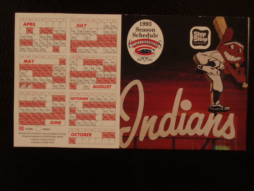
1. **Cleveland Indians – Chief Wa-how could this one not take the top spot?**Starting strong with a logo that sparked decades of fierce debate and ultimately led to a monumental shift, we have the Cleveland Indians’ Chief Wahoo. This mascot, with its wide grin and feather, became a lightning rod for criticism, standing as a stark example of how a brand’s visual identity can perpetuate harmful stereotypes. For years, advocates argued passionately that the logo was an “offensive caricature of a Native American character,” contributing directly to the “mockery of American Indians.” It wasn’t just a design choice; it was a cultural flashpoint.
On the other side, supporters of the mascot often retorted that the character was “simply a cartoon” and not intended to offend anyone. This divide highlighted a fundamental clash between historical context and perceived harmlessness, a tension that many brands struggle to navigate. However, as society’s understanding of representation evolved, the pressure mounted, making it increasingly difficult for the team to maintain the status quo without appearing tone-deaf.
Eventually, after much deliberation and widespread public outcry, the Cleveland Indians made the significant decision to remove the Chief Wahoo logo design from all of their branding. This wasn’t a minor tweak; it was a complete overhaul, culminating in the team changing their name entirely to the Cleveland Guardians. The fact that “over 50 US senators and President Barack Obama voiced their support for the brand change” truly underscores the profound impact and deep-seated controversy surrounding this logo, rightfully earning it a place at the very top of the list of most controversial logos of all time.
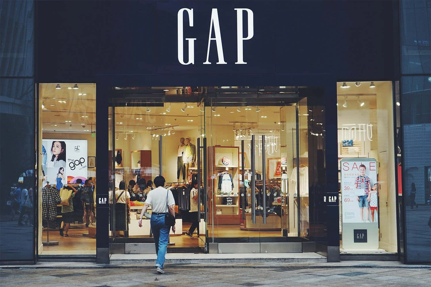
2. **Gap – A lesson in unnecessary changes**Remember when Gap decided to try something new, and then almost immediately decided against it? It was a whirlwind six days in 2010 when the US clothing retailer introduced its new, million-dollar logo design. The world, or at least the internet, was quick to remind them why “unprompted, soulless company changes are poor business etiquette.” This wasn’t a brand in crisis; it was a brand that simply thought it needed a refresh, but spectacularly misread the room.
Out went the company’s iconic blue box, a recognizable symbol that had served the brand for years, and in came an all-black font with a strange, bright blue gradient square next to the ‘p’. It all looked incredibly generic, described as “very vanilla” and made “infinitely worse by the questionable ‘Helvetica’ typeface,” which, let’s be honest, doesn’t exactly scream ‘young target demographic.’ It was a corporate makeover that stripped away all the personality, leaving behind something utterly forgettable and decidedly un-Gap.
The backlash was swift and brutal. “Thousands of users flocked to social media to tear the disastrous logo apart,” creating a firestorm of criticism. Unsurprisingly, Gap quickly reversed the change. The new look logo lasted a grand total of six days before being shelved, a humiliating retreat. To add insult to injury, Gap CEO Marka Hansen “promptly followed suit, leaving the company just four months later.” It was a costly lesson in brand loyalty and the danger of fixing something that wasn’t broken.
Read more about: Stop the Mistake: The 14 Vehicles Industry Insiders Are Steering Clear Of as Tariffs Reshape the Auto Market
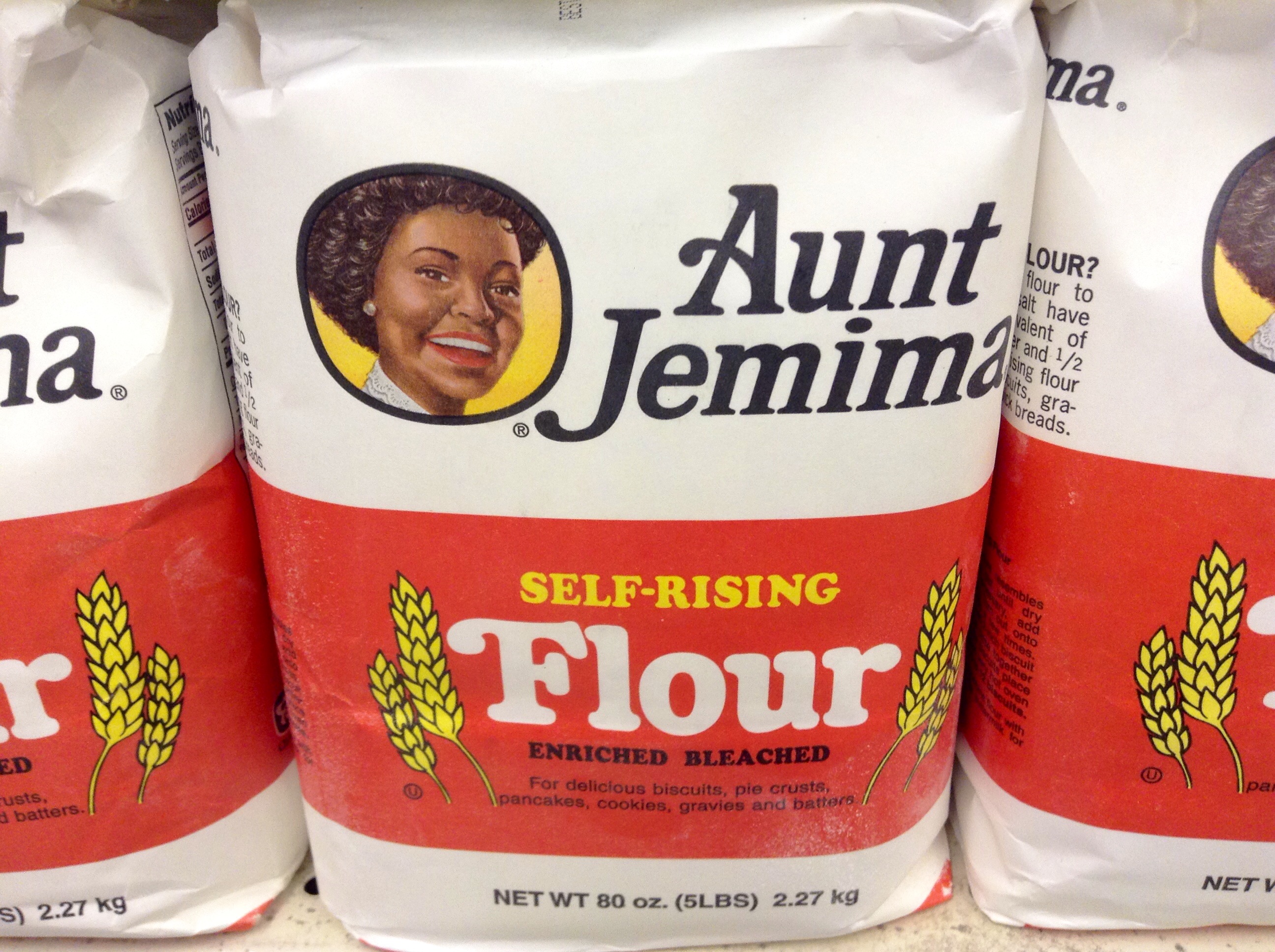
3. **Aunt Jemima – When small changes aren’t good enough**The story of Aunt Jemima is a profound example of how a brand’s visual identity can be steeped in deeply problematic historical context, and how incremental changes are sometimes insufficient to address foundational issues. The brand, established in the late 1800s by Missouri newspaper editor Chris L. Rutt for his self-rising flour, was named after “Aunt Jemima,” a ballad performed by minstrel songwriters. From its inception, the brand’s identity became “synonymous with the racist ‘mammy’ stereotype,” a caricature that portrays black female slaves as cheerful, subservient housekeepers for white families.
Over many decades, Quaker Oats, the owner of the brand, made numerous attempts to modify the logo. They introduced “dozens of changes to the logo over the years in an attempt to lessen the controversy surrounding the logo.” These efforts aimed to soften the image, to modernize it, to distance it from its painful origins. However, for many, “nothing could detract from the fact that the company was founded on racial stereotypes.” The core imagery, regardless of how it was tweaked, remained a painful reminder of an unjust past, making it impossible for the brand to truly evolve without a fundamental change.
Following decades of controversy and in the wake of renewed calls for racial justice, the Aunt Jemima brand finally recognized that small adjustments were no longer enough. The brand was officially renamed to Pearl Milling Company in 2021, a move that went beyond a mere logo refresh to a complete severing of ties with its racially charged past. This transformation represents a crucial lesson in corporate responsibility and the necessity of confronting problematic legacies head-on, rather than attempting superficial fixes.
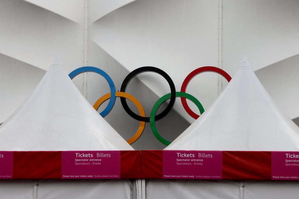
4. **London 2012 – This one isn’t taking home the gold**Back in 2007, when Wolff Olins unveiled its much-anticipated $400,000 Olympic logo for the London 2012 Games, it was meant to be iconic. Instead, it was met with a tidal wave of negative reviews, proving that even a massive budget doesn’t guarantee universal acclaim. The design was abstract, angular, and certainly unique, but it left many scratching their heads, and others downright offended.
Part of the problem was the immediate wave of conspiracy theories that followed. Some people claimed the logo “resembled a swastika,” while others “labeled it as ually suggestive.” The design’s bold, almost jagged form, interpreted by some as abstract figures or even a distorted ‘2012’, was widely mocked. It seemed to embody a classic design paradox: “too simple” yet “too abstract” all at once, failing to clearly communicate the spirit of the Olympics or even its host city.
Perhaps the most dramatic reaction came from Iran, which “even threatened to boycott the Olympics, claiming the logo was a thinly-veiled pro-Israeli conspiracy because it spelled the word ‘Zion’” when certain letters were rotated and imaginations were stretched. Naturally, the Olympic Committee stood firm, as you’d expect after such a hefty price tag. And as 2012 finally rolled around, the initial uproar largely faded, with the focus shifting to the games themselves. Wolff Olins’ design team surely breathed a collective sigh of relief, though the logo’s divisive legacy remains a talking point in design circles.
Read more about: Jennifer Aniston’s $21 Million Bel-Air Mansion: An Exclusive Peek Inside Her Stunning ‘Babe Cave’ and Emmy Prep!
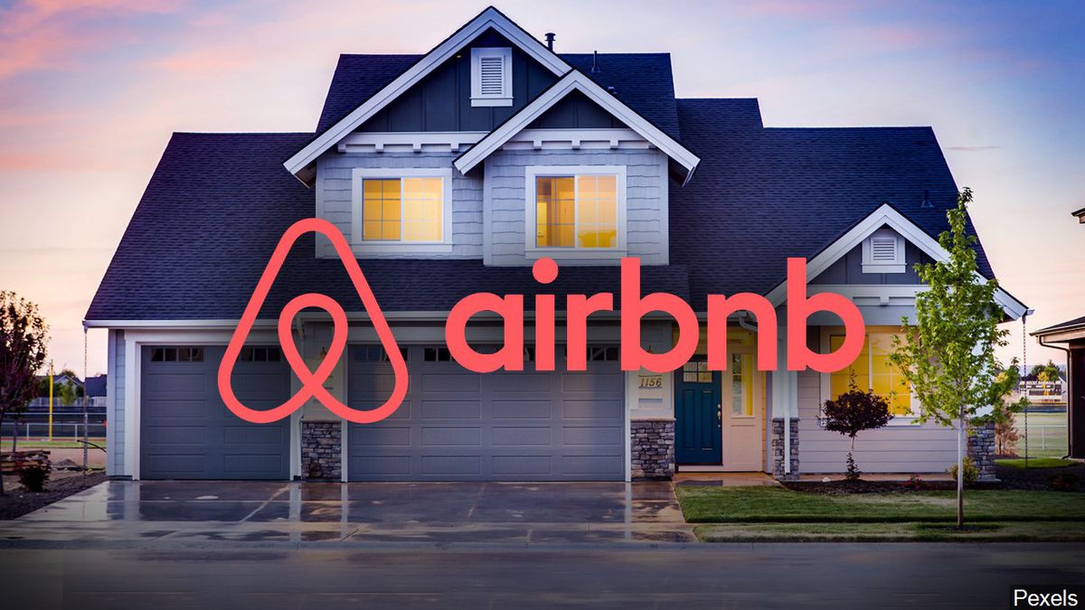
5. **Airbnb – It’s a ual organ… It’s Peter Griffin’s chin… It’s Airbnb’s new logo!**Airbnb’s 2014 logo redesign was another internet sensation, though perhaps not in the way the company had hoped. This emblem took some “serious heat from the public” right after its release, sparking such widespread mockery that “a Tumblr webpage was set up with the specific goal of mocking the disastrous redesign.” It quickly became a masterclass in how an abstract logo can be interpreted in countless, often embarrassing, ways by the internet hive mind.
The insults came thick and fast, ranging from the mundane to the wildly imaginative. Some users argued the logo was a “ripoff of Automation Anywhere’s logo,” pointing out striking similarities. But the real fun began when people started seeing things that were decidedly NSFW. One Twitter user famously claimed the logo was an amazing feat of “how to resemble as many ual organs at once as possible.” This particular critique went viral, forever linking the new ‘Bélo’ symbol with an uncomfortable sexual connotation.
And then there were the truly creative interpretations: “Some uniquely creative members of the design community even Photoshopped the new logo onto Peter Griffin’s iconic butt-chin,” a comparison that cemented its place in internet meme history. Despite the overwhelming backlash, Airbnb stuck by its new logo, announcing that the company was prepared for the social media response and that controversy wasn’t new to them. They still use the logo to this day, a testament to their conviction, or perhaps just their stubbornness.
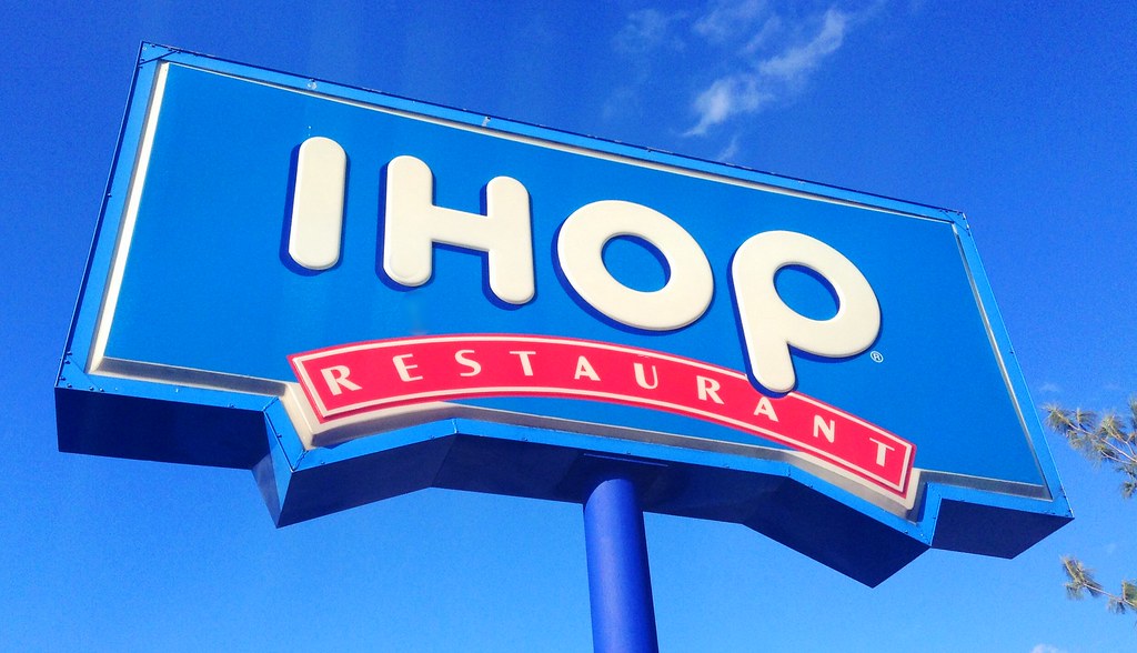
6. **IHOP – Smiling face or mascot on the brink of insanity?**In 2015, IHOP, the beloved International House of Pancakes, decided it was time for a fresh look, marking the first change to its logo in over two decades. They unveiled a new design that introduced a peculiar red curve beneath the ‘o’ and ‘p’ in their name. The intent was sweet and simple: this new look was “intended to resemble a smile, perhaps representing a consumer’s unshakeable happiness when biting into a stack of Original Buttermilk Pancakes.” A noble goal, right? You want your customers to feel joy!
However, as with many rebrands, the public had a different take. Sadly, “fans didn’t see it that way.” Beyond being yet “another example of unnecessary logo simplification,” many critics immediately pointed out that the new icon didn’t evoke happiness at all. Instead, it “more closely resembled a clown smiling through the pain than a happy consumer tucking into an IHOP lunch.” The cheerful smile they aimed for turned into something far more unsettling, an expression of forced joviality masking existential dread.
To make matters worse, the subtle line formed by the ‘p’ in the logo, when combined with the new red curve, made the mascot look like it was “shedding a solitary tear.” This unexpected detail added a layer of tragicomedy to the redesign, leaving many wondering if this was “exactly how IHOP’s graphic design team reacted when reading the horrendous reviews of their rebrand.” Ouch indeed. It just goes to show how fine the line is between a welcoming smile and a creepy grimace in logo design.

7. **Starbucks – Because you don’t need a name to be recognizable**By 2011, Starbucks had achieved a level of global recognition most brands only dream of. So, when they decided to unveil a massive logo redesign, their rationale was clear: their brand was so iconic, it no longer needed its name. This bold move involved “removing many of the elements consumers had grown to know and love,” signaling a shift towards a more minimalist identity. The ‘Starbucks’ name was officially dropped, and the iconic siren, previously encased within a circle, was brought to the forefront, dominating the visual space.
Adding to the simplification, the logo also “shed its black highlights in favor of a simplified green and white duotone.” The idea was to emphasize the siren herself, letting her stand alone as the singular, powerful emblem of the coffee giant. It was an ambitious play, banking heavily on the brand’s entrenched presence in daily life. However, this level of confidence didn’t sit well with everyone, especially those who felt a strong connection to the traditional logo.
The reaction from Starbucks loyalists was swift and intensely negative. Many felt a sense of alienation, expressing their frustration and declaring “how much they hated the new look” on platforms like Facebook. It was a classic case of an established brand taking its loyal customers for granted, assuming that their deep emotional bond would automatically extend to supporting any new initiative. Yet, despite the initial outcry, Starbucks refused to back down. The coffee giant “still proudly stands behind its simplified siren today,” a testament to their unwavering belief in their brand’s global power and perhaps, its ability to weather any storm of public opinion.
Alright, buckle up, because our journey through the land of brand blunders and logo face-plants isn’t over yet! We’ve already scrolled through some truly mind-boggling rebrands, but believe it or not, there are even more epic fails that prove designers sometimes need a serious reality check. From million-dollar logos that sparked Satanic panics to automotive icons morphing into unrecognizable blobs, get ready for another round of ‘What were they thinking?!’
Read more about: Oh, Honey, No: 13 Times Entitled Celebrities Learned the Law Doesn’t Care Who You Are
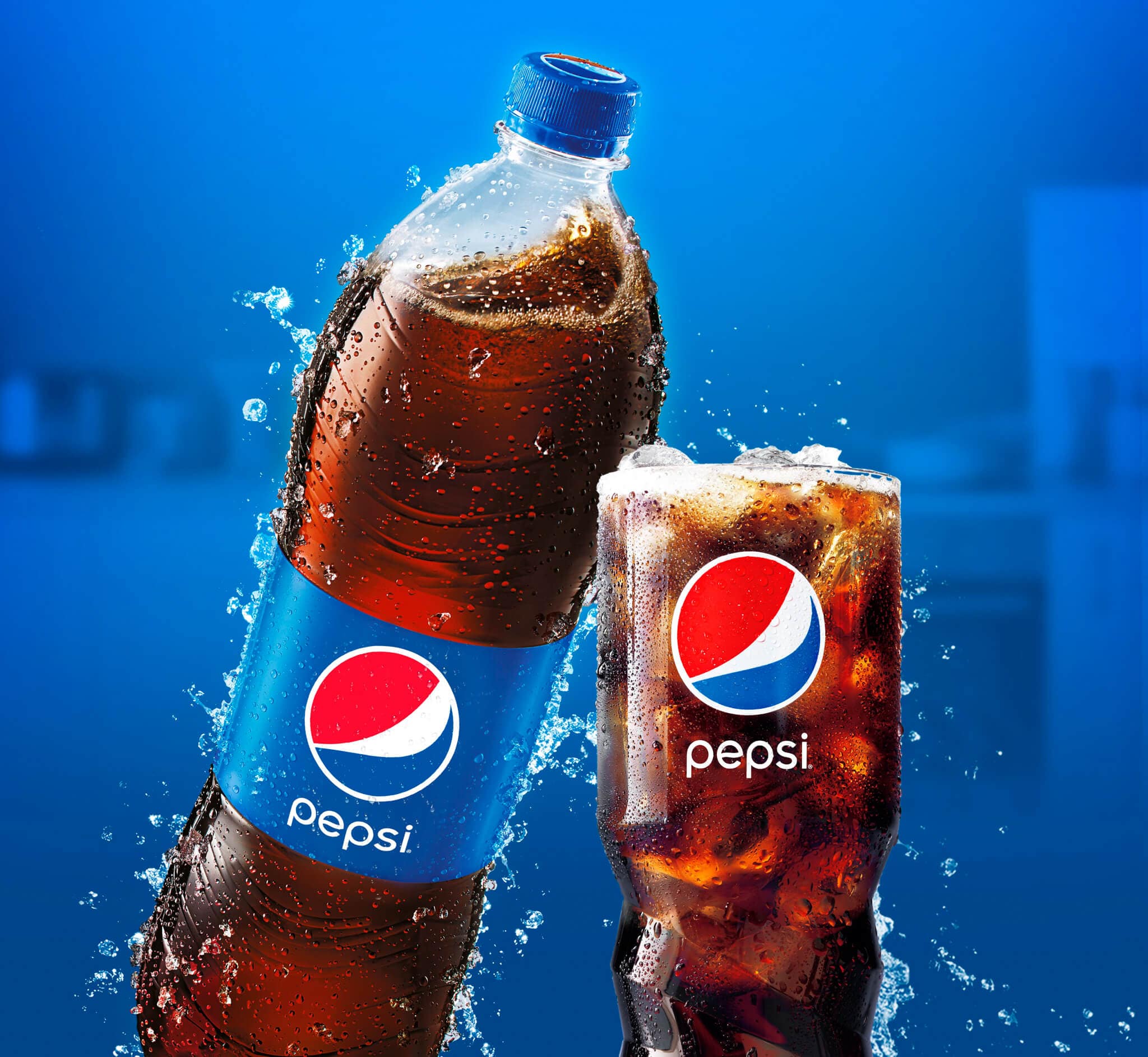
8. **Pepsi – The million-dollar ‘cheeky smile’ that fell flat**Ah, Pepsi. A global titan of the beverage industry, synonymous with refreshing sips and fierce rivalry. So, when they decided to revamp their iconic logo in 2008, you’d think it would be a stroke of marketing genius, right? Well, not exactly. The grand unveiling saw them rotate their familiar circular icon and incorporate what they optimistically described as a “cheeky smile” into the design. Sounds cute in theory, but the execution left many scratching their heads.
This particular refresh came with a whopping $1 million price tag, a figure that makes the eventual public reception sting even more. While the intent might have been to inject a sense of playful modernity, the general consensus quickly labeled it as one of the prime examples of “a logo redesign gone wrong.” It goes to show that sometimes, even a massive budget can’t buy universal appeal, especially when the end result feels less like an evolution and more like a shrug.
For a brand as deeply ingrained in pop culture as Pepsi, such a significant investment in a new visual identity carries monumental expectations. The disconnect between the stated intention of a “cheeky smile” and what consumers actually perceived highlights the tricky tightrope walk of rebranding. It’s a stark reminder that sometimes, the simplest changes can carry the heaviest consequences when you’re playing with such an iconic visual legacy.
9. **P&G – When a logo fuels a Satanic Panic**Prepare to dust off your tinfoil hats, because this next one is less about design missteps and more about… well, pure, unadulterated conspiracy theories! For years, Proctor and Gamble, the everyday household name behind countless products, found itself ruthlessly attacked. Why? Because some folks genuinely believed their logo contained secret references to the Devil himself.
Conspirators, bless their imaginative hearts, painstakingly pointed out what they insisted was an “inverted ‘666’ in the beard of the company’s mascot.” As if that wasn’t enough, they also claimed that “the devil’s horns were visible at the upper and lower edges of the design.” It was a full-blown “Satanic Panic” – a wild ride where a simple corporate emblem became a supposed gateway to the underworld.
Honestly, when you squint really hard, you might *think* you see something, but it’s definitely a testament to how far people will stretch their imaginations. Nevertheless, the pressure was real. P&G, perhaps tired of being accused of dabbling in dark arts, eventually “removed the logo in 1991 amidst the Satanic Panic,” replacing it with a much more straightforward, and decidedly less demonic, typographic logo. Better luck next time, Satan, maybe stick to something less… corporate?
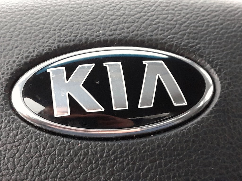
10. **Kia – Is it ‘KIA,’ ‘KN,’ or an automotive Rorschach test?**Automotive brands are constantly striving for sleek, modern identities that convey speed, innovation, and cutting-edge design. And then there’s Kia’s new logo, which, while certainly modern, has managed to spark a level of confusion usually reserved for advanced quantum physics. The immediate public reaction? A collective, resounding, “What *is* this?”
Seriously, the internet exploded with theories: “I still don’t know what this is. Is it K I A all weird? Is it KN? Is it KV with a tail?” became a popular refrain. It’s truly become an “automotive Rorschach test,” where everyone sees something different, and very few actually see the brand name clearly. The goal of a logo is usually instant recognition, but Kia’s rebrand went in a wildly different, and far more perplexing, direction.
While some might argue it’s a bold, abstract statement, the primary function of a logo is communication. When your emblem requires a detective’s keen eye and a guessing game to discern the brand it represents, you might have veered a little too far into artistic interpretation and away from practical branding. It’s a fascinating case study in how attempting to be ‘innovative’ can sometimes just lead to being utterly enigmatic.
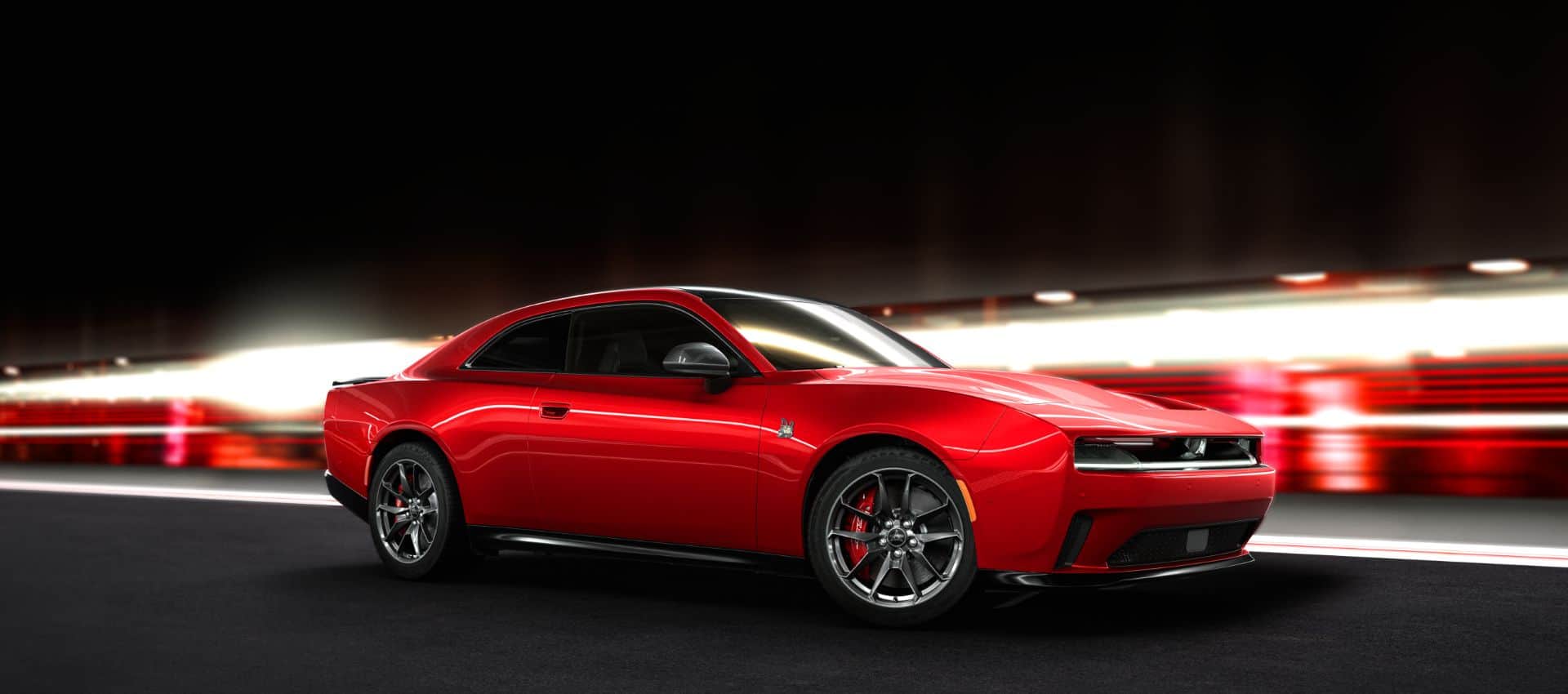
11. **Dodge – From iconic symbols to just… a name**In the world of automotive branding, some logos are legendary. They’re more than just symbols; they’re badges of honor, steeped in history and conveying a sense of identity. But lately, there’s been a trend, particularly among older brands, to shed these rich, traditional emblems in favor of something decidedly more minimalist: just the brand name itself, often in a stylized font. Cue the collective sigh of design purists!
Take Dodge, for example. Back in the “late 50s / early 60s they had a stylized pair of arrows to denote speed and forward motion.” Now, that’s what you call visual storytelling! It was dynamic, it was clear, and it instantly communicated what the brand stood for. Fast forward to today, and it’s “simply a name.”
While there’s certainly an argument for sleek simplicity, there’s also something lost when a brand discards decades of visual equity for a generic wordmark. As the saying goes, “A picture is worth a thousand words,” and in Dodge’s case, replacing a powerful symbol with just a word feels like trading in a thrilling novel for a single, albeit nicely typeset, sentence. It leaves you yearning for the days when automotive logos had a little more roar and a little less whisper.
Read more about: 12 Cars That Went From “Wow” to “Yikes”—Cool to Cringe in No Time

12. **Ram – The sub-brand that still gets called ‘Dodge Ram’**Sometimes, a rebrand isn’t about changing a logo, but about redefining an entire segment of a business. That’s precisely what happened when Dodge decided to implement the Ram sub-brand, spinning off its popular truck line into its own distinct entity. The idea was to give Ram trucks their own identity, allowing them to stand tall (pun intended) on their own four wheels. Sounds logical, right?
Well, for the general public, it seems old habits die hard. The overwhelming reality is that “Most folks still call ’em Dodge Ram trucks.” It’s like trying to separate peanut butter from jelly – they’re just inherently linked in people’s minds. Even internally, the distinction can be blurry, with one observer humorously admitting, “I genuinely didn’t realize they weren’t Dodge Ram trucks anymore until I started working here.”
This rebrand highlights a crucial challenge: you can draw lines in the corporate sand all you want, but if consumer perception doesn’t follow suit, your efforts might just create more confusion than clarity. While the business strategy behind creating a dedicated Ram brand might be sound, the battle for mental real estate in the minds of customers is clearly still ongoing. It’s a subtle but significant misfire in managing public perception.
Car Model Information: 2017 RAM 1500 Laramie
Name: Ram Trucks
Logo: Ramchryslerlogo.png
FormerName: Dodge Ram
Type: division (business)
LocationCity: Auburn Hills, Michigan
Foundation: [object Object]
AreaServed: North America, Middle East, Latin America, Europe, Southeast Asia, Oceania, and Angola
Industry: Automobile
Predecessor: Graham Brothers,Fargo Trucks,Plymouth (automobile)#Plymouth trucks
KeyPeople: Tim Kuniskis (CEO)
Products: Truck
Parent: Chrysler
Homepage: https://www.ramtrucks.com/|ramtrucks.com
Categories: 2010 establishments in Michigan, All Wikipedia articles written in American English, All articles with unsourced statements, Articles with short description, Articles with unsourced statements from July 2024
Summary: Ram Trucks (stylized as RAM) is an American brand of light to mid-weight pickup heavy duty trucks and other commercial vehicles, and a division of Stellantis North America (previously Chrysler Group LLC). It was established in a spin-off of Dodge in 2009 using the name of the Ram pickup line of trucks. Ram Trucks’ logo was originally used as Dodge’s logo. New series Ram 1500 pickups are made at Sterling Heights Assembly in Sterling Heights, Michigan. Since its inception, the brand has used the slogan “Guts. Glory. Ram.”
Get more information about: Ram Trucks
Buying a high-performing used car >>>
Brand: Ram Model: Truck
Price: $17,748 Mileage: 94,933 mi.
Read more about: Unmasking the Hype: 14 Overrated Trucks & SUVs That Fall Short for Tough Jobs, According to Engineers and Towing Tests

13. **Mitsubishi Eclipse – From awesome sports car to ‘crossover blob’**For a certain generation of car enthusiasts, the Mitsubishi Eclipse was more than just a car; it was an icon. A sleek, sporty, 2-door legend that graced magazine covers and movie screens, embodying performance and style. So, when Mitsubishi decided to rebrand this beloved nameplate, what did they do? They took it from a “2dr icon to a crossover blob.” The internet, quite rightly, collectively exclaimed, “RIP.”
This wasn’t just a logo change; it was a fundamental betrayal of a brand’s heritage and a model’s identity. Taking a name synonymous with a thrilling coupe and slapping it onto an entirely different vehicle segment – a utilitarian crossover – felt like a calculated insult to its loyal fanbase. The debate wasn’t even about whether it was a rebrand or a relaunch; it was simply dubbed a “waste of a good name.”
It serves as a painful lesson that some names carry too much weight, too much history, and too much emotional connection to simply be repurposed for a different product. The Mitsubishi Eclipse cross-pollination wasn’t just a design misstep; it was a heart-wrenching loss for fans who mourned the “painful death” of a true automotive legend, proving that some names are best left to their original, glorious forms.
Car Model Information: 2007 Mitsubishi Eclipse Spyder GS
Name: Mitsubishi Eclipse
Caption: Fourth-generation Mitsubishi Eclipse GS coupe
Manufacturer: Mitsubishi Motors
Production: 1989–August 2011 (906,876 units)
ModelYears: 1990–2012
Assembly: Normal, Illinois
Class: Sport compact
BodyStyle: liftback,coupé
Layout: Front-engine, front-wheel-drive layout,Front-engine, four-wheel-drive layout
Predecessor: Mitsubishi Cordia,Mitsubishi Starion
Categories: 1990s cars, 2000s cars, 2010s cars, All-wheel-drive vehicles, All articles with unsourced statements
Summary: The Mitsubishi Eclipse was a sport compact car manufactured and marketed by Mitsubishi over four generations in the 1990–2012 model years. A convertible body style was added during the 1996 model year.
The first two generations were marketed simultaneously as rebadged variants, including the Eagle Talon and Plymouth Laser — and were a byproduct of Mitsubishi Motors and Chrysler Corporation’s close alliance. Their partnership in turn gave rise to Diamond-Star Motors (DSM). In Japan, the first two generations were sold at a specific Japanese retail chain called Mitsubishi Car Plaza. The third, 2000–2005 generation shared an extended wheelbase variant of their platform with the Chrysler Sebring and Dodge Stratus. In May 2005, the fourth, and final generation Eclipse was introduced, replacing the Chrysler platform used for the third generation with the PS platform.
According to Mitsubishi, the Eclipse was named after an unbeaten 18th-century English racehorse that won 18 races in a row and then retired.
At the end of August 2011, the final Eclipse was manufactured and auctioned for charity.
In 2017, Mitsubishi resurrected the Eclipse name on a compact crossover vehicle, called the Eclipse Cross.
Get more information about: Mitsubishi Eclipse
Buying a high-performing used car >>>
Brand: Mitsubishi Model: Eclipse
Price: $3,900 Mileage: 115,000 mi.

14. **Jaguar’s 2024 Rebrand – The ‘Copy Nothing’ campaign that copied controversy**And finally, let’s talk about a rebrand that’s fresh off the press and still sparking heated debates: Jaguar’s 2024 overhaul. The iconic British automaker, known for its sleek elegance and roaring engines, announced a daring “Copy Nothing” campaign, signaling a full pivot to an all-electric lineup by 2025. This was meant to be a bold, electrifying leap into the future, but it quickly became a masterclass in how to alienate your base while baffling new audiences.
Jaguar’s new visual identity is a dramatic shift towards “Exuberant Modernism.” Out went the iconic big cat ensemble, replaced by a rounder, modernized typeface with a blend of upper and lower case letters. They introduced a “Device Mark” with geometric shapes, a linear graphic called the “Strikethrough,” and an “Artist’s Mark” (a circular badge with a stylized ‘J’ and ‘r’). Even the beloved “leaper” got an angular, dynamic update. Plus, a striking new palette of primary colors was adopted. It’s a lot of ‘new,’ and perhaps, too much.
The promotional ad leading up to the reveal of their “Type 00” concept car was particularly divisive. It bafflingly “omits a critical element traditionally associated with Jaguar: the car itself.” Instead, it bombarded viewers with vague phrases like “create exuberant” and “live vivid,” all set against a backdrop of “androgynous models.” Critics, including Tesla’s Elon Musk, who famously quipped “Do you sell cars?” on X, swiftly labeled it as a “woke” marketing strategy completely disconnected from Jaguar’s legacy. Even competitor Nothing took a clever jab, updating its bio to “Copy Jaguar.”
And the “Type 00” car itself? Revealed at Miami Art Week, its “brutalist styling” and resemblance to a “cuboid” drew comparisons to the Tesla Cybertruck, not exactly a compliment for a luxury brand. Add to this a reported price tag “over £100,000 (US$130,000)” for their new GT model, significantly higher than Tesla’s top EV, and you have a recipe for confusion and backlash. Jaguar’s managing director, Rawdon Glover, insisted the attention was exactly what they wanted, stating, “The eyes of the world are upon us at this point in time, which is exactly what we wanted.” But is all publicity truly good publicity when your core product is an afterthought?
Jaguar’s rebrand is a powerful, ongoing lesson in how vital it is to respect a brand’s legacy, build a clear narrative around its products, and never, ever take your customers for granted. While the shift to luxury electric is undeniably strategic, the execution has proven just how precarious transforming a legacy brand can be. Will Jaguar manage to roar back with its new electric lineup, or will this ambitious overhaul be remembered as a costly misstep? Only time will tell if this modernistic leap pays off or if it just leaves everyone scratching their heads.
So, there you have it! From iconic beverage giants to automotive legends, and even government bodies, the world of branding is fraught with peril. These stories of rebranding gone wrong aren’t just cautionary tales for designers and marketers; they’re fascinating glimpses into the fickle nature of public perception and the powerful, often emotional, connections we forge with the brands in our lives. Next time you see a familiar logo, take a moment to appreciate the delicate balance it represents – a balance that, as we’ve seen, can easily tip into total chaos!

