

If you’ve ever found yourself scratching your head, wondering why your carefully edited photos look radically different when printed, or why your screen’s colors seem perpetually washed out, you’re not alone. This frustrating experience is often a tell-tale sign of one of the most overlooked aspects of display performance: poor monitor calibration. It’s a truth that many users, from casual browsers to aspiring creative professionals, simply don’t realize the full potential of their screens because they haven’t taken the time to properly tune them.
The good news is that achieving accurate color representation on your display isn’t some arcane art reserved for seasoned tech gurus. Proper monitor calibration fundamentally transforms your entire computing experience, making everything from detailed photo editing to everyday web browsing a more visually accurate and comfortable affair. It’s about adjusting your display’s color output to align with standardized color spaces, ensuring that what you perceive on screen is a faithful representation of actual colors. This involves meticulously tweaking settings like brightness, contrast, gamma, and color temperature to unlock optimal accuracy, providing a significant difference whether precision is your profession or simply your preference.
Many of us are quick to blame the monitor itself when colors go awry, but the reality is that most monitors ship with settings far from ideal for accuracy. Manufacturers typically crank up brightness to attention-grabbing levels and oversaturate colors to create that ‘wow’ factor in a showroom. While initially impressive, these settings often lead to eye strain during prolonged use and, critically, misrepresent true colors. Our mission today is to equip you with the knowledge to avoid the most common missteps, guiding you through the essential steps to achieve professional-grade color accuracy on any monitor, regardless of your budget or technical background. Let’s dive into the 14 most common mistakes that hinder users from achieving their display’s true potential.
1. **Ignoring the Fundamentals of Display Parameters**One of the most foundational mistakes users make when approaching monitor calibration is diving in without a solid grasp of the core display parameters they are actually adjusting. Think of it like trying to tune a musical instrument without knowing what each knob or string does; you might make some noise, but you won’t achieve perfect harmony. Without understanding brightness, contrast, gamma, color temperature, and color gamut, any adjustments you make are essentially guesswork, leading to inconsistent and often counterproductive results.
Monitor calibration involves optimizing several key elements that collectively dictate how colors appear on your screen. Brightness, also known as luminance, controls the amount of light your monitor emits, impacting overall screen intensity. Contrast, on the other hand, defines the discernible difference between the deepest blacks and the brightest whites, crucial for detail rendition. Gamma affects the brightness of mid-tones and the smoothness of color transitions, a critical factor often overlooked.
Color temperature, measured in Kelvin (K), shifts colors along a spectrum from warm (yellowish) to cool (bluish), with a standard target of 6500K (D65) to match natural daylight. Finally, color gamut refers to the total range of colors your monitor is capable of displaying. Understanding these interlinked parameters is not just academic; it empowers you to make informed decisions during calibration, guiding you towards the standard targets like a gamma of 2.2 for Windows and general use, or the sRGB color space for web content.
Many users skip over this crucial learning phase, jumping straight into adjusting sliders without context. This often results in a display that might look “better” subjectively but is far from color-accurate, potentially causing issues down the line in color-critical workflows. Taking a moment to familiarize yourself with these fundamentals lays a robust groundwork for successful and meaningful calibration, ensuring that every adjustment you make is a step closer to precise color fidelity rather than just arbitrary changes.
Read more about: Demystifying the Dreaded Engine Knock: Your Ultimate Guide to Diagnosis, Repair, and Prevention for a Quiet Ride
2. **Sticking with Default Factory Settings**The second common mistake, and perhaps one of the most pervasive, is the assumption that a new monitor, especially a high-end one, arrives perfectly calibrated and ready for color-critical work. While some premium displays are pre-calibrated, the vast majority of monitors ship with settings that are optimized not for accuracy, but for showroom appeal. Manufacturers intentionally boost brightness to eye-searing levels and oversaturate colors to make displays appear more vibrant and catch the consumer’s eye in a brightly lit retail environment.
While these out-of-the-box settings might create an impressive initial visual impact, they are detrimental to long-term viewing comfort and, more importantly, color fidelity. Extended use of an uncalibrated monitor can lead to significant eye strain due to excessive brightness and inaccurate color reproduction that misrepresents actual colors. For anyone involved in photography, graphic design, or video editing, relying on these defaults can lead to costly mistakes, such as prints with colors vastly different from what was seen on screen.
Proper calibration is designed to fix these inherent biases, aligning your monitor’s output with industry standards such as a white point of 6500K, a gamma of 2.2, and a brightness around 120 cd/m² for typical indoor lighting. These standards ensure consistency across various devices and viewing conditions, which is utterly impossible to achieve with generic factory defaults. By diligently adjusting these parameters, you move beyond the “showroom look” to a display that offers a more comfortable viewing experience and ensures reliable color consistency.
The cost of neglecting this step can range from frustrated reprints to compromised professional output. An uncalibrated monitor, even an expensive one, can subtly distort color reproduction over time, meaning that your work might not appear as intended on other screens or in print. Therefore, proactively moving beyond factory defaults and engaging in a proper calibration process is an essential step towards professional-grade display performance and preventing avoidable errors.
3. **Skipping Monitor Warm-Up Prior to Calibration**A seemingly minor but critically important oversight many users make is failing to allow their monitor sufficient time to warm up and stabilize before beginning the calibration process. Just as an athlete needs a warm-up before a strenuous activity, LCD panels require time to reach a stable operating temperature, and their backlights need to warm up to deliver consistent output. OLED displays, while faster to stabilize, also benefit from a stabilization period.
If you start calibrating a cold monitor, its color output and brightness levels will still be fluctuating, leading to inaccurate measurements and a poorly optimized profile. The calibrations performed will reflect the monitor’s unstable state at that moment, rather than its true, stable performance. This results in a calibration profile that might be accurate for only a brief period, quickly drifting as the monitor continues to warm up and its characteristics change.
The general recommendation is to let your LCD monitor warm up for at least 30 minutes before calibration. For OLED displays, a 15-minute stabilization period is usually sufficient. During this warm-up time, it’s beneficial to display a neutral gray background rather than letting the screen go idle or showing highly dynamic content. This gentle warm-up ensures that when you begin calibration, your monitor is operating at its most consistent and predictable level, allowing the calibration tools to capture its true characteristics.
Ignoring this warm-up period undermines even the most sophisticated calibration efforts. A quick calibration on a cold monitor might seem efficient, but it’s a false economy, as the resulting profile will likely be compromised, leading to color inconsistencies that will frustrate you later. Prioritizing this simple preparation step ensures that your subsequent calibration efforts are built upon a stable and accurate foundation, yielding much more reliable and long-lasting results.

4. **Neglecting Thorough Screen Cleaning**It might sound elementary, but another common mistake that directly impacts perceived color accuracy and can interfere with calibration tools is neglecting to thoroughly clean your monitor screen. Dust, fingerprints, smudges, and even tiny fibers can subtly affect how colors are reflected and perceived, acting as visual noise that can trick your eyes and, more importantly, your hardware calibration sensors into making incorrect assessments.
When using a hardware calibration device like a colorimeter, its readings are directly influenced by the surface it’s placed upon. Any debris or smudges on the screen beneath the sensor can lead to skewed measurements of light output and color, resulting in an inaccurate color profile. Imagine trying to paint a masterpiece on a dirty canvas; the true colors simply won’t shine through. The same principle applies here: a clean screen is paramount for accurate measurement and visual assessment.
Before every calibration session, take the time to clean your screen meticulously. Use appropriate cleaning solutions designed for electronics, typically alcohol-free and ammonia-free, along with a soft, lint-free microfiber cloth. Gently wipe away any dust, smudges, or fingerprints. Pay particular attention to the area where you intend to place your colorimeter, ensuring it’s pristine for optimal contact and measurement accuracy.
This simple act of screen cleaning is often overlooked in the rush to get to the “technical” part of calibration, but its impact is undeniable. A clean screen ensures that both your eyes and any hardware sensors are evaluating the display’s true output, free from superficial interferences. It’s a quick and easy step that significantly contributes to the overall success and precision of your monitor calibration, preventing erroneous readings and ensuring that the colors you see are indeed what your monitor is producing.
Read more about: The Definitive Guide to Making Your Car’s Paint Last Forever: Expert Tips for Unrivaled Longevity for Car Owners
5. **Disregarding Ambient Lighting Conditions**A frequently overlooked but critical factor influencing the perception of color and the success of monitor calibration is the ambient lighting in your workspace. Many users make the mistake of calibrating their monitors without paying careful attention to their surrounding environment, leading to profiles that might be technically accurate but visually misleading under typical working conditions. Our eyes adapt to ambient light, and if the light around your monitor is inconsistent or poorly controlled, your perception of the display’s colors will be skewed.
Ideally, you should calibrate your monitor in the lighting conditions where you will primarily use it. This means avoiding direct sunlight, which can drastically alter color perception and create harsh reflections. Similarly, bright, colorful walls or overly dim room lighting can influence how your eyes interpret the colors on your screen. Inconsistent ambient light can make a perfectly calibrated monitor appear to have a color cast, leading to frustrating and unnecessary manual adjustments.
For color-critical work, controlling your ambient lighting becomes even more essential. Many professionals consider using bias lighting behind the monitor – typically a 6500K LED strip – to create consistent, neutral background illumination. This not only reduces eye strain but also improves perceived contrast and allows your eyes to adapt to a stable white point, making it easier to judge colors accurately on the screen. The standard 6500K (D65) white point for calibration targets natural daylight, and bias lighting helps simulate this neutral environment.
By neglecting ambient lighting, users risk calibrating their monitor to a specific, potentially poor, set of environmental conditions rather than to a universally accurate standard. This can lead to a monitor that looks great under the calibration conditions but then appears off once you return to your normal workspace. Taking the time to control and stabilize your ambient lighting is a relatively simple step that provides a significant boost to the reliability and consistency of your calibration results, ensuring what you see is truly what you get.
Read more about: Navigating the Road Ahead: An In-Depth Look at the Most Common Driving Mistakes That Cause Accidents
6. **Failing to Reset to Factory Defaults**Before embarking on any serious calibration endeavor, a crucial step that is often skipped, leading to potential conflicts and unreliable results, is failing to reset your monitor to its factory default settings. Many users attempt to calibrate on top of existing adjustments they might have made through the monitor’s on-screen display (OSD) menu, their graphics driver control panel, or even prior calibration attempts. This is a significant mistake.
Starting with a clean slate is paramount. Any previous adjustments, whether they were for personal preference, a gaming session, or an old, inaccurate calibration, can create a baseline that conflicts with the new calibration process. These underlying settings can interact unpredictably with calibration software or hardware, leading to profiles that are either incorrect, unstable, or simply unable to achieve the desired level of accuracy. It’s like trying to build a new house on a shaky, uneven foundation.
The solution is straightforward: access your monitor’s OSD menu using its physical buttons, navigate to the “reset” or “factory defaults” option, and confirm the reset. This action clears all custom settings, returning the monitor to its original, unadulterated state. By doing so, you ensure that you are starting from a known, neutral baseline. This allows your calibration tools, whether software or hardware, to accurately assess the monitor’s native characteristics and apply corrections without fighting against existing, potentially conflicting adjustments.
Skipping this step can make troubleshooting incredibly difficult if you encounter issues during or after calibration. You’ll be left wondering if the problem is with the calibration process itself or with a hidden, conflicting setting from the past. A quick factory reset eliminates this uncertainty, providing a solid, predictable starting point for every calibration session and significantly increasing the chances of achieving a successful and accurate outcome.
Read more about: Unleash Your PS5’s Full Potential: Essential Settings to Optimize Your Gaming Experience

7. **Solely Relying on Visual Guesswork (Windows/Mac)**While operating systems like Windows and macOS offer built-in calibration tools, a common mistake users make is relying solely on subjective visual assessment without understanding the nuances of these tools, or worse, making arbitrary adjustments based on what “looks good.” The Windows Display Color Calibration tool and Mac’s Display Calibrator Assistant are powerful, but they require careful attention and adherence to their guided visual cues, particularly when dealing with gamma and color balance.
In Windows, for instance, the gamma adjustment guides you through blending dots into circles. The mistake here is not patiently adjusting the slider until the dots *seamlessly* merge with their backgrounds, ensuring proper mid-tone reproduction. Similarly, for color balance, users often make hasty adjustments to red, green, and blue sliders without carefully observing the neutrality of the gray bars, leading to persistent color casts. These steps demand subtle adjustments and careful observation, not just quick fixes.
For macOS users, the Display Calibrator Assistant in expert mode offers sophisticated options. However, many users skip enabling expert mode, thus missing out on maximum control over calibration parameters. The native gamma adjustment using Apple’s unique visual matching system, involving parallel lines and apple logos, is precise but requires diligent effort to ensure the logos truly blend with their backgrounds. Failure to accurately match these visual patterns can result in a suboptimal native gamma response curve.
The danger of purely subjective adjustments is that they are highly susceptible to individual perception, environmental lighting, and even temporary eye fatigue. What looks “balanced” to one person or at one moment might be objectively inaccurate. While these built-in tools can provide surprisingly good results, they demand that users follow their instructions meticulously, leveraging the provided visual guides to make objective, rather than arbitrary, adjustments. This methodical approach ensures that the output from these software tools is as accurate as possible, laying the groundwork for truly reliable color representation.
Now that we’ve navigated the foundational missteps, it’s time to delve deeper into the more advanced calibration pitfalls. These are the nuances that separate an ‘okay’ display from one that truly excels, ensuring your creative output or viewing experience isn’t compromised by subtle, yet significant, inaccuracies. Let’s unravel the remaining common mistakes that often keep users from unlocking their monitor’s full potential.

8. **Neglecting to Install Manufacturer-Provided ICC Profiles**Even after diligently working through the basic calibration steps, a crucial oversight many users make is neglecting the custom ICC (International Color Consortium) profiles provided by their monitor manufacturer. These aren’t just generic presets; they are data sets specifically crafted for your monitor model, designed to ensure your operating system and applications interpret its color capabilities with the highest degree of accuracy. Ignoring these can leave subtle, yet noticeable, color shifts unaddressed, especially in displays with wider color gamuts.
Think of an ICC profile as a precise instruction manual for your display. While built-in OS tools or even hardware calibrators create a generic ‘best fit’ profile, the manufacturer’s profile often fine-tunes this by accounting for unique panel characteristics, backlight variations, and factory tolerances. This can be particularly vital for professional workflows, where precise mapping of color spaces like sRGB or Adobe RGB is paramount. These profiles work in conjunction with your calibration, not in place of it, complementing the adjustments you’ve already made.
The fix is straightforward and highly impactful. Simply visit your monitor manufacturer’s support website, locate the drivers and software section for your specific model, and download the latest ICC profile. Once downloaded, you can install it through your operating system’s color management system. For Windows, access the ‘Color Management’ panel, click ‘Add,’ browse to your ICC file, and set it as the default profile for your display. macOS users will find similar options within the ColorSync Utility.
This small but significant step ensures that your monitor’s intrinsic color characteristics are communicated precisely to your system, allowing for a more accurate and consistent color representation across all your applications. It’s an essential layer of precision that complements your calibration efforts, pushing your display closer to professional-grade color fidelity.
9. **Omitting Hardware Calibration Tools**While operating system-based calibration tools offer a good starting point, one of the most significant mistakes users make in the pursuit of true color accuracy is avoiding dedicated hardware calibration tools. Relying solely on subjective visual adjustments, no matter how carefully executed, introduces human perception errors and environmental biases that a device simply doesn’t contend with. Our eyes are remarkable, but they adapt to surrounding light, making objective color judgment incredibly difficult.
Hardware calibration, employing devices like colorimeters or spectrophotometers, transcends these human limitations. These tools objectively measure the actual light output and color reproduction of your display, bypassing subjective interpretation entirely. They systematically measure thousands of color patches, capturing a comprehensive ‘picture’ of your monitor’s capabilities and shortcomings, then generate an incredibly precise ICC profile based on these empirical measurements. This process eradicates guesswork, delivering a level of accuracy unachievable through visual means alone.
There’s a calibrator for nearly every budget and need. Entry-level colorimeters, such as the Datacolor SpyderX Express, offer excellent value for hobbyists and semi-professionals, capable of achieving Delta E values (a measurement of color error) under 3, which is largely imperceptible to the human eye. For those in color-critical professions, advanced options like the Calibrite ColorChecker Display Pro provide features like ambient light monitoring, projector calibration, and multi-monitor matching, pushing accuracy to Delta E values below 1.
The calibration process itself involves placing the device securely on your screen, allowing its software to display a series of color patches. The colorimeter measures these, feeding data back to the software to construct a custom profile, typically taking 5-15 minutes. This ensures that the corrections are applied based on real-world measurements, aligning your display with industry standards like a 6500K white point and a 2.2 gamma, providing a truly reliable color foundation for all your work.
Read more about: Tech Geek’s ‘Unknown’ Code: Unlock Your Car’s Hidden Menu Instantly Without Ever Visiting the Dealership
10. **Skipping Post-Calibration Verification**Many users make the mistake of assuming that once a monitor has been calibrated, the job is done. However, skipping post-calibration verification is like baking a cake without tasting it – you might think it’s perfect, but you won’t truly know until you check. Verification is a critical final step, often integrated into hardware calibration software, that confirms the effectiveness and accuracy of your newly created color profile.
This crucial step involves re-measuring a specific set of key colors and gray values after the calibration profile has been applied. The software then compares these measured values against the target standards, generating a report that typically includes Delta E values. These values quantify the difference between the desired color and the actual color displayed, providing an objective measure of your calibration’s success. A low Delta E (ideally below 1 for critical work, below 3 for general use) indicates excellent accuracy.
Verification is essential because it immediately identifies any issues that might have occurred during the calibration process. Perhaps there was a conflict with an underlying setting, or the monitor itself has an inherent limitation that the calibration couldn’t fully correct. Without this check, you’re operating under the assumption of accuracy, which can lead to costly reprints or inconsistent output in professional environments. It serves as your final quality control before you trust your display for color-critical tasks.
Running verification isn’t just a one-time thing immediately after calibration. It’s also a valuable diagnostic tool if you suspect your display has drifted or if colors suddenly seem off. If the verification reports high Delta E values, it’s a clear signal that recalibration is needed rather than attempting subjective manual adjustments that might exacerbate the problem. This iterative process ensures that your investment in calibration continues to yield reliable, accurate results over time.

11. **Ignoring Color Management Conflicts**One of the most frustrating calibration issues users encounter is persistent color casts or inconsistent color appearance between different applications, even after a meticulous calibration. This often stems from a common mistake: ignoring conflicts within your system’s color management architecture. Modern operating systems and creative applications all have their own color management engines, and if these aren’t working in harmony, your meticulously crafted profile can be undermined.
The problem arises when multiple layers try to control your display’s color output. Your monitor itself might have vendor-specific color enhancement features, your graphics card driver could be applying its own color adjustments, and then your operating system and individual applications (like Photoshop) add their own color management on top. This creates a confusing hierarchy where settings can override each other or apply conflicting corrections, leading to inaccurate display or subtle color shifts.
Troubleshooting this requires a systematic approach. First, ensure you disable any monitor vendor color enhancement features directly through your monitor’s On-Screen Display (OSD) menu. Next, reset your graphics driver color settings to their defaults; these drivers often include their own saturation, hue, and brightness controls that can interfere. Finally, pay close attention to your applications’ color management settings. Creative applications, in particular, often have options to use the system monitor profile or their own internal engines. Ensure these are correctly configured to work with your calibrated profile.
Understanding the distinction between color-managed and non-color-managed applications is also key. Web browsers, for instance, often default to sRGB and may not fully utilize your custom profile unless configured. By systematically eliminating conflicting color management layers and ensuring your system and applications refer to your accurate monitor profile, you can resolve frustrating inconsistencies and achieve predictable color across your entire workflow.
Read more about: Decode Your Dashboard: The Real Reasons Your Car’s Check Engine Light Turns On and How to Fix Them
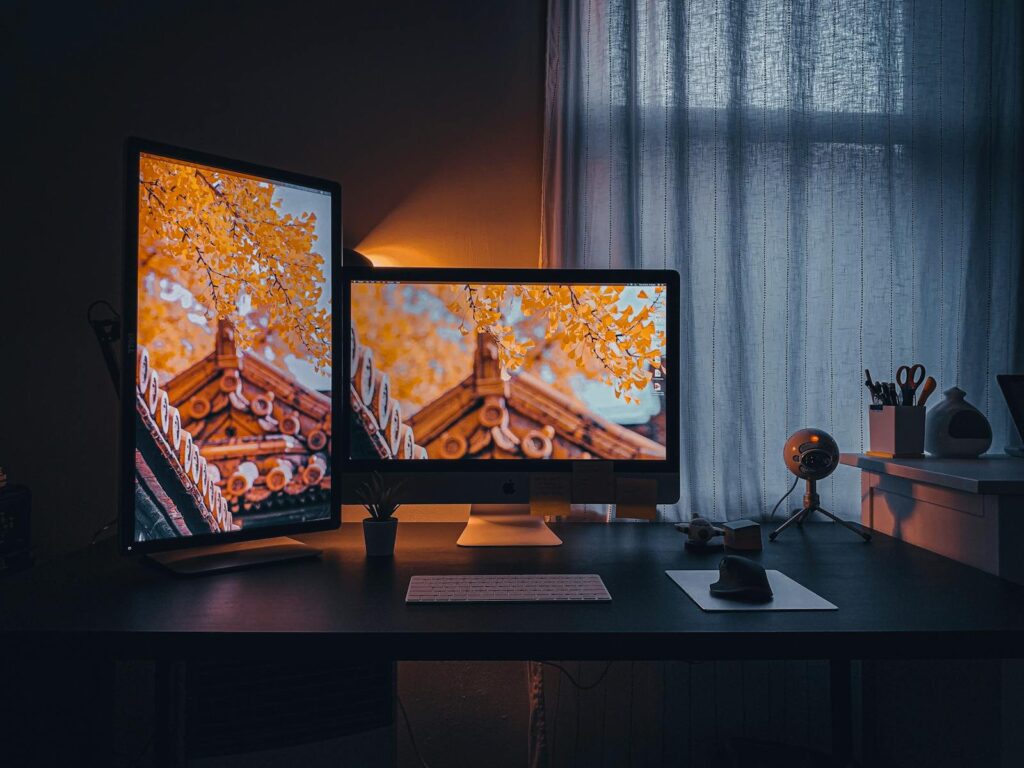
12. **Failing to Match Multi-Monitor Setups**For users with multi-monitor setups, a common pitfall is the assumption that if all monitors are the same model, they will inherently display colors identically. This couldn’t be further from the truth. Even identical panels coming off the assembly line exhibit subtle variations in their backlights, color temperature, and gamma response. Failing to account for these individual differences through specific matching calibration is a mistake that can severely hinder workflow, especially in professional environments.
These seemingly minor discrepancies become major headaches when you’re trying to compare images, match design elements, or perform color-critical tasks across multiple screens. What looks perfectly neutral on one monitor might have a slight green cast on its neighbor, leading to eye strain, confusion, and ultimately, compromised output. This issue is magnified in environments where color consistency is paramount, like photo editing suites or video production studios where large canvases span multiple displays.
The solution requires individual calibration for each monitor in your setup. While tedious, this process ensures that each display receives its own custom profile, finely tuned to its unique characteristics. The goal is not just to calibrate each monitor, but to match them to a common target. This means targeting identical white points (e.g., 6500K), gamma values (e.g., 2.2), and crucially, luminance (brightness) levels across all displays. Some advanced calibration software even includes specific multi-display matching modes designed to optimize this consistency, simplifying the process.
By diligently calibrating and matching each display, you create a seamless, cohesive visual workspace. This not only reduces eye strain and fatigue but also instills confidence that the colors you see are consistent across your entire viewing area, allowing for a far more efficient and accurate workflow. It transforms a collection of individual screens into a unified, reliable color output system.
13. **Overlooking Regular Maintenance**One of the most persistent misconceptions about monitor calibration is that it’s a one-time event. This leads to a common mistake: overlooking the need for regular maintenance. Unfortunately, displays do not maintain perfect accuracy indefinitely; they drift over time due to factors inherent in their technology and changes in their operating environment. Neglecting this ongoing need for recalibration means your meticulously achieved accuracy will slowly degrade, leaving you with an increasingly inaccurate display.
The reasons for this drift are multifaceted. LED backlights, for instance, gradually dim and can shift in color temperature as they age. OLED panels, while offering incredible contrast, also have characteristics that can subtly change over time. Furthermore, environmental factors such as fluctuations in room temperature, humidity, or even the gradual accumulation of dust on the screen can influence how your display performs and how your eyes perceive its output. Without regular checks, these changes silently erode your color fidelity.
The most effective solution is to establish a consistent recalibration schedule. For color-critical professionals like photographers and designers, monthly recalibration or after approximately 200 hours of active use is highly recommended. Casual users can often extend this to quarterly intervals, but consistency is key. Maintaining a log of your calibration dates, settings, and environmental conditions provides valuable insight into your monitor’s performance trajectory and helps you identify any anomalies.
Beyond just recalibration, regular cleaning of your screen with appropriate solutions and microfiber cloths is vital, as accumulated dust can interfere with light output and colorimeter readings. For consistent results, striving for environmental stability—avoiding direct sunlight, maintaining a stable room temperature, and using bias lighting—also significantly improves calibration longevity. This proactive maintenance ensures your display remains a reliable tool, consistently delivering accurate colors for years.
Read more about: Expert Auto Mechanic Reveals: The Used Cars You Should Never Buy, And Why Their Hidden Costs Will Drain Your Wallet
14. **Neglecting to Document Calibration Settings**In the rush to get back to work after a successful calibration, many users commit a simple yet potentially costly mistake: neglecting to document their calibration settings. This oversight might seem minor initially, but it can lead to significant headaches down the line, especially when troubleshooting issues, replacing hardware, or migrating to a new system. Without proper documentation, you’re essentially losing valuable data that could save you hours of frustration.
Documentation serves several crucial purposes. Firstly, it acts as a detailed reference point. If you ever suspect your calibration has gone awry, or if you need to manually adjust your monitor’s OSD settings again, having a record of the precise brightness, contrast, and color temperature values you used during calibration is invaluable. It eliminates guesswork and allows you to quickly reset to a known good state, preventing further accidental misalignments.
Secondly, and perhaps most critically, proper documentation is your safeguard against disaster. ICC profiles can sometimes become corrupted, or you might need to reinstall your operating system or even upgrade your entire PC. Saving your custom ICC profiles to a cloud storage service, along with calibration reports detailing measured Delta E values, ensures you have a backup. This allows for quick restoration of your precise color accuracy without having to repeat the entire calibration process from scratch, which is a major time-saver.
Finally, documenting your settings over time provides a performance history for your monitor. Tracking how your brightness levels or color temperatures drift from one calibration to the next can help you identify when your monitor might be aging or developing hardware issues. This forward-thinking approach transforms calibration from a reactive fix into a proactive strategy, ensuring consistent, professional-grade display performance and preventing avoidable errors from cropping up again.
Monitor calibration isn’t just a technical chore; it’s an empowering journey towards visual perfection. By understanding and avoiding these 14 common pitfalls, you transform your display from a mere output device into a precision instrument. Whether you’re a seasoned professional or simply someone who appreciates pristine visuals, the effort invested in proper calibration will pay dividends in reduced eye strain, impeccable color accuracy, and the unwavering confidence that what you see on your screen is a true reflection of reality. Embrace these insights, and unlock the full, vibrant potential of your monitor, ensuring your digital world always looks its absolute best.


