

Logos are everywhere—on smartphones, cars, clothing, and almost everything else made by a company with an identity. These visual shorthand cues are more than just pretty pictures; they are powerful tools for quick identification and crucial elements in shaping a brand’s narrative. They tell a story, build trust, signify essential elements of business philosophy, and most importantly, make brands unforgettable. Even if a brand has a simple logo, odds are plenty of thought, creativity, and sometimes, a dash of hidden meaning went into its design.
Indeed, the world of brand logos is a fascinating landscape where history, ambition, and clever symbolism often converge in subtle ways. From ancient heraldry to modern digital design, these emblems can incorporate secret symbols, clever visual puns, or direct references to a company’s deep-rooted history. They are, in essence, a forgotten code, waiting for curious minds to decipher the intriguing messages hidden in plain sight.
Today, we embark on an illuminating journey into the captivating realm of brand imagery. We’re going to peel back the layers of familiarity and reveal the astonishing ingenuity and surprising depth behind some of the world’s most recognizable automotive and tech brand logos. Get ready to discover the intricate stories and intellectual easter eggs that make these everyday icons truly unforgettable.
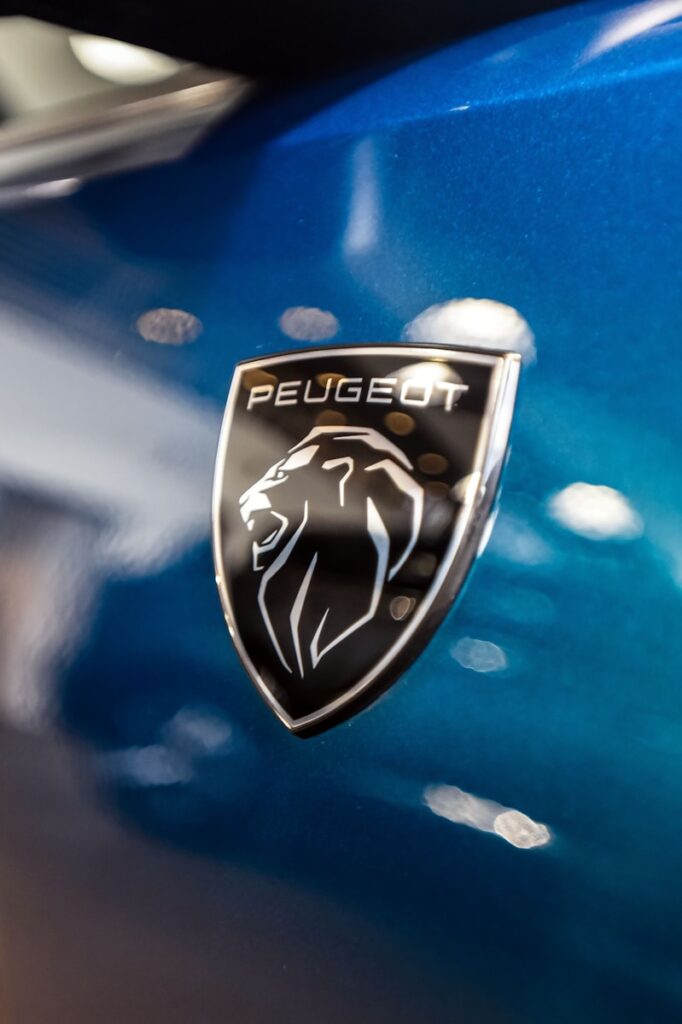
1. **Peugeot: The Lion’s Roar, Born from a Saw**: Peugeot, a name that resonates with a rich history in the automotive world, holds the distinguished title of being the first automobile builder to ever incorporate a logo. Long before its vehicles graced the roads, the company unveiled its famous lion symbol in 1850. The origin of this regal emblem wasn’t a sleek automobile, but rather a testament to the quality and characteristics of Peugeot’s flagship product at the time: saws. This might sound surprising, but it’s a perfect example of a brand’s earliest endeavors shaping its enduring identity.
The lion emblem was initially chosen for its powerful associations, specifically emphasizing the speed, flexibility, and bite that characterized Peugeot’s superior saw blades. These were qualities the company aspired to project across all its products, setting a high standard for craftsmanship and performance. By 1858, this emblematic lion officially became the brand’s logo, solidifying its place in Peugeot’s visual identity. It wasn’t until 1907 that this iconic symbol began gracing every Peugeot car, a tradition that continues to this day, elegantly linking the brand’s diverse past with its automotive present. It truly showcases how a logo can evolve while retaining its core essence, a historical anchor for a company’s enduring journey.
2. **Toyota: Intertwined Ovals of Customer, Company, and World**: Toyota isn’t just one of the most reliable car brands on the planet; it’s also a global powerhouse known for producing around 9 million vehicles every year. The story of its logo is as meticulously crafted as its cars. Founded in 1937, initially as “Toyoda,” the company transitioned to “Toyota” to establish itself as a carmaker. Founder Sakichi Toyoda initially created a simple badge with the word “Toyoda” at its center. However, the iconic three-oval logo, which now adorns all current Toyota models, was a much later and more elaborate creation, debuting in 1989 on the luxurious Celsior model—a year that also marked the company’s 50th anniversary.
The development of this particular emblem was no small feat; Toyota invested approximately five years into its design, ensuring every element carried significant meaning. The two inner ovals are arranged in such a way that they subtly form a “T” for Toyota, an ingenious integration of the company’s name. More profoundly, these ovals are symbolic of the vital relationship between the customer and the company, with one representing the customer’s heart and the other, the heart of Toyota. The larger, outer oval that encircles both beautifully signifies the world embracing Toyota, reflecting the brand’s global aspirations and rising status in international markets.
It’s a masterful display of how a logo can condense vast ideas—from intimate connections to worldwide ambition—into a single, cohesive image. Furthermore, as some design aficionados have discovered, the intricate arrangement of these ovals, when carefully dissected, can actually reveal every letter of the word “Toyota” within its form, a testament to the extraordinary level of detail and foresight that went into its creation.

3. **Audi: The Unbreakable Rings of Auto Union**: The distinctive four rings of Audi are globally recognized symbols of luxury and performance cars, yet their rich history predates the modern corporate entity we know today. This captivating logo is a direct visual narrative of a significant merger in the 1930s, when four pioneering German car companies—Audi, DKW, Horch, and Wanderer—united their forces to form Auto Union AG. Each ring, therefore, stands as a proud emblem for one of these founding companies, preserving their individual legacies within a powerful collective identity.
Based on early logo designs, a specific order was established, with the first ring representing Audi, the second DKW, the third Horch, and the fourth Wanderer. The very act of these four rings being interconnected serves as a potent metaphor, highlighting not only the company’s past achievements forged through this union but also its ongoing endeavors and its ambitious future aspirations. Despite being used for nearly a century, the logo remains remarkably visually captivating and entirely fitting for the modern era, successfully preserving a sense of evolution and refinement. This timeless symbol, adorning some of the best German cars in history, continues to represent the combined efforts and shared ambitions that ignited when these four companies first joined forces, embodying a powerful message of unity and enduring strength through collaboration.

4. **Mercedes-Benz: The Three-Pointed Star’s Lofty Ambition**: Mercedes-Benz stands as a true titan among luxury brands, a German carmaker boasting over 140 years in business and a portfolio of vehicles that command staggering prices. While its cars are lauded for sheer luxury and advanced features, it’s the iconic three-pointed star in a circle that makes any Mercedes-Benz instantly recognizable worldwide. This emblem, which expresses luxury and innovation, carries a fascinating history that stretches back to 1909. The inspiration for this powerful symbol emerged from a deeply personal place: the Daimler brothers, Karl and Gottlieb, drew from a design their father had once made on a postcard, where a three-pointed star marked his company’s home location.
The brothers, in a brilliant stroke of brand vision, adopted this symbol for their own enterprise, then known as Daimler-Motoren-Gesellschaft (DMG). The core meaning of the logo is as aspirational as it is elegant: each point in the three-pronged star represents one of the three realms where the company profoundly aspired to compete and dominate—land, sea, and air. This audacious vision speaks to an ambition that extended far beyond road vehicles, hinting at future innovations in engines and transportation across various domains.
While the logo has undergone subtle cosmetic changes over the decades, such as its shift from a red star with a laurel wreath border in 1926 to the sleeker silver in 1934, its foundational meaning has remained steadfast. It continues to symbolize the brand’s relentless pursuit of excellence and supremacy across all forms of mobility, making it a truly universal emblem of engineering prowess.

5. **BMW: Bavarian Pride, Debunking the Propeller Myth**: BMW, an acronym for Bayerische Motoren Werke, which translates from German to English as Bavarian Engine Works, is a global icon, yet its logo is often shrouded in a popular misconception. Established in Bavaria in 1913, the company initially manufactured various types of engines, notably for aircraft during World War I, under the name Rapp. This early history led many to believe that BMW’s distinctive blue and white roundel represents a stylized spinning propeller, a seemingly logical and romantic notion tied to its aviation heritage.
However, as Fred Jakobs of BMW Group Classic has pointed out, “Many people believe the BMW logo is a stylized propeller, but the truth is a little different.” The true origin of the initial iteration of the modern BMW logo, which first appeared on October 5, 1917, lies in a proud display of the colors of the Bavarian state flag. The blue and white quadrants are a direct homage to the company’s regional roots and identity, not a literal depiction of a propeller. The popular misconception actually originated much later, around 1929, when a BMW advertisement misleadingly showed the logo within the spinning propellers of an aircraft, cementing the myth in public consciousness.
While the logo has certainly evolved over time, adapting to new eras and design sensibilities, the central blue and white colors have consistently remained its undeniable centerpiece, a timeless affirmation of its Bavarian heritage. Furthermore, in 1972, BMW established its high-performance vehicle division, BMW M GmbH, which introduced its own distinctive logo. The current version, updated in 2020, features three colored stripes—blue, red, and purple—joined to the letter M, where blue stands for BMW, red for motorsport, and purple brilliantly represents the dynamic combination of the two, adding another layer of visual storytelling to this storied brand.

6. **Hyundai: The Diplomatic Handshake of Progress**: The Korean automotive giant Hyundai, established in 1967, has grown into a formidable global presence, offering popular models to customers worldwide. Its most prominent logo, adorning all Hyundai vehicles today, is far more than a mere initial; it’s a thoughtfully designed emblem that encapsulates the brand’s core values and philosophy. At first glance, it might simply appear as a stylized letter “H.” However, a deeper understanding reveals an ingenious double meaning woven into its form.
The ‘H’ is carefully crafted to resemble two individuals in the act of shaking hands. This visual metaphor powerfully represents a union between two key figures: the salesperson and the satisfied customer. This symbolism directly reflects Hyundai’s unwavering commitment to a “customer-first” philosophy, emphasizing trust, relationship-building, and mutual satisfaction. Adding another layer of meaning, the letter is depicted with a distinct forward lean. This angled appearance isn’t just a design flourish; it’s a subtle yet potent symbol of progress and the company’s relentless drive for innovation and advancement. The encompassing oval that surrounds the ‘H’ further signifies the brand’s ambitious global expansion, effectively communicating its worldwide reach and aspiration to connect with customers across the globe. This intricate logo, therefore, serves as a comprehensive visual statement of Hyundai’s dedication to customer satisfaction, forward momentum, and international presence.
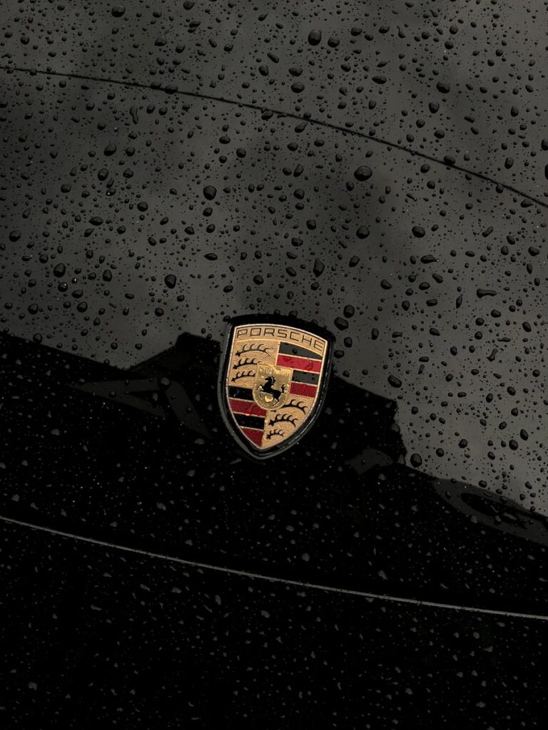
7. **Porsche: The Regal Crest of Stuttgart and Racing Heritage**: Porsche, a brand globally celebrated for its exquisite and luxurious high-performance cars, possesses a logo that is immediately recognized as a symbol of status and engineering prowess. Officially known as the Porsche Crest, this emblem first graced the automotive world in 1952. Its design is a masterful fusion of regional pride, heraldic tradition, and the brand’s intrinsic connection to speed and elegance. The crest was famously designed by Franz Xaver Reimspiess, a creative mind tasked with giving Porsche a proper, identifiable symbol after an Austrian-born U.S. car importer, Max Hoffman, suggested the need for a strong symbol in 1951, leading to a design competition among German art academies.
At the very heart of the crest, a powerful black horse rears, a direct and proud homage to Stuttgart, Porsche’s home city, whose seal features a similar equine figure. This horse isn’t just a geographical nod; it vibrantly represents the qualities that define Porsche cars: power, agility, and sheer elegance. Flanking the central horse, and creating a rich backdrop, are the distinctive red and black stripes—traditional colors of Württemberg-Hohenzollern, the historical German state in which Stuttgart is situated. Interspersed within these colors are the antlers, drawing directly from the region’s ancient coat of arms, further embedding the brand in its rich local heritage. The word “Stuttgart” boldly positioned at the center bottom of the crest reiterates this profound connection to its city of origin.
The most recent version of the Porsche crest, introduced in June 2023 to celebrate 75 years of Porsche sports cars, meticulously preserves these historical elements and retains its deep meaning, ensuring its timeless appeal. As Michael Mauer, Vice President of Style Porsche, eloquently puts it, “With its cleaner and more state-of-the-art execution, the refined crest communicates the character of Porsche,” proving that even classic emblems can evolve while holding onto their storied past and profound identity.
8. **Apple: More Than Just a Bite**: The Apple logo, a symbol recognized globally, has a fascinating evolutionary tale that transformed it from a complex illustration into an icon of minimalist design. The company’s very first emblem was an elaborate drawing of Isaac Newton seated beneath an apple tree, bordered by text and a ribbon reading “Apple Computer Co.” While a poetic homage to Newton’s contributions, this intricate design proved impractical for branding, highlighting that sometimes, simplicity reigns supreme in the world of visual identity.
In 1977, a new iteration emerged: the now-famous apple silhouette with a bite taken out, rendered in vibrant rainbow colors. This design spurred many theories, including a popular one suggesting the bite was a clever pun on “byte,” a unit of digital information. However, original designer Rob Janoff clarified that the bite’s primary purpose was practical: to visually distinguish the apple from other round fruits, preventing confusion. The rainbow hues, a striking feature, were specifically chosen to represent the Apple II’s groundbreaking color display, signifying a major leap in personal computing.
Today, the Apple logo retains its iconic silhouette, typically presented in a sleek, monochromatic shade, reflecting its contemporary design philosophy. While the colorful era has passed, the bite remains, and Janoff also offered a deeper, more metaphorical interpretation: it could symbolize the knowledge users would gain from using the computer. This evolution from intricate homage to a simple, yet profoundly symbolic, emblem mirrors Apple’s own journey, proving that powerful design often communicates volumes with the fewest possible elements.

9. **Amazon: The Smiling Arrow of Endless Possibilities**: Amazon, which began humbly in Jeff Bezos’ garage in 1994, has exploded into a global tech giant, now the fourth-largest company by market capitalization. Its rapid ascent from an online bookstore to an “everything store” is subtly communicated through the ingenious design of its logo, a visual masterstroke brimming with hidden meaning. The company’s original logo in 1995, designed by Turner Duckworth, was a black “amazon.com” with a symbol depicting the Amazon River, a direct nod to its vast ambitions.
After a brief, uninspired “zebra-striped” logo that lasted only a year, Amazon unveiled its current, highly recognizable emblem in 2000. This design is a brilliant example of dual-purpose symbolism, centering on an orange arrow that curves elegantly from the letter ‘a’ to the letter ‘z’ in “Amazon.” This arrow serves two crucial roles, encapsulating the brand’s core identity with remarkable efficiency.
Firstly, the graceful arc of the arrow subtly forms a smile, immediately conveying Amazon’s unwavering commitment to customer satisfaction and the joy it aims to deliver. This visual warmth fosters a sense of approachability and positive experience. Secondly, and equally important, the arrow’s expansive reach from ‘a’ to ‘z’ is a powerful visual metaphor for the incredible breadth of products the company offers. It signifies that Amazon truly provides everything imaginable, literally from A to Z, making it a masterclass in minimalist design that effectively communicates both vast inventory and a customer-first philosophy.

10. **Microsoft: The Window to a Digital World**: Microsoft, founded in 1975 by Bill Gates and Paul Allen, is a colossal tech giant whose portfolio of apps and services has profoundly shaped the digital age. Starting with a focus on developing a DOS-based operating system for IBM, Microsoft’s logo has evolved to become synonymous with computing itself, recognized globally as a gateway to technology. Its design journey reflects the company’s dynamic history, adapting to changing aesthetics and its ever-expanding influence.
Early logos included a 1975 design by Simon Daniels featuring concentric lines with “micro” stacked above “soft,” which now appears as a dated relic from the 1970s. By 1980, the company adopted a more assertive, heavy metal-inspired font, merging the name into a single “Microsoft” for the first time. This marked a shift in visual identity, mirroring the company’s growing presence and ambition in the burgeoning tech world.
The current Microsoft logo, a hallmark of modern design, is a deceptively simple yet deeply symbolic creation. It comprises four distinct colored squares—red, green, yellow, and blue—arranged to resemble a window. This visual metaphor directly references its flagship Windows operating system. Each vibrant color also carries specific meaning: red signifies Microsoft Office, blue represents the operating system itself, green is dedicated to the expansive gaming division (like Xbox), and yellow proudly signifies the Bing search engine. This cohesive, colorful design efficiently communicates the vast scope of Microsoft’s diverse empire within a single, instantly recognizable symbol.
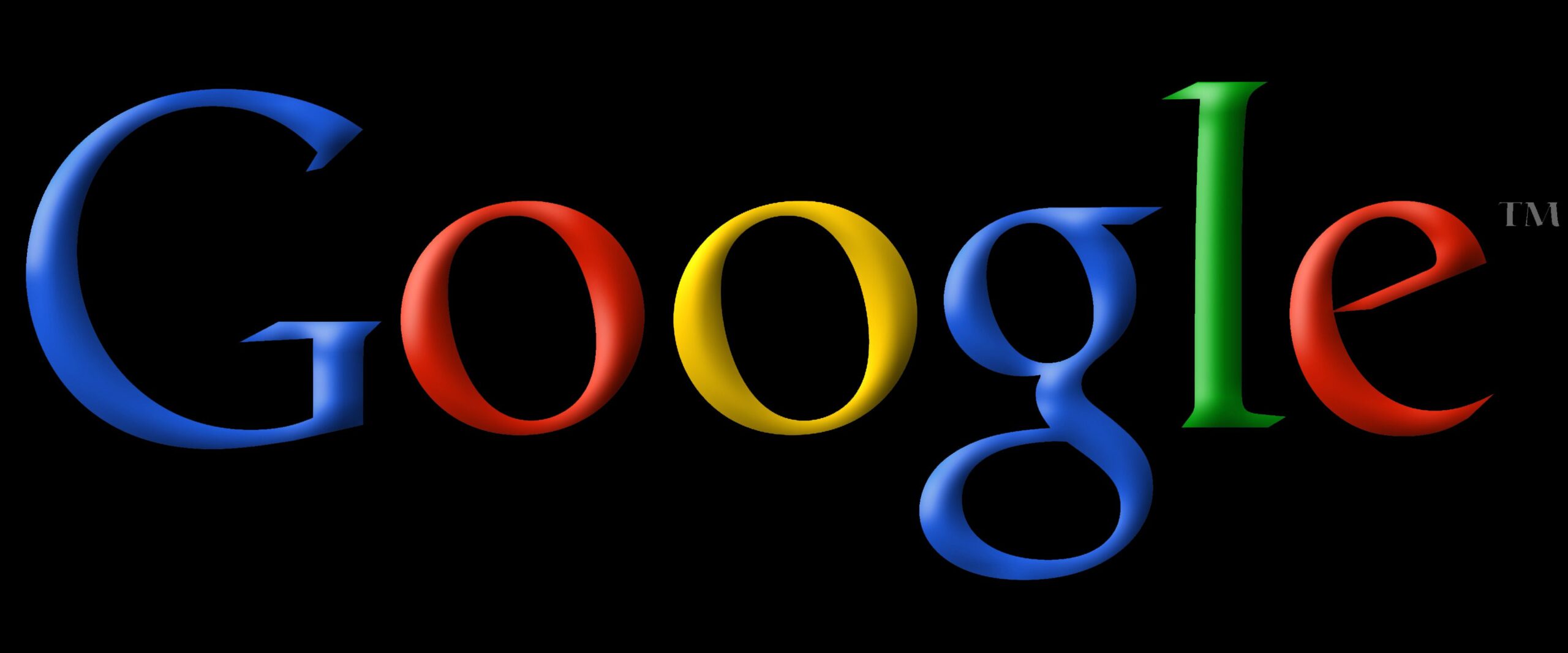
11. **Google: The “Googol” of Information and Playful Innovation**: Google’s origins, dating back to Larry Page and Sergey Brin’s “BackRub” search engine in the 1990s, are rooted in a mathematical term and a grand vision. When google.com was registered in 1998, the intended name was “googol”—a term for the number one followed by 100 zeros. This immense figure symbolized the vast library of information the search engine aimed to make accessible, promising an almost limitless well of knowledge to its users.
The early visual identity of Google, much like its name, underwent a significant evolution. The first official logo in 1997 was straightforward, using a Baskerville Bold font in a sequence of green, red, yellow, and blue, notably ending with an exclamation mark, a stylistic choice akin to Yahoo’s logo. Graphic designer Ruth Kedar later refined this, introducing the distinctive Catull font and removing the exclamation mark, giving the logo a cleaner, more sophisticated yet approachable presence.
A significant update in 2015 transitioned the logo to a Sans typeface with flattened letters, while preserving its iconic vibrant color pattern. This modern iteration reflects Google’s continuous adaptation and commitment to contemporary design. According to brand analysis, the deliberate arrangement of blue, red, yellow, and green colors in the Google logo effectively conveys the company’s bold, playful, and unconventional nature. This blend of historical depth, mathematical inspiration, and a subtle declaration of its brand personality makes the Google logo a captivating emblem of the digital age, much like the boundless information it helps us navigate.
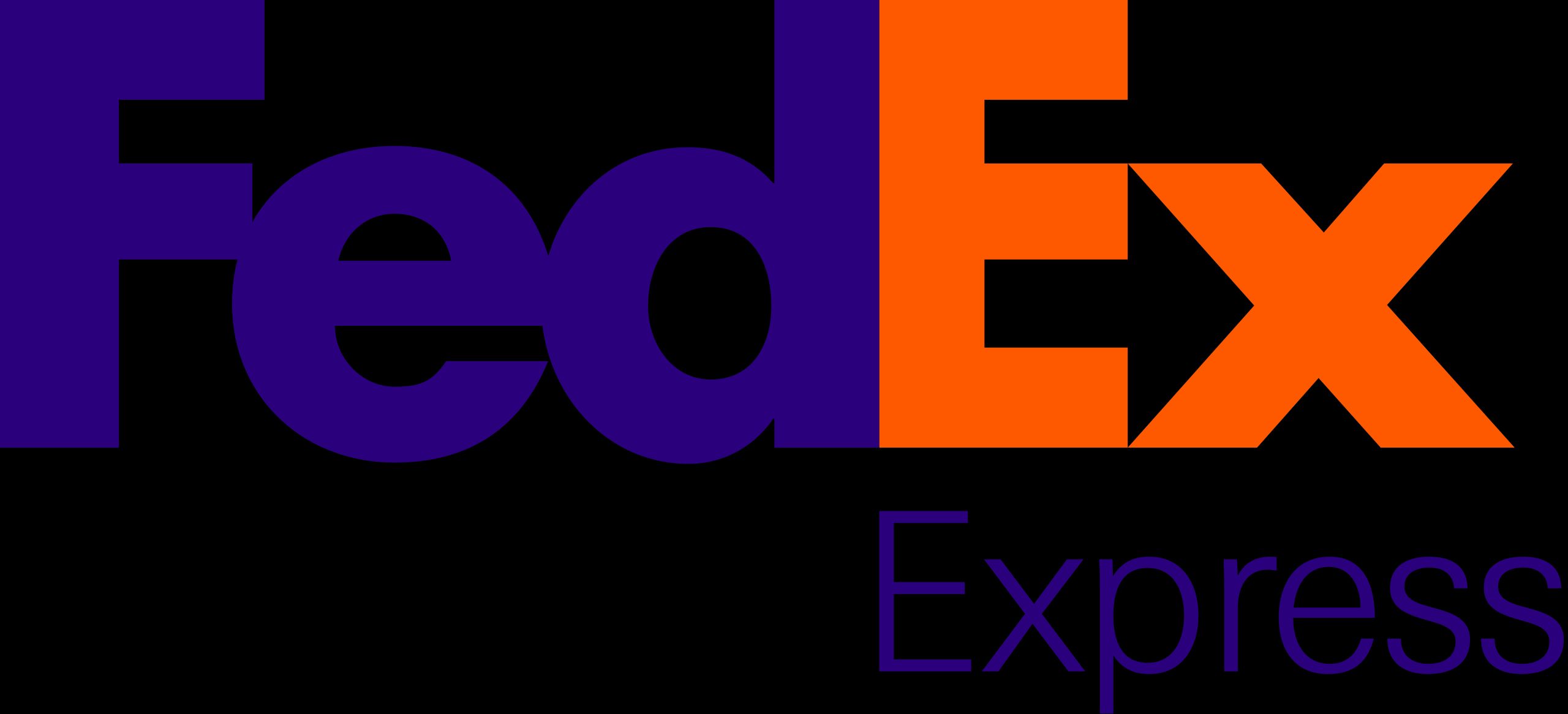
12. **FedEx: The Subtle Arrow of Speed and Precision**: The FedEx logo is a prime example of brilliant, often-unnoticed design, where its most profound element is subtly woven into its very structure. While appearing as a straightforward rendition of the company’s name, ‘FedEx,’ a clever secret lies hidden in plain sight. The true genius resides in the negative space between the bold capital letters ‘E’ and ‘x,’ where a perfectly formed white arrow subtly emerges, pointing forward with undeniable clarity.
This ingenious, hidden arrow is far more than a simple design flourish; it’s a powerful, subliminal symbol that encapsulates FedEx’s core business values. It instantly communicates speed, efficiency, and precision—qualities that are absolutely paramount for a global shipping and logistics company. The arrow signifies forward momentum, the swift movement of packages from origin to destination, and the impeccable accuracy with which FedEx executes its deliveries. It’s a masterful demonstration of how a logo can convey complex ideas without overt imagery, instead relying on an integrated design element that, once discovered, forever reinforces the brand’s commitment to swift and reliable service.
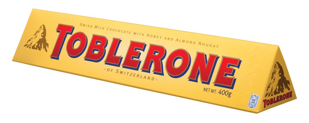
13. **Toblerone: The Bear in the Mountain**: The iconic triangular shape of a Toblerone chocolate bar is globally recognized, but its packaging harbors a delightful secret in its logo that pays tribute to its origins. The emblem prominently features a majestic, snow-capped mountain, an unmistakable visual reference to the Matterhorn in the Swiss Alps, proudly symbolizing the chocolate’s rich Swiss heritage. However, nestled within the intricate lines of this mountain illustration, a more subtle and truly unexpected element is cleverly hidden, patiently waiting for curious eyes to discover it.
Upon closer inspection of the mountain’s contours, specifically utilizing the lighter, negative space, the distinct silhouette of a standing bear becomes visible. This hidden bear is far from accidental; it serves as a direct and affectionate homage to Bern, Switzerland, the very city where Toblerone was first crafted. Bern is famously known as the “City of Bears,” with the bear being a prominent feature on the city’s coat of arms. This playful yet profound integration of local symbolism into a globally recognized brand showcases a wonderful blend of artistic design and regional pride, ensuring that every piece of Toblerone comes with a hidden nod to its historical and geographical roots.
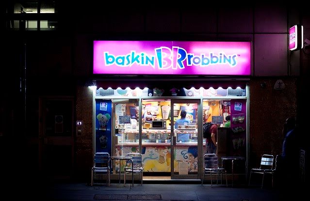
14. **Baskin-Robbins: The Sweet Number 31**: Baskin-Robbins, a cherished ice cream chain renowned for its extensive variety of flavors, has ingeniously woven its most famous promise directly into its vibrant logo. The brand’s full name, Baskin-Robbins, is presented in two distinct colors: blue for the ‘B’ and ‘R’ and pink for the ‘baskin’ and ‘robbins’ segments. It’s within this seemingly simple color scheme that a clever numerical secret is concealed, a playful detail that delights those who uncover it.
By examining the pink portions of the stylized ‘B’ and ‘R’ within the logo, you’ll distinctly discover the number ’31’ subtly integrated into their design. This isn’t merely a random number; it represents the original 31 flavors that Baskin-Robbins proudly offered upon its inception. The core concept behind this offering was to provide a different, exciting flavor for “each day of the month,” ensuring consistent variety and fresh anticipation for its customers. This brilliant incorporation of “31” directly into the brand’s visual identity serves as a constant, sweet reminder of its foundational commitment to an abundance of choices, making its logo not just a symbol, but a fun, flavorful Easter egg for ice cream enthusiasts worldwide.
As our captivating journey through the “forgotten code” of brand logos concludes, it becomes abundantly clear that these everyday symbols are far more than mere corporate badges. They are miniature masterpieces, meticulously crafted canvases upon which history, ambition, and ingenious creativity are artfully etched. From the roar of a lion on a saw blade to the subtle smile of an online giant, from the unifying rings of automotive titans to the hidden bear in a chocolate mountain, each emblem tells a one-of-a-kind story. Unlocking these secret messages enriches our understanding of the brands we encounter daily, transforming casual recognition into a deeper appreciation for the thought, passion, and cleverness woven into the fabric of our commercial world. So, the next time you spot a familiar logo, take a moment; you might just uncover another fascinating secret waiting in plain sight.


