

In an era defined by rapid technological shifts and evolving communication paradigms, it is easy to overlook the foundational elements that underpin our entire linguistic infrastructure. Yet, at the very genesis of our alphabet lies a letter whose journey is as complex and influential as any block-busting epic: the letter ‘A’. Far from being a mere static symbol, ‘A’ represents a dynamic narrative of adaptation, innovation, and cultural transmission, reflecting millennia of human ingenuity in the pursuit of effective written expression.
Much like the intricate production history of a major studio franchise, the story of ‘A’ is one of constant reinvention and influential partnerships across civilizations. From its earliest pictographic representation to its ubiquitous presence in digital media, its form and function have been meticulously crafted and refined by successive cultures, each leaving an indelible mark on its identity. This profound lineage offers a compelling parallel to the way established creative properties are continuously reimagined for new audiences and platforms.
Today, we embark on an in-depth analysis of this silent titan of communication, dissecting its historical transformations and the significant typographic innovations that have sculpted its various manifestations. This exploration will not only illuminate the rich heritage of our primary vowel but also provide a nuanced understanding of how such fundamental building blocks of language have evolved, much like the changing landscape of media itself, continuously adapting to meet the demands of new eras.

1. **Phoenician Aleph: The Proto-Alphabetic Origin**
Our journey begins with the earliest known ancestor of ‘A’, the Phoenician letter aleph, a pivotal innovation in the history of writing systems. This precursor, existing within an alphabet that famously employed only consonantal letters, was designed to represent a distinct glottal stop, pronounced as [ʔ]. Its very existence marked a sophisticated step towards a more systematic phonetic representation of language, laying the groundwork for future alphabetic advancements.
Scholars widely believe that the ancestor of aleph itself emerged from a rich visual tradition: a pictogram of an ox head. This ancient symbol, drawn from the proto-Sinaitic script, was profoundly influenced by the Egyptian hieroglyphic system, showcasing an early example of cross-cultural conceptual borrowing in design. The pictogram was stylized, often appearing as a triangular head complete with two horns extended, a powerful and recognizable image in its original context.
The adoption and adaptation of this ox-head pictogram by the Phoenicians were not merely aesthetic choices; they represented a practical and cognitive leap. By abstracting a complex image into a simpler, more reproducible form, and associating it with a specific sound, the Phoenicians streamlined communication. This early abstraction proved to be a masterstroke, setting the stage for the dramatic spread and evolution of this fundamental character across diverse linguistic landscapes.

2. **Greek Alpha: Adapting for Vowels**
The narrative of ‘A’ underwent a transformative chapter with its adoption by the ancient Greeks, a period that fundamentally reshaped its phonetic role. Unlike the Phoenicians, the Greeks found themselves with no direct use for a letter explicitly representing a glottal stop. This linguistic gap presented an opportunity for radical reinterpretation, highlighting the adaptive nature of early alphabetic systems.
In a move of remarkable linguistic ingenuity, the Greeks ingeniously adapted the existing Phoenician sign to represent the vowel sound /a/. This alteration was monumental, as it introduced the concept of explicit vowel representation into an alphabetic script, a feature that would prove indispensable for the accurate transcription of their language. They affectionately named this newly repurposed letter “alpha,” a name that directly echoed its Semitic predecessor, aleph, signifying both continuity and change.
The earliest Greek inscriptions, which notably date back to the 8th century BC following the Greek Dark Ages, reveal alpha initially resting upon its side. This initial orientation suggests a period of experimentation and visual adjustment as the letter integrated into the nascent Greek writing system. However, as the Greek alphabet matured and stabilized, its form steadily evolved, generally coming to resemble the familiar modern capital form that we recognize today. While many localized varieties existed, often distinguished by subtle variations such as the shortening of a leg or the angle of its cross line, the core identity of alpha as the primary ‘A’ sound was firmly established.
3. **Roman Influence: Establishing the Latin ‘A’**
The journey of the letter ‘A’ continued its westward expansion and solidified its enduring form through the influential hands of the Etruscans and subsequently the Romans. The Etruscans, acting as cultural conduits, were instrumental in bringing the Greek alphabet across the Italian Peninsula. Notably, during this crucial transfer, they meticulously preserved the form of the Greek alpha, recognizing its elegant simplicity and functional efficiency.
This careful stewardship by the Etruscans paved the way for the letter’s next significant evolution. When the Romans, with their burgeoning empire and administrative needs, decided to adopt the Etruscan alphabet as the basis for their own Latin script, the form of alpha remained largely unchanged. This decision underscored the inherent stability and proven utility of the character, allowing it to transition seamlessly into a new linguistic framework.
Consequently, the resulting form of ‘A’ as used in the Latin script would achieve an unparalleled global reach. It became the foundational character for writing an immense array of languages across continents, eventually including English. This Roman adoption cemented ‘A’s status as a fundamental building block of Western communication, a testament to its robust design and successful adaptation through successive cultural epochs.
Read more about: Giorgio Armani, Fashion’s Master of the Power Suit, Dies at 91, Leaving an Indelible Mark on Global Style
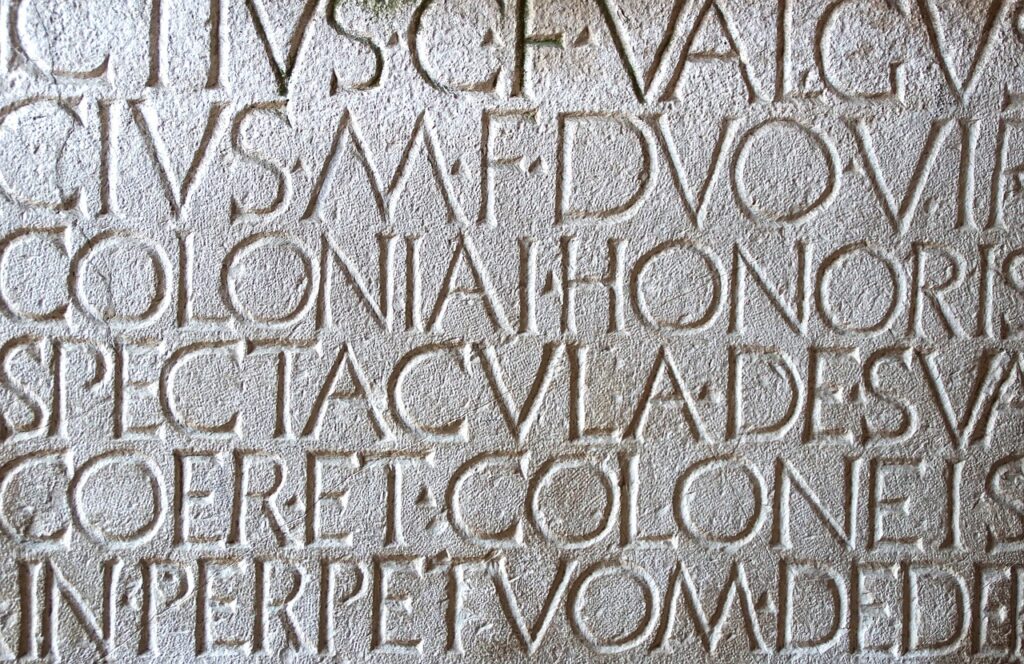
4. **Early Roman Typographic Variations: Monumental and Cursive**
During the expansive Roman era, the letter ‘A’ was not a singular, immutable entity; rather, it manifested in a fascinating array of variant forms, each tailored to specific uses and media. This diversity reflects a sophisticated understanding of typography and functionality in a society with varied writing needs, much like modern media requires diverse formatting for different platforms.
One prominent style was the monumental or lapidary form. This grand, authoritative script was meticulously crafted for permanence, typically carved into stone or etched onto other durable media such as bronze tablets. Its robust, clearly defined lines were designed to withstand the test of time and command attention in public inscriptions, embodying the imperial gravitas of Roman authority.
In stark contrast to the formal monumental style, there also existed a highly functional cursive style. This variant was employed for the everyday, utilitarian writing demands of Roman life, from personal correspondence to administrative records. Written on more perishable surfaces like papyrus, wax tablets, or even ostraca, its flowing, often connected strokes allowed for greater speed and fluidity, prioritizing efficiency over monumental permanence.
Due to the ephemeral nature of these perishable writing surfaces, fewer examples of Roman cursive have survived the passage of centuries compared to their stone-carved counterparts. Nevertheless, archaeological discoveries have unearthed a rich tapestry of different cursive types, including the more formal majuscule cursive, the smaller and more intricate minuscule cursive, and the transitional semi-cursive minuscule, each offering a window into the varied daily writing practices of ancient Rome.

5. **Medieval Script Development: From Uncials to Caroline**
As the Roman Empire waned and Europe transitioned into the medieval period, the letter ‘A’ continued its evolutionary journey, giving rise to fascinating intermediate forms that bridged the gap between earlier monumental and cursive styles. These scripts were crucial in preserving and disseminating knowledge during a time of significant cultural flux, much like archival systems safeguard cinematic history.
Among these transitional forms were the early semi-uncial script, which emerged around the 3rd century, offering a more rounded and adaptable hand than its predecessors. Following this, the uncial script, flourishing approximately from the 4th to 8th centuries, became a dominant book hand, characterized by its distinctive majuscule, rounded letters that facilitated easier reading on parchment. The late semi-uncial, appearing around the 6th to 8th centuries, further refined these styles, showcasing a continuous quest for legibility and aesthetic appeal in manuscript production.
By the close of the Roman Empire in the 5th century AD, a vibrant tapestry of cursive minuscule variants began to unfurl across Western Europe. Each region developed its own distinctive calligraphic tradition: Italy saw the rise of the semi-cursive minuscule, France cultivated the elegant Merovingian script, Spain developed the distinctive Visigothic script, and Great Britain gave birth to the Insular, or Anglo-Irish, semi-uncial, also known as Anglo-Saxon majuscule. These regional styles underscored the localized development of writing during the early medieval period.
The zenith of medieval script development, however, arrived in the ninth century with the advent of the Caroline script, a truly transformative innovation. This remarkably clear and legible script, developed during the Carolingian Renaissance, bore a striking resemblance to the present-day form of ‘A’. Derived through a sophisticated synthesis of prior forms, Caroline script quickly became the principal standard for book-making across Europe, a pre-eminent form that would endure until the dawn of the printing press, demonstrating an enduring influence on the subsequent standardization of the letter.

6. **The Renaissance Divide: Italic vs. Roman Forms**
The 15th century in Italy marked a pivotal moment in the typographic history of the letter ‘A’, giving birth to the two primary variants that continue to shape our written world today. This period of artistic and intellectual ferment, the Renaissance, spurred a renewed interest in classical forms and a desire for greater clarity and beauty in printed text, much like studios strive for visual perfection in their productions.
From the refined Caroline Script version emerged the Italic form, often referred to as script ‘a’ and represented as ⟨ɑ⟩. This variant is commonly encountered in handwriting, distinguished by its distinctive structure: a simple circle elegantly joined by a vertical stroke on its right side. Its evolution is particularly interesting, tracing back to the hands of medieval Irish and English writers, where it gradually developed from a 5th-century form that strikingly resembled the Greek letter tau ⟨τ⟩, demonstrating a deep historical connection.
In parallel, the Roman form of ‘a’, represented as ⟨a⟩, solidified its position as the dominant style found in the vast majority of printed material. This form is characterized by its small, enclosed loop, surmounted by a graceful arc. Both the Italic and Roman forms ultimately trace their lineage back to the majuscule form ⟨A⟩, illustrating a shared ancestry despite their divergent aesthetics and functions. The uncial version in Greek handwriting, which often joined the left leg and horizontal stroke into a single loop, played a significant role in this development, with many fonts then rendering the right leg vertically.
Further refinement saw the serif that initiated the right leg stroke evolve into an arc in some printed iterations, resulting in the widely recognized Roman form, while in others, it was simply dropped, leading to the modern handwritten form. This clear distinction in design and function is often highlighted by graphic designers, who aptly differentiate between the Italic form as the ‘single-decker a’ and the Roman form as the ‘double-decker a’. This dichotomy reflects a sophisticated understanding of visual communication, allowing for aesthetic variation and specific applications, such as the use of Italic type to mark emphasis or to distinguish a part of a text from the main body set in Roman type.
7. **The Precision of Latin Alpha: Entering the International Phonetic Alphabet**
While the Renaissance cemented the divergence between the ‘double-decker’ Roman ‘a’ and the ‘single-decker’ Italic ‘ɑ’, the latter form, also known as script ‘a’ or Latin alpha, found its true calling in the realm of phonetic precision. This distinction, often subtle to the casual observer, became profoundly significant in specialized linguistic transcription, demonstrating how even minute variations in a character’s form can unlock entirely new applications in communication.
Indeed, the Latin alpha ⟨ɑ⟩ is not merely an aesthetic choice; it serves a crucial, unambiguous function within the International Phonetic Alphabet. Here, it explicitly denotes the open front or central unrounded vowel sound, a specific articulation that requires its own distinct symbol. This careful differentiation underscores the sophisticated requirements of phonetic representation, where every nuance of sound must be meticulously captured in written form, elevating the letter ‘A’ beyond a general vowel to a highly technical indicator.
Graphic designers intuitively understand this critical difference, often referring to these two prevalent lowercase forms as the ‘single-decker a’ (the Italic script ‘ɑ’) and the ‘double-decker a’ (the Roman print ‘a’). This vernacular highlights the visual and functional separation that has evolved over centuries. The adoption of script ‘a’ for specific phonetic tasks exemplifies a trend in linguistic scholarship: the need for absolute clarity and universality in transcribing human speech, a challenge met by the letter’s adaptable form.
This specialized role within the IPA marks a significant phase in ‘A’s evolution, transforming it from a general-purpose alphabetical character into a precision instrument for linguistic analysis. It ensures that regardless of the language being studied, the open front or central unrounded vowel is consistently represented. This standardization is vital for academics and linguists globally, much like standardized metrics are crucial for industry-wide reporting, showcasing the letter’s enduring utility in specialized domains.

8. **Unicode Variations: The Digital Lexicon of ‘A’**
As the world transitioned into the digital age, the journey of ‘A’ took on new dimensions, requiring universal standards for its representation across countless devices and software platforms. This digital imperative led to the establishment of Unicode, an encoding system that meticulously cataloged every character, ensuring that the diverse forms of ‘A’ could be faithfully reproduced and understood globally. The letter, much like a legacy content library, needed to be digitized and standardized for modern consumption.
Within the Unicode standard, the most common form, the ‘LATIN SMALL LETTER A’, is assigned U+0061. However, ‘A’s versatility demanded recognition for its various nuances. This includes, for instance, the ‘MODIFIER LETTER SMALL A’, represented as U+1D43, which serves specialized phonetic or grammatical functions, often indicating a subtle coloration or a fleeting, epenthetic sound. Such precise categorization ensures every subtle form of ‘A’ has a dedicated digital identity, preventing misinterpretations.
Further demonstrating its extensive range, Unicode also accounts for less common but equally important variants. The ‘FULLWIDTH LATIN SMALL LETTER A’, U+FF41, addresses specific typographic needs in certain East Asian computing environments. Crucially, the single-story form of ‘a’, the Latin alpha ⟨ɑ⟩, which is so vital for IPA use, also has its dedicated Unicode character. This comprehensive approach ensures that ‘A’, in all its forms, is preserved and accessible across diverse digital landscapes, mirroring the meticulous archiving of historical film reels.
These extensive Unicode assignments are more than technical specifications; they are a testament to ‘A’s fundamental status as a cornerstone of global communication. By providing a standardized digital identity for each variant, Unicode guarantees consistency in how ‘A’ is rendered, printed, and interpreted worldwide. This robust digital framework underpins the letter’s continued prevalence, allowing its millennia-old legacy to thrive in the modern technological era, a true testament to its adaptability.
9. **’A’ as a Symbol: Scientific and Metric Abstractions**
Beyond its fundamental role as an alphabetic character, ‘A’ has transcended its linguistic origins to assume vital symbolic functions within the precise domains of science and measurement. Here, it operates not as a letter forming words, but as a succinct, universally recognized abbreviation or marker. This transformation illustrates the letter’s power to represent complex concepts efficiently, much like a compelling logline summarizes a complex narrative.
One prominent symbolic application of ‘A’ is as an abbreviation for “atto-,” derived from the Danish word “atten,” meaning “eighteen.” In the metric system, “atto-” signifies a factor of 10⁻¹⁸, denoting incredibly minute quantities. Thus, ‘a’ precedes units to express magnitudes such as attometers or attoseconds, making it indispensable in fields like nanotechnology and quantum physics where precision at the smallest scales is paramount.
In the foundational principles of physics, the letter ‘a’ is universally recognized as the symbol for “acceleration.” This role is most famously encapsulated in Newton’s Second Law of Motion, expressed as the equation F=ma. Its use here is not arbitrary; it represents a specific physical quantity and a measurable rate of change in velocity. This concise notation allows for complex mathematical relationships to be articulated with elegant simplicity, providing a universal shorthand for scientists worldwide.
Furthermore, ‘A’ also serves as an abbreviation for “are,” a unit of area equivalent to one hundredth of a hectare. While perhaps less common in everyday discourse than “acceleration,” its presence in land measurement highlights its versatility in quantifying spatial dimensions. These diverse applications demonstrate how ‘A’ has been strategically deployed to convey critical information across various scientific and technical disciplines, reflecting its broad influence and utilitarian value in the factual landscape.
10. **Specialized Notations: Time, Finance, and Beyond**
The remarkable adaptability of the letter ‘A’ extends even further into highly specialized professional notations, where it conveys precise meanings within fields like chronology and finance. These applications showcase its capacity to act as a coded shorthand, condensing complex terms and calculations into a single, efficient symbol. This ability to embody intricate data within a compact form is akin to a financial analyst distilling market trends into a concise report.
In the measurement of time, ‘A’ elegantly serves as an abbreviation derived from the Latin “annum” or “annus,” signifying a “year.” This usage is particularly prevalent in historical or scientific contexts where specific durations are denoted with formal accuracy. For instance, when discussing astronomical periods or historical timelines, ‘a’ can represent a standard year, or more precisely, a Julian year of 365.25 days, offering a consistent unit for chronological reference.
Perhaps one of its most intricate symbolic roles is found within actuarial notation, a specialized language for expressing financial mathematics, particularly concerning annuities. Here, ‘a’ denotes an “annuity,” with specific modifications conveying further detail. For example, “a x:n̅|” represents an “n-year annuity-immediate to a person currently age x,” while “a x” signifies a “life annuity-immediate to a person currently age x.” These precise symbols are fundamental for calculating long-term financial products.
These specialized notations exemplify how ‘A’ becomes an indispensable tool for professionals to communicate complex information with clarity and conciseness. From denoting geological timescales to quantifying intricate financial obligations, its symbolic weight in these fields is profound. It underscores the letter’s journey from a phonetic marker to a powerful, context-dependent symbol, proving its enduring significance in the intellectual and economic frameworks of global society.
11. **The Global Linguistic Footprint of ‘A’**
Beyond its individual forms and symbolic abstractions, the true breadth of ‘A’s influence is perhaps best observed in its ubiquitous presence and multifaceted functionality across a staggering array of the world’s languages. As a fundamental building block, it adapts its role and meaning, demonstrating unparalleled linguistic agility. This global reach and adaptable performance make ‘A’ the ultimate linguistic superstar, transcending borders and cultural divides.
Drawing from an extensive list, ‘A’ serves as a core ‘letter’ in 187 languages, ranging from English and Albanian to Vietnamese and Zulu. Its consistent inclusion in such diverse phonetic systems underscores its status as a primary vowel sound, central to the spoken and written expression of countless communities. This sheer scale of adoption is a testament to its fundamental efficiency and its seamless integration into vastly different linguistic structures.
However, ‘A’ is far more than just a letter. Its functional versatility sees it appearing as an ‘article’ in languages like Aragonese, Corsican, and Haitian Creole, where it helps define nouns. In other contexts, it functions as a ‘preposition’, as seen in Asturian, Breton, and Spanish, denoting relationships between words. It can also stand as a ‘noun’ in languages such as English, Danish, and Estonian, or even a ‘pronoun’ in Bambara, Chuukese, and Edo, showcasing its capacity to occupy various grammatical roles.
Its adaptability further extends to serving as a ‘conjunction’ in languages like Czech, Estonian, and Hawaiian, linking clauses and ideas with seamless flow. We find it as an ‘interjection’ in Cornish, Inupiaq, and Malay, expressing sudden emotion. It acts as an ‘adverb’ in Old English and Murui Huitoto, modifying verbs or adjectives. In its most subtle roles, it functions as a ‘particle’ in Chichewa, Istriot, and Nupe, conveying nuances that are crucial to meaning. This expansive portfolio of grammatical applications solidifies ‘A’s position as an indispensable, protean element in the global tapestry of human language.
Read more about: Unraveling the Enduring Legacy Behind Wolfgang Van Halen’s Storied Name

12. **’A’ in Modern Communication Systems and Codes**
As we survey the extraordinary journey of ‘A’, its story culminates in its integration into various modern communication systems and specialized codes, transcending traditional writing to become a cornerstone of rapid and unequivocal information exchange. These applications underscore the letter’s foundational importance, transforming it into a vital component in scenarios where clarity and immediate recognition are paramount, much like a lead actor’s recognizable face ensures immediate audience engagement.
In the critical domain of international aviation and maritime communication, ‘A’ is unequivocally identified as “Alpha” within the NATO phonetic alphabet. This standardized pronunciation ensures that the letter is distinctively understood, even amidst static or language barriers, preventing potentially dangerous misunderstandings. It’s a testament to ‘A’s intrinsic clarity that it anchors the very first word in this essential phonetic system.
Beyond spoken communication, ‘A’ maintains its iconic status in non-verbal coding systems. In the rhythmic pulses of Morse code, it is represented by the distinct pattern “·–”, a universally recognized signal transmitted across vast distances. Similarly, for the visually impaired, ‘A’ is rendered as “⠁” in Braille, a tactile representation that opens up the world of literacy. These forms highlight the letter’s fundamental nature, translating across different sensory modalities.
Furthermore, in visual communication, ‘A’ finds its form in American Sign Language (ASL), where a specific hand shape represents it. It also appears as “Ga” when translated into signal flags, a system used for communication between ships or over distances where verbal contact is impractical. These diverse visual and tactile codes reinforce ‘A’s role as a primary, non-negotiable symbol, a universal constant in the ever-evolving narrative of human communication, affirming its status as a truly indispensable character in our global lexicon.
**The Enduring Legacy of the Alpha Glyph**
Read more about: Beyond the Hype: The Real Reasons Your New iPhone Isn’t Perfect (and How to Master the Fixes)
From its humble beginnings as a proto-Sinaitic ox head to its omnipresent status across digital screens and global communication networks, the letter ‘A’ has journeyed through millennia of human ingenuity, adapting, transforming, and solidifying its role as an indispensable pillar of language and information. It is more than just the first letter of our alphabet; it is a testament to the enduring power of a symbol to transcend its initial purpose and weave itself into the very fabric of civilization. Like a timeless blockbuster, ‘A’ continues to redefine its narrative, remaining perpetually relevant and ever-present in the grand epic of human expression. Its story, rich with cultural borrowing, ingenious adaptation, and persistent evolution, reflects the dynamic spirit of communication itself—always changing, always growing, yet always anchored by such foundational, unyielding elements.


