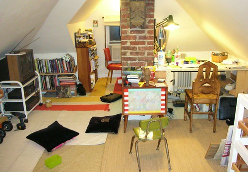
The world of interior design is a vibrant, ever-evolving landscape where styles ebb and flow, constantly redefining what makes a house a home. While certain vintage elements are making a celebrated comeback, there are other design features that, despite their past popularity, have simply run their course. Keeping up with these shifts isn’t about chasing every fleeting fad, but rather about creating spaces that feel genuinely fresh, functional, and reflective of modern living. After all, your home should be a comfortable, inspiring sanctuary, not a time capsule of yesterday’s trends.
It’s a natural process: what once felt cutting-edge or charming can, over time, begin to feel tired or simply impractical. Design pros and discerning homeowners alike are increasingly identifying specific elements that, when present, can instantly signal an older aesthetic and detract from a home’s overall appeal. Moving beyond these outdated looks doesn’t require a complete overhaul; often, it’s about making smart, targeted changes that elevate your space and foster a sense of enduring style.
So, if you’re looking to refresh your American home and ensure it feels current, welcoming, and perfectly suited to your lifestyle, join us as we explore some of the interior design trends that designers believe should stay firmly in the past. We’re here to help you identify those features that are quietly dating your decor and offer practical, accessible advice on how to infuse your home with a sense of lasting charm and contemporary elegance. Let’s dive into the first seven trends that are already out of style in American homes.
1. **Overly Coordinated Sets**
There was a time when purchasing an entire matching furniture set for a room felt like the ultimate design statement. A dining table, its chairs, a sideboard, and a china cabinet, all in the exact same finish, or a bedroom suite with a perfectly matched bed, nightstands, and dresser. However, designers universally agree that this ‘matchy-matchy’ approach is one of the quickest ways to make a space feel dated and visually heavy today.
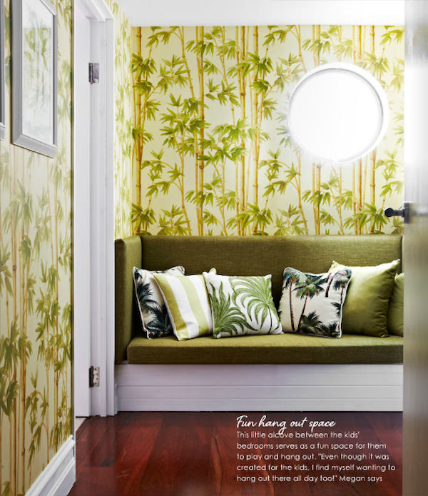
Meghan Jay of Meghan Jay Design highlights this sentiment, stating, “I love vintage ‘brown furniture,’ especially heirloom pieces that tell a story. But what I don’t love are overly coordinated sets—like a dining table, chairs, sideboard, and china cabinet all in the same finish, or a bedroom with a bed, nightstands, and dresser that perfectly match.” She explains that while a single vintage piece or even two can beautifully anchor a room and add character, “when everything matches, it quickly feels overdone and visually heavy.” It restricts individuality and creativity.
Today’s most stylish homes embrace a more curated, collected aesthetic. Melissa Denham, an interior design expert at Hammonds Furniture, confirms that “The era of matching furniture sets is over for many, as we look to regain more warmth, individuality and charm in our homes.” This shift allows for greater personalization and makes a home feel like it has been thoughtfully assembled over time, rather than purchased all at once.
To move away from this outdated look, consider mixing decor styles, materials, and eras. Introduce different wood tones, varying textures in your upholstery, and unique accent pieces that speak to your personal taste. This approach fosters a rich, layered look that feels deeply personal and far more intriguing than any perfectly matched set could ever achieve.
Read more about: The Unexpected Revival: Why Gen Z is Shifting Gears Back to Manual Transmissions
2. **Tiled Countertops**
While tiles, with their vast array of patterns and bold hues, are making exciting appearances on walls and floors, particularly colored tiles, their practicality on other surfaces, especially countertops, has proven to be less than ideal. This design choice, once popular for its aesthetic versatility and often lower cost, has revealed significant functional drawbacks that designers now firmly recommend avoiding.
Peggy Haddad of Peggy Haddad Interiors sums up the sentiment perfectly: “I’ve heard whispers of them making a comeback, and maybe—just maybe—they could work in a small powder bath. But in kitchens and full baths? They’re a cleaning nightmare.” This straightforward assessment resonates with anyone who has experienced the challenges of maintaining tiled countertops in high-traffic, moisture-prone areas of the home.
The primary issue lies with the grout lines. As Haddad plainly states, “grout lines and daily use do not mix.” These porous lines are notorious for trapping food particles, spills, and grime, making thorough cleaning a constant struggle. Over time, grout can discolor, stain, and even harbor bacteria, creating a hygiene headache that far outweighs any initial visual appeal.
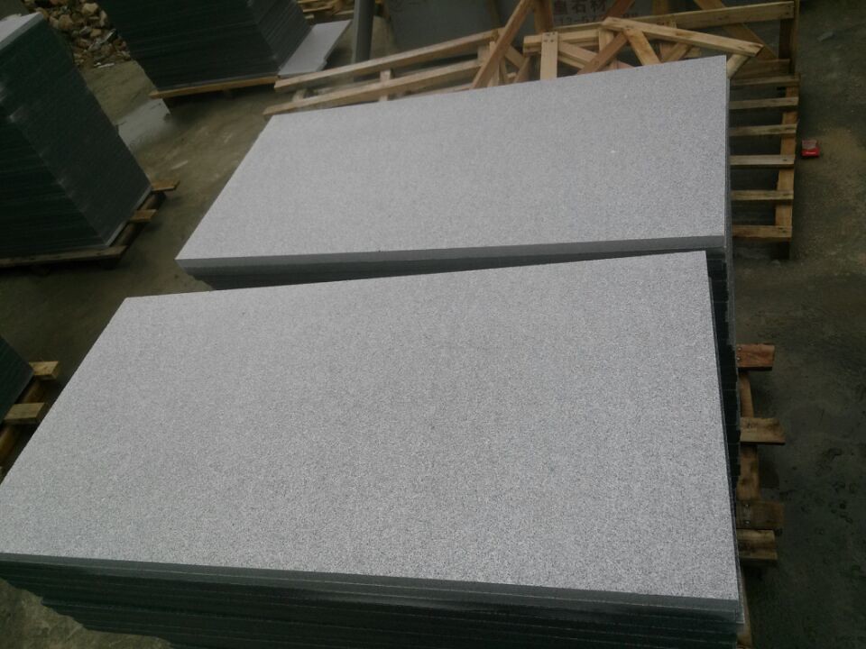
For a more practical and timeless solution, consider solid surface materials like natural stone, quartz, or even durable laminates that offer a seamless, easy-to-clean expanse. These alternatives provide superior hygiene and a sleeker aesthetic, allowing for bold tile choices to be reserved for less demanding surfaces, like backsplashes or accent walls, where their visual charm can truly shine without the maintenance woes.
Read more about: Jennifer Aniston’s $21 Million Bel-Air Mansion: An Exclusive Peek Inside Her Stunning ‘Babe Cave’ and Emmy Prep!
3. **Sponge Paint**
The quest for wall texture and visual depth is an ongoing journey in home design, but not all techniques stand the test of time. While we’ve collectively moved away from stark, bland gray and white color schemes, some of the textural treatments of decades past, particularly sponge paint, are best left in the archives. This faux finish, a hallmark of the 1990s, no longer aligns with the sophisticated and elevated looks homeowners crave today.
Peggy Haddad emphasizes this point, advising that “Faux finishes from the ’90s can stay in the archives.” Sponge painting, with its mottled, often uneven appearance, now feels less like an artistic statement and more like a relic from a bygone era. It lacks the subtle sophistication and organic quality that modern textural treatments offer, often appearing busy rather than rich.
Fortunately, if you desire texture and depth on your walls, there are far more elegant and contemporary options available. Haddad suggests exploring “limewash, plaster, or other artisanal wall treatments” that “create a much more elevated look.” These finishes provide a soft, nuanced texture and a beautiful depth of color that sponge paint simply cannot replicate.
Embracing these newer techniques allows for a personalized, handcrafted feel that enhances the character of a room without dating it. They offer a refined backdrop that complements various decor styles, ensuring your walls contribute to a serene and stylish atmosphere rather than a nostalgic, yet outmoded, one. It’s about achieving texture with intention and timeless appeal.
Read more about: Beyond the Boardroom: 14 Unconventional Rules Billionaires Set for Their Children

4. **Popcorn Ceilings**
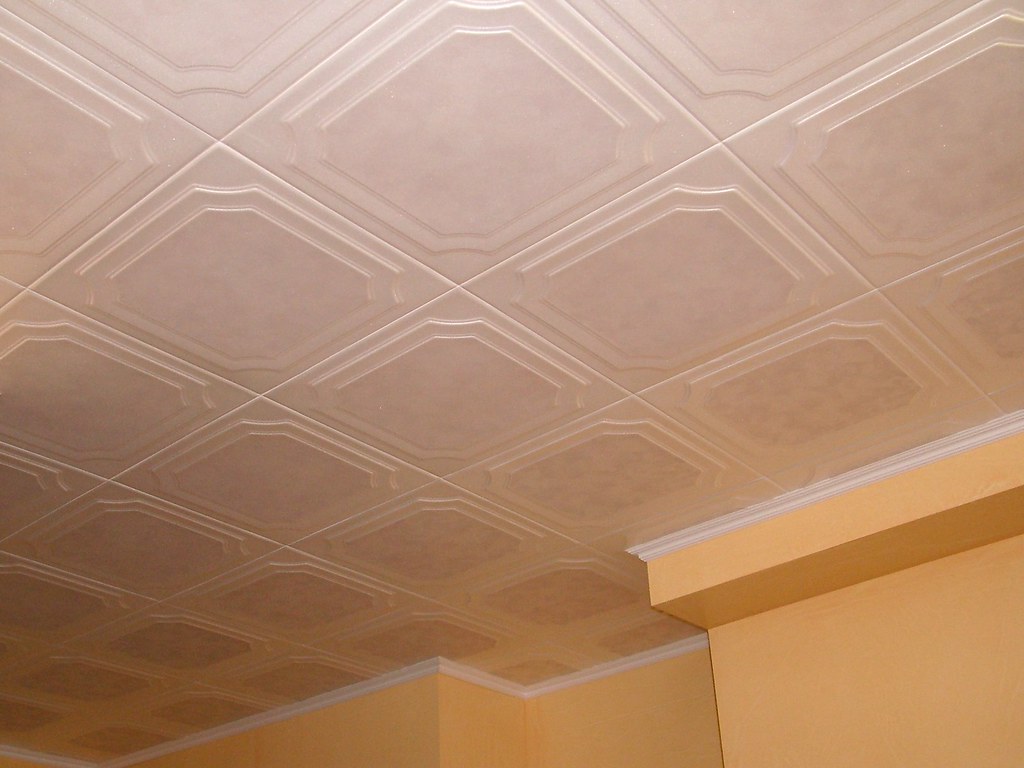
When it comes to ceilings, the distinction between what’s in and what’s decidedly out is crystal clear: painted ceilings are embraced for their ability to add visual interest, but popcorn ceilings are unequivocally a trend that needs to stay in the past. This textured ceiling treatment, once a common feature in many American homes, is now a universally disliked element among designers and homeowners alike, and for good reason.
Lauren Saab of Saab Studios states, with conviction, that “Popcorn ceilings never make a comeback, and for good reason.” She articulates their numerous downsides, noting that “They trap dust, flatten light, and lower the perceived value of a home the moment you walk in.” These issues are not merely aesthetic; they impact the cleanliness, brightness, and overall impression of a living space.
Beyond their unappealing appearance, popcorn ceilings are notoriously difficult to clean, becoming magnets for dust and cobwebs that are challenging to remove without damaging the texture. Their uneven surface also disperses and absorbs light, making rooms feel darker and smaller than they actually are, thus “flattening light.” This visual drag can diminish the impact of all other carefully chosen design elements in a room.
In contrast, Saab advocates for “Smooth, clean ceilings open up a room and and let every design choice shine.” Opting for a smooth ceiling creates a pristine canvas that enhances spaciousness and allows light to reflect beautifully throughout the room. Removing popcorn ceilings is an investment that immediately modernizes a home, increasing its perceived value and making it feel cleaner, brighter, and more expansive.
Read more about: Still Kicking It! 11 Classic Hollywood Stars Who Are Miraculously Still With Us
5. **Carpeted Bathrooms**
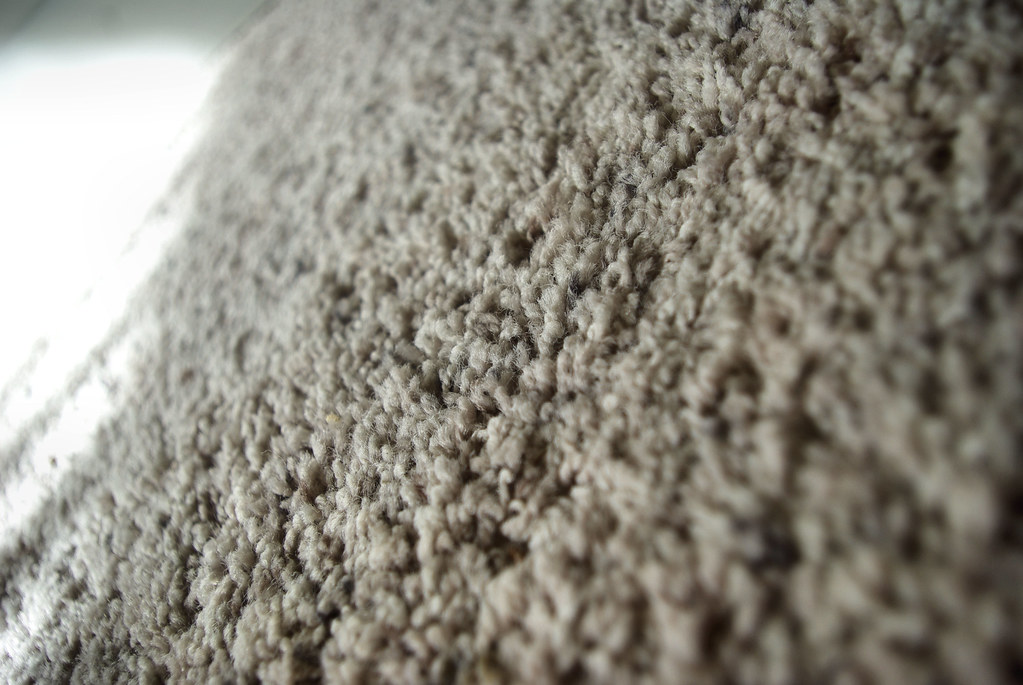
Rugs, in all their varied patterns and textures, are certainly welcome elements in a vintage-inspired home, adding warmth and personality to many spaces. However, there’s one area where carpet should never venture: the bathroom. This particular design choice is firmly in the category of features that should stay in the past, primarily due to significant hygiene and maintenance concerns that make it unsuitable for a modern, clean living environment.
Lauren Saab unequivocally states, “Carpet in bathrooms should stay firmly in the past.” The reasons are compelling and rooted in practical realities. “It holds moisture, traps odor, and never feels truly clean,” she explains. Bathrooms are inherently humid spaces, prone to splashes and spills. Carpet in such an environment becomes a breeding ground for mildew and bacteria, trapping moisture and odors that are almost impossible to eradicate.
The idea of a soft, warm surface underfoot in a bathroom might seem appealing at first glance, but the reality of daily use quickly negates any comfort. It becomes a hygiene headache, making the space feel less sanitary and more susceptible to unpleasant smells. Homeowners seeking a truly clean and fresh bathroom experience will find carpet to be a constant source of frustration.
Instead of carpet, Saab suggests, “Tile or stone brings the same softness underfoot when paired with a rug, without the hygiene headache.” High-quality tile or natural stone offers durability, water resistance, and effortless cleaning, while a strategically placed bath mat or washable rug can provide that desired softness and absorbency. This combination ensures a hygienic, stylish, and practical bathroom space that truly stands the test of time.
6. **Maximalist Bedrooms**
While the ‘more is more’ philosophy of maximalism has permeated many areas of home design, leading to trends like dopamine decor and grandmacore, designers are drawing a clear line when it comes to the bedroom. The yearning for a highly personalized space is understandable, but applying a full-force maximalist approach to your primary suite might actually be counterproductive to its fundamental purpose.
Andy Yates of Andy Yates Design highlights a crucial insight from his client interactions: “I have found that many clients seek peace, serenity, and a quiet place to rest in their primary suites.” The bedroom, above all, should be a haven for recuperative sleep and tranquil relaxation, a stark contrast to dynamic, bold, or overly stimulating environments.
This is where maximalism can become problematic. Yates explains that “While the ‘more is more’ approach works in spaces that are meant to be dynamic and bold, bedrooms covered in wild patterns and loud colors are antithetical to getting sound, recuperative sleep.” A barrage of patterns, a cacophony of colors, and an abundance of decorative items can overstimulate the senses, making it difficult to unwind and find the peace necessary for a good night’s rest.
Instead, consider a more toned-down, serene approach for your bedroom. You can still infuse personality through carefully selected pieces, comforting textures, and a harmonious color palette, perhaps reserving bolder maximalist expressions for other, more social areas of the home. The goal for your bedroom should be to create a calm, restorative environment that prioritizes your well-being and promotes deep, uninterrupted sleep.
Read more about: Natalie Wood at Home: Inside the Silver Screen Siren’s Beloved Domestic Life

7. **Glass Blocks**
For a period, glass blocks offered a perceived solution for introducing natural light while maintaining privacy, particularly in bathrooms or as decorative architectural elements. They certainly possess a vintage aesthetic, but contemporary designers agree that their moment has passed. What once felt innovative now often reads as a dated, utilitarian fix rather than a thoughtful design choice, and there are far more sophisticated alternatives available today.
Meghan Jay articulates this shift in perspective, stating, “Glass blocks had their moment, but let’s be honest—they rarely add beauty to a space.” The inherent nature of glass blocks – their opaque quality, chunky appearance, and grid-like structure – often detracts from a space’s elegance rather than enhancing it. They create a visual barrier that can feel heavy and intrusive.
Jay further explains that these blocks “end up feeling more like a dated, utilitarian fix than a design choice.” They were often employed as a functional compromise, a way to get light without sacrificing privacy, but without much consideration for their overall aesthetic impact. This pragmatic, rather than artistic, application has contributed to their fall from favor in modern design.
Today’s homeowners have a wealth of options for balancing natural light with privacy and safety that far surpass the outdated appeal of glass blocks. “Today, there are far more elegant ways to bring in natural light while maintaining privacy and safety,” Jay notes. Think frosted or textured glass panels, smart window treatments, or even strategically placed architectural elements that offer both light and visual interest, proving that function and beauty can, and should, coexist seamlessly in contemporary design.
Read more about: Seven: The Number That’s Everywhere – From Ancient Mysteries to Viral TikToks!

8. **Shiny Yellow Brass**
While brass itself holds a classic appeal, adding a touch of metallic interest to any space, not all iterations stand the test of time. One particular finish that designers are united in pushing to the past is the shiny, overly yellow, lacquered version of brass. It’s a look that once adorned many homes, but its artificial gleam now instantly signals a bygone era rather than a sophisticated touch.
Peggy Haddad succinctly states, “Brass itself is classic, but that overly yellow, lacquered version? It doesn’t need a revival.” She explains that this specific finish lacks the organic depth and character that more natural brass applications offer. Instead of maturing gracefully, shiny yellow brass can feel rigid and stuck in its original manufactured state, failing to blend seamlessly with evolving aesthetics.
Lauren Saab echoes this sentiment, adding that this finish, “instead of adding character, it makes a room feel stuck in the past.” The problem isn’t brass itself, but this particular, often mass-produced, shiny variant. It lacks the subtle nuances and the ability to develop a beautiful patina over time, which are qualities highly valued in contemporary design for creating warmth and individuality.
Thankfully, moving away from this dated look is wonderfully simple. Both designers recommend opting for warmer, more authentic brass finishes. Haddad advises, “Unlacquered, aged, or burnished brass feels timeless instead. Say yes to patina.” Saab agrees, suggesting, “Warmer finishes like unlacquered brass or matte bronze bring in the same metallic interest without ever looking out of style.” These alternatives offer elegance and a lived-in feel, proving that metal accents can be both stylish and enduring.
Read more about: Where Do You Really Draw the Line with Restomods? A Deep Dive into the Soul of Modified Classics
9. **Orange Polyurethane Oak Floors**
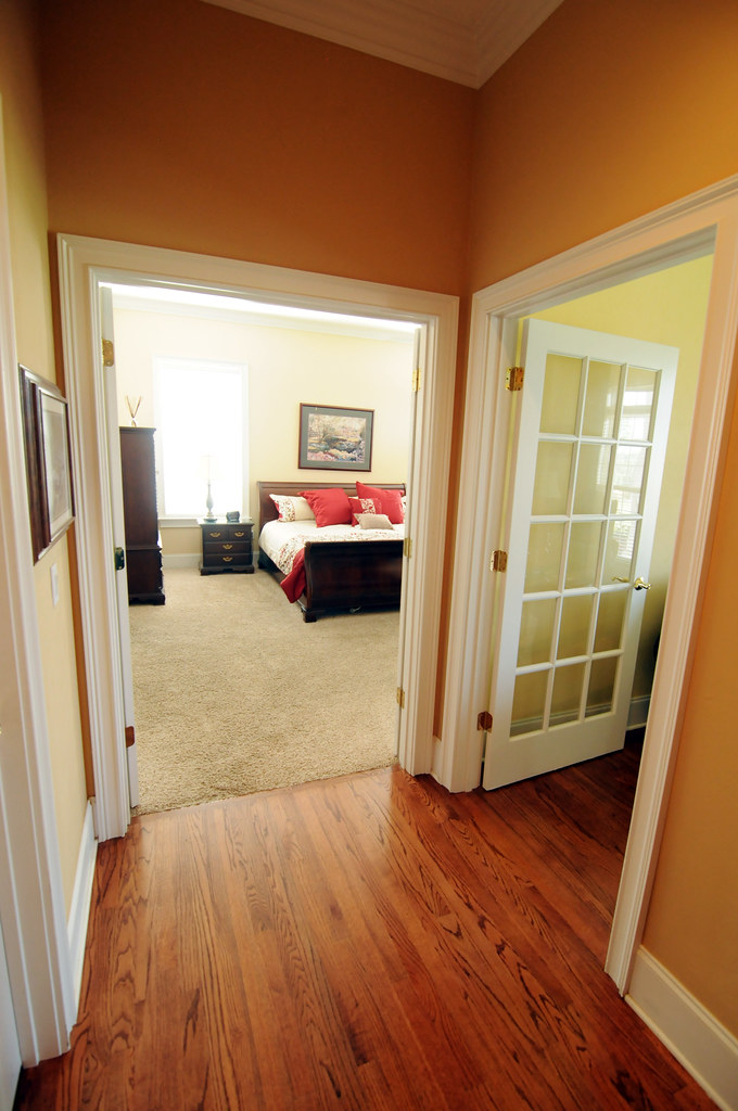
Wood flooring is undeniably a timeless element in home design, and warm oak tones are currently enjoying a welcome resurgence, celebrated for their natural beauty and ability to bring comfort into a space. However, not all wood treatments share this enduring appeal, and there’s one specific finish that designers are keen to leave behind: the orange-red polyurethane coating often seen on oak floors from past decades.
This particular finish, while aiming to protect the wood, ultimately distorts its natural beauty, imparting a heavy orange or reddish cast that feels decidedly unnatural. Peggy Haddad points this out, emphasizing, “I love that warm oaks are trending again, but the orange-red polyurethane finish? That one should stay firmly in the past.” It’s not about the wood itself, but the way it was treated, which now detracts from the contemporary desire for authenticity.
The issue lies in how this finish often saturates the wood, masking the subtle variations and grain patterns that give oak its unique character. Instead of enhancing the wood, it creates a uniform, somewhat artificial sheen that lacks the sophistication and organic appeal favored today. This heavy, orange tint can also clash with modern color palettes and decor, making rooms feel visually unbalanced and dated.
For homeowners looking to embrace the warmth of oak without the dated undertones, Haddad offers a clear solution: “Matte, natural stains highlight the beauty of oak without the heavy orange cast.” Opting for finishes that allow the wood’s inherent qualities to shine through, perhaps with a subtle stain that enhances its natural color rather than overpowering it, creates a far more timeless and elegant foundation for your home. These contemporary approaches respect the material and integrate seamlessly with a range of design styles.
10. **Accent Walls (as previously done)**
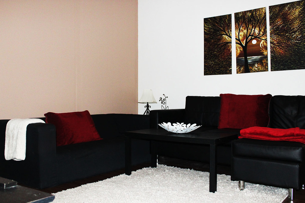
For many years, the accent wall was a go-to design trick, a simple way to add a splash of color or a focal point to a room. Whether it was a bold paint color, a patterned wallpaper, or a textured finish, the idea was to make one wall stand out from the rest. However, this once-popular trend, especially in its early 2000s iteration, has now become a common sign of a dated interior, as design philosophies have shifted towards more cohesive and immersive aesthetics.
Interior designer Kristen McGowan points out that while accent walls “can be impactful and fun,” their moment in the spotlight as a leading trend has passed. She notes that around 2020, they were everywhere, but in 2025, they are generally “considered dated.” The piecemeal approach of highlighting just one wall often breaks the visual flow of a room, making it feel less harmonious and thoughtfully integrated.
Today’s design world, according to McGowan, has gracefully moved “toward a more cohesive look through color-drenching.” This technique involves a more encompassing approach, where all surfaces – walls, trim, doors, and sometimes even ceilings – are painted in a single hue. This creates a unified, enveloping effect that adds depth and sophistication without the abrupt visual interruption of a single contrasting wall. It’s about creating an atmosphere rather than a single point of interest.
If you currently have an accent wall and are looking to update your space, the solution is refreshingly straightforward. McGowan suggests, “simply extending that same treatment to the rest of the space can bring your room up to date.” By embracing the concept of color-drenching, you can transform a formerly disjointed feature into a sophisticated, modern statement, making your room feel larger, more intentional, and wonderfully current. It’s an accessible way to refresh your home without a complete overhaul.

11. **Fiddle Leaf Fig Tree**
In the realm of indoor plants, trends ebb and flow just as they do with furniture and decor, and few plants had a run quite like the Fiddle Leaf Fig tree. For a significant period, it was the undisputed ‘it’ plant, gracing countless stylish homes and magazine spreads. Its large, glossy leaves and sculptural form made it a striking statement piece, instantly elevating any interior. Real or faux, these trees were ubiquitous, signaling a home that was on-trend and thoughtfully curated.
However, the very popularity that propelled the Fiddle Leaf Fig to stardom has also contributed to its current status as a telltale sign of a dated space. Kristen McGowan highlights this shift, explaining that these trees were “once everywhere—real or faux—but their overuse has made them feel passé.” When a design element becomes so pervasive that it appears in nearly every home, it inevitably loses its unique charm and starts to feel generic and uninspired.
While the Fiddle Leaf Fig remains a beautiful plant, its widespread adoption means that it no longer offers the fresh, unique aesthetic that homeowners crave today. Its presence can subtly anchor a room in a past trend cycle, making the entire space feel less current. The desire for individuality and a more personal touch in interior design means moving beyond predictable choices.
Instead of clinging to the once-mighty Fiddle Leaf Fig, McGowan encourages homeowners to “explor[e] other greenery options that feel more current and natural in today’s spaces.” This opens up a world of diverse plant life, from olive trees and snake plants to various types of philodendrons and statement cacti, each offering its own unique texture and form. Embracing a wider array of plants allows for greater personalization and ensures your indoor greenery truly complements a contemporary aesthetic, rather than dating it.
Read more about: Green Thumbs Not Required: 12 Houseplants That Thrive on Neglect, According to the Experts

12. **Sliding Barn Doors**
Sliding barn doors, with their rustic hardware and distinctive tracks, burst onto the design scene as a defining feature of the farmhouse aesthetic. They offered a charming, often DIY-friendly solution for dividing spaces or concealing doorways, particularly appealing for their space-saving functionality in smaller rooms where a traditional swinging door might be cumbersome. For a time, they were seen as a quintessential element for achieving that cozy, modern-rustic vibe.
However, as design trends continue to evolve, the farmhouse style that popularized these doors is no longer leading the charge. Kristen McGowan notes that while barn doors are indeed “functional, particularly in small spaces,” their “traditional rustic hardware instantly dates a home.” The very elements that once made them unique – the exposed track, the chunky rollers, the often distressed wood – now read as a nod to a specific, and increasingly past, design moment.
These doors, despite their practicality, often introduce a visual heaviness and a specific stylistic commitment that can feel out of place in more contemporary or eclectic interiors. Their strong aesthetic can dominate a space, making it challenging to introduce other design elements without creating a disjointed look. The rustic appeal, once fresh, has become predictable and less aligned with the clean lines and refined textures favored in today’s homes.
For those who appreciate the space-saving benefits of barn doors but want to avoid the outdated look, McGowan offers elegant alternatives. She suggests homeowners “opt for hidden hardware or consider pocket doors, which offer the same space-saving benefits with a sleeker, more timeless appeal.” These solutions provide seamless transitions and a more integrated appearance, allowing the focus to remain on the overall design of the room rather than on a dated hardware choice. It’s about achieving both functionality and sophisticated style.
Read more about: Gone But Not Forgotten: Tracing the Legacy of 14 Iconic American Car Brands That Vanished from Dealerships
13. **Glass-Top Dining Tables**
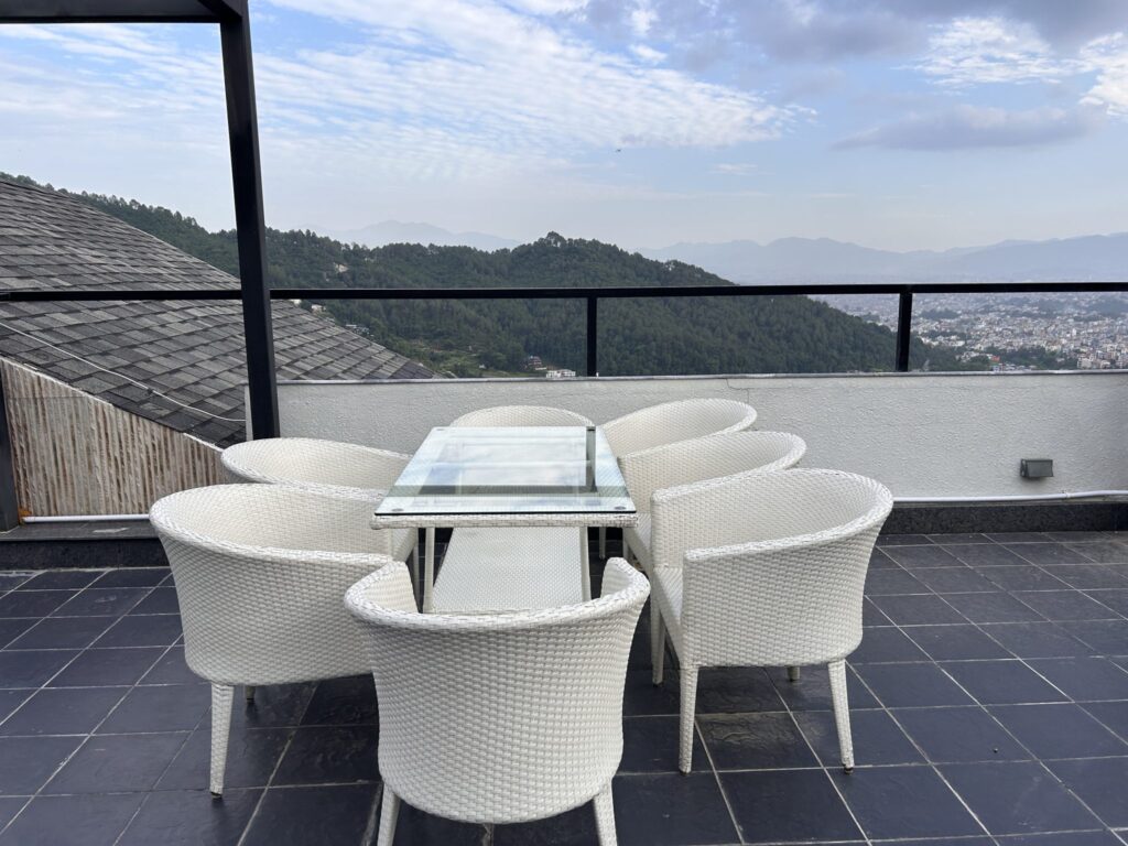
At first glance, glass-top dining tables might seem like a natural fit for a modern home, offering a sleek, minimalist aesthetic that appears to open up a space. Their reflective surfaces and often lighter visual footprint can create an illusion of airiness and sophistication. For a period, they were a popular choice for contemporary dining areas, promising a chic and unobtrusive presence in a room.
However, interior designer Kristen McGowan cautions that despite their initial appeal, glass-top dining tables “can actually date your space and feel disconnected from the rest of your decor.” The very qualities that once made them popular have, over time, revealed significant drawbacks. Not only are they notoriously “difficult to keep clean,” constantly showcasing smudges, fingerprints, and dust, but their “mix of materials often becomes outdated quickly,” failing to offer the enduring quality of solid pieces.
The disconnected feeling often stems from the transparency of the glass, which can make the table appear to float, lacking the grounded presence that a solid material provides. This can make it challenging to create a cohesive and warm dining environment. Furthermore, the combination of a glass top with various base materials – often chrome, wrought iron, or less refined wood – can quickly fall out of fashion, leaving homeowners with a piece that feels both impractical and stylistically rigid.
To cultivate a dining space that feels more grounded, timeless, and inviting, McGowan advises homeowners to “go for solid dining tables that offer a more grounded and enduring look.” Whether crafted from wood, stone, or even concrete, a solid dining table provides a robust focal point that anchors the room and offers a stable foundation for layering decor. These materials age beautifully, are more forgiving in daily use, and lend a sense of permanence and warmth that glass often struggles to achieve, creating a truly enduring and stylish gathering place.
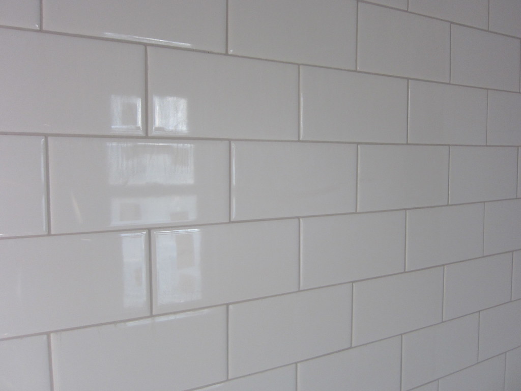
14. **Subway Tile with High-Contrast Grout**
Subway tile has earned its reputation as a design classic, lauded for its versatility, clean lines, and ability to suit a wide range of aesthetic styles, from traditional to contemporary. Its enduring appeal makes it a safe and stylish choice for kitchens, bathrooms, and utility areas. Yet, even a classic can be made to feel dated by specific styling choices, and one such culprit is the pairing of classic white subway tile with high-contrast, typically dark, grout.
Kristen McGowan highlights this nuanced point, explaining that while subway tile itself is a classic, “white tile paired with dark grout—a favorite during the farmhouse trend boom—can now make a space feel overdone.” This particular combination, which became ubiquitous during the peak of the farmhouse aesthetic, was once a hallmark of rustic charm. However, its widespread adoption and strong visual statement now tend to anchor a space firmly in that specific, and receding, trend cycle.
The stark contrast between the white tile and dark grout creates a grid-like pattern that can feel busy and visually heavy, often drawing too much attention to the individual tiles and the grout lines themselves rather than the overall design. While it served its purpose in a particular style, in today’s design climate, which often favors softer transitions and more harmonious elements, this high-contrast look can feel abrupt and less sophisticated, diminishing the tile’s classic elegance.
For those looking to keep subway tile fresh and relevant, McGowan offers a straightforward and impactful update: “For a more seamless and modern look, choose low-contrast grout to create a softer, cleaner backdrop in kitchens and bathrooms.” Opting for grout that closely matches the tile color—whether white, light grey, or a subtle natural tone—allows the texture and shape of the tile to emerge gently, creating a cohesive surface that feels elegant, expansive, and effortlessly modern. This subtle shift transforms a once-dated pairing into a sophisticated and enduring design element.
And there you have it – a comprehensive look at the interior design trends that, according to our experts, are currently dating American homes. It’s a fascinating journey to witness how quickly design aesthetics can evolve, transforming once-beloved elements into relics of the past. The key takeaway here isn’t about rigidly following every new fad, but rather about creating spaces that genuinely feel fresh, functional, and reflective of your own personal style, while also offering longevity.
Ultimately, your home should be a comfortable and inspiring sanctuary that grows with you, not a static display of yesterday’s popular choices. By understanding these shifts and embracing thoughtful, accessible updates, you can ensure your living spaces remain vibrant, welcoming, and beautifully attuned to contemporary life. Remember, good design is about making choices that truly serve you and your home, ensuring it feels both stylish and uniquely yours for years to come. Here’s to creating homes that stand the test of time, infused with personality and enduring charm!

