

The contemporary automotive landscape feels, well, a little bland, doesn’t it? If you’ve ever found yourself gazing across a parking lot, noting an overwhelming sea of black, white, silver, and gray, you’re not alone. The latest iSeeCars Color Study confirms this intuition, revealing a dramatic shift in car color trends over the past two decades. Grayscale shades have surged from 60 percent to 80 percent market share between 2004 and 2023, effectively cutting the prevalence of more colorful tones like blue, red, and green in half. It seems the vibrant palette that once defined our roads has been yielding to a more subdued, and arguably, safer selection.
This phenomenon extends beyond just the pragmatic choices of car buyers and dealers, although those certainly play a significant role. As John Hennessy, owner of River View Ford, insightfully observes, dealers prioritize stocking vehicles they can sell quickly to avoid “floor planning” interest payments, leading to a preference for “safe colors” that are perceived to have broad appeal. He noted, “When I’m paying interest on $5 million worth of inventory, I can’t afford to take chances on a bunch of gold and yellow cars that I might never match with customers.” This retail reality, coupled with consumers’ own assumptions about resale value, creates a feedback loop that pushes vibrant hues out of the mainstream.
Yet, the story of disappearing colors is far richer and more complex than just modern market forces. Our world, throughout history, has been a canvas splashed with an astonishing array of unique shades—from the audacious automotive statements of the past to the subtle, natural tones of long-lost creatures, and even the extraordinary, sometimes unsettling, pigments born from human ingenuity. Many of these hues have vanished entirely, become incredibly rare, or exist today only as synthetic echoes of their former selves. Join us on an intriguing expedition as we unearth some of these captivating colors and patterns that, for various reasons, have faded from existence or become treasures of the past.

1. **Mint Green**
Remember the 1980s? It was an era of distinct styles, and car colors were no exception. Among the bold and unusual paint shades of that decade was Mint Green, a hue that graced many compact cars and economy models. It was chosen for its light, fresh look and also offered the practical advantage of low heat absorption, aiding functionality.
This shade projected a playful yet understated vibe, perfectly suiting the smaller, fuel-efficient vehicles. It truly belonged to its moment, a reflection of an evolving automotive landscape where practicality and lightheartedness converged. You could easily spot a Mint Green car zipping through suburbia, a cheerful outlier from a transitioning world.
However, as consumer preferences shifted, Mint Green started to lose its sparkle. It came to be viewed as somewhat outdated, a relic of a bygone era. Buyers gravitated towards darker, more sophisticated metallic colors. Automakers, responsive to these tastes, phased out Mint Green, making it a rare, nostalgic sight on today’s highways.
Read more about: Unlocking the Ubiquitous: An In-Depth Exploration of the Dollar Sign’s Enduring Legacy and Global Impact
2. **Powder Blue**
Another gentle giant of the past was Powder Blue, a soft, pastel blue common on many sedans. It exuded a clean, unassuming aesthetic, offering a calm presence on the road. This color appealed to buyers seeking something classic yet approachable, speaking to a different kind of elegance than the bolder hues emerging at the time.
Despite its initial appeal, Powder Blue faced challenges as paint technology advanced. It lacked the depth and richness of modern metallic blues, often appearing one-dimensional. Its flat tone also tended to fade faster under elements, losing luster and becoming duller over time, thus showing age more quickly than newer finishes.
Today’s buyers overwhelmingly prefer richer, more complex, or neutral shades that are durable and visually striking. The demand for uniform Powder Blue dwindled, leading automakers to discontinue it. It’s a color left behind by evolving tastes and technology, now a rare glimpse into a softer, quieter past in automotive aesthetics.
Read more about: The Unshakeable Blueprint: Dwayne Johnson’s 12-Step Routine That Keeps His Workout Consistent for 15 Years
3. **Burnt Orange**
For those who desired a car that truly stood out, Burnt Orange offered a compelling, bold choice. This earthy, spirited orange was popular on sporty models and compact cars, making a strong statement without neon extravagance. It exuded energy and adventure, perfectly matching the vivacious spirit of its era and the cars it adorned.
However, Burnt Orange’s very vibrancy proved its Achilles’ heel. It notoriously faded quickly under sustained sunlight exposure, its rich hue gradually losing intensity and becoming duller. This susceptibility meant a car’s striking finish struggled to maintain brilliance, especially in sunny climates, increasing maintenance and repainting costs.
As a result, car manufacturers removed Burnt Orange from their palettes, gravitating towards more stable finishes. While the spirit of bold orange cars lives on in niche models, the original Burnt Orange, with its distinctive earthy depth and delicate nature, is largely a color of the past, fondly remembered by enthusiasts.
Read more about: $1000 Repair Alert: 13 Critical Early Warning Signs Your Car’s Head Gasket Is About to Blow
4. **Root Beer Brown**
Emerging from the late 1970s into the early 1980s, Root Beer Brown was a distinctively rich, dark brown, giving vehicles a unique, warm appearance. It offered an alternative to common blacks and grays, appealing to those seeking sophistication mixed with an earthy, grounded feel. This color evoked comfort and a subtle sense of luxury.
Initially, Root Beer Brown enjoyed popularity, providing a fresh perspective amidst prevailing trends. It captured an understated cool, found on family sedans to robust vehicles. Its deep tones looked surprisingly elegant, especially with chrome accents, adding unique character to automobiles of that period.
Yet, as the decade closed, brown tones waned. Once warm, they became associated with older, less stylish vehicles. This shift impacted the market, dropping resale values. By the mid-1990s, most brands stopped offering Root Beer Brown, making it a nostalgic, rare sight on today’s roads, a distinct chapter closed.
Read more about: Beyond the Spotlight: The Personal Trials and Triumphs of Scout Willis, Daughter of Bruce and Demi Moore
5. **Olive Green**
Olive Green strongly conveyed ruggedness and utility. Predominantly seen on military-inspired vehicles, trucks, and utility models, it possessed a muted, earthy appearance. This color was chosen to reflect durability and an adventurous, no-frills spirit, resonating with buyers valuing practicality and a connection to the outdoors.
For specialized vehicles, Olive Green was fitting, emphasizing functional design. However, its appeal for everyday cars was limited. Its muted tones, while authentic to military roots, often failed to capture broader public imagination for personal vehicles, which increasingly leaned towards colors offering more shine or perceived sophistication.
As consumer tastes evolved, a shift occurred towards polished and glossy finishes. The desire for sleek, eye-catching exteriors meant Olive Green, with its un-flashy demeanor, fell out of favor. Consequently, it vanished from mainstream production, now an exceedingly rare sight found mostly on vintage restorations or specialized off-road vehicles.
Read more about: The Unspoken Code: Why the Rules of Engagement Cast May Never Reunite (And What It Means for TV’s Beloved Legacies)

6. **Plum Crazy Purple**
Plum Crazy Purple was a pure cultural statement. Not just a paint code, it was the audacious heart of Mopar muscle cars from the 1970s. Imagine a ’70 Challenger or ‘Cuda in this electric purple—part of Chrysler’s “High Impact” color lineup, its essence was to be unmistakably loud and proud.
It embodied the rebellious energy of the muscle car era with intense vibrancy. Not about subtlety, but making an entrance—a defiant roar of color complementing raw power. For enthusiasts, this shade was a badge of honor, a declaration of speed and individuality, truly setting these vehicles apart.
Dodge revived Plum Crazy on modern vehicles, but a difference remains. The original formulation, with its raw, less metallic sheen, possessed a unique character hard to replicate. It was a period piece, linked to specific 1970s pigments and application, distinct from its contemporary namesake.
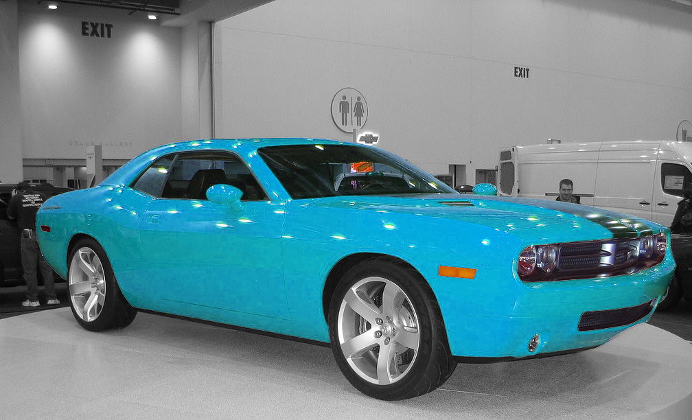
Car Model Information: 2020 Dodge Challenger R/T
Name: Dodge Challenger
Production: 1969–1974,1977–1983,2008–2023
ModelYears: 1970–1974,1978–1983,2008–2023
Caption: 2015 Dodge Challenger SRT Hellcat
Manufacturer: Dodge
Categories: 1970s cars, 1980s cars, 2000s cars, 2010s cars, 2020s cars
Summary: The Dodge Challenger is the name of three generations of automobiles produced by the American automobile manufacturer Dodge. However, the first use of the Challenger name by Dodge dates back to 1959 for marketing a “value version” of the full-sized Coronet Silver Challenger.
From model years 1970 to 1974, the first-generation Dodge Challenger pony car was built using the Chrysler E platform in hardtop and convertible body styles sharing significant components with the Plymouth Barracuda.
The second generation, from model years 1978 to 1983, was a rebadged Mitsubishi Galant Lambda / Sapporo, a coupe version of an economical compact car.
The third and most recent generation is a full-size muscle car that was introduced in early 2008 initially as a rival to the evolved fifth generation Ford Mustang and the fifth generation Chevrolet Camaro.
In November 2021, Stellantis announced that the 2023 model year would be the final model year for both the LD Dodge Charger and LA Dodge Challenger, as the company will focus its plans on electric vehicles rather than fossil fuel-powered vehicles, due to tougher emissions standards required by the Environmental Protection Agency for the 2023 model year. Challenger production ended on December 22, 2023, and the Brampton, Ontario, assembly plant will be re-tooled to assemble an electrified successor.
Get more information about: Dodge Challenger
Buying a high-performing used car >>>
Brand: Dodge Model: Challenger
Price: $24,335 Mileage: 70,496 mi.
Read more about: Get Ready to Rev Your Engines: A Deep Dive Into Val Kilmer’s Jaw-Dropping Car Collection, Both On-Screen and Off!
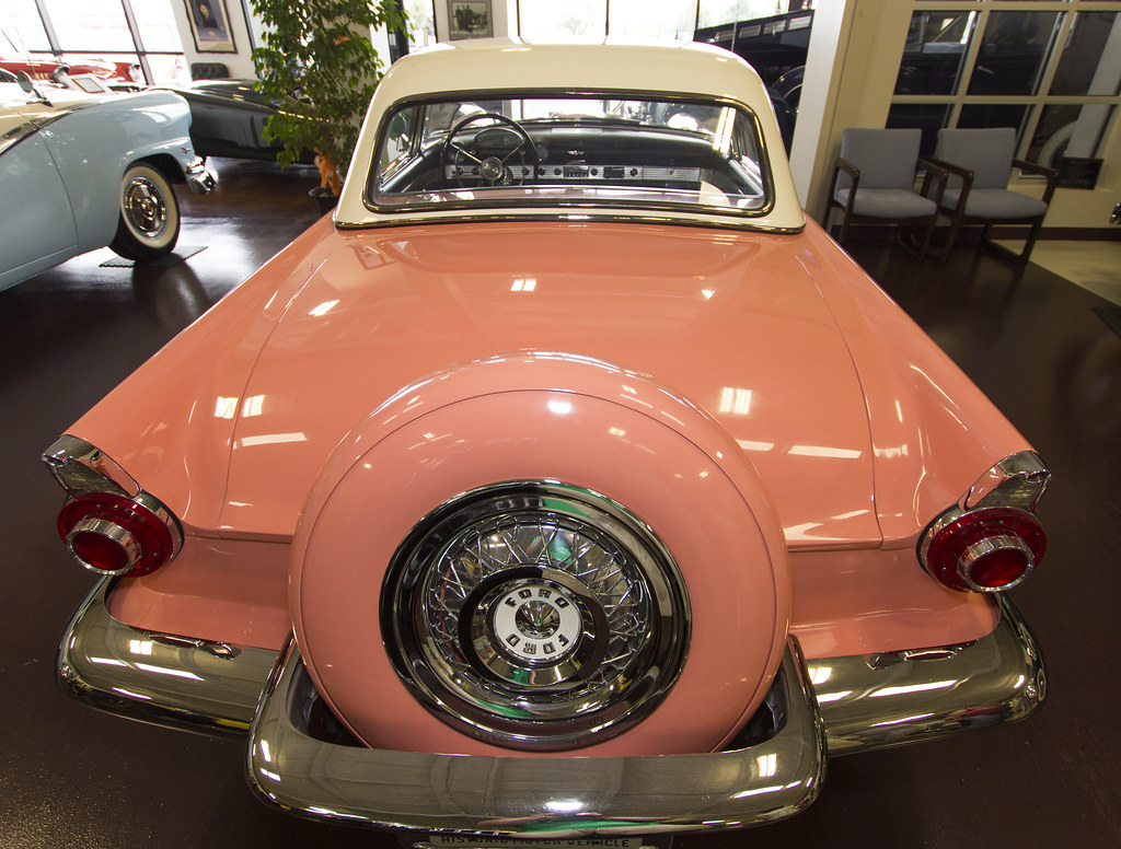
7. **Coral Pink**
Stepping into the 1950s, Coral Pink perfectly encapsulated post-war exuberance. Iconic on the 1956 Ford Thunderbird, this hue brought tropical paradise, a dash of Miami Beach vibrancy, to American driveways. It was soft, warm, yet undeniably bold, resonating with a generation that embraced color and style.
The 1950s saw cars as extensions of personal style, rolling sculptures, fashion accessories. A Coral Pink Thunderbird was a statement of flair and sophistication, reflecting a brighter, playful approach to automotive aesthetics rarely seen today. This pastel stunner was a true snapshot of its time.
In today’s market, a factory-correct Coral Pink Thunderbird is a show-stopper, a rare artifact. This unique shade, symbolizing carefree elegance, has all but disappeared from modern car offerings. Its absence underscores the shift in design philosophy, leaving Coral Pink a beloved, bygone hue cherished by collectors.
The initial seven vanished hues only scratch the surface of our planet’s colorful past! The stories behind these fading shades are often as captivating as the colors themselves, weaving together threads of history, culture, environmental shifts, and even surprising scientific breakthroughs. From the subtle elegance of a bygone automotive paint to the ethical dilemmas of ancient pigments and the fascinating mysteries of prehistoric creatures, the journey into vanishing colors is truly a vibrant exploration of what we’ve lost and, sometimes, what we’ve rediscovered.
Car Model Information: 1966 Ford Thunderbird Base
Name: Ford Thunderbird
Caption: 1957 Thunderbird
Manufacturer: Ford Motor Company
Production: unbulleted list
ModelYears: unbulleted list
Class: unbulleted list
Layout: Front-engine, rear-wheel drive layout
Categories: 1960s cars, 1970s cars, 1980s cars, 1990s cars, 2000s cars
Summary: The Ford Thunderbird is a personal luxury car manufactured and marketed by Ford Motor Company for model years 1955 to 2005, with a hiatus from 1998 to 2001.
Ultimately gaining a broadly used colloquial nickname, the T-Bird, the model was introduced as a two-seat convertible, subsequently offered variously in a host of body styles including as a four-seat hardtop coupe, four-seat convertible, five-seat convertible and hardtop, four-door pillared hardtop sedan, six-passenger hardtop coupe, and five-passenger pillared coupe, before returning in its final generation, again as a two-seat convertible.
At its inception, Ford targeted the two-seat Thunderbird as an upscale model. The 1958 model year design introduced a rear seat and arguably marked the expansion of a market segment that came to be known as personal luxury cars, positioned to emphasize comfort and convenience over handling and high-speed performance.
Get more information about: Ford Thunderbird
Buying a high-performing used car >>>
Brand: Ford Model: Thunderbird
Price: $44,999 Mileage: 71,017 mi.
Read more about: Beyond the Flames: How 11 Celebrities Faced Extreme Fear, While Others Found Luxurious Escape in Their Jaw-Dropping Pools

8. **Champagne Beige**
While some colors aimed for outright boldness, Champagne Beige offered a touch of understated luxury that was once highly sought after for upscale car models. This sophisticated hue struck a perfect balance, providing a warm, refined tone that nestled comfortably between the more obvious choices of gold and tan. It whispered elegance rather than shouting it, appealing to a clientele who appreciated subtlety and a classic aesthetic.
However, its very subtlety proved to be a practical pitfall on the open road. Champagne Beige had an unfortunate tendency to blend almost too well with road dirt, making vehicles look unclean far too quickly. This lack of contrast, a seemingly minor detail, became a significant drawback for discerning owners who expected their luxury vehicles to maintain a pristine appearance with minimal fuss.
As automotive aesthetics evolved and paint technologies advanced, the industry began favoring deeper, richer metallic golds and more complex browns that offered both visual depth and better camouflage against the daily grime of travel. These newer formulations provided the perceived luxury without the maintenance headache, ultimately leading to Champagne Beige being quietly phased out, becoming a fond, if dusty, memory for those who remember its brief reign of subtle sophistication.
Read more about: The Unseen Cost: How Your Car’s Color Choice Significantly Impacts Its Resale Value
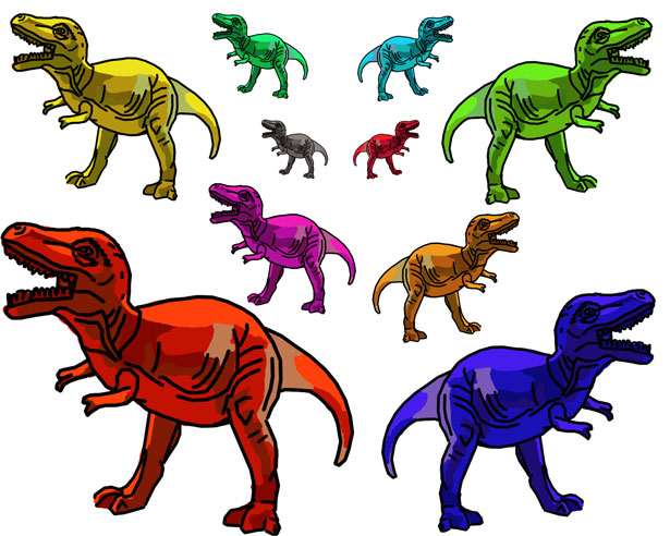
9. **Dinosaur Colors**
For decades, our mental image of dinosaurs was largely monochromatic—think endless shades of green, brown, and black. This dull palette left many to wonder: what did these magnificent creatures truly look like? Could they have sported vibrant colors or intricate patterns, much like the diverse animals that roam our world today? For a long time, the answers remained trapped in the fossil record, seemingly as extinct as the dinosaurs themselves.
Remarkably, recent scientific breakthroughs have started to peel back the curtain on these prehistoric puzzles. Researchers are now meticulously examining dinosaur fossils at a cellular level, specifically targeting tiny, pigment-filled organelles called melanosomes. These microscopic structures contain melanin, the very same pigment responsible for much of the coloration we see in modern animals. The preservation of these melanosomes in fossilized dinosaur feathers has provided astounding clues, hinting that some feathered dinosaurs might have showcased dark bodies adorned with vivid red, ginger-like markings and striking striped patterns. It’s fascinating to consider that the presence of these pigments was actually crucial for the feathers’ fossilization; entirely white, pigment-lacking feathers would simply not have been preserved in the same way.
While the original pigments have long since vanished through millions of years of chemical transformation, scientists can still make educated guesses about the colors by studying the size and shape of these ancient melanosomes. Much like modern animals have specific melanosome shapes linked to particular colors—such as black or red—paleontologists can infer similar hues in dinosaurs whose fossilized melanosomes bear a resemblance. Furthermore, by analyzing how melanosome structures in living animals correlate with traits like iridescence, researchers have even found evidence suggesting that some dinosaurs might have boasted shimmering feathers that caught the light with breathtaking shades of purple, blue, and green, painting a far more dazzling picture of their prehistoric world than we ever imagined.
Read more about: The Hollywood Ending That Was a Lie: Unveiling the Stars’ Secret Financial Ruin

10. **Piebald Hamster**The humble hamster, often overlooked in the grand tapestry of animal biodiversity, actually comes in a delightful array of colors and patterns, from the neatly segmented Banded to the boldly marked Dominant Spot, and the distinctive Roan. Among these fascinating variations was the Piebald hamster, a unique individual that, despite some similarities to the Dominant Spot, truly carved out its own niche in the world of rodent aesthetics.
The humble hamster, often overlooked in the grand tapestry of animal biodiversity, actually comes in a delightful array of colors and patterns, from the neatly segmented Banded to the boldly marked Dominant Spot, and the distinctive Roan. Among these fascinating variations was the Piebald hamster, a unique individual that, despite some similarities to the Dominant Spot, truly carved out its own niche in the world of rodent aesthetics.
What set the Piebald hamster apart was its charming, random distribution of white spots across an otherwise fully colored body. Unlike the Dominant Spot, which sported an all-white belly alongside its dorsal markings, the Piebald proudly displayed a colored belly, sometimes even featuring its own smattering of spots. This made each Piebald hamster a truly one-of-a-kind miniature canvas, a testament to the incredible genetic diversity that can exist within a single species.
However, the path to popularity proved challenging for the Piebald. When the Dominant Spot hamster made its debut in America in 1964, it quickly eclipsed its Piebald counterpart in breeder circles, largely because it was simply easier to breed successfully. This practical advantage, coupled with shifting preferences, led to a decline in the Piebald population. Today, the Piebald hamster is sadly believed to be extinct; its distinctive markings and colored belly have become a wistful memory, with no specimens having been sighted for many years, reminding us how quickly even seemingly common genetic traits can vanish.

11. **Red (Orange) Fiesta Ware**The vibrant and unmistakable dinnerware known as Fiesta ware, initially introduced in the 1930s by the Homer Laughlin China Company, became an icon of American kitchens. Although the original line was discontinued in 1973 and later reintroduced, a particular set of hues from that initial collection—the vivid red and orange—are now impossible to find in new pieces, existing only as coveted vintage relics.
The vibrant and unmistakable dinnerware known as Fiesta ware, initially introduced in the 1930s by the Homer Laughlin China Company, became an icon of American kitchens. Although the original line was discontinued in 1973 and later reintroduced, a particular set of hues from that initial collection—the vivid red and orange—are now impossible to find in new pieces, existing only as coveted vintage relics.
The original Fiesta ware palette consisted of five carefully chosen colors: red, blue, green, yellow, and ivory, all designed to be mixed and matched, allowing for personalized table settings. Among these, the red Fiesta ware stood out as the most popular, and also the most expensive. Its brilliant, unprecedented red (which often leaned towards orange) was achieved through a remarkably high concentration of uranium dioxide in its glaze, sometimes up to 15% by weight, combined with a complex firing process that locked in its unique glow.
This radiant red Fiesta ware, produced from 1936 to 1943, used uranium dioxide until the material was diverted for atomic weapons development during World War II, after which the company switched to a depleted uranium product. The original, truly radioactive pieces remain fascinating but also potentially hazardous. The dangers range from gamma rays emitted by the glaze to beta particles on the surface and even radionuclides that can leach into food. While other Fiesta ware colors, like ivory, also contained trace amounts of uranium, it was the bright red-orange that was by far the most radioactive. Due to these inherent hazards, it is virtually certain that this distinct and dangerous color will never again grace our dinner tables in consumer products, sealing its fate as a beautiful but bygone collectible.

12. **Indian Yellow**
Imagine a pigment so luminous it almost glows, a transparent yellow that was once the darling of oil and watercolor artists for its striking vibrancy and fluorescent qualities when touched by sunlight. This was Indian yellow, a hue whose very existence would, without a doubt, cause an uproar among contemporary animal rights activists if it were still produced in its original form. Its debated origins have long centered on a rather unsettling, though widely believed, source: the urine of cows in India, purportedly fed an exclusive diet of mango leaves.
The whispers surrounding Indian yellow’s creation solidified into startling claims during an investigation in 1883. This inquiry suggested that the specific yellow pigment was indeed derived from the urine of cows subjected to a mango-leaf-only diet. The collected urine was then dried and molded into pigment balls, which were then shipped to Europe for processing into the final paint pigment. This process, as it was understood, painted a grim picture of animal welfare.
By 1908, this method of production was officially deemed inhumane and subsequently discontinued, primarily due to the severe malnutrition inflicted upon the cows by their restricted diet. However, the exact truth of Indian yellow’s origins remains shrouded in mystery, as subsequent investigations have struggled to find any definitive confirmation in India that cows were ever actually used in its production. Today, artists can still enjoy the beauty of Indian yellow, but it is a synthetic, nickel-based replacement, a far cry from its controversial, and possibly mythical, biological predecessor.
Read more about: Beyond the Buzz: Your Definitive Guide to Headphone Driving Laws Across All 50 States
13. **Red Lead**
For generations, the sight of an old metal bridge painted a distinctive red was as common as the rivers they spanned. This familiar red, often leaning towards a bright orange, was thanks to red lead paint, an industrial workhorse named ‘minim’—a nod to the Minius River in Spain where its primary component was first mined. Composed of lead tetraoxide, this pigment, when mixed with linseed oil, formed a thick, corrosion-resistant paint that became the go-to primer for almost all iron structures exposed to the harsh elements, particularly bridges near water.
Its robust protective qualities made it indispensable, famously coating the magnificent Golden Gate Bridge. The original paint on this iconic structure, a testament to red lead’s prowess, contained a staggering 68% red lead paste. It was a color not chosen for its aesthetic appeal alone, but for its unparalleled ability to shield colossal metal from rust and decay, ensuring the longevity of engineering marvels.
However, the reign of red lead came to an inevitable end as scientific understanding of its severe environmental and toxicity risks grew. Today, the once-ubiquitous red and orange structures are gradually being recoated with safer, zinc-based primers and topcoats. Since 1968, for instance, the Golden Gate Bridge has undergone a monumental shift, first to an inorganic zinc silicate primer with a vinyl topcoat, and later to an acrylic topcoat, to meet stringent air quality standards. The use of lead-based paints is now heavily regulated globally, making zinc-based coatings—which typically appear green—the standard. While many venerable red-painted bridges still stand as stoic reminders of an era past, their days are numbered. Before they receive their modern, greener protective layers, the old red lead must be meticulously and safely removed, safeguarding both the workers and the environment from the legacy of this powerful, yet dangerous, color.
Read more about: Guitar Queens: 12 Loudest Most Iconic Rock Anthems Ever Shredded by Female Artists
14. **Ivory Black**
A color that evokes profound depth and richness, Ivory Black, a deep blue-black pigment, was once a cornerstone of artists’ palettes, lending an unparalleled intensity to their masterpieces. Its original creation method, however, places it firmly in the category of pigments that would ignite passionate debate among animal rights activists today. Historically, true ivory black was exclusively derived from the burning of elephant tusks, with the resulting charred material meticulously refined in oil to produce the exquisite pigment.
The direct link to elephant ivory made this color particularly precious and, tragically, contributed to the decline of elephant populations. Consequently, for obvious and ethical reasons, this traditional source of ivory black is no longer in use, as elephants, the magnificent creatures that provided the raw material, are now an endangered species. While a similar pigment, often referred to as ‘bone char,’ could be produced by charring the bones of any animal, it lacked the specific, unique qualities and the direct historical connection to ivory that defined the original.
This rich, captivating hue was favored by many artistic giants throughout history, most notably by the legendary Dutch master Rembrandt. His frequent use of ivory black in his works speaks to its profound visual impact and versatility, allowing him to achieve unparalleled chiaroscuro effects and emotional depth. Today, synthetic alternatives attempt to replicate its unique qualities, but the original Ivory Black remains a powerful testament to a time when artistic materials often came with a hidden, and now unacceptable, cost to the natural world.
Read more about: Nicole Kidman’s Fearless Style Journey: Mastering Every Unique Look with Timeless Grace
As we conclude our journey through the spectrum of vanished hues, it’s clear that colors are far more than mere visual phenomena; they are storytellers, chronicling human ingenuity, changing tastes, environmental shifts, and ethical awakenings. From the audacious automotive statements of yesteryear to the intricate patterns of long-lost creatures and the profound history embedded in artistic pigments, these disappearing shades offer a compelling glimpse into eras and realities that are no longer. While many of these vibrant tones have faded from common sight, their stories endure, reminding us to appreciate the richness around us and perhaps, to look a little closer at the colors that define our world today, before they too, become tales of the past.


