

Alright, internet, gather ’round! We’ve all been there: you’re casually going about your day, and BAM! You encounter a product, a piece of infrastructure, or even just a simple label that makes you stop dead in your tracks and wonder if humanity collectively forgot how to, well, *design*. It’s a special kind of facepalm-inducing magic when something is so poorly conceived that it transcends mere inconvenience and enters the hallowed halls of comedic genius. Today, we’re diving headfirst into that glorious abyss.
We often take good design for granted, living in a world where things mostly, blessedly, work as intended. But as the folks at Jalopnik wisely put it, “Humans are an imperfect species, people make mistakes.” And sometimes, those mistakes aren’t just minor blips; they’re full-blown design disasters that leave a trail of confusion, frustration, and, let’s be honest, a whole lot of laughter. We’re not talking about complex systems that are hard to maintain, or awkward packaging compromises. No, as the experts remind us, “This is about stuff that’s just either silly or hopelessly wrong.”
So, buckle up your seatbelts – assuming the buckle isn’t designed to pinch you every time – because we’re about to embark on a side-splitting journey through some of the most cringe-worthy, head-scratching, and utterly hilarious product designs ever unleashed upon an unsuspecting public. Get ready to ask, “Why? Oh, *why*?!” and maybe, just maybe, appreciate the perfectly functioning stapler on your desk a little bit more. Let’s kick things off with some truly mind-boggling automotive blunders, straight from the highway to hilarity!
1. **The Nissan Xterra Sunroof/Roof Rack Paradox**Ah, the SUV! A marvel of modern engineering, designed to take you on adventures, haul your gear, and let in the glorious sunshine through an optional sunroof. What could possibly go wrong when combining these two fantastic features? Well, apparently, a lot, if you’re the Nissan Xterra. Imagine the brilliant minds in the design room, patting themselves on the back for including both a robust roof rack and a lovely sunroof. Separately, these are indeed awesome features.
However, someone, somewhere, forgot to check if these two awesome features could, you know, *coexist*. The result? A sunroof that, when you attempt to open it, is promptly blocked by the very roof rack designed for adventure. It’s like buying a convertible only to find the folding roof gets stuck on your giant spoiler. The sheer audacity of this oversight is enough to make any sane person chuckle, then sigh deeply.
This isn’t a complex mechanical failure; it’s a fundamental lack of spatial awareness in the design process. It forces the Xterra owner into an impossible choice: enjoy the wind in their hair, or carry their kayaking equipment. It’s a classic example of two good ideas failing spectacularly when forced into an awkward marriage, leading to a situation that is, as Goggles Pizzano suggested, “a discredit to the engineering profession.”
Car Model Information: 2007 Nissan Xterra S
Name: Nissan Xterra
Caption: Second-generation Nissan Xterra
Manufacturer: Nissan
Aka: Nissan Paladin (China),Nissan Roniz (Iran),Dongfeng Oting (China)
Production: 1999–2015,2003–2015 (China)
Class: Compact sport utility vehicle
BodyStyle: Sport utility vehicle
Layout: Front-engine, rear-wheel-drive layout,Front-engine, four-wheel-drive layout
Successor: Nissan Rogue,Nissan Murano,Nissan Terra
ModelYears: 2000–2015
Categories: 2000s cars, 2010s cars, All-wheel-drive vehicles, Articles with short description, CS1 Brazilian Portuguese-language sources (pt-br)
Summary: The Nissan Xterra is a truck-based compact SUV manufactured and marketed by Nissan from 1999 to 2015 across two generations; the first (1999–2004) sharing a platform and many of its major exterior parts from the front doors forward with the Nissan (D22) Frontier pickup – and the second (2005–2015) sharing the Nissan F-Alpha platform with the Frontier and Pathfinder.
Sporting a name licensed from the XTERRA off-road triathlon race series, the vehicle was positioned by Nissan as functional and reliable outdoor gear, epitomized by its marketing tagline “Everything You Need, Nothing You Don’t.”
It was developed in La Jolla, California, by Nissan Design International (NDI)’s (now Nissan Design America) then Director of Design Tom Semple, and became the first Nissan vehicle completely conceived, developed and manufactured in the United States. According to Jerry Hirshberg, president of Nissan Design International (NDI), “the impetus for Xterra designers was to create an affordable, rugged, quality piece of equipment”. He later described it as “a garage tool that says, ‘treat me rough’ – it’s designed to look better dirty than clean.”
While the two Xterra generations differed significantly, both prioritized ruggedness, practicality, and affordability over luxury. Traditional body-on-frame construction and underbody skid plates reflected both its truck heritage and off-road capability. Throughout its lifetime the Xterra used a two-box design with a prominent two-tiered roof enabling second row stadium seating, C-pillar-mounted rear door handles, asymmetrical rear window, and a distinctive tailgate bump-out for an inside mounted first aid kit. For hauling exterior loads a roof rack with a removable forward gear basket was standard equipment.
Road & Track described the Xterra as “an honest SUV that doesn’t try to be a luxury car alternative, nor tries to hide its truck underpinnings”. Jalopnik called it a “knockoff of the Land Rover Discovery”. The Washington Post described it as “rugged without bravado”.
First generation manufacture took place at Nissan’s Decherd, Tennessee Plant (engines) and Smyrna Assembly plant (final assembly). Second generation Xterras were manufactured at the company’s Canton, Mississippi plant (final assembly). Variants were also manufactured in Brazil and China.
Get more information about: Nissan Xterra
Buying a high-performing used car >>>
Brand: Nissan Model: Xterra
Price: $5,494 Mileage: 158,814 mi.
2. **The Hyundai Veloster’s Hydrating Rear Hatch**Next up, we have Hyundai’s youth-oriented sports coupe, the Veloster. This car is lauded for its “all kind of interesting details,” which is great! Innovation is key, right? But then there’s that *one* annoying detail, as True-Blue pointed out: the rear hatch. Now, a hatch should be a simple affair – open, load, close. Not so fast, says the Veloster.
Picture this: It’s raining, you’re at the grocery store, and you need to load your bags. You pop the hatch, and suddenly, all the rainwater that has been collecting on the roof decides to make a grand entrance, spilling directly onto your unsuspecting rear-seat passengers. Because who doesn’t love a surprise shower after a shopping trip? But wait, there’s more!
After you’ve drenched your friends and managed to wrestle your groceries into the car, you attempt to close the hatch. And if your passengers are even slightly taller than average, BAM! The hatch bonks them right on the head. It’s a one-two punch of inconvenience and mild assault, all thanks to a design that seems to actively punish anyone attempting to use the rear of the car. It truly is a discredit to the engineering profession when basic functionality is sacrificed for what, exactly? A unique silhouette?
This isn’t just an awkward packaging compromise; it’s a genuine operational flaw that undermines the utility of a compact car. It suggests a disconnect between the visual appeal and the practical, everyday experience of owning the vehicle. One can only imagine the sheer bewilderment of Veloster owners encountering this hydrological hazard and cranial calamity for the first time.
Car Model Information: 2012 Hyundai Veloster Base
Name: Hyundai Veloster
Manufacturer: Hyundai Motor Company
Production: 2011–2022
Class: Sport compact car
Layout: Front-engine, front-wheel-drive layout
BodyStyle: hatchback
Predecessor: Hyundai Tiburon
ModelYears: 2012–2022
Assembly: Ulsan
Categories: All Wikipedia articles in need of updating, All articles with unsourced statements, Articles containing Korean-language text, Articles with short description, Articles with unsourced statements from May 2018
Summary: The Hyundai Veloster (Korean: 현대 벨로스터, romanized: Hyeondae Belloseuteo) is a compact car first produced in 2011 by Hyundai, with sales beginning in South Korea on March 10, 2011, and in Canada and the United States since the fall of 2011. In South Korea, it was marketed under Hyundai’s ‘Premium Youth Lab’. It was unveiled on January 10, 2011, at the Detroit Auto Show, and fills the void left when Hyundai discontinued the Hyundai Tiburon after the 2008 model year.
The car differs from most other hatchbacks with its asymmetrical door configuration, featuring one large door on the driver side and two smaller doors on the passenger side. This configuration is more common on commercial vehicles and minivans.
Get more information about: Hyundai Veloster
Buying a high-performing used car >>>
Brand: Hyundai Model: Veloster
Price: $7,645 Mileage: 83,462 mi.
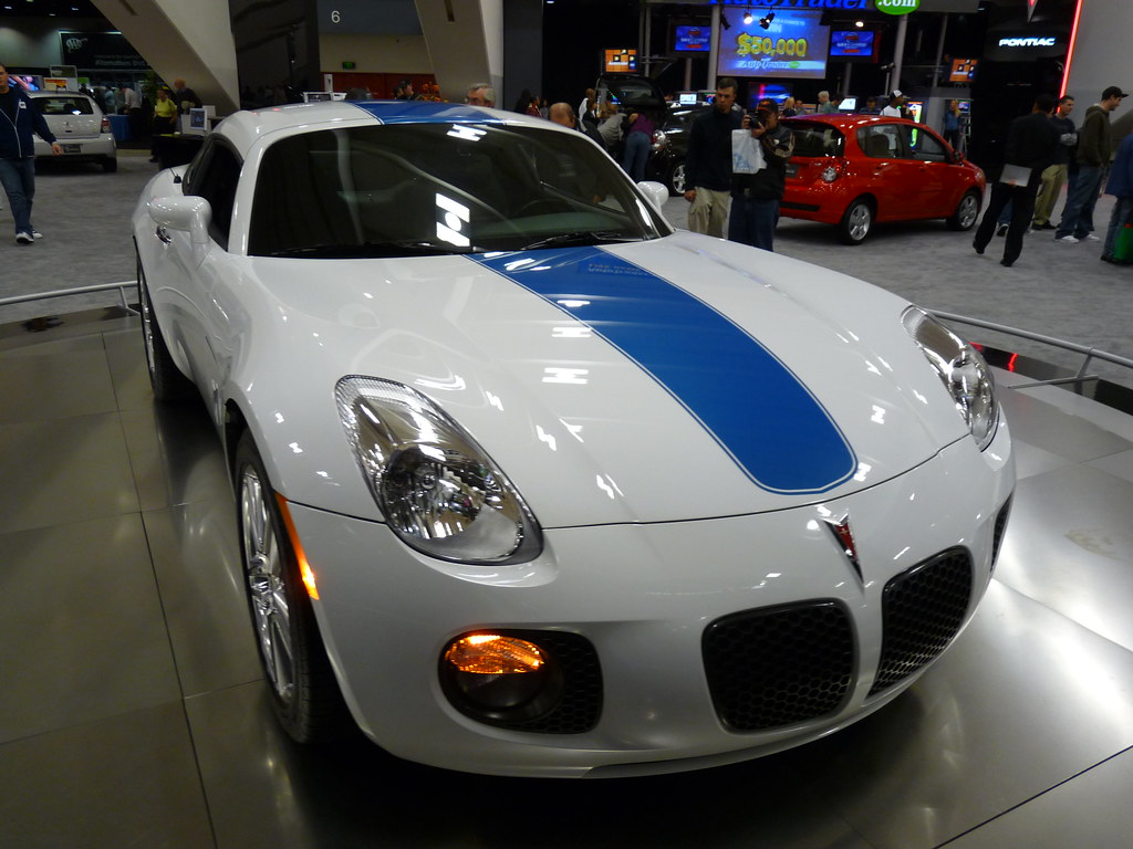
3. **The Pontiac Solstice Coupe’s Vanishing Roof Panel Storage**The Pontiac Solstice and its sibling, the Saturn Sky, were presented as “great ideas” – sleek, sporty roadsters that promised open-air thrills. And they delivered, mostly. But like many half-baked plans, these cars harbored “aggravating under-considered details.” The most infamous of these, suggested by Lothar, was the perplexing situation of the removable roof panel on the Solstice Coupe.
Here’s the rub: if you wanted to enjoy the coupe with the top down, where exactly were you supposed to put the roof panel? The answer, in a stroke of minimalist (or perhaps nihilist) design, was “there wasn’t any” dedicated storage space in the car itself. That’s right, folks. You could either leave it in place, leave it at home, or, my personal favorite, “leave it at the side of the road to pick up later.”
This bizarre oversight meant that the very essence of a convertible – the freedom to spontaneously drop the top – was utterly negated. It’s a car designed for an open-top experience that essentially says, “Sorry, you can only have that experience if you plan *way* ahead or don’t mind sacrificing your expensive roof.” It’s no wonder “very few left dealer lots” in that configuration, as the practicality meter flatlined with this decision, making it a truly laughable design fail.
Car Model Information: 2007 Pontiac Solstice Base
Name: Pontiac Solstice
Manufacturer: General Motors
Production: 2005–2010,65,724 produced
ModelYears: 2006–2010
Assembly: Wilmington, Delaware
Class: Sports car
Layout: Front-engine, rear-wheel-drive layout#Front mid-engine, rear-wheel-drive layout
Platform: GM Kappa platform
Predecessor: Pontiac Fiero
BodyStyle: Roadster (automobile),targa top
Wheelbase: 95.1 in
Abbr: on
Length: 161.1 in
Width: 71.4 in
Height: 50.2 in
Weight: 2860 lb
Engine: GM Ecotec engine#LE5,GM Ecotec engine#2.0 LNF (Z20NHH Opel)
Transmission: Aisin Seiki,GM 5L40 transmission
Related: Saturn Sky,Opel GT#GT (roadster) (2007–2010),Daewoo G2X
Designer: Franz von Holzhausen,Vicki Vlachakis,Wayne Cherry
Categories: All articles needing additional references, All articles with unsourced statements, Articles needing additional references from March 2025, Articles with short description, Articles with unsourced statements from March 2025
Summary: The Pontiac Solstice is a convertible sports car that was produced by Pontiac from 2005 to 2010. Introduced at the 2004 North American International Auto Show, the Solstice roadster began production in Wilmington, Delaware, starting in mid-2005 for the 2006 model year. It is powered by a naturally aspirated 2.4 L I4 engine, producing 177 hp (132 kW) and 166 lb⋅ft (225 N⋅m) of torque.
The exterior styling of the production Solstice is similar to that of the 2002 Solstice concept that preceded it. Production of the Solstice was to be running before summer 2005, but delays at the Wilmington plant pushed volume production to the fourth quarter. The new hardtop targa top 2009 model was announced in mid-2008. The Solstice uses the GM Kappa platform, which also underpins the Saturn Sky, Opel GT, and Daewoo G2X. It was the brand’s first two-seater since the Pontiac Fiero was discontinued in 1988.
The Solstice was nominated for the North American Car of the Year award and Design of the Year award from the Automobile Journalists Association of Canada (AJAC) for 2006. It was a runaway hit for Pontiac, with 7,000 orders in the first 10 days of availability and 6,000 more orders before winter. Although first-year production was planned at 7,000, GM apologized to customers for delays and increased production, delivering 10,000 by March 1.
Following the 2008 economic recession, GM discontinued the Pontiac division. Production ended with the closure of the Wilmington Assembly plant in July 2009.
Get more information about: Pontiac Solstice
Buying a high-performing used car >>>
Brand: Pontiac Model: Solstice
Price: $16,995 Mileage: 7,712 mi.

4. **Cupholders, Cupholders, Cupholders: The Unsung Fails of the Automotive Interior**We all know them, we all use them, and we all have a strong opinion about them: cupholders. For something so seemingly simple and “essentially a required item in a mainstream vehicle,” the sheer “litany of complaints about poorly-designed cupholders is breathtaking,” as disadvantage got there first points out. It’s a universal struggle, a saga of spilled lattes and awkwardly placed sodas that unites drivers everywhere.
Think about it: too small, too shallow, flimsy, can’t hold a regular drink, breaks, blocks the shifter, launches drinks across the cabin, covers the stereo, overcomplicated, breaks a nail, weird location, “man touching.” The list goes on and on, a truly magnificent collection of petty but persistent annoyances. It’s as if designers sometimes forget that real humans with real drinks in real cups will actually use these things.
It’s a stark reminder that even the smallest details matter. A bad cupholder can ruin your morning commute, scald your lap, or simply make you wish you’d “just hav[en] our coffee at home.” This isn’t just a design mistake; it’s a cultural phenomenon, a testament to how frustratingly simple things can go wrong when common sense takes a coffee break.

5. **Mercedes-Benz’s Biodegradable Wiring Harnesses: A Noble Idea, a Fiery Execution**Now, here’s a design decision that probably started with the best intentions. Mercedes-Benz, the epitome of luxury and engineering prowess, decided to be “thoughtful, conscientious.” Their idea? “Using plastics that will break down so they don’t sit in a landfill until the end of time.” On paper, this sounds like a gold star for environmental responsibility.
However, the execution, as fintail notes, was a “not-so-great idea” when applied to “the rather extreme environment of your average car.” Cars are not gentle places for delicate materials. They’re exposed to heat, cold, vibrations, and various fluids. The result of these noble intentions? Wiring harnesses that broke down *within the car*, leading to electrical failures and, in some cases, catastrophic shorts.
It’s “a bit hard to believe that the sober, rational types at Mercedes could make this call.” This is a prime example of a good intention gone terribly, hilariously wrong in practice. The road to hell, it seems, is paved with biodegradable wiring, turning luxury cars into ticking electrical time bombs and costing owners a fortune in repairs. A round of applause for trying, though!

6. **The Myth of ‘Lifetime Fluids and Filters’: An Engineer’s Folly or Marketer’s Dream?**Next on our list of head-shakers is the concept of “lifetime fluids and filters” in cars. SilverBulletBoxer perfectly captures the confusion: “We have no idea if this is something that the marketing types impose or if engineers sometimes think that they’ve gotten around the inevitable.” Regardless of origin, the result is the same: a profound inconvenience, and often, premature component failure.
Automakers, bless their hearts, sometimes decide that certain components or fluids never need servicing. An “uncleanable filters and undrainable fluids in a car is unforgivable.” This isn’t just about saving a few bucks on maintenance; it’s about ignoring the fundamental physics of wear and tear. Fluids degrade, filters clog, and components inevitably collect gunk. Claiming they last a “lifetime” is akin to saying you never need to change the oil in your frying pan.
Subaru (with screens, especially in the SVX) and Ford (with fluid in automatic transmissions) are called out as particularly “guilty parties.” The consequence? Entire transmissions and other vital systems failing because of a design philosophy that denies reality. It’s a hilariously short-sighted approach that screams, “Let’s pretend entropy doesn’t exist!” and then leaves the unsuspecting car owner with a very expensive repair bill, all for the sake of a marketing buzzword.

7. **The Era of Overly Minimalist, Screen-Dominated Cabins: A Distracting ‘Feature’**Welcome to the modern automotive age, where physical buttons are an endangered species and screens reign supreme. This is arguably “the most egregious of the current automotive trends,” and a source of collective exasperation for many. We get it, technology is cool, and smartphones are everywhere. But do our cars “need to be smartphones on wheels”? Absolutely not, and it’s a design trend that’s both “unnecessary, distracting and cheap.”
Instead of tactile buttons and intuitive dials, we’re now greeted by “fingerprint-covered screen[s] everywhere I look” in supposedly luxurious vehicles. Adjusting simple things like climate controls or air vents through a touchscreen is “cumbersome at best, dangerously distracting at worst.” Studies show that drivers prefer physical controls because, surprise, they’re safer. You can feel a button without taking your eyes off the road.
This isn’t innovation; it’s a “clear cost-cutting measure disguised as high-tech bliss.” While a configurable digital gauge cluster and a decent-sized center screen can be great, relegating *everything* to a touchscreen is a step backward in usability and safety. It’s a prime example of “fixing things that aren’t broken,” sacrificing ergonomic interior design for a sleek, but ultimately frustrating, digital facade. Luxury, it seems, has become less about “leather, wood trim and metal” and more about endless swiping and tapping, making us all yearn for the satisfying click of a simple knob.
Alright, internet, if you thought the road was paved with questionable design decisions, wait until you see what awaits us in our everyday lives! We’ve navigated the treacherous terrain of automotive blunders, but now it’s time to pull over and gaze in bewildered awe at some of the most hilariously bad designs found in homes, public spaces, and even on your favorite products. Get ready for more head-scratching, belly-laugh-inducing moments as we continue our journey through the absurdities of the design world.

8. **The Playground That Becomes a Puddle**You know, kids love playgrounds. They’re a place of boundless energy, scraped knees, and dreams of soaring high on the swings. But what happens when the very place designed for joyful frolic transforms into an impromptu swimming pool? We’re talking about that special kind of design genius that places a playground *in a hole*, ensuring it “fills with water when it rains.” It’s less a playground and more a miniature, accidental moat, perfect for… well, not playing, unless you enjoy squelching in soggy shoes.
Imagine the grand opening: balloons, happy children, maybe a local dignitary cutting a ribbon. The sun is shining, all is well. Then, the inevitable happens. A perfectly normal rain shower turns the entire play area into a retention pond. Are the swings now submerged? Is the slide a water chute leading to a muddy splash? It’s a hilarious oversight that makes you question the very foundations of urban planning. Who looked at that dip in the land and thought, “Ah, yes, prime real estate for a children’s play space!”?
It’s truly a masterclass in unintentional water feature creation. Instead of slides and monkey bars, kids are probably building dams out of sand and sticks, converting a space meant for dry play into an aquatic adventure zone. It’s almost as if the designers wanted to teach children about hydrology firsthand, turning their playtime into an unexpected science lesson. One can only hope there are enough rubber ducks to go around when the rain finally decides to grace us with its presence.
This design fail isn’t just inconvenient; it’s a testament to how easily a fundamental environmental factor can be overlooked. You’d think “does it flood?” would be high on the checklist for outdoor public spaces, right after “is it safe?” and “does it have enough swings?”. Clearly, someone skipped that crucial step, leaving us with a playground that doubles as a rainwater harvesting system, much to the amusement (or dismay) of local parents.
Read more about: From Red Carpet to Reading Nook: The Surprising Celebrities Crafting Children’s Book Series

9. **Elevator Buttons From Another Dimension**Alright, prepare yourselves, because you thought you’d seen bad elevator button designs before? Think again. We’ve all encountered those tricky panels where the door close button is bigger than the door open one, or the numbers are arranged in a peculiar order. But then there’s the design that makes you scratch your head, squint, and wonder if you accidentally stepped into a portal to a dimension where logic is purely decorative. This particular elevator button layout is touted as “the crappiest elevator button design you’ve ever seen.” Challenge accepted, but also, challenge *met*.
This isn’t just a minor visual quirk; it’s an active assault on intuition. Elevators are supposed to be straightforward. Press your floor, doors open, doors close. Simple! But when the buttons are arranged in a way that defies all common sense, it becomes a perplexing puzzle. Are the numbers scattered randomly? Is there a secret code to reach the 4th floor? It’s like a game of “Where’s Waldo?” but with your destination at stake, and honestly, who has time for that when you’re just trying to get to your meeting?
The beauty of a truly bad design is how it takes something universally understood and turns it into an enigma. This elevator panel isn’t just poorly laid out; it’s actively working against the user. It forces you to pause, analyze, and potentially make a wrong choice, causing awkward glances or missed floors. It’s a reminder that sometimes, trying to be “innovative” with something as basic as an elevator button can lead to absolute chaos and widespread frustration.
Perhaps the designers of this particular marvel believed they were challenging commuters to engage their brains, to ponder the meaning of spatial relationships before ascending. Or maybe, just maybe, they simply enjoyed watching people struggle with a task that should be effortless. Either way, it’s a hilarious, albeit annoying, example of how a simple interface can go horribly, horribly wrong, making every trip an unexpected adventure.

10. **The Case of the Misleading Multicoloured Sizes**Imagine this: You’re trying to quickly grab the right size item from a multipack box, perhaps some socks or t-shirts. Easy, right? They’re usually sorted by size, or at least clearly labeled. But then you encounter this masterpiece of packaging, which makes you exclaim, “Couldn’t figure out why I kept grabbing the wrong size out of the multipack box… Then Realized All 3 Sizes Come In All 3 Colors!” And just like that, a simple task becomes a bewildering quest.
This isn’t just a minor inconvenience; it’s a hilarious bait-and-switch. You naturally associate different colors with different sizes in a multipack, a mental shortcut that good design usually facilitates. But this product actively dismantles that expectation, creating pure, unadulterated confusion. It’s like a mischievous prank played by the packaging department, ensuring that every time you reach for a specific size, you’re forced to double-check, and then triple-check.
The sheer audacity of this design choice is what makes it so comical. It goes against every instinct ingrained in us by years of interacting with logical product packaging. Why would you offer three sizes *and* three colors, only to mix and match them completely? It feels like an advanced test of observation, or perhaps a secret initiation rite for owning this particular brand. You’re not just buying a product; you’re buying into a lifestyle of perpetual uncertainty.
This kind of oversight, where perceived visual cues are completely decoupled from actual product attributes, is a goldmine for design fails. It highlights a complete lack of user-centric thinking, prioritizing… well, what exactly? Aesthetic variety at the expense of functionality? Whatever the reason, it’s a perfect example of how a seemingly small decision in packaging can lead to a daily dose of “facepalm” for consumers, turning a mundane purchase into an unexpectedly entertaining struggle.
11. **The Oven Knobs of Doom**Here’s one that probably started with a sleek, minimalist vision and ended with singed fingertips and discolored controls. Picture an oven with its “Vents Directly Onto The Knobs, Making Them Discolored And Burning Hot To The Touch.” It’s a design that actively punishes you for, you know, *using* the oven! It’s like a tiny, domestic dragon guarding the temperature settings, ready to unleash a fiery breath upon your unsuspecting digits.
The problem here isn’t just aesthetic damage; it’s a legitimate safety hazard disguised as an unfortunate byproduct of modern appliance design. You’re trying to adjust the oven to bake those delicious cookies, and instead, you’re playing a dangerous game of “hot potato” with the controls. It’s a prime example of form completely obliterating function and common sense. Who tested this and thought, “Yeah, this is perfectly fine for human interaction”?
One has to wonder about the design process. Did they prioritize a certain look, perhaps a flush front panel, over the basic principle of “don’t make things that get burning hot touch things that people need to touch”? It’s the kind of oversight that leads to daily micro-frustrations, accumulating into a hilarious, yet exasperating, user experience. Every time you preheat, you’re not just cooking; you’re bracing for an encounter with the fiery knobs of doom.
This isn’t some obscure, rarely used feature. We’re talking about the primary interface for a kitchen appliance! It’s a stark, scorching reminder that good design isn’t just about looking good, but about being safe, intuitive, and not actively painful to use. The discolored knobs serve as a permanent monument to this design blunder, a badge of shame for an oven that clearly never got the memo on user safety.

12. **The Wheelchair Accessible Bridge with a Pole Problem**Accessibility is a cornerstone of thoughtful public space design, ensuring everyone can navigate and enjoy shared environments. So, when you encounter a “Beautiful Hardwood Bridge We Built At Work. Wheelchair Accessible. Comes With A Nice Steel Pole Almost Smack Bang In The Middle,” you can’t help but let out a hearty, bewildered laugh. It’s an epic fail that screams, “We tried! Almost!” turning a noble intention into a comedic obstacle course.
This isn’t just ironic; it’s a full-blown paradox. A perfectly lovely, supposedly accessible bridge, rendered inaccessible by a strategically (or rather, unstrategically) placed steel pole. It’s the kind of design decision that makes you wonder if the architects were playing a cruel joke, or if there was a profound communication breakdown somewhere along the line. “Yes, wheelchair accessible! But also, a challenging boss fight in the middle!”
The frustration it must cause is immense, but from a distance, the absurdity is undeniably funny. It’s a monument to the phrase, “common sense says let’s move the bridge,” which was, apparently, ignored. This steel sentinel stands guard, mocking the very purpose of the bridge, turning a path of ease into a path of “figure it out, buttercup.” It’s an unfortunate symbol of how even the best intentions can be derailed by a spectacular lack of foresight.
It’s a testament to how design isn’t just about individual components, but how they interact within a larger system. The bridge is great, the pole is fine on its own, but together, they form a hilariously dysfunctional duo. This design fail perfectly encapsulates the bizarre outcomes when design logic takes a vacation, leaving us with a beautiful structure that’s almost, but not quite, what it claims to be. A truly head-scratching, belly-laugh-inducing blip in public infrastructure.

13. **Formaldehyde, Anyone? A Refreshing Drink Choice!**Product labeling is crucial. It tells you what you’re buying, what’s inside, and generally, that it won’t kill you. So, when a product’s design makes you question the very contents, it’s a special kind of hilarious disaster. Enter the “Who Wants A Nice Cold Formaldehyde Beverage? Someone Didn’t Think That Chemical Formula Through…” This is less a drink and more a chemical experiment gone wrong on the supermarket shelf.
The designers, bless their hearts, probably thought they were being clever, incorporating scientific elements into their branding. But when your chosen chemical formula, “CH2O,” happens to be the well-known formula for formaldehyde – a chemical used for preserving biological specimens, among other things – you’ve got a problem. A very, very funny problem. It transforms a potentially refreshing beverage into something that screams “do not ingest!”
This isn’t just a misstep; it’s a scientific comedy show in a bottle. It’s the kind of graphic design oversight that makes you question how many eyes reviewed this before it went to print. Did no one in marketing, or even the chemical-themed art department, have a basic chemistry class? It’s a hilarious blunder that instantly makes the product unforgettable, for all the wrong, slightly terrifying, reasons.
It serves as a brilliant example of why context and accuracy matter deeply in design, especially when dealing with technical information. What might have started as an edgy, scientific aesthetic quickly devolves into a warning label of epic proportions. So, next time you’re thirsty, maybe double-check those chemical formulas, lest you end up with a drink that promises to preserve you for eternity, rather than refresh you. Cheers to that design fail!
14. **The Geometry Set’s Geographical Blunders**Oh, the humble geometry set! A beacon of precision, logic, and mathematical accuracy, meant to guide young minds through the wonders of shapes and measurements. But what happens when that very tool of precision is riddled with inaccuracies so glaring, they become hilariously bad? We’re talking about a geometry set that “Comes With This Map Of The World That Has So Many Countries Spelt Incorrectly. I Don’t Know What Country Yogo Is In Europe, But It’s There. Panama Is Spelt Banama, But I Suppose They Do Grow Bananas There. Vietnam Is Shown As An Island.”
This isn’t just a spelling mistake; it’s a cartographical catastrophe and a linguistic laugh riot! A map meant to educate is instead propagating an entirely new, fictional geography. “Yogo” in Europe? “Banama” where Panama should be? Vietnam suddenly an island? It’s less a map and more a parallel universe’s atlas, presented as an educational tool. The irony is so thick, you could cut it with one of the set’s (hopefully correctly labeled) rulers.
The humor lies in the profound disconnect between the product’s purpose and its execution. A geometry set should embody accuracy, yet here it is, proudly displaying a world that exists only in the wildest dreams of a very confused cartographer. It’s a design fail that doesn’t just miss the mark; it misses the entire continent, then sails right off the edge of the flat earth it’s probably depicting.
This is a stark reminder that attention to detail isn’t just good practice; it’s absolutely essential, especially when your product is designed for learning. It’s a hilarious, if slightly worrying, example of how easily factual information can be butchered in the design and production process, leaving us with educational tools that are more likely to spark geographical debates than mathematical breakthroughs. Who knew a geometry set could be such a source of international intrigue and amusement?

15. **The Unbalanced Pan of Peril**Last but certainly not least, we delve into the realm of kitchen nightmares, where even the simplest tools turn against you. We’re shining a spotlight on “Unbalanced Pan… Only Stands Correctly When There Is Weight In It – Pretty Annoying And Even Dangerous With Hot Oil.” This isn’t just a quirky kitchen accessory; it’s a culinary tightrope walk, a utensil designed to keep you on your toes (and potentially burn them).
This is a pan that embodies passive aggression. It refuses to stand upright unless bribed with ingredients, making prep work a precarious dance. Imagine pouring hot oil into this contraption, only for it to tip precariously the moment you let go, sending sizzling liquid towards your countertops, or worse, your limbs. It’s a hilarious, yet genuinely hazardous, design choice that makes you wonder if the manufacturers ever actually tried cooking with their own product.
The irony is rich: a cooking vessel that only achieves stability *after* you’ve committed to filling it, usually with something hot and potentially dangerous. It’s a fantastic example of a fundamental design flaw that could have serious consequences. Who needs an adventurous cooking show when your own pan is providing all the unexpected drama and potential injury? It turns meal prep into an extreme sport, and for that, we applaud its sheer, unadulterated absurdity.
This design fail is a powerful reminder that basic functionality and safety should never be compromised for novelty or, in this case, a complete oversight. It’s a pan that constantly challenges you, demanding commitment and defying gravity, all while threatening to unleash a cascade of culinary chaos. It’s a perfect capstone to our list, showcasing how even the most mundane household item can harbor a hilariously bad design that keeps on giving – usually, a headache.
Read more about: Engineering Eyesores: 14 Ford Models with the Most Confusing and Awful Styling of All Time
And there you have it, folks! From automotive head-scratchers to everyday items that just refuse to make sense, we’ve journeyed through a veritable hall of fame for hilariously bad product designs. Each one, in its own glorious way, reminds us that while perfection is elusive, comedy is abundant, especially when common sense takes a coffee break. These aren’t just mistakes; they’re viral sensations waiting to happen, sparking debates, shared laughs, and an undeniable appreciation for the things that actually, you know, *work*. So next time you encounter a design that makes you want to pull your hair out, take a deep breath, snap a pic, and remember: you’re not alone in your bewilderment. We’re all in this wonderfully, chaotically designed world together, trying to navigate through the absurdities, one poorly placed pole or formaldehyde-labeled beverage at a time. Keep your eyes peeled, because the next viral design fail might just be around your corner!


