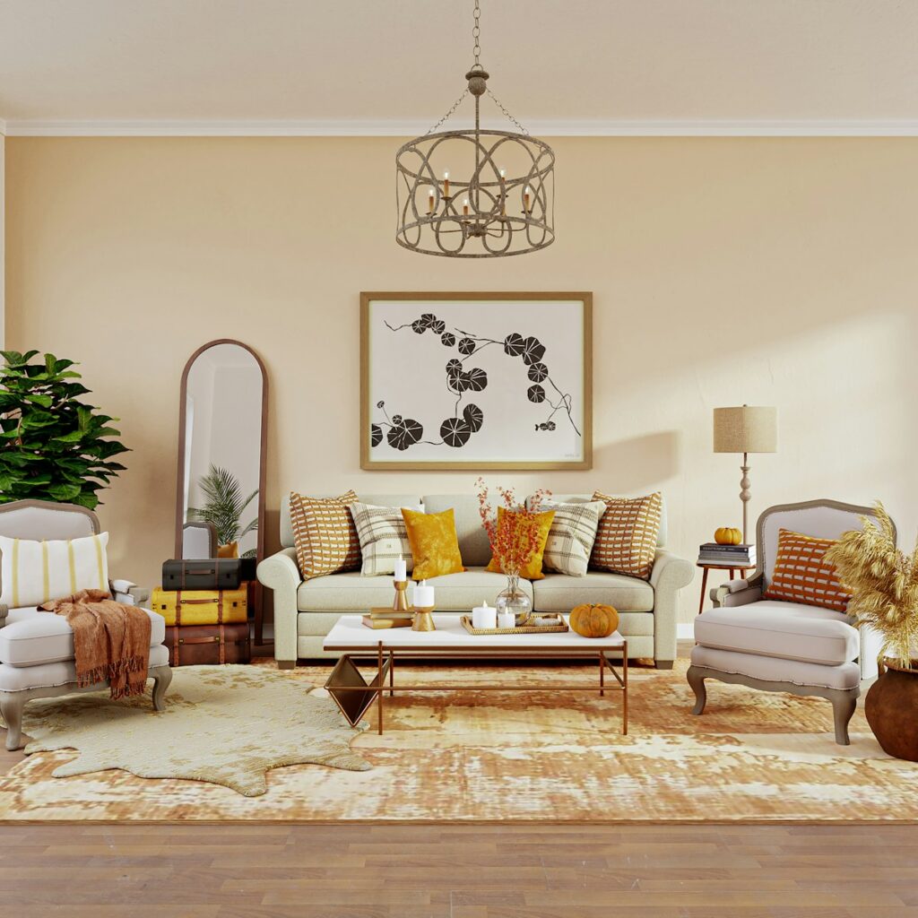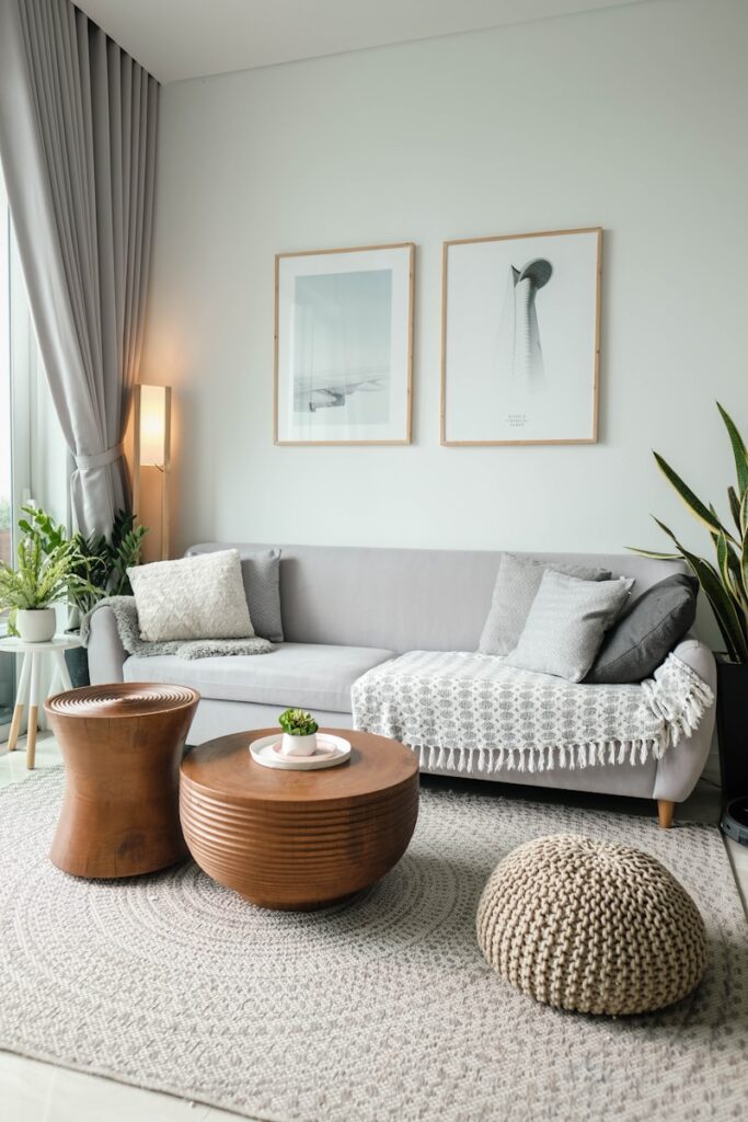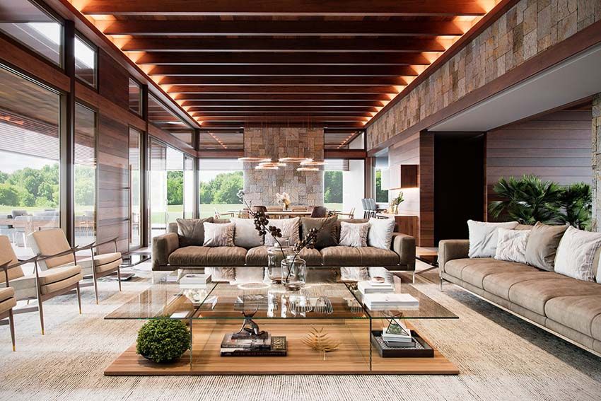
The living room, often hailed as the heart of the home, is where life truly unfolds. It’s the backdrop for cherished family gatherings, the quiet sanctuary for a moment of peace with a book, or the vibrant hub for entertaining friends. As an interior decorator with years of experience, I’ve seen countless spaces, and I understand that crafting a living room that feels both beautiful and deeply personal is an art.
Yet, despite its central role, the living room is also a place where design mistakes can easily creep in, turning what should be a comfortable, inviting haven into something that feels off-kilter or less than ideal. With so many choices in styles, colors, and materials today, it’s completely understandable to feel overwhelmed or unsure about making the right decisions for your space. My goal, always, is to help clients create rooms they’ll genuinely love, spaces that are functional, gorgeous, and truly reflective of who they are.
That’s why I’m pulling back the curtain today to share my insider perspective. Consider this your definitive guide to the major ‘don’ts’ when it comes to living room decorating. These are the 7 key elements or practices that, as an expert, I would unequivocally never incorporate into my own living room design, ensuring it remains a place of genuine comfort, style, and enduring appeal.

1. **Overcrowded Spaces** First on my list of absolute no-gos is an overcrowded living room. It’s a common misconception that more items equate to more personality or luxury. In reality, jamming too many pieces into a space creates a cramped, chaotic, and ultimately uninviting atmosphere. Less truly is more when it comes to cultivating a sense of calm and visual clarity in your home.
Clutter, in particular, is my biggest pet peeve. All it does is create chaos for the eye, and frankly, a chaotic home can significantly impact your mental state, leading to stress. Instead of stuffing every available surface and corner, a well-designed living room prioritizes quality over quantity, segmenting the space effectively for natural movement and allowing carefully chosen statement pieces to truly shine.
To avoid this pitfall, I always advocate for strategic editing and smart storage solutions. Baskets with lids are fantastic for discreetly hiding things you don’t want on display, while built-in cabinets can store a surprising amount of items, keeping surfaces clear and the room feeling open and airy. A few minutes each day picking things up and putting them away can make a huge difference in maintaining that serene, uncluttered look.
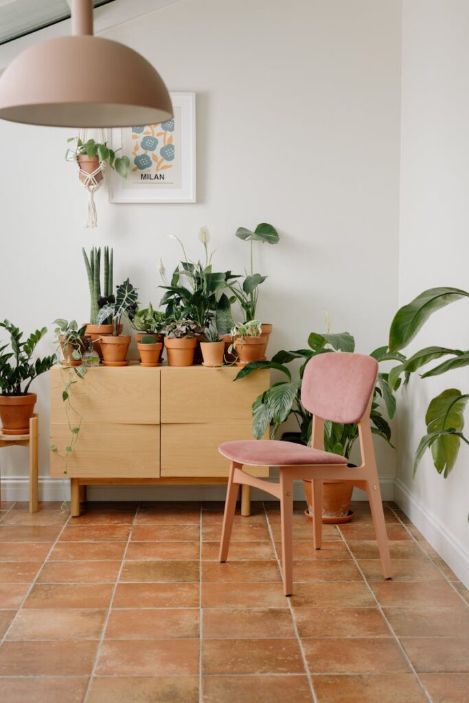
2. **Unbalanced Proportions and Scale** Imagine a massive, sprawling sofa squeezed into a tiny living room, or conversely, a compact, almost lost sofa sitting forlornly in an expansive, 18x24ft space. It feels incredibly odd, doesn’t it? This visual discord, stemming from a disregard for correct proportions and scale, is another major mistake I’d never make. Furniture size is fundamentally important when planning your room’s layout, as it dictates how comfortable and cohesive the space feels.
If you have a very large room populated by tons of small furniture, the room will inevitably look cluttered and chaotic, lacking any visual anchor. Conversely, if a small space is overwhelmed by oversized furniture, it will feel cramped, hindering easy movement and creating an oppressive atmosphere. The key is to achieve a balanced and harmonious arrangement that allows for comfortable movement and visual appeal, ensuring furniture doesn’t overpower the room.
This principle extends to artwork as well. A small piece of art hung on a vast, blank wall will look, quite frankly, ridiculous. As an insider, I believe bigger is often better when it comes to wall art. For a large wall, consider a substantial single piece or a thoughtfully curated gallery wall, where multiple smaller pieces come together to create the impactful look of one large artwork. When placing art above furniture, a good rule of thumb is that the artwork, or grouping of art, should be approximately two-thirds the width of the furniture piece below it.

3. **Furniture Pushed Against Walls** A common default, especially for beginner decorators, is to push all furniture pieces flat against the walls. Yet, this is a practice I would always steer clear of in my own home. While it might seem like a way to maximize floor space, it often makes a room feel awkward, stiff, and less inviting. It can create an unappealing ‘bowling alley’ effect, where the center of the room feels empty and unused.
Instead, I always encourage pulling a few pieces out from the walls, giving your furniture some much-needed breathing room. This simple adjustment instantly transforms the dynamics of the space, making it feel more cozy and intimate, particularly when creating conversation areas. For instance, positioning a couch in line with the edge of a fireplace can open up a natural walkway behind it, connecting different zones of the home like a breakfast nook or kitchen.
Pulling furniture into the room helps define distinct zones and fosters a more comfortable and engaging conversation area. Adding a console table behind a floating sofa is another brilliant touch; it not only grounds the furniture but also offers practical functionality for decor, electronics, books, and even additional lighting, enhancing both style and usability.
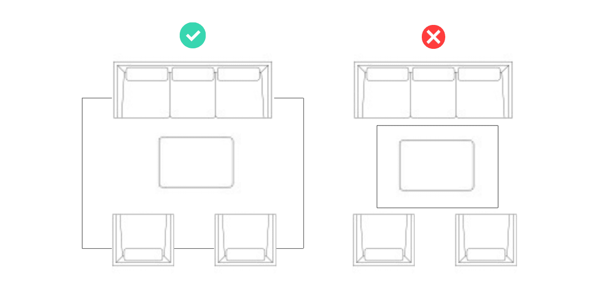
4. **Incorrect Area Rug Sizes** While adding an area rug is a fantastic idea for pulling a living room together and defining a space, the size of that rug is absolutely critical – and getting it wrong is a mistake I’d actively avoid. An undersized rug can make a room look disjointed and incomplete, almost as if it’s floating aimlessly within the space rather than grounding it.
Area rugs are superb for connecting all the furniture within a conversation area, creating a cohesive zone for you and your guests. If you have hardwood or tile floors, a well-sized area rug can instantly soften the space, adding warmth and texture, which is particularly beneficial for homes with young children. Even in carpeted open-plan layouts, a rug can clearly define the living room space, giving it purpose and boundaries.
My golden rule for area rugs is straightforward: ensure at least the front legs of all major furniture pieces are on the rug. Ideally, it’s even better to have the entire piece on the area rug, but this isn’t always feasible. What you absolutely must avoid is a rug so small that it sits like a postage stamp in the middle of the room, barely touching any furniture. Do not go smaller than the ‘front legs on’ rule, as it undermines the rug’s purpose and makes the room appear haphazard.
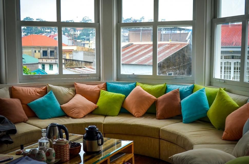
5. **Matching Sofa Pillows** When you purchase a new sofa, it almost invariably comes with a set of matching pillows. And here’s an insider tip: I would never, ever use them. While they might seem like a convenient bonus, these ‘matchy-matchy’ pillows are an instant giveaway that a room hasn’t been truly designed. They lack personality, creativity, and detract from the opportunity to create a layered, sophisticated look.
The primary reason to ditch them is simple: they offer no visual interest. A well-designed living room thrives on texture, pattern, and subtle variations that add depth and character. Matching pillows, by their very nature, flatten the aesthetic and make the sofa feel uninspired. They don’t contribute to the nuanced, curated feel that truly elevates a space.
Instead of settling for the factory-issued pillows, invest in a few pillow covers in different patterns, textures, and even shapes. Pillows can be relatively inexpensive, making them a fantastic way to introduce pops of color, seasonal updates, or simply to express your unique style. Layering them, perhaps with an accent color repeated elsewhere in the room, makes your space look far more sophisticated and thoughtfully put together.
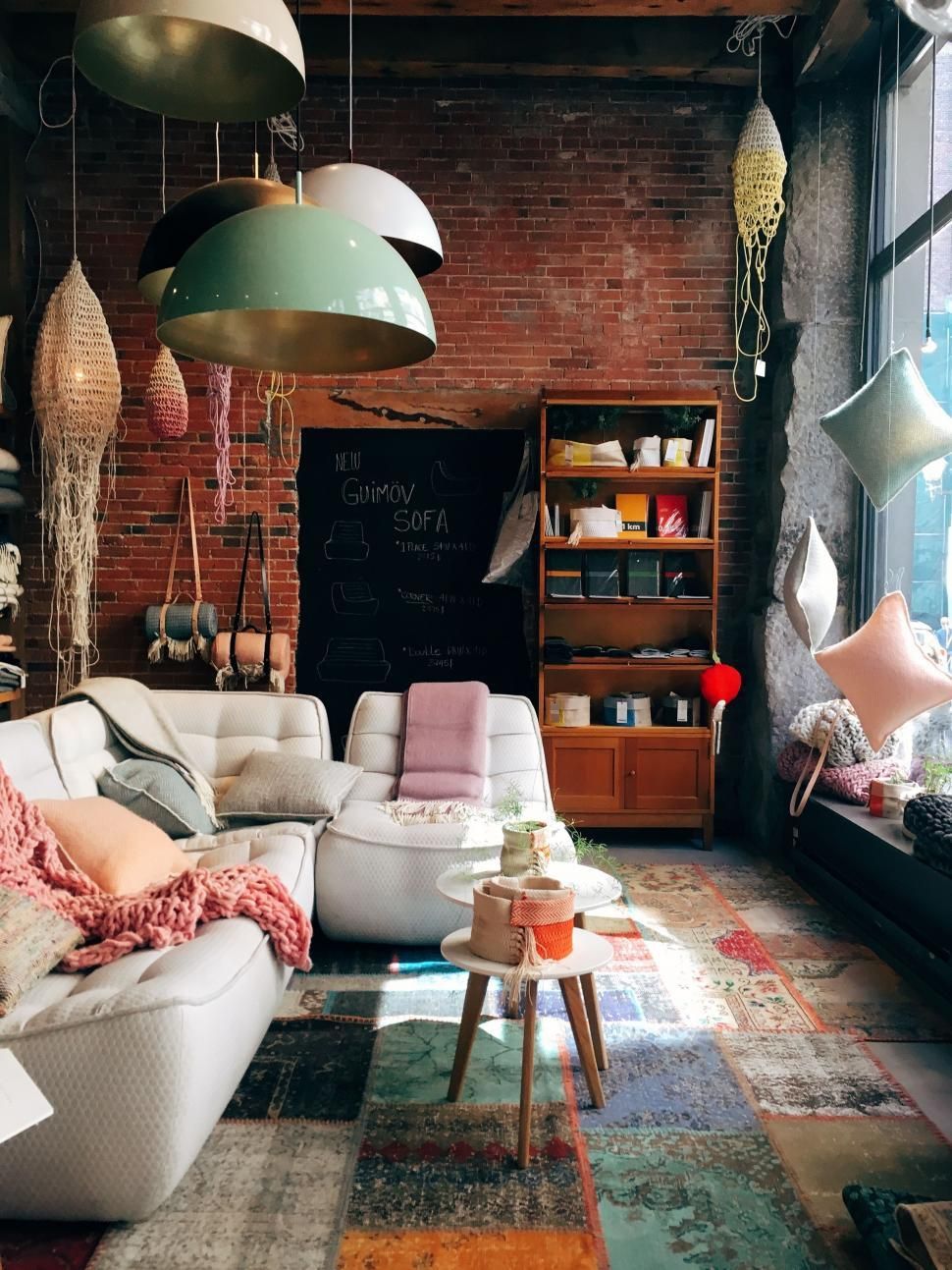
6. **Full Matching Living Room Sets** This follows closely on the heels of matching sofa pillows, but it’s a larger, more impactful ‘don’t’: I would never buy an entire matching living room set—meaning a sofa, loveseat, armchair, or recliner, all in the same style and fabric. While it might seem like an easy way to furnish a room, it’s just not a good look and screams ‘undesigned.’
There’s an exception: if you’re buying two sofas that will face each other in a large room, having them match can create beautiful symmetry and a sense of balance. As a ‘symmetry girl’ myself, I appreciate this. However, when multiple different pieces like a sofa, loveseat, and armchair all match, the room loses all interest and character. It ends up looking flat, generic, and uninspired, lacking the layered depth of a truly curated space.
A well-designed room achieves interest through a thoughtful mix of pieces. Having your armchairs be distinctly different from your sofa, perhaps in a complementary fabric or style, gives your room a more designed and bespoke appearance. It allows each piece to contribute individually to the overall aesthetic, fostering a rich, multi-dimensional look that feels professional and inviting. This approach adds intrigue and visual dynamism, transforming the room from merely furnished to truly decorated.
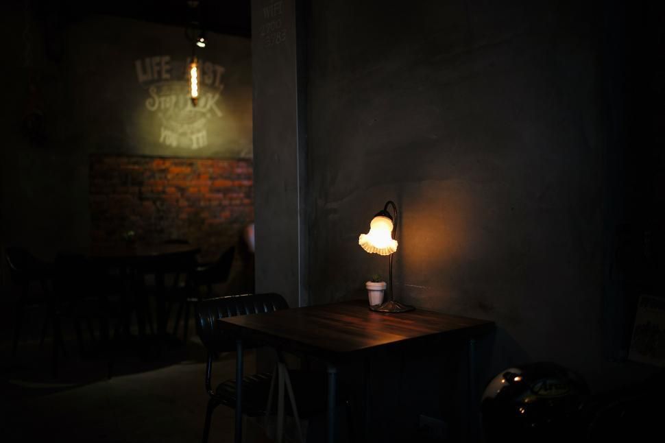
7. **Poorly Lit Rooms / Single Lighting Type** Finally, a significant oversight I would never permit in my living room is neglecting proper lighting or relying solely on a single type of light source. Lighting is absolutely transformative, and a poorly lit room — or one that only has, say, overhead lights with no windows — feels instantly uninviting, flat, and often, quite unfunctional. As someone who truly ‘lives’ in their living room, using it for everything from work to relaxation, I know how crucial good lighting is.
What I mean by ‘good lighting’ is a layered approach. You need a mix of overhead lighting for general illumination, task lighting for specific activities like reading or cross-stitching, and accent lighting to highlight features and create mood. A beautiful chandelier can make a huge impact on overall brightness and style, while floor lamps can banish dark corners, and table lamps provide that perfect, focused glow for tasks. Dimmer switches are also a decorator’s best friend, allowing you to control the ambiance for any occasion.
The lack of varied lighting leaves a room feeling cold and uninviting, especially during darker hours. Incorporating wall sconces, floor lamps, and table lamps alongside overhead fixtures creates a dynamic, multi-dimensional lightscape. This strategic layering ensures your living room is not only perfectly illuminated for any activity but also exudes a warm, welcoming, and sophisticated atmosphere, making it a truly enjoyable space at any time of day or night.
Now, let’s explore the strategic nuances and subtle details that truly distinguish a thoughtfully designed living room from one that merely exists. These are the additional seven traps I’ve learned to unequivocally avoid, delving beyond basic arrangements into the long-term impact of color, texture, trends, and the underlying flow of your space. As an insider, I’m here to ensure your living room is not just functional, but genuinely inspiring and reflective of your unique style, enduring the test of time and daily life.
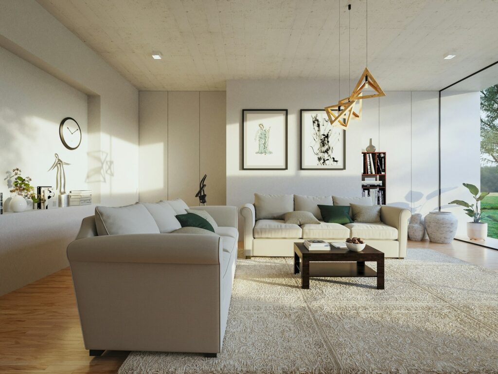
8. **Blindly Following Fleeting Trends**Trends, by their very nature, are transient. As an interior decorator, I would never succumb to the temptation of blindly following every passing trend in my own living room. While it’s great to be aware of what’s current, like the resurgence of vintage lighting or the popularity of sunset metallics in 2025, building your entire design around them can lead to a space that feels dated surprisingly quickly. The context explicitly states, “Trends come and go, and following any particular trend makes your space feel outdated once it is out of the market.” My approach is always to create a space that feels timeless, personal, and genuinely reflective of the homeowner, rather than a temporary showroom.
The real trick is to incorporate elements that you genuinely love, that resonate with your personal style, and that contribute to a feel-good space. While modern interior design ideas for 2025 highlight things like “cuddly furniture,” “even more curves,” and “flowy, organic modern style,” these are concepts that speak to comfort and a natural feel—elements that have a longer shelf life than a specific pattern or color craze. Focus on the underlying philosophy, such as embracing lifestyle concepts that enhance mental wellness, rather than chasing short-lived fads.
Instead of a wholesale adoption of every new “in” thing, consider integrating trendy elements in small, easily changeable ways. For instance, splashes of color are back in fashion and can be “as free-spirited as it gets,” allowing you to “refresh your modern house interior in 2025 with modernized classic patterns” and “decorate the room with vibrant color flashes and unexpected scales.” This allows you to nod to current aesthetics without committing to something that will feel obsolete next year, ensuring your living room remains a cherished space that evolves with you.
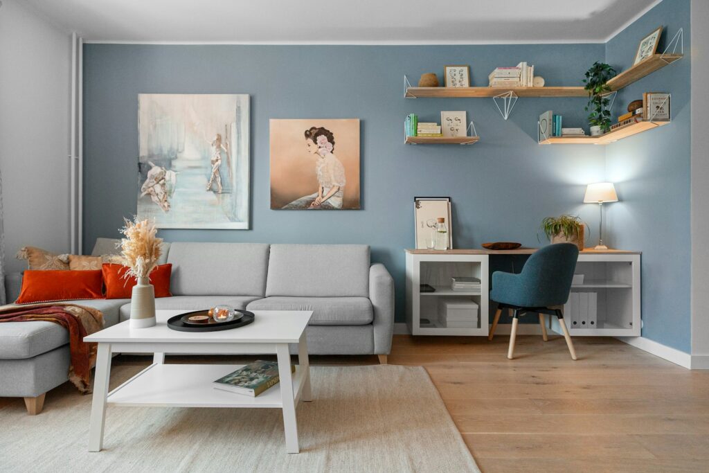
9. **Uncurated or Poorly Scaled Wall Decor**My living room would never suffer from messy or neglected walls, nor would it host artwork that fails to meet proper scale. While it might seem like a minor detail, the strategic placement and sizing of wall decor are crucial for a cohesive and sophisticated space. The idea that “Home decor or living room decor is fine, but not stuffing the wall” is paramount. A well-designed room isn’t about filling every blank space, but rather about thoughtful curation that resonates with the room’s overall theme and avoids a congested, chaotic look.
When it comes to artwork, the principle is clear: “Neglect scale for artwork,” is a definite don’t. A small piece of art hung on a vast, blank wall will look “ridiculous,” undermining its purpose and drawing attention to the wrong elements. Conversely, if you have a large wall, “consider a gallery wall. It is a great way to add lots of small pieces to make the look of one large piece.” This transforms a potential design pitfall into an opportunity for impactful visual interest.
A key guideline I always follow is that if artwork is placed above furniture, “your art, or grouping of art, should be 2/3’s the width of your piece of furniture.” This “2/3 rule” ensures a harmonious relationship between the art and the furniture below it, preventing either from looking out of place. It creates a visually grounded and balanced arrangement. Furthermore, not every wall needs art; “If you have a small wall you don’t have to hang anything on it. Sometimes having too much on the walls can make a room feel cluttered.” It’s about intentionality and balance, not simply filling space.
10. **Ignoring Strategic Color Planning**I would never dive into decorating my living room without a clear, strategic color plan, especially by picking paint colors first or ignoring foundational color rules. This is a trap many beginners fall into, leading to disjointed or unharmonious results. The advice is direct: “Don’t select wall paint colors at the paint store!” The hue on a small chip looks “entirely different” in your home due to varying light conditions. A crucial step is to “Buy a small test sample and test it in your room before painting all the walls.” This practical tip saves both time and potential disappointment, ensuring the chosen color truly complements your space.
A common oversight is failing to consider the fixed elements of a room before selecting paint. “Don’t pick your paint color first. Your flooring, countertops and other fixed elements in a room need to be selected first.” These existing elements dictate the underlying palette, making it easier to choose a paint color that seamlessly integrates rather than clashes. This methodical approach ensures your color choices build upon the room’s existing foundation, creating a cohesive backdrop.
To create a truly pulled-together look, employing a coherent color strategy is essential. “Do repeat your accent color a few times in a room to make it look pulled together.” This ties the different elements of the room together, providing visual rhythm and unity. The context also hints at the “60-30-10 color rule design tip to choose the right colors that balance and flow,” though the specifics of this rule aren’t detailed, the emphasis is on strategic application for balance. Modern design trends for 2025 are embracing “Pastel & Muted Shades” for a “calming and tranquil space,” or “Splashes of Color” which can “wind around woodwork or break up segments of space.” These demonstrate the versatility of color when chosen and applied thoughtfully.
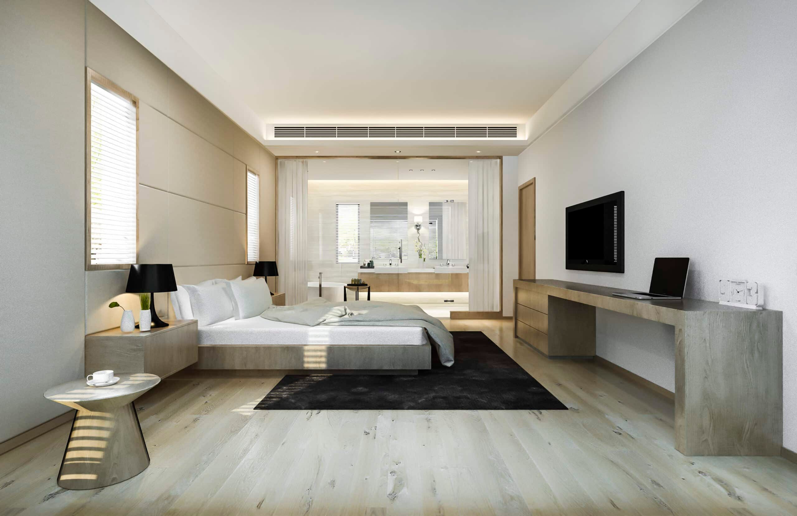
11. **Rooms Without Intentional Contrast**A living room of mine would certainly never lack intentional contrast. This isn’t just about adding pops of color; it’s about strategically introducing elements that provide visual interest and prevent a space from feeling monotonous or flat. The expert advice is clear: “Do add some black into every room for some contrast and interest.” Black, even in small doses through accessories or picture frames, “adds sophistication and it also grounds a room.” It creates a visual anchor, preventing the room from appearing too light or airy without definition.
While the article emphasizes the importance of a limited color palette thriving on “proper shading” and “tactical use of negative space” for depth, true dynamism comes from contrast. Whether it’s through “matte red and green clay ceramics” against lighter tones, or the fusion of “futuristic tech with roots from yesteryear” as seen in cyberpunk influences, deliberate opposition in design elements keeps the eye moving and engaged. It’s about balancing different textures, shades, and forms to add intrigue.
For example, even subtle touches can make a difference. The expert mentions having “black accessories for my fireplace and a black clock above the stone fireplace mantel,” alongside “black frames around my TV.” These seemingly minor details collectively contribute to a sophisticated and grounded feel, proving that contrast doesn’t require dramatic statements. It’s about thoughtful layering and ensuring that every element contributes to a rich, multi-dimensional aesthetic, preventing the room from feeling one-note or bland.
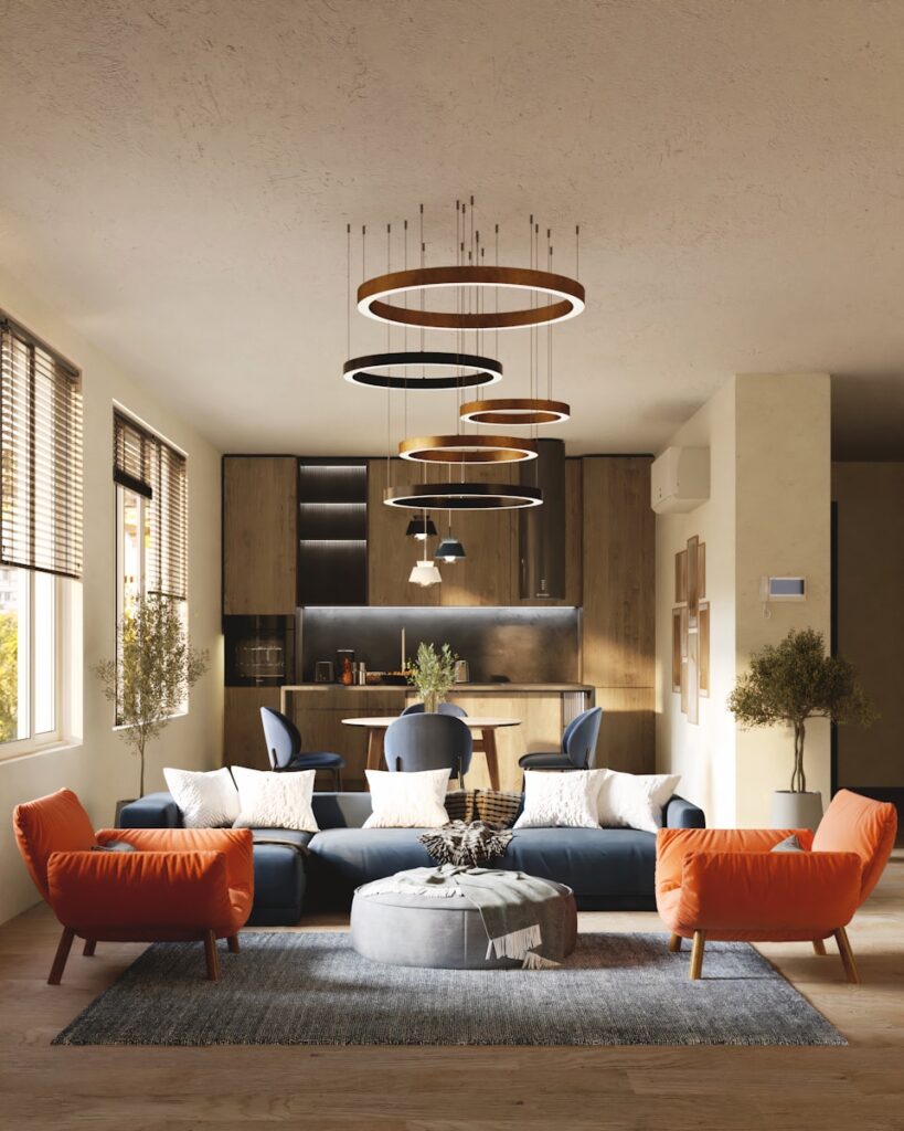
12. **An Uncomfortable or Uninviting Atmosphere**My living room would never be a place where comfort takes a backseat. It’s the ultimate ‘don’t’ to create a space that feels cold, stiff, or unwelcoming. The very essence of modern interior design, particularly for 2025, emphasizes “Feeling Good Spaces” and concepts that “enhance the mental wellness of its residents as much as their physical comfort.” This means prioritizing comfort beyond just plush seating, extending to the overall ambiance and tactile experience. “Cuddly Furniture” with “deep cushions and body-embracing shapes” are highlighted as essential for “cocoon[ing] in your private little world.”
To achieve this inviting atmosphere, layering with textures and patterns is paramount. As the context suggests, “To add character and depth to the living room, start layering with textures like rugs, plush cushions, and metallic accents.” These elements soften the space, add warmth, and create a visually rich environment that beckons you to settle in. Think about adding a throw blanket, or selecting materials that feel pleasant to the touch. The goal is to make the room a true haven, a “go-to destination” where “life happens.”
Furthermore, the decorator’s own advice states, “Want your room to feel cozy? Add lots of comfortable textiles to the room!” This underscores the importance of soft furnishings in cultivating a welcoming feel. Beyond physical comfort, a well-designed living room also needs “enough seating space” for guests, perhaps incorporating “ottomans” for additional seating, which also act as “coffee tables, footrests.” Every design choice should contribute to a space where you and your guests can genuinely relax, connect, and enjoy.

13. **Misguided Spending on Furnishings**A significant trap I would actively avoid is making misguided financial decisions when furnishing a living room. It’s not about spending the most, but spending wisely. The expert’s clear advice is to “Do invest in a few quality pieces – especially furniture! – and layer in lesser expensive accents.” This strategic approach ensures the foundational elements of your room are durable and well-made, designed to withstand daily use and provide long-term value. These “workhorses” of the room, like upholstered furniture, are where you should put your money, as they “aren’t cheap” and “it will last longer.”
Conversely, there are specific items where overspending is unnecessary and, frankly, a waste. The decorator advises, “Here are some items that I would not splurge on: throw pillows, throw blankets, area rugs, side tables, accessories, lamps.” The reasoning is practical: side tables, for instance, “get spilled on, dented, and you will want to swap them out often.” Similarly, for “throw pillows opt for just the cover and not the whole pillow” to avoid unnecessary bulk and cost.
This selective approach to spending allows for greater flexibility and easier updates down the line. You can introduce trendy or seasonal elements through these less expensive items without committing to a costly overhaul. This “smart spending on furnishings” ensures your living room is both stylish and sustainable, allowing you to “update your home today” without breaking the bank, by focusing on “small changes like swapping out light fixtures, changing decor, or adding a new accent piece.” It’s about creating a “truly one-of-a-kind” space through intelligent allocation of resources.
14. **Suboptimal Room Flow and Awkward Spacing** A major ‘don’t’ I would always steer clear of is creating a living room with suboptimal flow or awkward spacing. The seamless movement and functionality of a space are just as crucial as its aesthetics. While Section 1 touched on pushing furniture against walls, this delves deeper into the precise relationships between furniture pieces and the overall room. As the expert emphasizes, “Spacing might be one of the most important things when planning your living room layout.”
Specific measurements are vital for a comfortable and functional flow. For instance, “Between a couch and coffee table/ottoman, you need to have 15-18 inches of space. This gives you the ability to walk in between them without bruising up your shins and knees.” For walkways between furniture or furniture and a wall, “you need 24-36 inches of space,” ensuring easy passage. Even between two side chairs, “you should leave 24-48 inches in between them,” which also conveniently provides space for a small side table.
Beyond individual measurements, the overall proportion of furniture to the room itself plays a huge role in flow. The “golden rule for home decor” states: “Your furniture should not take up more than 60% of the room or floor space.” Exceeding this can make the room feel cramped and hinder movement, while “Too much less than 60% and your room can feel sparse.” Ensuring this balance creates an open, inviting atmosphere where everything feels harmoniously placed, allowing for effortless movement and genuine comfort, making the living room a truly versatile and enjoyable hub for all of life’s moments.
And there you have it – my comprehensive guide to avoiding the pitfalls that can transform a potential dream living room into a design dilemma. From the fundamental errors of scale and clutter to the more nuanced mistakes of color strategy, trend chasing, and flow, these are the lessons honed over years of designing spaces that truly sing. By steering clear of these ‘don’ts’ and embracing thoughtful, intentional choices, you’re not just furnishing a room; you’re crafting a sanctuary, a vibrant hub, and a personal statement that will bring joy and comfort for years to come. Remember, the heart of your home deserves nothing less than your most discerning eye and expert touch.

