

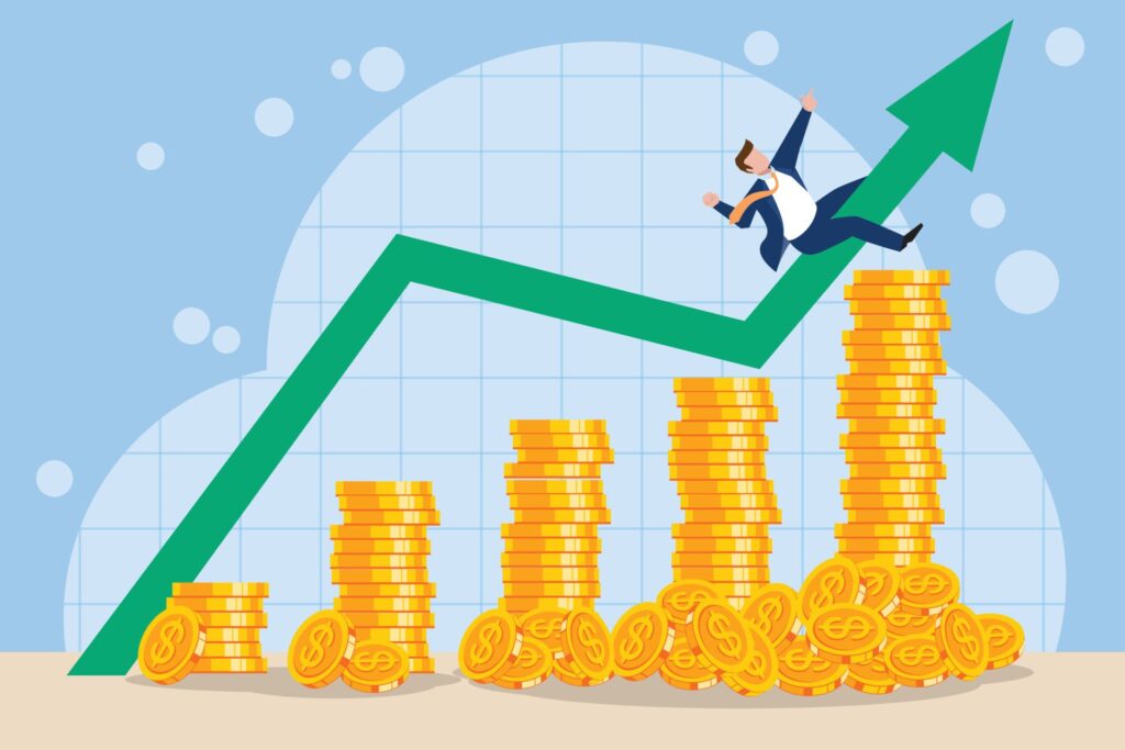
Imagine stepping back to 1970 with a crisp $5,000. What could you buy? Perhaps a shiny new car, a home’s down payment, or plenty of groceries. That $5,000’s purchasing power was dramatically different from today’s, revealing a fascinating tale of economic shifts and rising prices. It truly shows how much the cost of living has changed.
We’re about to dive into money’s real value, focusing on how $5,000 from 1970 depreciated into its 2025 equivalent. This isn’t just numbers; it’s understanding inflation’s powerful, silent force reshaping our economic landscape. From staggering cumulative price changes to nuanced differences across cities and countries, we’ll uncover eye-opening facts.
So, buckle up, we’ll explore what that 1970 dollar *really* meant, and what it takes for similar purchasing power today. Forget buying a car; let’s discuss the economic engine driving those prices. We’ll examine the data, break down figures, and make sense of how a once-substantial sum transformed over five and a half decades.

1. **The $5,000 Question: From Then to Now** Let’s kick off with the big reveal: that solid $5,000 from 1970 now holds dramatically different purchasing power. According to Bureau of Labor Statistics calculations, replicating $5,000 from 1970 in 2025 would require a staggering $41,629.90. That’s a monumental increase, illustrating how much money’s value has shifted over generations.
This isn’t just a quirky historical fact; it’s a tangible economic measurement. The $36,629.90 difference represents the dollar’s cumulative value erosion over 55 years due to inflation. What felt like a considerable sum for major purchases then, barely scratches the surface today without a substantial budget. It’s almost nine times the original amount!
This direct conversion highlights a fundamental economic principle: money does not retain constant value. It sets the baseline for understanding how inflation isn’t just an abstract concept, but a real-world force affecting every dollar. What once purchased significant assets now requires far greater nominal amounts.
Read more about: Where Do You Really Draw the Line with Restomods? A Deep Dive into the Soul of Modified Classics
2. **The Cumulative Crunch: A Staggering 732.60% Price Increase** Beyond raw dollar figures, the cumulative price change provides a stark picture of inflation’s impact. Between 1970 and 2025, the U.S. dollar experienced a cumulative price increase of 732.60%. To put that into perspective, prices are now over eight times higher today than they were in 1970. This isn’t a minor tweak; it’s a seismic economic shift.
This enormous percentage isn’t something that happens overnight. It’s the result of decades of incremental increases, each year adding to overall inflationary pressure. This 732.60% figure truly encapsulates inflation’s enduring nature, showing how the cost of virtually everything has ballooned over five and a half decades.
For anyone remembering 1970s prices, this number resonates deeply. It explains why a gallon of gas, a loaf of bread, or a movie ticket has seemingly skyrocketed. It’s not just that things got more expensive; it’s that the purchasing power of each individual dollar has shrunk dramatically.

3. **The Annual Ascent: An Average Inflation Rate of 3.93%** While the cumulative figure is eye-popping, understanding the average annual inflation rate offers insight into consistent, year-over-year price pressure. Between 1970 and today, the U.S. dollar averaged 3.93% inflation per year. This might seem modest, but this steady, compounding growth leads to massive cumulative changes.
Think of it like a marathon: no single step is a sprint, but many steps cover huge ground. Similarly, an average annual rate of nearly 4% meant the cost of living steadily climbed, making each dollar less potent. This consistent erosion demands wages and investments keep pace to maintain the same standard of living.
The 3.93% average smooths out peaks and valleys, even with 1970’s higher 5.72% rate. It provides a useful benchmark for understanding the general trend of price increases Americans have experienced for over half a century. It’s a key figure in comprehending the economic backdrop of the last 55 years.
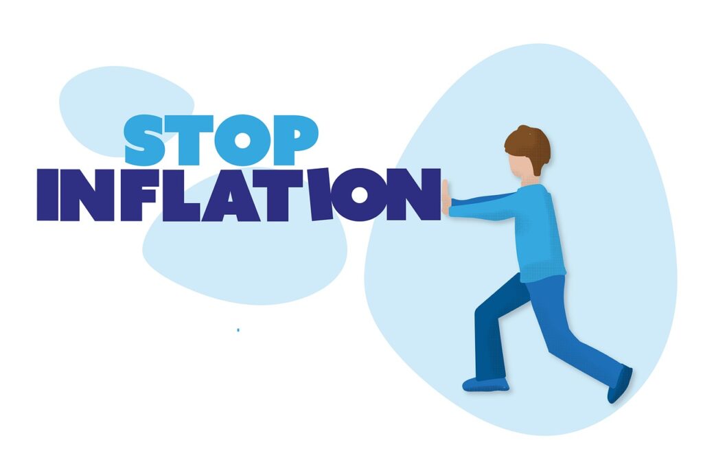
4. **A Dollar’s Diminishing Power: Only 12.011% of Its 1970 Strength** Still pondering inflation’s magnitude? A dollar today buys only 12.011% of what it could purchase in 1970. This stark percentage truly drives home the concept of inflation eroding the “real value” of money. It’s not just prices went up; it’s that the U.S. dollar fundamentally lost much of its buying capability.
This means for every dollar held in 1970, you’d need roughly $8.33 today for the same goods or services. It’s a direct consequence of the cumulative price increase, showing precisely how much less bang you get for your buck in the modern era. This metric powerfully visualizes the shrinking economic footprint of a single dollar.
The “real value” of money is crucial, and this statistic illustrates it perfectly. Having a dollar in hand doesn’t guarantee the same purchasing power from one decade to the next. This consistent decline in a dollar’s strength is why financial planning emphasizes saving and investing to “beat inflation” and preserve real wealth.

5. **CPI: The Economic Barometer – Tracking Price Changes Over Time** At the heart of inflation calculations lies the Consumer Price Index, or CPI, the Bureau of Labor Statistics’ gauge for tracking a standard basket of consumer goods and services. Understanding CPI’s movement is key to grasping inflation. In 1970, the CPI was 38.800. By 2025, that index number swelled to 323.048.
This leap from 38.800 to 323.048 is the direct mathematical representation of the 732.60% cumulative price increase. It’s a powerful illustration of how the base cost of living, measured by broad consumer items, has scaled upwards. The CPI isn’t just an abstract number; it’s a reflection of how much more consumers must spend.
The CPI is compiled by meticulously tracking prices across various spending categories, providing a weighted combination reflecting average household consumption. So, when discussing the dollar’s diminishing power or cumulative price increases, we’re talking about what the CPI is telling us. It’s the official scorecard for our money against increasing costs.

6. **City-Specific Surges: Where Your Dollars Stretched Differently Across America** Inflation isn’t a uniform beast; its impact varies significantly by location, even within the United States. This geographical divergence adds a fascinating layer to understanding purchasing power. Data clearly shows some cities experienced much more aggressive price rises than others from 1970 to 2025.
Seattle, Washington, led the pack with a 4.20% average annual inflation rate. For $5,000 in 1970, you’d need $48,137.77 in 2025 to achieve the same buying power there, representing an 862.76% cumulative change. Imagine the difference in property values and local expenses! Other major cities like San Francisco, Boston, and New York also saw significant rates.
Detroit, Michigan, experienced the lowest average inflation among listed cities, at 3.72%. There, $5,000 in 1970 would convert to $37,362.65 in 2025, with a 647.25% cumulative change. While still a powerful force, Detroit’s prices climbed considerably slower than in places like Seattle. This disparity underscores how local economic conditions shape the cost of living.

7. **Global Money Matters: How $5,000 Fared Across Continents** If inflation varies by city, it varies even more dramatically by country. Our economic journey reveals how different the experience of $5,000 from 1970 would be if held in British Pounds or Canadian Dollars. These international comparisons provide compelling evidence that economic policies, global events, and national market conditions contribute to unique inflation trajectories.
Across the Atlantic, in the United Kingdom, £5,000.00 in 1970 would equate to a whopping £98,842.45 in 2025. That’s an absolute change of £93,842.45 and an astounding cumulative change of 1,876.85%. Compared to the U.S.’s 732.60% cumulative change, the UK experienced a far more aggressive inflationary environment, more than doubling the American percentage.
Meanwhile, Canada faced a different, though still substantial, inflationary path. CA$5,000.00 in 1970 would be equivalent to CA$39,786.89 in 2025. This translates to an absolute change of CA$34,786.89 and a cumulative change of 695.74%. While significant, Canada’s cumulative inflation rate was slightly lower than that of the U.S., showcasing yet another distinct national experience.
8. **Dissecting the Basket: Inflation by Spending Category** We’ve seen inflation’s overall punch, but what if we told you it doesn’t hit every part of your wallet equally? The Consumer Price Index isn’t just one big number; it’s a meticulously crafted tapestry woven from various spending categories. By breaking down these elements, we can truly pinpoint the main culprits behind rising prices and understand where your dollars are working hardest. It’s like looking under the hood of the economy to see which gears are turning fastest.
Unsurprisingly, some areas have seen truly astronomical price surges. Medical care, for instance, has been a runaway train, averaging a staggering 5.29% inflation per year and resulting in an incredible 1,599.80% total inflation between 1970 and 2025. That means a $5,000 healthcare expense in 1970 would demand nearly $85,000 today! Other goods and services weren’t far behind, with a 4.92% average and 1,304.47% total, turning $5,000 into over $70,000. Even housing, a constant concern for many, swelled at a 4.17% average rate, leading to an 847.15% total inflation and requiring over $47,000 to match that original $5,000. These categories highlight where the cost of living has truly exploded over five and a half decades.
On the flip side, some categories have shown surprising resilience, with much more modest price increases. Apparel, for example, defied the inflation monster with an average annual rate of just 1.46%, yielding a total inflation of 121.88%. This means your $5,000 clothing budget from 1970 would only require about $11,094 today – a significant jump, but far less dramatic than medical care. Recreation followed suit, averaging 1.38% per year for a total of 112.81%, turning $5,000 into just over $10,640. Education and communication also remained relatively subdued at 1.70% average and 152.35% total, transforming $5,000 into just over $12,600. It’s a fascinating contrast, showing that not everything gets pricier at the same rate, proving that where you spend your money truly matters in the face of inflation.

9. **The Architect of Averages: How Inflation Rates are Calculated** You’ve heard the numbers, seen the percentages, but how exactly do economists and statisticians arrive at these figures? It’s not magic, but a methodical approach using precise formulas and historical data, primarily centered around the Consumer Price Index. Understanding this calculation demystifies the process, making inflation less of an abstract concept and more of a measurable economic force that impacts our daily lives. It’s the engine that powers our understanding of money’s changing value.
The fundamental calculation for determining today’s equivalent value of past money relies on the ratio of the CPI values. The formula is elegantly simple: `(CPI today / CPI in 1970) × 1970 USD value = Today’s value`. When we plug in the numbers for our journey from 1970 to 2025, we use the U.S. CPI from 1970, which was 38.800, and the projected CPI for 2025, which is 323.048. So, for our initial $5,000 from 1970, the math looks like this: `(323.048 / 38.8) × $5,000 = $41,629.90`. This isn’t just an estimation; it’s a direct calculation of equivalent purchasing power.
To figure out the total cumulative inflation rate over these 55 years, a slightly different formula comes into play: `((CPI in 2025 – CPI in 1970) / CPI in 1970) × 100 = Cumulative inflation rate`. Using the same CPI figures, the equation becomes `((323.048 – 38.8) / 38.8) × 100 = 733%`. This reveals the staggering overall price increase we’ve discussed, showcasing how inflation isn’t just about annual changes, but a relentless compounding force. These formulas are the bedrock upon which our understanding of monetary history is built, offering a clear, quantifiable way to track the dollar’s journey through time.
10. **Beyond the Headline: Exploring Alternate Inflation Measurements** While the Consumer Price Index (CPI) is the most globally recognized and commonly used yardstick for inflation, it’s not the only game in town. In the world of economics, different situations call for different tools, and there are multiple ways to slice and dice inflation data. These alternative measurements are sometimes employed based on specific economic contexts or political considerations, offering economists and policymakers different lenses through which to view price changes. It’s a reminder that no single metric tells the whole story, and nuance is key in understanding complex financial landscapes.
These variations in methodology mean that published rates of inflation can, and often do, differ depending on which index is being referenced. Each measurement has its own particular strengths and focus, designed to capture different aspects of price changes within the economy. For instance, some might emphasize consumer spending habits more broadly, while others intentionally exclude highly volatile components to get a clearer picture of underlying price trends.
Two prominent examples of these alternative measurements are the Personal Consumption Expenditures (PCE) Price Index and the Core CPI. Each offers a unique perspective on how prices are changing, shedding light on different facets of inflationary pressures. By exploring these, we gain a more comprehensive, multi-dimensional view of inflation’s true reach and impact, going beyond the standard headlines to understand the deeper economic currents at play.

11. **The Federal Reserve’s Favorite: Personal Consumption Expenditures (PCE) Inflation** If you’ve ever wondered what inflation metric the U.S. Federal Reserve keeps a particularly keen eye on, look no further than the Personal Consumption Expenditures (PCE) Price Index. Compiled by the Bureau of Economic Analysis, the PCE index is the Fed’s preferred measure, offering a slightly different, and some argue, more comprehensive, view of consumer spending and price changes. It tracks the prices of goods and services purchased by consumers, but with a weighting that can differ from the CPI, reflecting shifts in consumer behavior more dynamically.
Between 1970 and 2025, the PCE Price Index changed by an average of 3.42% per year. This rate, while still significant, is notably lower than the overall CPI’s average of 3.93%. This difference in annual rates translates into a substantial divergence over the long term, with the total PCE inflation between these dates amounting to 537.09%. This comparison reveals that under the PCE’s methodology, the overall increase in prices was considerably less dramatic than what the standard CPI suggests over the same period.
What does this mean for our $5,000 from 1970? If measured by PCE inflation, that initial sum would be equivalent to $31,854.53 in 2025. This represents a difference of $26,854.53 in purchasing power over 55 years. When compared to the standard CPI measurement, which pegs the equivalent value at $41,629.90, the PCE measured -195.51% less inflation. This isn’t a small difference; it’s a nearly $10,000 discrepancy in equivalent value, highlighting how critical the choice of inflation metric can be in economic analysis and policy-making.

12. **Stripping Out Volatility: Understanding Core Inflation** Sometimes, to get a clearer picture of underlying economic trends, economists prefer to filter out the noise. That’s where Core Inflation comes in. This measurement takes the standard CPI and strategically omits the notoriously volatile categories of food and energy. Why? Because the prices of food and energy can swing wildly due to factors like weather, geopolitics, and supply chain disruptions, which might obscure the more consistent, long-term inflationary pressures within the broader economy. It’s about getting to the “core” of the issue, without the distractions.
When we look at core inflation, the average annual rate between 1970 and 2025 stood at 3.85%. This is just slightly lower than the all-items CPI inflation rate of 3.93%, suggesting that while food and energy do contribute to overall inflation, the core components also experienced substantial, sustained price increases. Over the entire 55-year period, core inflation tallied a total of 700.21%. This is still a formidable figure, demonstrating the persistent upward trajectory of prices even when the most fluctuating elements are removed from the equation.
So, how does our $5,000 from 1970 stack up using the core inflation measurement? It would be equivalent in buying power to $40,010.55 in 2025. This represents a difference of $35,010.55. If you recall, the converted amount using the standard CPI (which includes food and energy) was $41,629.90. The core inflation figure is slightly less, reinforcing the idea that food and energy prices, when included, push the overall inflation numbers a bit higher. This distinction is vital for economists trying to identify structural inflation versus temporary, supply-side shocks.

13. **Beating the Odds: The S&P 500 as an Inflation Hedge** For those looking to not just survive inflation but potentially thrive amidst it, the question often turns to investment strategies. Could a savvy move in the stock market have protected, or even grown, your $5,000 from 1970? The answer, when looking at the S&P 500 index, is a resounding “yes.” This broad market index, representing 500 of the largest U.S. publicly traded companies, has historically served as a powerful counter-force to the relentless erosion of purchasing power. It’s the financial equivalent of fighting fire with fire, or in this case, inflation with growth.
Imagine the foresight to invest that $5,000 in the S&P 500 back in 1970. What would that investment be worth in 2025, without adjusting for inflation? A breathtaking approximately $1,594,521.90. This incredible sum reflects the nominal growth of the index over five and a half decades, showcasing the sheer power of long-term equity investing. It’s a testament to the compounding returns and overall economic expansion represented by these leading companies.
This phenomenal growth translates into an astounding nominal return on investment of 31,790.44%. That’s an absolute return of $1,589,521.90 on top of the original $5,000. These figures, while impressive, are what we call “nominal” because they don’t yet account for inflation. They show the raw increase in dollar value, but to understand the true wealth generated, we need to consider how far those millions of dollars actually stretch in today’s economy.

14. **Real vs. Nominal: Unpacking Investment Returns in an Inflationary World** While a nominal return of over $1.5 million from a $5,000 investment sounds like an absolute win, the story isn’t complete without bringing inflation back into the picture. Nominal returns tell you how many more dollars you have, but real returns tell you how much more *buying power* those dollars possess. This distinction is crucial, because inflation, as we’ve thoroughly explored, is constantly chipping away at the value of every dollar, even those earned from stellar investments. It’s like a silent tax on your wealth.
The average inflation rate of 3.93% per year between 1970 and 2025 indeed had a profound compounding effect. This compounding inflation would actually account for a massive portion of those nominal returns – specifically, 87.99% of them, which translates to a whopping $1,403,010.27. Think about that: nearly 90% of the nominal gain from the S&P 500 was effectively just keeping pace with the rising cost of goods and services over five and a half decades. It’s a sobering reminder of inflation’s immense power.
So, what was the true, inflation-adjusted “real return” of that $5,000 S&P 500 investment? After accounting for the dollar’s diminishing purchasing power, the real return amounted to $186,511.63. While significantly less than the nominal figure, this is still an impressive positive return, demonstrating that smart investments can indeed triumph over inflation, preserving and even growing real wealth. Of course, one might also need to factor in capital gains tax, which would further adjust that real return, bringing it down to approximately $158,535 for most investors. It underscores that understanding both nominal and real values is paramount for any long-term financial planning.
From the dizzying heights of cumulative price changes to the nuanced variations across cities and spending categories, and finally, to the strategic defense offered by savvy investments, our journey through the economics of $5,000 has been an eye-opening one. It’s clear that money, much like time, flows ever forward, but its value does not remain constant. Understanding inflation isn’t just an academic exercise; it’s a vital life skill, empowering us to navigate a world where a dollar today is a vastly different beast than a dollar of yesterday. So, next time you see a price tag, remember the invisible forces at play, constantly reshaping the true cost of everything.


