


Car logos are more than just simple graphics stuck on the front of a vehicle. They’re carefully chosen symbols that tell a story about each brand’s origins, values, or ambitions. What seems like a simple design often hides a backstory full of ambition, heritage, or pure marketing mischief. These emblems carry historical references or clever visual tricks that most people never notice, even after years of driving past them.
Have you ever looked at a car badge and wondered about its deeper meaning? You might think the Subaru badge just looks cool with its stars in a sleek oval. Then someone tells you it represented the Pleiades constellation and symbolized the merging of six companies into one, and suddenly, that little badge had way more personality. It’s these unexpected details that make the world of automotive branding truly fascinating.
Get ready to pull up a chair and discover the quirky stories behind some of your favorite car logos. We’re about to delve into the surprising personal inspirations, mythological connections, and historical secrets that reveal exactly why these emblems were designed the way they are. These untold stories are sure to make you popular at your next Cars & Coffee or pub trivia night.

1. **Ferrari’s Prancing Horse**
The instantly recognizable black stallion on Ferrari’s emblem wasn’t Enzo Ferrari’s original creation at all. In fact, he borrowed this powerful symbol from a remarkable source rooted in wartime heroism. It was first used by Count Francesco Baracca, Italy’s top WWI fighter ace, who proudly painted the horse on his plane as a personal good luck charm. Baracca was a celebrated national hero, and his emblem carried a significant weight of prestige and courage.
After Baracca tragically passed away in combat, his mother approached Enzo Ferrari with a poignant and incredibly meaningful suggestion. She firmly believed that if Enzo were to adopt her son’s symbol, the prancing horse, it would bring immense fortune and success to his burgeoning racing cars. This touching gesture, linking a fallen hero to a new automotive venture, laid the groundwork for one of the most famous automotive emblems ever conceived.
Enzo Ferrari wholeheartedly embraced the suggestion, recognizing the power and sentiment behind the symbol. He understood the profound connection it would forge between his racing team and a national icon of bravery. The prancing horse became an integral part of his brand identity, signifying speed, power, and an indomitable spirit.
However, Enzo also added his own distinctive touch to the emblem, grounding it firmly in his personal history. He chose a vibrant canary yellow background, a direct and proud tribute to Modena, his cherished hometown. This powerful combination of a heroic legacy, personal connection, and local pride forged what has become perhaps the most recognized automotive emblem in history, instantly conveying prestige and performance.
Read more about: Unlocking Automotive Excellence: Your Definitive Guide to the 12 Hallmarks of Top Classic Car Restoration Shops in the US
2. **Lamborghini’s Raging Bull**
The story behind Lamborghini’s raging bull emblem is a legendary tale of sweet revenge, famously served with a healthy dose of Italian horsepower and a dash of stubborn pride. Ferruccio Lamborghini, who had already achieved considerable success as a tractor manufacturer, was also a discerning luxury car owner. He frequently experienced vexing clutch problems with his personal Ferrari.
Frustrated by these recurring issues, Ferruccio decided to take his complaints directly to the source: the formidable Enzo Ferrari himself. However, Enzo, known for his fiery temperament and dismissive attitude towards perceived outsiders, met Lamborghini’s concerns with disdain. He imperiously told Ferruccio to stick to making tractors and leave the serious business of building high-performance cars to the experts.
This insulting retort, delivered with a healthy dose of arrogance, deeply wounded and profoundly infuriated Ferruccio Lamborghini. Rather than being discouraged, this dismissal ignited a fierce determination within him. He vowed to prove Enzo wrong and, more importantly, to build a car superior to a Ferrari.
Insulted but incredibly motivated, Ferruccio decided then and there that he would create his own supercar company, one that would directly challenge Ferrari’s dominance. For his emblem, he chose the powerful and aggressive image of a fighting bull. This choice was a direct, defiant visual challenge to Ferrari’s iconic prancing horse, symbolically pitting one formidable animal against another in a battle for automotive supremacy.
Furthermore, the bull was not just a symbol of strength and challenge; it held a deeply personal significance for Ferruccio. He was a Taurus, and the fighting bull served as a proud and fitting nod to his own zodiac sign. Thus, the raging bull became an iconic representation of passion, raw power, and a spectacular automotive grudge match that continues to thrill enthusiasts worldwide.
Read more about: Unleashed Beasts: A Deep Dive into Lamborghini’s 8 Coolest Concept Cars Ever Made

3. **Mercedes-Benz’s Three-Pointed Star**
The elegant three-pointed star of Mercedes-Benz is far more than just a pretty design; it’s a symbol of truly ambitious branding and a deeply personal promise. The emblem eloquently represents founder Gottlieb Daimler’s grand vision: achieving motorized domination across all three elements of existence—land, sea, and air. This audacious goal was set from the very beginning of the company’s aspirations.
The inspiration for this profound and enduring symbol actually came from a very private and touching moment in Daimler’s life. Gottlieb Daimler once drew this very star on a postcard he sent to his wife. On the card, he not only marked the location of their home but also made a heartfelt promise: that one day, this star would shine proudly over his factory as a powerful symbol of prosperity and unparalleled success.
His son, Adolf Daimler, later took up this prophetic vision, meticulously developing the three-pronged shape further and refining its artistic representation. The emblem was officially registered in 1909 by DMG, the Daimler-Motoren-Gesellschaft, solidifying its place in automotive history. This star rapidly transcended its personal origins, swiftly becoming a worldwide mark of automotive excellence and engineering superiority.
Today, the shimmering chrome emblem sits proudly and majestically on Mercedes hoods across the globe, a powerful and undeniable testament to the fulfillment of that personal promise made by Gottlieb Daimler over a century ago. It signifies not only luxury, groundbreaking performance, and unmatched quality but also the enduring legacy of a visionary man’s dream to conquer the elements and define an era of mobility.
Read more about: Seriously Where Did They Go? A Deep Dive into 14 Iconic Car Gadgets That Vanished From Our Toolboxes

4. **BMW’s Blue and White Quarters**
For decades, a widespread and rather charming myth has circulated about BMW’s iconic blue and white quarters. Many people mistakenly believe that the emblem, with its segmented circular design, represents spinning airplane propeller blades, a direct nod to the company’s early history in aircraft engine manufacturing. It’s a compelling and romantic image, perfectly evoking notions of speed, flight, and precision engineering.
However, despite its enduring popularity and widespread acceptance, this captivating propeller myth isn’t actually rooted in historical fact. The truth behind the emblem’s design is far more grounded, literally, in its geographical origins. The blue and white quarters simply and elegantly incorporate the official colors of Bavaria, the German state where BMW has its historical home and where its foundational roots are deeply embedded.
The distinctive roundel design itself, with its striking blue and white sections, has remained remarkably consistent since its inception in 1917. Over the years, it has undergone only subtle adjustments to fonts and borders, but the core design principle, directly inspired by Bavarian heritage, has always been the unwavering foundation of the logo. This adherence highlights a deep connection to its regional identity.
The company, ever astute to public perception and marketing opportunities, was quite savvy about this widespread misunderstanding. BMW later strategically embraced the propeller myth in its advertising campaigns, understanding that it presented a much cooler, more dynamic, and evocative narrative than simply stating, “we used our state’s colors.” Sometimes, as this story illustrates, clever marketing and an appealing anecdote truly trump strict historical accuracy in capturing the public’s imagination and enhancing brand appeal.
Read more about: The Future Is Now: 13 Game-Changing 2026 Car Models That Are Absolutely Worth the Wait

5. **Maserati’s Trident**
The powerful trident that so elegantly graces Maserati vehicles has an origin story steeped in rich local pride and the grandeur of classical mythology. Unlike some corporate logos that might have been meticulously brainstormed in a sterile boardroom, the Maserati brothers didn’t have to look far for their iconic symbol. They found their profound inspiration right in their beloved hometown of Bologna.
Specifically, the famous Neptune statue located in Bologna’s Piazza Maggiore, the vibrant central square of their birthplace, provided the direct visual cue. The brothers were utterly captivated by the formidable trident held aloft by the Roman god of the sea, recognizing its potent symbolism of strength, power, and command over the elements. They decided to borrow it directly for their burgeoning car company, imbuing their brand with ancient authority.
The Maserati brothers firmly believed that this powerful emblem of strength and vigor perfectly captured the very essence of their sporting luxury vehicles. The trident represented not only raw power and authoritative command but also a sublime connection to the sea, evoking a sense of fluid motion, effortless grace, and undeniable dominance on the road, much like Neptune’s rule over the oceans.
To further connect the emblem to their deep local roots, distinct red and blue elements were thoughtfully incorporated into the logo’s design. These colors proudly represent Bologna’s traditional civic colors, cementing the brand’s identity with its birthplace. It’s a remarkable and unique fact that this is perhaps the only luxury car logo directly inspired by a specific, grand piece of Renaissance sculpture, making it both uniquely artistic and deeply meaningful in the automotive world.
Read more about: Revved Up and Reborn: 14 Legendary Vehicles That Roared Back to the Market with Unforgettable Style and Power

6. **Rolls-Royce’s Spirit of Ecstasy**
The ethereal “Spirit of Ecstasy” mascot, gracefully adorning the hood of every Rolls-Royce, harbors an untold love story that is as captivating and enduring as the luxury cars themselves. By 1909, the customization of luxury vehicles was a burgeoning trend, with many affluent car buyers commissioning unique hood ornaments for their opulent rides. However, some of these early, personalized statues were, to put it politely, not exactly “safe for work,” and could be rather scandalous.
The Rolls-Royce company, ever meticulously concerned with upholding its pristine and dignified reputation, was naturally worried about these potentially risqué embellishments. Seeking to elevate the brand’s image and standardize its elegance, company owner Baron John Walter Edward Douglas-Scott-Montagu decided to find a more refined and tasteful solution. He commissioned the talented artist Charles Sykes to design an appropriate and universally appealing hood ornament that could be officially shipped on every Rolls-Royce vehicle.
Sykes meticulously followed the directives for elegance and tastefulness, crafting a figure with exquisitely flowing robes that were intended to symbolize the perfect blend of speed, grace, and sophisticated elegance. However, Sykes also embedded a deeply personal and, at the time, secret tribute within his beautiful design. He privately and discreetly based the “Spirit of Ecstasy” on Eleanor Thornton, who was, unbeknownst to the wider public, Lord Montagu’s beloved mistress and the mother of his child.
Since its elegant debut in 1911, Eleanor Velasco Thornton’s idealized likeness has graced the bonnets of these magnificent automobiles, carrying with it a hidden layer of romance, devotion, and personal history. This iconic mascot thus represents not only the pinnacle of automotive luxury and engineering but also serves as a discreet, enduring, and remarkably beautiful testament to a secret affair that has now become a cherished part of Rolls-Royce lore.
Read more about: I’m a Designer: These 9 Luxury Sedans Are the Most Stunning Lookers of 2025

7. **Skoda’s Winged Arrow**
During the vibrant and progressive era of the roaring 1920s, a distinctive and somewhat fashionable trend swept through the luxury car manufacturing world: the prominent incorporation of wings into company logos. Many prominent and aspirational carmakers, including American giants like Chrysler and European stalwarts such as Aston Martin, Bentley, and Mini, eagerly adopted this imagery, and strikingly, some still feature sophisticated winged designs today. Skoda, however, presented a curious and rather unexpected take on this popular motif.
The Skoda logo stands out as a unique outlier among its winged brethren, immediately catching the eye with its singular design. It distinctly features what appears to be a single, dynamically poised wing, prominently positioned on an arrow. This particular design decisively departs from the more common symmetrical, often avian-inspired wings used by other prestigious brands, immediately sparking curiosity and intrigue about its truly unique origin.
An intriguing rumor, one that adds a fascinating layer of cultural anecdote to the brand’s history, suggests that the company’s founder, Emil von Skoda, harbored a deep and rather unusual obsession with Native American headdresses. According to this captivating anecdote, he was so profoundly influenced by these ceremonial artifacts that he based his distinctive winged arrow logo directly on one of them. It’s a truly fascinating and rather unexpected source of inspiration for a major European automaker, bridging vastly different cultural aesthetics.
Adding another layer of quirky charm and a touch of historical irony to this particular origin story is the fact that the company Emil von Skoda founded, despite its emblem’s rumored Native American inspiration, ironically does not actually sell its cars in North America. This particular detail, seemingly a contradiction, further accentuates the unique narrative of the logo, making it a truly distinctive and memorable piece of automotive trivia that piques the interest of any curious mind.

8. **Audi’s Interlocking Rings**
Talk about a powerful symbol born out of necessity! Audi’s iconic four interlocking rings aren’t, as some might mistakenly assume, a nod to Olympic glory. Instead, they tell a much more grounded, yet equally compelling, story of survival and collaboration from a tumultuous period in history. They represent a “shotgun wedding” of sorts, forged in the crucible of the Great Depression.
In 1932, four struggling German automakers—Audi, DKW, Horch, and Wanderer—faced dire economic circumstances. To survive, they did the unthinkable: they merged. This strategic union gave birth to Auto Union, a formidable new entity in the automotive landscape. Each of the distinctive rings in the Audi logo proudly represents one of these original companies, a lasting testament to their collective effort to overcome adversity.
What’s even more fascinating is the personal connection woven into this merger. August Horch, a pioneering figure in German automotive history, actually founded two of these constituent companies: Horch and Audi. So, in a neat twist, he essentially laid the groundwork for two of the four rings himself! The story deepens with the name “Audi” itself, which isn’t just a catchy label.
The name “Audi” is Latin for “listen,” a clever and deeply significant choice, as “Horch” (August Horch’s surname) means the same thing in German. This linguistic playfulness demonstrates a subtle wit and a reverence for the founder’s legacy, even as a new conglomerate was formed. It’s a prime example of how even the most corporate of mergers can carry clever, personal touches, forever etched into a company’s very identity.

9. **Toyota’s Hidden Message**
Toyota’s logo is a masterclass in understated complexity, hiding a whole universe of meaning within its sleek, modern design. While many simply see three overlapping ovals, this emblem, introduced in 1989 to celebrate the company’s 50th anniversary, is packed with symbolism that reflects both its heritage and its vision for the future. It’s a subtle masterpiece that reveals more the closer you look.
The genius of the design truly shines when you discover its cleverest secret: the current logo actually contains every single letter of the word “Toyota” hidden within its various curves and intersections. It’s a linguistic puzzle embedded right into the visual identity, a testament to the meticulous thought process behind Japanese corporate branding, where every line and space is imbued with intentionality.
Beyond this fascinating alphabetical Easter egg, the three overlapping ovals carry profound philosophical weight. The two inner ovals are designed to symbolize the crucial bond between the heart of the customer and the heart of the company, a visual representation of mutual trust and respect. Meanwhile, the larger, encompassing outer oval signifies Toyota’s global reach and its ambition to serve customers worldwide.
But the symbolism doesn’t stop there. The negative space formed within the logo also cleverly creates a “T,” while the entire emblem, when viewed holistically, is intended to resemble a steering wheel. This combination of deeply philosophical corporate values with practical, automotive imagery makes the Toyota logo a prime example of a design that is both beautifully symbolic and incredibly functional, a truly harmonious blend.
Adding another layer of historical depth, some astute observers believe the inner oval also subtly represents a needle, with the space around it symbolizing an invisible thread. This is a brilliant, silent tribute to the company’s humble beginnings as Toyota Automatic Loom Works, a manufacturer of industrial looms. It’s a nod to its textile engineering roots, woven subtly into a global automotive giant’s badge.
Read more about: The Top 14 Vehicles Built to Go the Distance: Your Guide to 350,000+ Mile Reliability
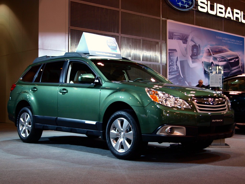
10. **Subaru’s Celestial Connection**
We touched on this earlier, but it’s worth a deeper dive: the Subaru badge is more than just a cool collection of stars in an oval. Its story quite literally reaches for the heavens, drawing inspiration from one of the most beautiful sights in the night sky. For a brand synonymous with rugged individualism and exploring the great outdoors, a celestial connection seems perfectly fitting, doesn’t it?
The name “Subaru” itself isn’t arbitrary; it’s the Japanese name for the Pleiades star cluster, a dazzling group of stars also affectionately known as the “Seven Sisters” in Western astronomy. While the constellation contains many stars, only six are prominently visible to the eye. And just like magic, those six visible stars perfectly align with the six stars depicted in Subaru’s distinctive logo.
This stellar connection isn’t just a poetic coincidence; it’s deeply rooted in the company’s origins. Subaru was formed through the merger of six smaller, independent companies into one unified entity. So, the Pleiades constellation, representing a cluster of distinct bodies coming together, became an incredibly apt and powerful symbol for this new automotive conglomerate, signifying “unity”—another direct meaning of “Subaru.”
The brilliance of this emblem is truly multi-faceted. It’s a visual representation of a natural phenomenon, a historical record of corporate formation, and a linguistic nod to the brand’s identity, all rolled into one. It’s a testament to thoughtful branding that finds profound meaning in both the cosmos and corporate strategy. Their cars may be earthbound, but their brand identity reaches for the stars, truly making it what makes a Subaru, a Subaru.
Read more about: Remember the ’90s? These 11 Unkillable Economy Sedans Were the Absolute Albums of Reliability and the Commute.
11. **Alfa Romeo’s Bizarre Combo**
Prepare for a logo that’s straight out of a medieval fantasy, or perhaps a nightmare! Alfa Romeo’s emblem is arguably one of the most visually complex and, let’s be honest, bizarre in the automotive world. It’s a captivating blend of local Milanese pride and a truly astonishing mythological element: a serpent, known as the Biscione, that appears to be devouring a human figure. Yes, you read that right!
This striking and somewhat unsettling imagery has its roots firmly planted in Milan’s rich and often turbulent history. The serpent devouring a man (or sometimes a Moor) was the heraldic symbol of the powerful Visconti family, who were historic rulers of Milan. Legend has it that this terrifying image originated from a Visconti ancestor defeating a Saracen leader whose helmet bore this very same fearsome design.
Other interpretations suggest the serpent symbolizes the Visconti family’s triumph over Moorish enemies, adding another layer of historical conflict and cultural significance to the emblem. While the exact meaning of the “devouring” act is debated—some interpret it as representing rebirth or renewal—it remains undeniably one of the most uniquely graphic and symbolically loaded logos you’ll ever encounter on a car.
Alongside this dramatic serpent, the emblem also features a more familiar symbol: the red cross of Milan, a straightforward representation of the city’s civic pride. The combination is utterly unforgettable, marrying a symbol of local identity with an ancient, formidable creature. It’s probably the only mainstream car logo featuring a creature consuming a human being, a fact that surely makes it a fantastic talking point at any car enthusiast gathering!

12. **Volvo’s Iron Mark**
When you think of Volvo, “safety” is probably the first word that springs to mind, closely followed by “reliability” and “Swedish engineering.” But their iconic logo, a circle with an arrow pointing diagonally upwards and to the right, actually carries a surprisingly warrior-like and historically rich meaning that speaks to an entirely different kind of strength. It’s a fascinating blend of ancient symbolism and industrial pride.
Contrary to some playful misinterpretations (no, it’s not just the symbol for “male”!), this emblem is actually the ancient chemical symbol for iron. This choice wasn’t accidental; it’s a direct and proud nod to Sweden’s renowned steel industry and the exceptional quality of Swedish iron. Volvo cars, with their reputation for being robust and built like tanks, are quite literally “strong like iron,” a core brand value cleverly embedded in their visual identity.
This symbol also has roots in even older iconography, representing Mars, the Roman god of war, and, in a more general sense, the male gender. So, while Volvo’s contemporary focus is on protecting lives, its emblem carries echoes of ancient strength, durability, and a certain martial resilience. It’s a profound connection to materials science and classical mythology, giving the badge layers of unexpected depth.
In a neat piece of historical design, early Volvo cars even featured this very emblem physically attached to a diagonal metal bar that ran across the grille. This wasn’t just a stylistic flourish; it embodied the logo’s design in a tangible way, reinforcing the message of strength and integrity. It’s a subtle reminder that while safety is paramount, it’s built upon a foundation of formidable, iron-like construction and enduring design principles.
Read more about: Turbocharged Engines Unveiled: Decoding Turbo Lag, Engineering Solutions, and The Legacy of Reliability vs. Catastrophic Failure

13. **Chevrolet’s Bowtie**
The Chevrolet bowtie is one of those instantly recognizable symbols that’s become a global automotive icon. Yet, for a logo so pervasive and universally known, its exact origin remains shrouded in delightful mystery and playful speculation. It’s a story with several fascinating versions, making it a favorite piece of trivia for car enthusiasts and history buffs alike.
The most popular and enduring rumor attributes the bowtie’s genesis to a moment of inspiration experienced by co-founder William C. Durant. The story goes that in 1913, while staying in a Parisian hotel, Durant was captivated by a striking Art Deco wallpaper pattern in his room. So enchanted was he by the design that he allegedly tore off a piece of the wallpaper to bring home, convinced he had found the perfect emblem for his nascent car company.
This tale certainly ties in rather neatly with the company’s French-derived name, adding a touch of European flair to an otherwise quintessential American brand. However, another theory suggests a more mundane, albeit equally plausible, origin: that the bowtie is simply a stylized cross, a straightforward geometric design chosen for its simplicity and strength. The ambiguity only adds to its charm, doesn’t it?
To this day, Chevrolet has never definitively confirmed which origin story is the true one, allowing the delightful mystique to persist. Perhaps the actual piece of wallpaper, or a sketch from that Parisian hotel, is still tucked away in some forgotten archive at Chevy headquarters. Or maybe, just maybe, the hotel still wants its wallpaper back, creating a fun, ongoing secret for one of the world’s most recognizable car badges.
Read more about: The Million-Dollar Drive: 15 Vintage American Cars Now Worth Over Half a Million Dollars

14. **Mitsubishi’s Three Diamonds**
Mitsubishi’s distinctive three-diamond logo is a fantastic example of a symbol deeply embedded in a company’s very name and historical lineage. What might appear as a sleek, modern design to English speakers actually has a remarkably direct and culturally rich origin that, once you know it, makes the emblem feel incredibly clever and, in Japan, perhaps even a little bit redundant in its literalness.
The name “Mitsubishi” itself is a combination of two Japanese words: “mitsu,” meaning “three,” and “hishi,” which can refer to a “water chestnut.” Intriguingly, “hishi” also happens to be the word for a “rhomboid” or “diamond shape”—a visual connection drawn from the natural, geometric form of the water chestnut plant’s leaf. So, the name literally translates to “three water chestnuts” or “three diamonds.”
Given this linguistic and botanical background, it’s hardly surprising that Mitsubishi’s logo is, quite literally, three diamonds. This emblem first appeared on ships way back in 1874, through Tsukumo Shokai, the shipping firm that was the precursor to the modern Mitsubishi. The design itself was inspired by a fusion of the founder’s family crest—which featured three stacked rhomboids—and the crest of the Tosa Clan, his first employer, which showcased three oak leaves.
This blend of family heritage, feudal allegiance, and a deeply embedded linguistic connection makes the Mitsubishi logo a powerful testament to its Japanese roots. While it might seem cool and uniquely original to those of us in the West, the directness of its translation means it probably looks a bit like “Three Threes” or “Diamond Diamonds” to a Japanese speaker—a fun, slightly meta aspect that makes this logo’s story truly unique.
So there you have it – another dive into the amazing world of automotive emblems, where every line, curve, and shade carries a secret history. From ancient constellations guiding corporate mergers to medieval serpents and whispered hotel wallpaper tales, these logos are truly tiny masterpieces of storytelling. They prove that even the most fleeting glimpse of a car badge can unlock a treasure trove of unexpected facts, cultural curiosities, and incredible human ingenuity. Next time you see one of these iconic symbols, remember the hidden narratives they carry. You might just see them, and the roads they travel, in a whole new light.


