
 That Need to End Now")
Okay, let’s be real for a moment. Cars aren’t just vehicles that get us from point A to point B; they’re ingrained in our daily lives, often becoming extensions of our personalities and symbols of distinct eras. From the flamboyant fins of the 1950s to the raw power of ’60s muscle cars, and even the memorable (for better or worse) Malaise Era of the ’70s, every period in automotive history has brought with it a unique blend of trends and fads. Some were absolutely iconic, while others, well, they just left us scratching our heads in utter bewilderment.
Indeed, even for someone who’s owned, worked with, and studied countless cars over the past decade, the sheer number of questionable decisions automakers have perpetuated can be mind-boggling. It’s true that many of these trends emerged with the best intentions, or were direct responses to situations beyond manufacturers’ control. Think about the 1973 Oil Crisis kick-starting the infamous Malaise Era, or the 2007 financial crisis birthing programs like Cash for Clunkers. These were significant events that forced change, leading to justifiable, if sometimes questionable, decisions.
But what about those trends that aren’t just bizarre but also had no good justification whatsoever? What about the ones that wound up being detrimental to the driving experience, or even outright dangerous? Or perhaps the ones we simply look back on and collectively wonder, “Why, though?” Today, we’re taking a deep dive into six absolute worst of these automotive trends, exploring how they came about, why they’re so awful, and why drivers are truly begging for them to finally come to an end.
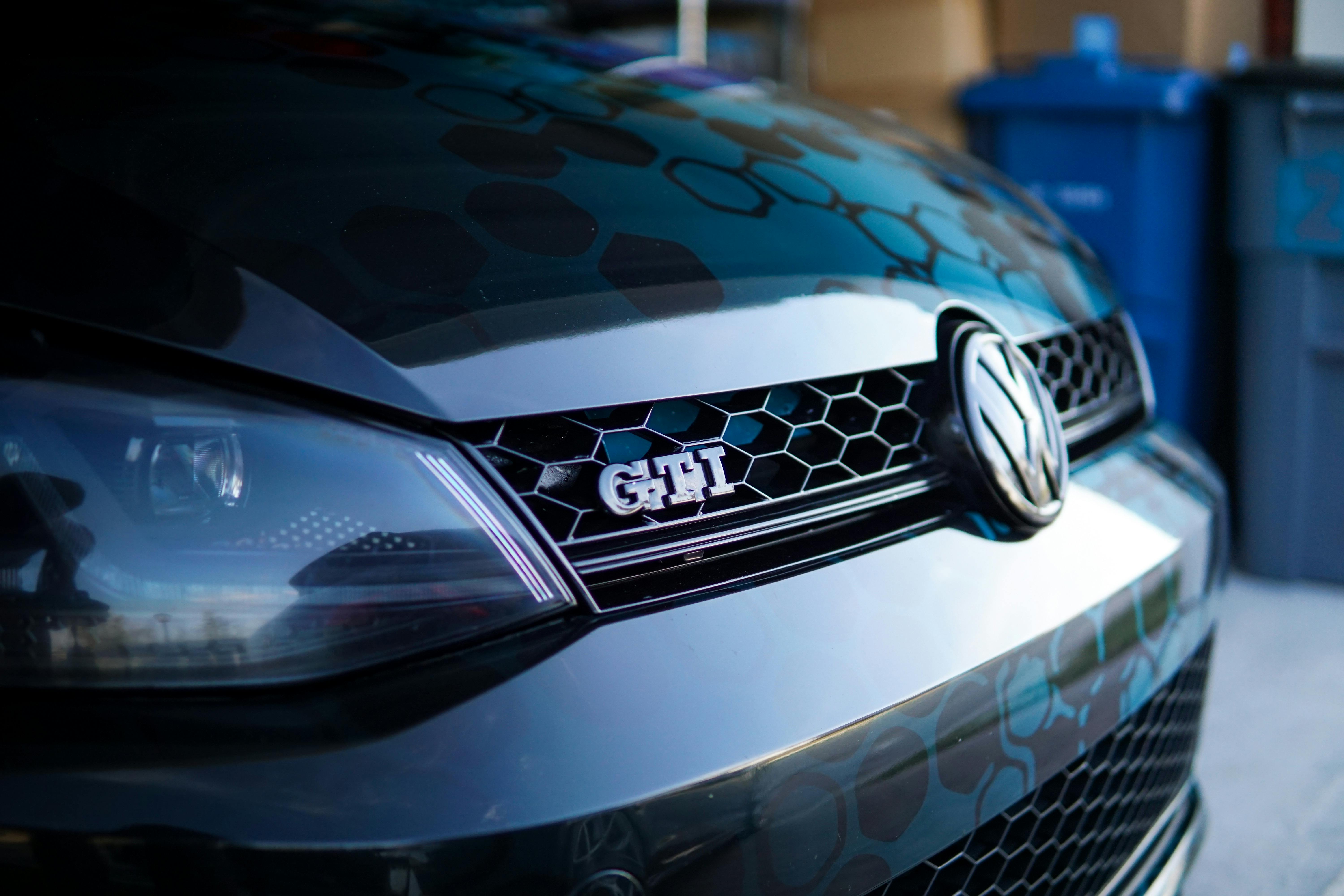
1. **The Tuner Era’s Form-Over-Function Mods**Ah, the early 2000s! A time when the tuner scene exploded, bringing us some truly iconic cars. But on the flip side, it also ushered in one of the most bizarre-looking automotive subcultures, defined by a “form over function” mentality that makes us collectively cringe a little when we look back. You know the type: vehicles featuring entirely cosmetic enhancements with no actual performance to back them up, often fitted to a cheap beater Japanese sedan.
We’re talking wild bodywork, excessively cut-down springs that practically scrape the ground, obnoxious neon underglow, ridiculously large spinning rims, exhaust cans that sounded like angry weed eaters, massive rear wings that served no aerodynamic purpose on a street car, fake carbon fiber accents, and more tacky decals than a sticker book. This look was everywhere, popularized by racing games and movies of the era, and while it was what some people could afford and had the skill to perform, it often resulted in truly horrifying-looking creations.
Looking back, it’s a bit like flipping through your old yearbook photos – a mix of nostalgia and utter bewilderment. Thankfully, many of these modifications are reversible, which is a blessing for those who, for whatever reason, don’t want their pristine classic Integra to sound like it’s mowing the lawn. While modern highly-stanced cars do owe their lineage to this era, the current execution often involves genuine workmanship to make them drive. But the days of purely aesthetic, often grotesque, mods? Drivers are definitely ready to leave those in the past.

2. **Blinding High-Intensity Headlights**Headlights are arguably one of the most vital safety components on any vehicle, right up there with brakes and steering. Over the years, manufacturers have continuously iterated on their basic design, bringing us innovations like sealed beams, aerodynamic housings, and long-lasting bulbs. We’ve even seen novel concepts like headlights that move with the steering wheel, which is pretty neat, if you ask me.
However, one of the most recent — and honestly, one of the worst — trends for headlights is unquestionably their ever-increasing brightness. Let’s put aside for a moment the issue of ever-increasing SUV and crossover heights, which already make headlights shine directly into the cabins of lower vehicles. The actual measure of how much light these things emit has dramatically increased, averaging double the brightness compared to just a decade ago.
People often cite improved safety, a more modern/upscale look, or increased confidence at night as reasons for these super-bright HID headlights. But here’s the kicker: the human eye evolved with inherent night vision that simply cannot cope with blinding lights pointed directly into your rearview mirror or coming straight at you. It’s why our ancestors used lanterns beside them, not directly in front of their heads! The paradox is that when everyone has brighter headlights, your night vision gets ruined by oncoming traffic and glare in your mirrors, meaning you actually cannot see as much.
This vicious cycle then necessitates equipping your vehicle with even more powerful headlights just to compensate, and the problem only escalates. What’s even more dangerous is when people fit these high-intensity beams to older vehicles not designed for them and then don’t bother to calibrate them. The result is a genuinely hazardous driving environment, making nighttime commutes a blinding gauntlet that many drivers are absolutely fed up with.
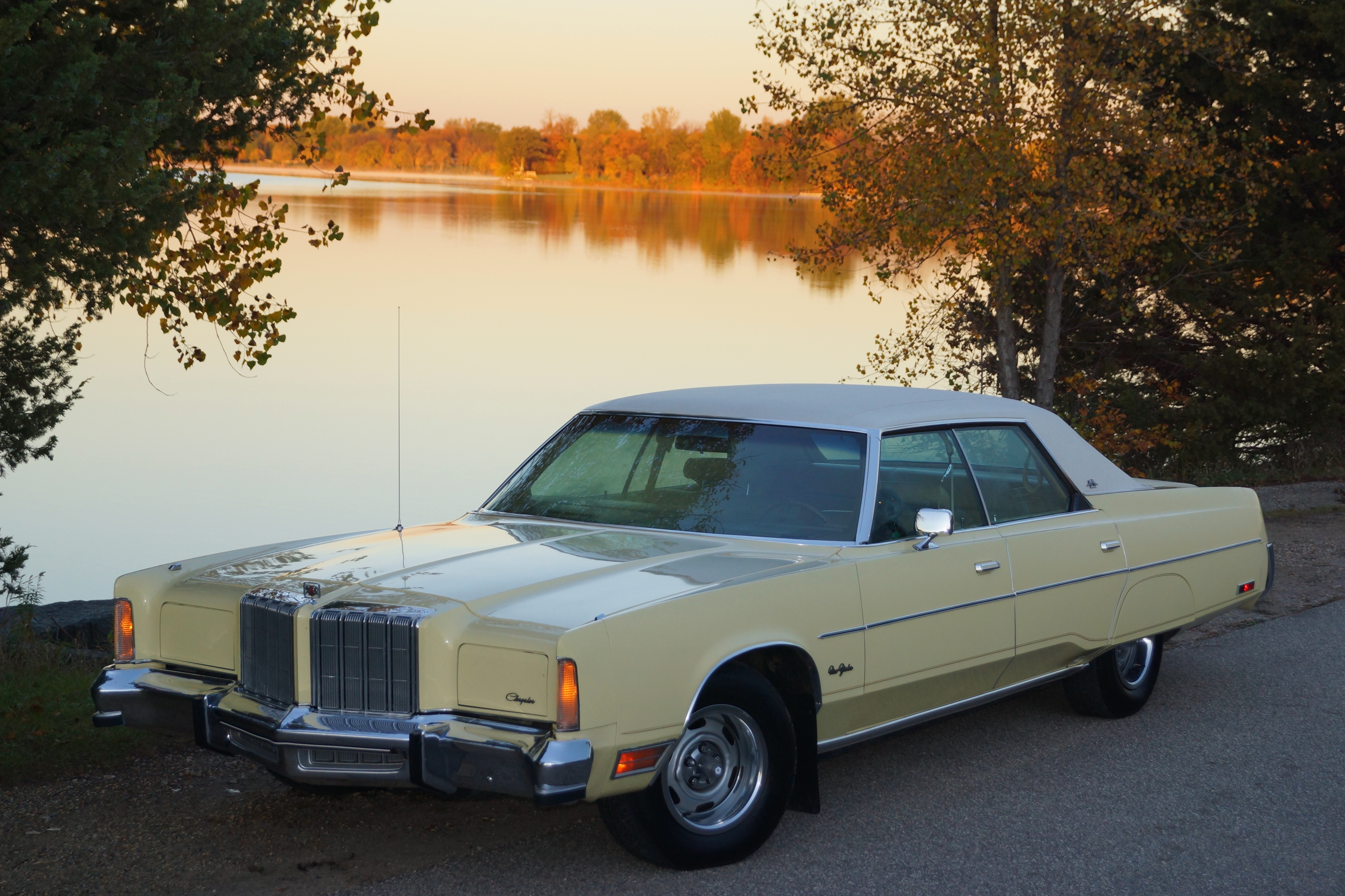
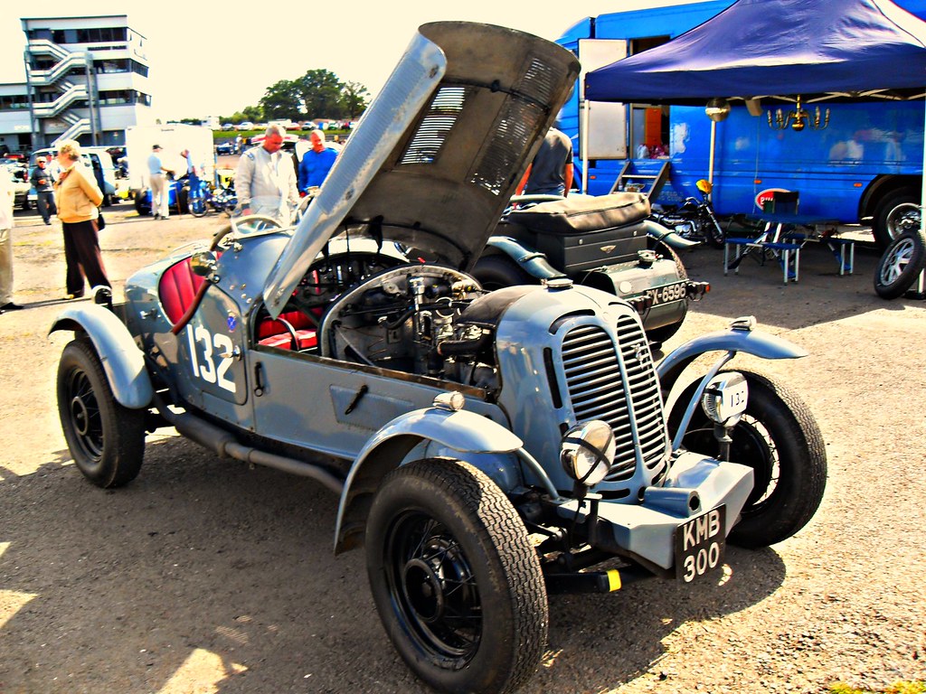
3. **The Bloated 1970s Luxury Barges**Picture this: it’s the mid-1970s, right after the shock of massive gas lines and the devastating 1973 Oil Crisis. Anti-smog regulations are catching on, and efficient, reliable small Japanese imports have just shaken the American auto industry to its core, winning over first-time owners with promises of low MSRPs. While American automakers responded with subcompacts like the Pinto, Vega, and Pacer (some of which were surprisingly decent), a different beast sat prominently at dealerships.
These were the larger luxury siblings, the quintessential American land-yachts of the era. Take, for example, mid-1970s Cadillacs, often fitted with an absolutely mammoth 500 cubic-inch V8. In a rush to comply with tightening emissions restrictions, manufacturers decided to retain their existing lineup of massive vehicles rather than immediately transition to more midsize options. The solution? Equip these enormous engines with primitive, rudimentary emissions controls.
This led to a brief, yet deeply problematic, period of giant cars with engines choked to within an inch of their lives. That huge Cadillac V8, for instance, somehow had its output dropped to a measly 190 horsepower. Think about that: the largest V8 ever fitted to a regular production car, displacing more air than their interwar 7.4L V-16, was delivering less power than many modern four-cylinders. It truly takes a special kind of skill to achieve such a feat.
While this undeniably lowered the vehicles’ emissions (to an extent), it absolutely plummeted their efficiency figures. These thirsty, underpowered engines had to work twice as hard just to move all that car, leading to fuel economy numbers hitting the dreaded single-digit MPG. These were, without a doubt, the wrong cars at the wrong time, and you have to feel for the poor souls who had to keep them fueled as gas prices quadrupled in less than a decade. We’re certainly not missing those fuel-guzzling behemoths.
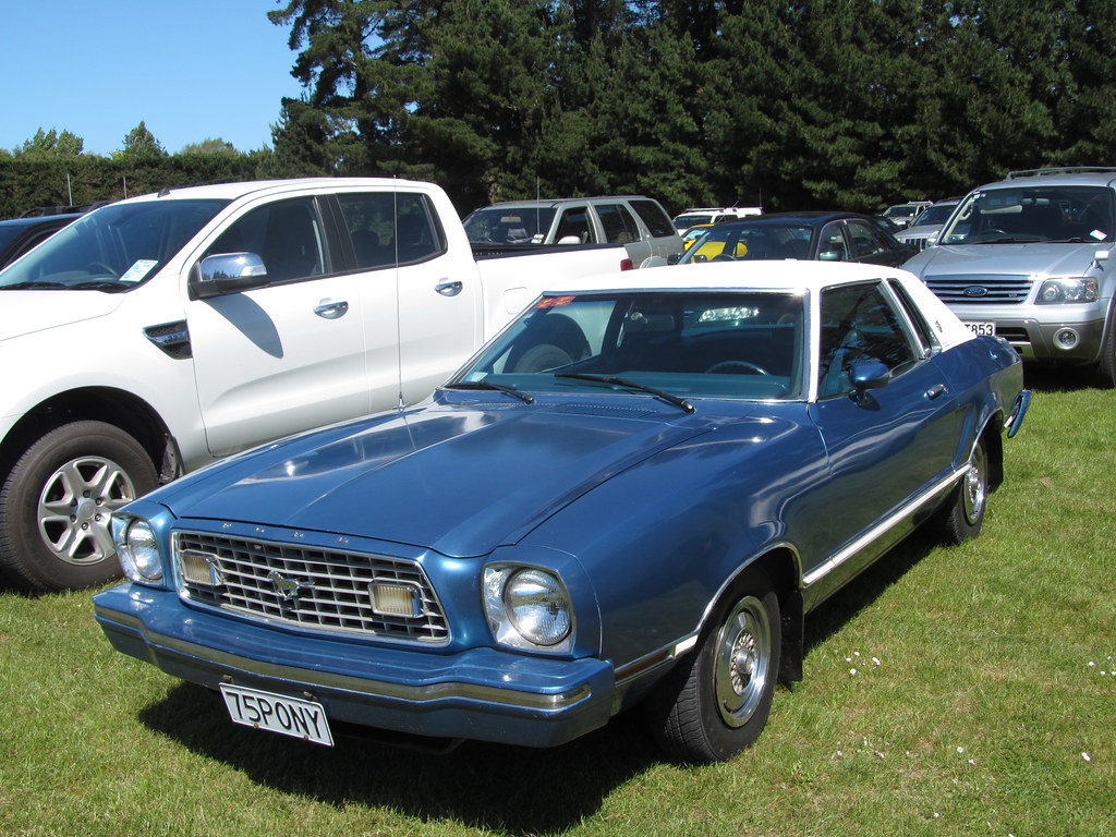
4. **Destructive Vinyl Roofs**Back in the 1960s and 1970s, if you wanted to add a touch of luxury or a stylish two-tone look to your car without breaking the bank, the vinyl roof was the go-to option. These were incredibly popular, often equipped on cars with “designer” trims like the Mustang II Ghia, or offered as an option on countless American sedans and coupes. For their day, they looked quite nice, providing a relatively cheap and easy way to make a regular passenger car appear more upscale.
But that’s pretty much where the good times ended. Today, vinyl roofs are routinely listed among the worst ideas in automotive design, and for very good reason. Much like how simulated wood-grain paneling can instantly date a car’s exterior (though some cars do pull off the fake wood fantastically, I’ll admit), the vinyl hardtop similarly fell out of favor, rarely seen beyond the 1980s. The core problem, however, wasn’t just aesthetic; it was structural.
Unlike an actual convertible roof, these vinyl tops were essentially just large, decorative decals placed on top of the car’s metalwork. And that metalwork, as we all know, is prone to rust. A quick Google search will reveal a horrifying laundry list of auto body shops performing extensive rust repair directly underneath these vinyl tops. So, what on Earth went wrong with this seemingly innocent trend?
Simply put, because they were glued on and not integrated bodywork, vinyl tops were susceptible to scuffs and damage. Cracks would readily form, especially in areas with significant temperature fluctuations, and this damage would often compromise what was underneath. You’d rip up the old, desiccated vinyl only to reveal huge rust holes and extensive water damage that had been silently propagating beneath those cracks, often for many years. While a well-maintained vinyl hardtop can still look good to some, the litany of problems it caused makes it a trend most drivers are happy to have seen the back of. Though, shout out to vintage auto body repair shops – at least it kept them busy!

5. **Unsafe Proportions of Modern Pickup Trucks**Modern pickup trucks have become behemoths on our roads, and their sheer growth since the 2000s is a phenomenon worth discussing. These vehicles and their derivatives pride themselves on being the absolute largest usable passenger vehicles available, with towering proportions that literally dwarf most other cars and, more critically, pedestrians. Several factors fueled this growth, including historical policies like the 1962 Chicken Tax and, interestingly, today’s EPA regulations.
Here’s the kicker for the EPA standards: the bigger a vehicle’s footprint, the less fuel-efficient it needs to be to pass testing. This bizarre loophole makes it easier and more appealing for automakers to develop and sell larger, rather than smaller, vehicles to meet these regulations. Add to that the increasing consumer desire for the convenience, cargo space, and utility that crossovers and pickups offer, and you’ve got a recipe for these giants dominating sales, even as unibody compact trucks prove their viability.
Now, there’s nothing inherently wrong with full-size pickups in principle. However, their sheer size, particularly their huge and prominent front ends, has created a legitimately dangerous situation for pedestrians, placing this trend high on our list of things that need to stop. Over the years, various organizations and crash safety reports have consistently published findings indicating that increased hood height significantly raises pedestrian fatality rates – by up to a shocking 45%! This isn’t just about small kids being hard to see; the blind spots below the hood line of even mildly lifted trucks are so poor that some stock ride-height pickups have hoods at eye-level with adults.
While the growing size of pickups isn’t the sole contributor to the alarming 80% increase in pedestrian accident deaths since 2009, it certainly isn’t helping the situation. Thankfully, modern proposals are aiming to rein in this horrifying safety risk. But the fact that this trend has been allowed to go on for so long, especially when we previously banned pop-up headlights largely due to their risk to pedestrian safety, is, frankly, nothing short of hypocritical and abhorrent. Drivers and pedestrians alike deserve better.
Read more about: The Ultimate Guide to Affordable Classic Cars: 14 Reliable Rides That Won’t Break the Bank (and Are Surprisingly Easy to Own!)
6. **The 1990s Ford ‘Oval’ Design Trend**Let’s take a quick trip back to the 1990s, an era when Ford embarked on a distinctive, yet ultimately regrettable, design journey. The company decided to adopt its iconic oval logo shape as the main theme for its vehicles, intending to create a cohesive and recognizable brand identity. On paper, it might have sounded like a clever idea, a way to visually link all their products. In practice? Well, it turned into something quite different, and not in a good way.
This oval motif began appearing everywhere across their lineup – on central consoles, grilles, door handles, lights, mirrors, and even window frames. You could literally find an oval shape in “pretty much everything except for the wheels.” The 1994 Ford Scorpio and the 1996 Ford Taurus became the most famous, or perhaps infamous, examples of this design philosophy. It also affected compact cars like the 1995 Ford Fiesta and 1998 Ford Escort ZX2, albeit with less severe outcomes.
While there’s no doubt that these shapes made their cars instantly recognizable as Fords, the problem was that forcing one single motif onto countless different components meant it had to be adapted into many different sizes and shapes. The result often looked distorted, exaggerated, and frankly, a bit unsettling. It created a sense of visual imbalance that screamed “overdone” rather than “unified.”
Automakers always want their designs to make a statement, but they have to find that sweet spot, even if it means toning down their original, bold idea. Ford eventually realized the misstep, rushing to revert this design trend by the end of the decade. While it was essentially an emergency fix, the new designs looked much better precisely because they brought back the balance those cars so desperately needed. It’s a prime example of how even a good idea, when taken too far, can become a car trend drivers are more than happy to forget.
Read more about: From Fleeting Trend to Lasting Regret: 12 Once-Popular Tattoos That Are Now Causing Major Ink Remorse

7. **BMW’s Giant Grille**Okay, let’s dive right into something that’s been a massive talking point for car enthusiasts and everyday drivers alike: BMW’s undeniably enormous grilles. For decades, the iconic “kidney grille” was a hallmark of BMW design, evolving gracefully while maintaining a recognizable, sophisticated presence. It was part of what made a BMW, well, a BMW. But then, something shifted, and those grilles started to grow, and grow, and grow, until they became the gargantuan, often polarizing, visual statements we see today. It’s definitely a case of an automaker striving to make a “statement,” as our context suggests, but perhaps overshooting that “sweet spot” that balances boldness with beauty.
This trend is a textbook example of how “using a visual element too many times” or allowing it to become “too big” can throw an entire design into “imbalance.” The front fascia, once a symphony of well-proportioned elements, now feels dominated by a grille that seems to swallow everything else. It’s an aggressive approach to brand identity, making sure you know instantly that you’re looking at a BMW, but at what cost to the overall aesthetic harmony? This isn’t just about a slight tweak; it’s a fundamental redefinition of the car’s ‘face’ that has split opinions right down the middle.
While the intention behind such a dramatic move is undoubtedly to create an imposing presence and stand out in a fiercely competitive luxury market, many drivers feel it simply looks overdone, exaggerated, and frankly, a bit unsettling. The elegance and understated sportiness that once defined BMW’s front ends have, for some, been replaced by a visual assertion that borders on aggressive. This isn’t just criticism from a few purists; it’s a widespread sentiment that these giant grilles are a “brand-specific visual overload” that needs to be reined in. When a design element becomes the *only* thing you can focus on, it’s a clear sign that “imbalance” has crept in, and it’s a trend many are actively begging to see end.
Read more about: Beyond the Hype: 10 Cars That Consistently Disappoint Owners and Drain Wallets – A Deep Dive into Automotive Regret

8. **Hyundai’s Futuristic Shapes**The world of product design is an intricate maze, with countless paths to success and just as many to failure. Automakers, particularly in an era driven by rapid technological advancement and a constant demand for novelty, are forever pushed to innovate and create distinctive market niches. This drive is perfectly embodied in trends like “Hyundai’s futuristic shapes,” exemplified by models such as the 2024 Kona. The ambition here is clear: to offer something fresh and exciting, moving beyond “tried and true solutions” that might otherwise lead to forgettable designs.
However, the leap into overly “futuristic shapes” can be a risky venture. While the immediate goal might be to “attract more attention” and generate “hype,” the crucial test is whether that hype successfully “converts into sales” and enduring appeal. Often, when the pursuit of innovation becomes too aggressive, it can lead to designs that prioritize shock value over timelessness or ergonomic sensibility. The result can be a vehicle that looks undeniably different, but perhaps not universally appealing or even visually coherent in the long run.
Our guiding principle for identifying a “bad car design trend” often boils down to “imbalance.” When “futuristic shapes” involve using “too many” jarring angles, unconventional proportions, or visual elements that clash rather than complement, the overall aesthetic suffers. It can make a car appear fragmented, or as if it’s trying too hard to embody an aesthetic that doesn’t quite fit its purpose or brand identity. Drivers, ultimately, seek a harmonious blend of form and function, and when extreme “futuristic shapes” disrupt that balance, they become a source of contention.
Indeed, while some consumers are drawn to these avant-garde aesthetics, many others find them challenging to connect with, preferring designs that feel more grounded, functional, and aesthetically pleasing over extended periods. The novelty of a “futuristic shape” can wear thin, leaving a design that might not age gracefully or, worse, actively deter potential buyers who are looking for something more classic, understated, or simply less visually jarring. This means that while the intention is good, the execution of extreme “futuristic shapes” often creates a polarizing effect, marking it as a trend that many wish would be toned down or refined for broader appeal.
Car Model Information: 2023 Hyundai KONA EV Limited
Name: Hyundai Kona
Caption: Hyundai Kona N Line (SX2)
Manufacturer: Hyundai Motor Company
Aka: Hyundai Kauai (Portugal)
Production: 2017–present
ModelYears: 2018–present
Class: Subcompact crossover SUV
BodyStyle: SUV
Layout: ubl
Categories: 2020s cars, All-wheel-drive vehicles, All Wikipedia articles in need of updating, Articles containing Chinese-language text, Articles containing Korean-language text
Summary: The Hyundai Kona (Korean: 현대 코나) is a subcompact crossover SUV produced by the South Korean manufacturer Hyundai. The first-generation Kona debuted in June 2017 and the production version was revealed later that year. It is positioned between the Venue or Bayon and the Tucson in Hyundai crossover SUV line-up. The battery electric version called the Kona Electric (or Kona EV) was first launched in South Korea during the first half of 2018 and rolled out gradually worldwide afterwards.
Get more information about: Hyundai Kona
Buying a high-performing used car >>>
Brand: Hyundai Model: Kona
Price: $24,499 Mileage: 17,989 mi.
---Front-3869660-2560x1440.jpg)
9. **Mercedes-Benz’s Star Theme**When you think of a Mercedes-Benz, the elegant three-pointed star is undoubtedly one of the first images that comes to mind. It’s an emblem synonymous with luxury, prestige, and a century of automotive excellence. Naturally, a brand with such a powerful symbol would want to integrate it prominently into its vehicle designs. However, much like Ford’s earlier, albeit different, “oval” obsession, Mercedes-Benz has at times embraced its “star theme” with such gusto that it risks becoming a “brand-specific visual overload.” The desire to make a strong “statement” is clear, but the execution can sometimes stray into excess.
The fine line between tasteful branding and overwhelming repetition is where this trend often falters. Our assessment of “bad car design trends” points to “imbalance” as a key factor – specifically, “using a visual element too many times” or making it “too big.” While a single, well-placed star evokes class, a multitude of them, integrated into grilles, headlights, or scattered across interior surfaces, can transform the symbol from an icon of luxury into a relentless branding exercise. It dilutes the very power and exclusivity the star is meant to convey.
This saturation of the star motif can lead to a design that feels less about sophisticated elegance and more about an insistent reminder of the brand. Drivers appreciate the heritage and recognition that comes with the Mercedes-Benz badge, but they also expect a certain level of design purity and restraint. When the “star theme” becomes overly pervasive, it can detract from the clean lines and thoughtful details that define luxury automotive design, making the car’s aesthetic feel less cohesive and more like a collage of brand identifiers.
In today’s highly competitive market, automakers are constantly vying for attention, but this intense fight can also lead to “mistakes,” as the context aptly notes. Over-reliance on a single motif, even one as iconic as the Mercedes star, risks pushing a design past the point of sophisticated branding and into the realm of visual noise. For many, this pronounced “star theme” is an example of a brand overplaying its hand, creating a car trend that drivers are subtly, or not so subtly, hoping will fade into a more balanced and elegant approach.
Read more about: Dream Machines That Never Drove Off the Drawing Board: Iconic Concept Cars That Missed Production

10. **Renault’s Angular Shapes**Automotive design is a perpetual dance between fluid curves and sharp, decisive angles, each capable of conveying distinct emotions and characteristics. However, in recent years, “Renault’s angular shapes” have sometimes pushed this architectural approach to an extreme that has left many drivers scratching their heads. The deliberate adoption of pronounced angularity, rather than the smooth, flowing lines often associated with grace and speed, is clearly an attempt to imbue vehicles with a sense of modern aggression, technological edge, and a unique visual identity to carve out its niche in the bustling market.
The challenge arises when this quest for a sharp, edgy look overrides the principles of visual harmony and proportion. According to our insights into “bad car design trends,” “imbalance” often results from “using too many” specific visual elements, or making them “too big.” When a design is almost entirely composed of sharp angles, pronounced creases, and intersecting lines, the effect can be overwhelming, making the vehicle appear fragmented and visually restless rather than dynamic. It’s a bit like a piece of abstract art that’s trying a little too hard to make its statement.
While a bold, angular aesthetic certainly catches the eye and can convey a sense of robustness and modernity, the downside is often a design that sacrifices fluidity and timelessness. Extreme angularity can contribute to a look that feels dated quickly, or one that lacks the organic appeal that draws many people to automotive aesthetics. The sheer number of sharp edges and dramatic folds can sometimes make a car feel less inviting and more unapproachable, a stark contrast to the welcoming feel many drivers seek.
Ultimately, automakers strive for designs that “make a statement,” but they must also “find that sweet spot” where the boldness resonates positively with a wide audience. When “Renault’s angular shapes” lean too heavily into a singular geometric obsession, the design can become polarizing, drawing strong opinions both for and against. For those who prefer a more refined, cohesive, or subtly styled vehicle, this trend of aggressive angularity has become one of those “controversial modern car design philosophies” that they are eager to see softened or phased out entirely.
11. **Volkswagen’s Grille-Less Design**In the electrifying age of automotive innovation, designers are often tasked with reimagining fundamental aspects of car aesthetics, especially when traditional components become functionally redundant. Volkswagen’s embrace of a “grille-less design,” particularly evident across its electric vehicle range, is a prime example of this paradigm shift. The rationale is compelling: electric motors don’t require the same large air intakes as internal combustion engines, freeing up the front fascia for entirely new interpretations. This move is meant to signify progress, efficiency, and a clean, futuristic identity.
Yet, this departure from the conventional can, ironically, lead to its own set of aesthetic challenges, resulting in a design trend that many find problematic. The front grille has historically been a defining feature of a car’s ‘face,’ anchoring its visual identity and conveying character. When this element is minimized or removed entirely, the design must work exceptionally hard to compensate, otherwise, it risks creating an “imbalance” – a visual void where familiarity and character once resided. It’s like removing a central facial feature; the rest of the face suddenly feels different, sometimes unsettlingly so.
While the intention is to present a sleek, unencumbered, and thoroughly modern appearance, the reality for some drivers is a front end that can look somewhat bland, unfinished, or even anonymous. The lack of a strong central motif to draw the eye can make the car blend into the background rather than stand out, which runs counter to the general goal of attracting attention in a crowded market. The visual impact of a well-executed grille is often underestimated until it’s gone, leaving a sense of something missing.
The challenge, as our context reminds us, is to “find that sweet spot” where innovation sparks appeal without alienating traditional preferences. A “grille-less design” might be conceptually sound for EVs, but if it doesn’t translate into a visually engaging and cohesive aesthetic, it risks becoming a trend that fails to truly convert “hype into sales.” Many drivers crave cars with a distinct personality and a visually satisfying front end, and the stark “grille-less design” often falls short of meeting those expectations, making it a trend that leaves many wishing for more visual interest and character.
Car Model Information: 2022 Nissan Rogue SV
Name: Volkswagen
Logo: Volkswagen logo 2019.svg
LogoSize: 150
Type: Division (business)
Foundation: [object Object]
LocationCity: Wolfsburg
LocationCountry: Germany
Founder: German Labour Front
AreaServed: Worldwide
KeyPeople: Thomas Schäfer (CEO, Volkswagen Passenger Cars)
Industry: Automotive industry
Parent: Volkswagen Group
Homepage: https://www.vw.com/en.html|vw.com
Categories: All articles containing potentially dated statements, All articles lacking reliable references, All articles needing additional references, All articles with dead external links, All articles with specifically marked weasel-worded phrases
Summary: Volkswagen (VW; German pronunciation: [ˈfolksˌvaːɡn̩] ) is a German automobile manufacturer based in Wolfsburg, Lower Saxony, Germany. Established in 1937 by the German Labour Front, it was revitalized into the global brand it is today after World War II by British Army officer Ivan Hirst. The company is well known for the Beetle and serves as the flagship marque of the Volkswagen Group, which became the world’s largest automotive manufacturer by global sales in 2016 and 2017.
The group’s largest market is China (including Hong Kong and Macau), which accounts for 40% of its sales and profits. The name Volkswagen derives from the German words Volk and Wagen, meaning ‘people’s car’.
Get more information about: Volkswagen
Buying a high-performing used car >>>
Brand: Volkswagen Model: Electric Vehicles
Price: $24,768 Mileage: 33,001 mi.

12. **Lexus’s Spindle Grille**When Lexus decided to dramatically redefine its brand identity, it did so with an unforgettable, and profoundly controversial, statement: the “spindle grille.” This design element, introduced with an almost audacious confidence, was a clear attempt to shake off any lingering perceptions of conservatism and inject a powerful, aggressive, and undeniably unique face onto every vehicle in its lineup. The ambition was nothing short of establishing a new, instantly recognizable signature that would distinguish Lexus in the competitive luxury segment.
However, the spindle grille quickly became a textbook case of a design trend that pushed the boundaries of aesthetic acceptability, triggering widespread debate and dividing opinion sharply. Our overarching definition of a “bad car design trend” highlights “imbalance,” particularly when a “visual element” becomes “too big” or is used in an “exaggerated” manner. The spindle grille, in many of its initial iterations, consumed the entire front fascia of Lexus vehicles, often dwarfing other elements and creating an overwhelming visual focal point that some found jarring.
For a luxury brand known for its refinement and elegant lines, the stark, imposing nature of the spindle grille was a radical departure. While some lauded its boldness and futuristic appeal, a substantial number of drivers found it to be overly aggressive, garish, and out of sync with the sophisticated image Lexus typically projected. This polarizing effect is precisely what lands it on our list of the decade’s worst trends; it alienated as many as it captivated, creating a love-it-or-hate-it aesthetic that lacked universal appeal.
Although the context mentions “Lexus spindle grille recovery,” implying an evolution towards better integration, the initial, often extreme, versions of this design solidified its place as a prime example of a brand striving for a “statement” but veering into excess. The lesson here is clear: while innovation is vital, a design must find that delicate balance to avoid becoming a source of heavy criticism. For many, the original “spindle grille” remains a vivid reminder of how a bold design choice can quickly become a trend that drivers are more than ready to see relegated to the history books.
Read more about: Remember These? 14 ‘Invisible’ Cars You Totally Forgot Existed (Until They Passed You On The Road)
And there you have it – a deep dive into another six automotive trends that have undeniably tested the patience and aesthetic sensibilities of drivers across the globe. From the bizarre, form-over-function modifications of the early tuner era to the dangerously bright modern headlights, the fuel-guzzling land-yachts of the 70s, destructive vinyl roofs, and the ongoing contemporary debates over gargantuan grilles and polarizing design philosophies, our journey through the annals of questionable automotive decisions offers a clear takeaway: not every idea, no matter how well-intentioned or boldly conceived, truly hits the mark. As car enthusiasts and everyday commuters, our hope remains that automakers will continue to learn invaluable lessons from these missteps, constantly striving for designs that are not only innovative and deeply functional, but also universally appealing, and, above all, inherently safe. After all, shouldn’t our cars be a consistent source of pride, joy, and visual delight, rather than a recurring reminder of what could, and should, have been done so much better?


