

The world of graphic design, and indeed, the broader landscape of visual culture, recently mourned the passing of a true titan. Joe Caroff, the unheralded graphic designer whose iconic creations have permeated global consciousness for decades, died peacefully in hospice care at his home in Manhattan. His passing on August 17, just one day shy of his 104th birthday, marks the end of an extraordinary life dedicated to the art of visual communication.
Caroff’s legacy is monumental, a testament to a career spanning more than 300 campaigns that shaped the visual identities of some of the most enduring films and brands in history. From the instantly recognizable James Bond 007 gun logo, a symbol etched into popular culture, to the compelling posters for cinematic masterpieces like “West Side Story” and “A Hard Day’s Night,” Caroff’s fingerprints are found on countless works that transcended mere advertising to become art themselves. His distinctive typographic treatments for films such as “Last Tango in Paris,” “Manhattan,” and “Rollerball” exemplify a creative spirit that sought to infuse every design with life and effervescence, a quality he deeply valued in his work.
Born Joseph Caroff on August 18, 1921, in Linden, New Jersey, Caroff inherited an artistic sensibility from his father, Julius, a painter who possessed a remarkable ability to make “a plaster wall look like a wood wall.” This foundational influence, coupled with his rigorous training at Brooklyn’s Pratt Institute where he majored in advertising design and served as art editor for the school yearbook, laid the groundwork for his groundbreaking career. It was a journey that began with assisting the celebrated French graphic designer Jean Carlu and evolved into a singular vision that defined an era of visual storytelling. We now embark on a look at some of the foundational works that cemented Caroff’s indelible place in the pantheon of design.

1. **The James Bond 007 Gun Logo**: Perhaps Joe Caroff’s most globally recognized creation, the iconic 007 gun logo, emerged from a spontaneous moment of brilliance that belied its future omnipresence. Tasked by United Artists executive David Chasman to design a “little decorative thing” for a publicity release tied to the inaugural Bond film, “Dr. No,” Caroff found inspiration in the very designation of the secret agent. As he recounted in 2021, “I knew [Bond’s] designation was 007, and when I wrote the stem of the seven, I thought, ‘That looks like the handle of a gun to me.’ It was very spontaneous, no effort, it was an instant piece of creativity.”
This simple yet profoundly effective design, inspired by Ian Fleming’s favored weapon, a Walther PPK, saw Caroff attach a barrel and trigger directly to the “007.” For this piece of ingenuity, he received $300, which he acknowledged was the standard rate for such an assignment at the time. Despite the logo’s subsequent evolution and its appearance on every Bond film and millions of pieces of merchandise globally, Caroff never received additional credit, residuals, or royalties for his seminal contribution.
Nevertheless, Caroff viewed the logo as a significant professional boon. He stated that it brought him “a lot of business,” describing it as “like a little publicity piece for me.” This understated perspective underscores Caroff’s practical, artist-first approach, prioritizing the joy of creation and the opportunities it generated over potential financial windfalls, a testament to his dedication to the craft itself rather than its commercial trappings.
2. **West Side Story (1961) Poster**: Joe Caroff’s first major foray into movie poster design, for the groundbreaking 1961 musical drama “West Side Story,” set a high bar for his subsequent career. Hired by United Artists executive David Chasman, the same individual who later sought his talent for the Bond logo, Caroff was given the crucial task of visually encapsulating the film’s essence. Having seen clips of the movie, Caroff drew upon its thematic and aesthetic elements to craft a poster that has since become iconic in its own right.
The resulting design famously features “textured letters that resemble bricks,” immediately evoking the urban setting and gritty reality of the film’s New York City backdrop. Complementing this, Caroff incorporated “the ballet-like outlines of lovers Maria and Tony on fire escapes,” a poignant visual metaphor for the film’s central romance and tragic divide. This artistic choice perfectly captured the delicate balance between the raw energy of the street and the poetic beauty of the dance sequences that define the movie.
Caroff’s personal connection to the setting also played a subtle role in his creative process. He noted that it “helped that he was a West Sider in real life,” implying an innate understanding of the environment and ethos depicted in the film. This ability to imbue his designs with an authentic resonance, whether through literal textures or evocative imagery, became a hallmark of his enduring work, establishing his reputation for insightful and impactful visual storytelling from his earliest film assignments.
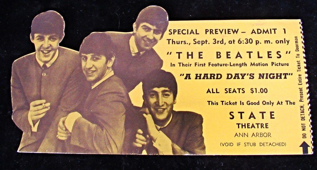
3. **A Hard Day’s Night Poster**: Joe Caroff’s creative ingenuity extended beyond the dramatic and epic, readily embracing the playful and the whimsical, as evidenced by his poster design for The Beatles’ seminal film, “A Hard Day’s Night.” This project allowed Caroff to inject elements of pure fun and unexpected quirkiness into his work, reflecting the revolutionary spirit and lighthearted charm of the band itself. His approach to the poster was not merely functional but aimed to capture the energetic essence of the burgeoning phenomenon that was Beatlemania.
One of the most notable “fun touches” Caroff added to the poster was the inclusion of “a knot in a guitar handle.” This seemingly small detail speaks volumes about his design philosophy. It wasn’t about grand gestures or overt symbolism; rather, it was about infusing an unexpected twist that could delight and intrigue the viewer. Caroff himself explained the rationale behind this choice with disarming simplicity.
He stated that it “frankly was just a whim,” and that it “doesn’t do anything except to create a quirky note, nothing more.” This candid admission highlights his spontaneity and willingness to experiment, to add a distinctive flourish purely for the sake of creative expression. Such a subtle, yet memorable, detail helped to cement the poster’s unique identity, ensuring it stood out and resonated with the film’s innovative and spirited nature, a testament to Caroff’s ability to find artistry in the unconventional.
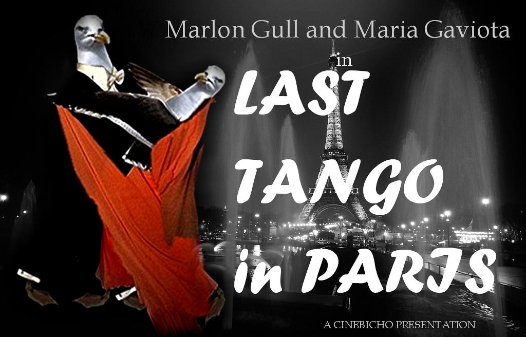
4. **Typography for Last Tango in Paris (1972)**: Joe Caroff’s brilliance was not confined to illustrative posters; he was equally adept at transforming textual elements into compelling visual art. His work on the typography for Bernardo Bertolucci’s controversial 1972 film, “Last Tango in Paris,” stands as a prime example of his innovative approach to film titles. For this highly emotive and charged film, Caroff recognized the need for a typeface that could convey its complex themes and raw emotional landscape, rather than merely presenting the film’s name.
To achieve this, Caroff “invented an undulating typeface” for the film. This was no ordinary font selection; it was a bespoke creation designed to visually echo the film’s narrative. The term “undulating” suggests a flowing, wave-like quality, perhaps hinting at the film’s turbulent relationships, its shifting emotional currents, or even the fluidity of human passion and vulnerability explored within its narrative. Such a design choice transcends simple legibility, embedding a deeper meaning into the very letters on screen or poster.
By creating a typeface that moved and flowed, Caroff ensured that the film’s title itself became a piece of evocative art, contributing to the overall sensory experience. This meticulous attention to the inherent character of words and their potential for visual expression defined his typographic mastery, showcasing his understanding that even the static text could be imbued with the same “effervescence” he sought in all his designs, making the title an inseparable part of the film’s identity and impact.
5. **Typography for Rollerball (1975)**: Caroff’s mastery of integrating thematic elements directly into typography continued with his distinctive work for the 1975 dystopian sports film, “Rollerball.” For a film centered around a violent, futuristic sport involving roller skates, Caroff ingeniously crafted a visual identity that immediately communicated the movie’s core concept, turning the title itself into a dynamic emblem of its brutal world. His design philosophy consistently aimed for instant recognition and thematic resonance.
His approach involved coming up with “treatments that used roller skates… to spell out Rollerball.” This meant that the very wheels and frames of roller skates were incorporated into, or perhaps formed the basis of, the letters themselves. This inventive method transcended traditional lettering, turning functional objects into integral components of the film’s branding. It was a bold and direct way to convey the movie’s content, appealing directly to the audience’s visual understanding.
This kind of integrated design not only served to inform but also to excite, drawing viewers into the kinetic energy of the film. Caroff understood that the visual language of a title could set the tone for the entire cinematic experience. By making the typography an active, illustrative part of the film’s presentation, he demonstrated his exceptional ability to merge form and function, creating a title treatment that was both literally descriptive and stylistically powerful, cementing the film’s visual identity.

6. **Typography for Manhattan (1979)**: The urban landscape and architectural grandeur of New York City, particularly Manhattan, became another fertile ground for Joe Caroff’s typographic innovation in his work for Woody Allen’s critically acclaimed 1979 film. For a movie so intrinsically tied to its setting, Caroff understood that the title treatment needed to embody the iconic skyline and the distinct character of the borough itself. His solution was a clever visual play that transformed cityscapes into typography.
Caroff famously “came up with treatments that used… high rises to spell out Manhattan.” This inventive technique meant that the very structures defining the Manhattan skyline – its towering skyscrapers and distinctive buildings – were either stylized or directly integrated to form the letters of the film’s title. This was not just a typeface; it was a miniature architectural feat, translating the essence of the city into a readable, artistic form.
Such a design not only served as an immediate identifier for the film but also as a subtle homage to its central character: the city itself. By literally building the title out of its environment, Caroff created a profound connection between the film’s content and its visual branding. This further exemplified his philosophy of making designs “have a life,” ensuring they were dynamic and interpretative rather than static, a consistent hallmark of his sophisticated and contextually rich work across various film projects.
7. **Other Iconic Film Posters**: Joe Caroff’s prolific career extended far beyond the select few masterpieces often cited, encompassing a vast array of cinematic genres and styles. His ability to capture the essence of a narrative, whether a gritty Western or a complex drama, was unparalleled. He worked on “more than 300 campaigns during his career,” a testament to his incredible output and the trust placed in his vision by studios. This diversity is clearly seen in his work for films such as Clint Eastwood’s early Spaghetti Westerns, “A Fistful of Dollars” (1964) and “For a Few Dollars More” (1965), where his designs undoubtedly contributed to establishing the lean, iconic visual language that defined the genre for a generation.
His portfolio also boasted the poster for Bob Fosse’s acclaimed musical “Cabaret” (1972), a film that required a sophisticated and subtly provocative visual identity. Caroff navigated this challenge with his signature blend of artistic flair and commercial savvy, ensuring the poster resonated with the film’s daring themes and intricate narrative. He also designed a “dozen or so Woody Allen films,” showcasing his capacity to adapt to a director’s distinctive style and thematic concerns while maintaining his unique touch.
Later, for Richard Attenborough’s monumental epic “Gandhi” (1982), Caroff’s design had to convey the film’s profound historical weight and its central figure’s moral gravitas, a testament to his versatility and depth as a visual storyteller. His consistent ability to adapt his style while maintaining a high level of expressive quality across such varied subjects solidifies his standing as a master of the craft, proving his designs could both inform and deeply engage audiences across the entire spectrum of cinema.
8. **The Great Train Robbery (1978) Poster**: Joe Caroff’s ingenuity in transforming literal elements into striking visual metaphors was a recurring motif throughout his career, often elevating a simple title into an immersive piece of art. His work for the 1978 film “The Great Train Robbery” perfectly exemplifies this clever integration of concept and design. For this period heist film, Caroff did not merely create a static title or an illustrative scene; instead, he ingeniously “fashioned a train out of the title.
This innovative approach meant that the very letters forming “The Great Train Robbery” were designed to resemble the carriages and engine of a train, chugging along the poster. This wasn’t just a clever visual trick; it was a deeply immersive design choice that immediately conveyed the film’s core subject matter and kinetic energy without needing explicit imagery of the crime itself. It showcased his remarkable ability to distil a complex narrative into a singular, dynamic visual concept.
Such a design choice speaks volumes about Caroff’s belief in making his work “have a life,” ensuring it didn’t “lie there flat,” a quality he valued deeply, as stated in the 2022 TCM documentary *By Design: The Joe Caroff Story*. It demonstrated his capacity to imbue inanimate typography with narrative motion and thematic depth, solidifying the film’s visual identity through an unforgettable, integrated design that captured the adventurous spirit of the movie.
9. **Corporate Identity: Orion Pictures and Decca Records**: Beyond his profound impact on the film industry through posters and title sequences, Joe Caroff’s design genius also extended into the crucial realm of corporate identity, shaping the visual presence of major entertainment entities. One of his most enduring contributions in this area was his design of “the logo and title signature for Orion Pictures.” This instantly recognizable emblem, featuring a stylized constellation, became synonymous with a prolific film studio known for producing a diverse range of cinematic works.
Caroff’s ability to create a mark that was both memorable and timeless ensured Orion Pictures maintained a distinct and authoritative presence in a highly competitive market, guiding audiences through countless cinematic journeys. The logo was not just a symbol; it was a statement of artistic ambition and a beacon for quality filmmaking that endured for many years, reflecting the studio’s identity and aspirations.
Furthermore, his work encompassed the music industry, as he designed “several album covers for Decca Records.” In an era when album art was paramount to an artist’s and label’s identity, often serving as the first visual introduction to the music within, Caroff’s contributions for Decca showcased his versatility. This demonstrated his keen understanding of how visual branding could powerfully resonate across different entertainment mediums, from the silver screen to the tactile experience of vinyl records, reinforcing his comprehensive influence on popular culture.
Joe Caroff’s passing marks the end of an era, but his influence remains as vibrant and dynamic as the “effervescence” he sought in all his creations. From the high-stakes world of Hollywood blockbusters to the ubiquitous branding of major networks, his designs did not just serve a purpose; they told stories, provoked thought, and indelibly shaped the way we see the world. His legacy is a rich tapestry woven with innovation, passion, and an unwavering commitment to the art of visual communication, ensuring his place as a true titan in the annals of graphic design history.


