
Alright, listen up, trendsetters! If you thought the reign of minimalist neutrals was forever, think again. Get ready to swap muted tones for a kaleidoscope of vibrant hues, because in 2025, color is taking over with a bold, unapologetic bang. We’re talking color blocking – but not as you know it. This isn’t your grandma’s color wheel; this is a revolution set to dominate wardrobes and living rooms.
What exactly is this magic? Color blocking is an invigorating design technique combining solid, contrasting blocks of color in a single composition. It’s a versatile powerhouse that originated in high fashion but has since exploded across graphic design, branding, and how we conceptualize our living spaces. Its appeal is simple: it creates immediate visual impact and communicates emotion through striking, yet surprisingly simple, color arrangements.
So, whether you’re a seasoned design pro or just looking to inject serious personality into your life, embracing this trend is about more than staying current. It’s about leading the charge, redefining possibilities, and making every visual statement count. We’re about to unlock the twelve essential secrets to mastering color blocking in 2025 – prepare to be inspired, delighted, and perhaps a little shocked by its sheer joy. Let’s dive into the first six game-changers!

1. Understanding Color Blocking: The Basics for 2025
First things first, let’s get on the same page about what color blocking truly entails for the coming year. At its core, it’s the art of combining multiple bold and contrasting colors within a single composition. Forget traditional color coordination where similar shades gently blend; color blocking uses complementary or contrasting hues to create a vibrant, eye-catching, and strong statement. It’s a design technique that has truly stood the test of time, now receiving a massive glow-up for 2025.
We’re moving well past the basic two-tone looks that might come to mind from previous iterations. Imagine a world where three, four, or even five shades don’t just coexist but harmonize in one spectacular look or design. The secret lies in intentional styling and creative contrasts, making each color choice feel deliberate and impactful. It’s not about blending in; it’s about standing out with purpose and panache, embracing a new level of visual sophistication.
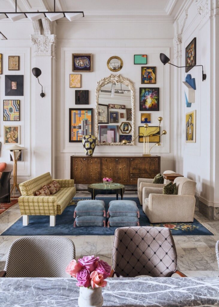
This season’s color blocking feels both bold and elevated, often combining saturated shades with barely-there tones to keep the look grounded and sophisticated. Think fuchsia paired with a soft sand beige, or vibrant cobalt juxtaposed with a calming cream. As AD100 talent Ross Cassidy aptly puts it, “Color blocking is a wonderful shock tactic—you build a harmonious base, and then you upend it with an unexpected jolt.” It’s time to say goodbye to ‘matchy-matchy’ and fully embrace ‘unexpected harmony’ in all its glorious forms.

2. Why Color Blocking is Exploding Now: The 2025 Resurgence
The fashion and design industries are always in motion, constantly evolving and reinventing themselves, and color blocking is a prime example. Its resurgence in 2025 is no accident; it’s deeply rooted in our collective desire for unique, standout looks in an increasingly visually-driven world, especially with social media’s pervasive influence. It offers a perfect avenue to inject fun and playfulness into our wardrobes and living environments.
One of the most compelling factors contributing to its renewed popularity is how visual simplicity meets bold expression. In an increasingly cluttered digital landscape, the clean, no-nonsense approach of color blocking offers a refreshing break. It allows for impactful, memorable designs without overwhelming the senses, providing clarity and visual appeal in a sea of complexity. This streamlined aesthetic makes a powerful statement.
Furthermore, its versatility across various media is a huge draw. Whether stunning print designs, engaging digital interfaces, or captivating packaging, color blocking works seamlessly. It’s particularly effective in print and packaging, where it effortlessly draws attention on crowded shelves and enhances the tactile experience of paper products, proving its adaptability across different consumer touchpoints.
Finally, the trend’s emotional resonance cannot be overstated. The bold contrasts inherent in color blocking evoke strong emotions and associations, making it an incredibly powerful tool for branding and storytelling. Color, in this context, has truly become a key narrative element in design, capable of conveying optimism, individuality, and a fresh spirit. Embracing color blocking now isn’t just about catching a trend; it’s about leading a shift towards more daring and creative expressions that redefine what’s possible.
3. The 2025 Color Palette: Saturated Tones and Unexpected Pairings
Get ready for a color explosion because the palette for 2025 is leaning heavily into rich, saturated tones and combinations that might just surprise you. This isn’t about playing it safe; it’s about vibrant blues clashing harmoniously with fiery oranges, or muted pastels juxtaposed against bold, earthy hues. These aren’t random pairings; they’re carefully chosen to embody a spirit of optimism and individuality, perfectly aligned with the adventurous ethos of color blocking.
A huge player in setting this tone is, of course, the Pantone Color of the Year for 2025: “Mocha Mousse.” This warming, rich brown hue perfectly encapsulates a global need for comfort, harmony, and shared indulgence. What’s brilliant about Mocha Mousse is its versatility; it acts as an incredible, grounding centerpiece for bold and innovative designs, allowing those vibrant contrasting blocks to truly pop while maintaining a sense of sophisticated warmth.
So, what does this mean for your spaces and styles? Say goodbye to the era of stark whites, dated grays, and cool neutrals that have dominated for too long. Consumers are actively opting for layered colors, including electric brights, ravishing rubies, and exciting new neutrals that help tell a more personal story through interior design or fashion. This shift signifies a desire for authenticity and self-expression through thoughtful color choices.
According to Sherwin-Williams’s Director of Color Marketing, Sue Wadden, consumers are gravitating towards timeless colors like antiquarian browns and earthy yellows. These shades feel more personal and nurturing, moving away from predetermined color palettes. Wadden emphasizes that “We’re all about creating spaces that are ours, and personalization may become the new ritual.” It’s about tending to our interiors like we tend to ourselves, bringing in meaningful elements, and letting our true colors shine.

4. Beyond Fashion: Color Blocking’s Versatility Across Industries
While color blocking made its initial splash in fashion, its ingenious appeal means it’s too good to be confined to clothing racks. This vibrant approach has transcended its sartorial origins, leading to widespread adoption across creative industries, proving its incredible versatility. From editorials to everyday packaging, color blocking is making its mark everywhere.
For those working in publishing and printing, this trend opens up exciting new opportunities to innovate and stand out. Designers can wield color blocking to craft striking, contemporary book covers and magazines that immediately capture the eye on newsstands or digital storefronts. Beyond that, the trend lends itself beautifully to high-end stationery and invitations, where bold blocks of color elevate paper goods, making every piece feel like art.
The impact extends into cross-industry applications. Consider footwear, where brands like Birdies utilize color-blocked sneakers and sandals with tonal contrasts for playful, eye-catching appeal. In beauty and cosmetics, companies such as ColourPop leverage vibrant red and rose pink palettes for lipsticks and blushes, turning makeup into mini color-blocked statements. Even home goods and branding, with Shopify stores like Heinz and Tentree, employ bold color schemes for product packaging and overall brand identity, showcasing color’s universal communication power.
Essentially, color blocking’s power lies in its ability to translate seamlessly across mediums. Whether it’s a digital ad, a product label, or the tactile experience of a beautifully designed book, color blocking ensures your message is seen and felt. It’s particularly effective in physical products like packaging and print design, where it not only draws attention but also enhances the overall sensory experience, proving that this trend is far more than skin deep.
5. Mastering Visual Simplicity & Bold Expression
In our increasingly digital and often chaotic world, where visual clutter is the norm, the elegant simplicity of color blocking offers a much-needed breath of fresh air. It presents a clean, no-nonsense approach to design that doesn’t sacrifice impact. In fact, its straightforward nature is precisely what allows for incredibly memorable and powerful designs to emerge, cutting through the noise with clarity and purpose, making every visual a statement.
At its heart, color blocking means painting walls or objects in separate, solid color zones, making it inherently geometric and highly intentional. This deliberate application of color isn’t just for aesthetics; it fundamentally defines spaces and adds visual depth in a way that feels both modern and impactful. It’s about creating structure and focal points through the intelligent use of color alone, transforming ordinary surfaces into captivating statements.
The real magic here is how this technique allows colors to take center stage. By consciously focusing on minimalism and keeping typography and other decorative elements understated, the bold blocks of color are given the spotlight they deserve. This focused approach ensures that each hue speaks volumes, creating a design that is both sophisticated and strikingly expressive without feeling overdone or chaotic.
Ultimately, the enduring appeal of color blocking lies in its innate ability to create undeniable visual impact while simultaneously communicating emotion through simple, striking arrangements of color. It’s a testament to the power of deliberate choice in design. This clean, no-nonsense approach proves that sometimes, less truly is more, especially when that ‘less’ involves thoughtfully selected, vibrant blocks of color making a big, beautiful statement.
Read more about: The ’90s Called, They Want Their Fashion Back: 12 Wild Trends We Loved (And Loved to Hate)
6. Emotional Resonance: How Color Blocking Tells a Story
Color isn’t just something we see; it’s something we *feel*. And in the world of color blocking, this emotional connection is amplified to incredible degrees, making it a profound tool for branding and storytelling. The bold contrasts inherent in color blocking aren’t just visually stimulating; they evoke strong emotions and associations, turning a simple design into a powerful narrative that resonates deeply with an audience. Color, as many experts point out, has truly become a key narrative element in design, speaking volumes without uttering a single word.
Indeed, the psychology of color is a fascinating realm, and that’s precisely where color blocking truly shines. Historical figures like Le Corbusier, with his polychromie architecture principles, demonstrated that strategic paint placement can profoundly impact human emotion. This isn’t just theory; it’s a practical application that allows designers and homeowners alike to consciously shape the atmosphere and mood of any given space, creating environments that support specific feelings and functions.
Want to cultivate calm? Soft blue zones are your go-to. Need to spark balance and harmony? Olive greens will do the trick. Looking to infuse warmth and coziness into a room? Terracotta is your secret weapon. In a minimalist room, the trick is to limit your palette to three hues maximum. This intentional layering allows you to craft spaces that meticulously support focus, relaxation, or energy, turning your environment into a curated experience of emotion.
Beyond just aesthetics, this strategic use of bold color has a profound psychological superpower. It can genuinely elevate your mood, boost your confidence, and subtly shift your energy throughout the day. After years of neutral-heavy minimalism, the pendulum is definitely swinging back towards vibrant, expressive color. Color blocking, therefore, becomes more than just a trend; it’s a conscious choice to create spaces and styles that don’t just look good, but also feel better, embodying joy, creativity, and self-celebration.
Alright, let’s keep this color-blocking party going strong! We’ve covered the what, the why, and the wow-factor of this incredible trend for 2025. Now, get ready to roll up your sleeves because we’re diving into the nitty-gritty: how to actually bring this vibrant magic into your life, from your living room walls to your dazzling wardrobe. You’re about to unlock some serious style secrets and transform your world, one bold block at a time!
7. Your Home, Transformed: Pro Color Blocking Techniques for Interiors
Ready to make your interiors sing? Color blocking in home design is like giving your walls a chic, structural makeover. It’s all about painting walls or objects in separate, solid color zones, making everything feel geometric and incredibly intentional. This isn’t just about pretty colors; it’s about fundamentally defining spaces and adding visual depth in a way that feels both modern and impactful. Imagine transforming ordinary surfaces into captivating statements with just a few clever color choices!
When you’re diving into paint color blocking, always start with geometry in mind. Shapes and clean lines aren’t just aesthetically pleasing; they actually help define areas in your rooms and give the design a clear purpose. Mitchell Black’s 2025 decorating trends are already showing us the way, with vertical stripes, half-painted walls, and cleverly cornered-off zones designed to alter how we perceive space. It’s like magic, but with paint!
For those channeling a modern minimalist vibe, pairing base colors like crisp white, soft gray, or warm beige with muted bolds such as sage, terracotta, or charcoal is an absolute game-changer. These combinations effortlessly maintain harmony while injecting serious character into your space. As AD100 talent Ross Cassidy aptly puts it, he “conceives of color as a structural component of a space, not just an added layer.” This means your color choices are literally building blocks for your room’s personality.
The real secret sauce? Focusing on minimalism. By keeping typography and other decorative elements understated, those bold blocks of color get to truly take center stage and shine. This focused approach ensures that each hue speaks volumes, creating a design that is both sophisticated and strikingly expressive without ever feeling overdone or chaotic. Get ready to fall in love with your home all over again!

8. DIY Dreams: Your Go-To Guide for Color Blocking Your Space
Feeling inspired to tackle a color blocking project yourself? You absolutely should! DIY color blocking isn’t nearly as daunting as it might seem. In fact, with a trusty roll of good painter’s tape, a level to keep those lines crisp, and a little bit of patience, you’re more than capable of pulling off a stunning transformation. We suggest starting with an accent wall or a simple vertical division. This way, you can get a feel for the technique without committing to a full room right off the bat. It’s all about building that confidence!
So, how do you kick off your color blocking adventure? Let’s break it down into easy, actionable steps. First up, grab a pen and paper (or your tablet!) and sketch out your design. While you’re doing that, take a moment to identify the natural light flow in your room—this will influence how your colors look. Once your masterpiece is envisioned, it’s time to carefully tape off your color zones. And seriously, don’t forget to use that level for those perfectly sharp lines!
Next, the exciting part: test your swatches! Always, *always* test your paint colors in a small, inconspicuous area before applying full coverage. This ensures you love how the color looks in your space and under different lighting conditions. Once you’ve picked your winners, apply two coats for a rich, even tone that truly pops. This step is crucial for that vibrant, professional finish we’re all chasing.
Finally, for the ultimate crisp lines, here’s a pro tip: remove the painter’s tape while the paint is still slightly wet. This helps prevent any peeling or jagged edges, leaving you with a flawless division between your color blocks. Remember, this trend is about injecting personality, so have fun with it! Your home is your canvas, and you’re the artist ready to make some serious magic happen.

9. Color Crush: The Hottest Pairings You NEED to Try in 2025
Alright, prepare to have your mind blown by the amazing world of color combinations! In 2025, the palette rulebook has been thrown right out the window, replaced by an exciting attitude: if it makes you smile, it works! We’re seeing a vibrant shift where brights are mixing with earthy tones, and soft shades are expertly used to temper neons, creating looks that are playful, modern, and brimming with personality. Get ready for some seriously unexpected harmony!
For your minimalist home, some go-to pairings can truly transform a space. Imagine your living room rocking “Snowbound” with “Misty Teal” – sophisticated yet fresh. In the bedroom, a dreamy combo of “Soft Gray” and “Blush” creates a serene sanctuary. Your kitchen could shine with “Sandstone” and “Forest Green,” bringing a touch of nature indoors. And for a studio space, “Cool Blue” paired with “Clay Terracotta” offers a grounding yet inspiring vibe. These thoughtfully selected hues elevate your everyday!
But let’s talk about those truly unexpected combos that just *work* – the ones that look like mistakes on paper but turn into pure magic in person. Picture “Coral” meeting “olive green” for a bold-meets-earthy vibe, or “Lavender” dancing with “tangerine” for a sweet yet punchy statement. How about “Sky blue” and “fire red” for a cool-and-hot contrast that will turn heads? Even “Lime green” and “blush pink” are creating a tropical and flirty feel, while “Lemon yellow” with “slate gray” offers a soft yet edgy appeal.
And for those looking for the absolute trendsetters, the official word is in! According to our fabulous trend reports, “Pink + Green” are dominating dresses and casual separates, with brands like Valentino and Birdies leading the charge. “Mocha Mousse + Red” are making a statement in outerwear and accessories, seen from Gucci to Toteme. And if you’re heading for the beach, “Emerald + Tangerine” swimwear is where it’s at, thanks to brands like Bottega Veneta. These aren’t just colors; they’re a vibe!
10. Small Space, BIG Impact: Color Blocking Hacks to Make Any Room Pop
Living in a cozy apartment or have a small office? Don’t even sweat it! Color blocking is an absolute wizard when it comes to making tight rooms feel dramatically bigger and more open. Seriously, smart placement of color can completely alter the perception of space, and we’ve got the hacks to prove it. This technique is a secret weapon for anyone looking to maximize impact in a compact footprint.
One of our favorite tricks for small rooms is to go vertical with geometric color blocking paint. By drawing the eye upward, you immediately create the illusion of height. Imagine pale shades on your upper walls, making the ceiling feel miles away, while deeper hues on the lowers ground the space without making it feel cramped. It’s an ingenious way to expand the sense of space without knocking down any walls!
This strategy isn’t just for living areas. For small kitchens or pantries, using color blocking is a super smart technique to keep everything feeling open, fresh, and surprisingly spacious. Think about painting a narrow vertical band in a vibrant hue to delineate a zone, or using two-tone colors to add visual interest without overwhelming the space. Every inch counts, and color blocking makes every inch count for more.
So, ditch the idea that small spaces mean playing it safe with neutrals. Embrace the power of color blocking to make your apartment or tiny office feel expansive, energetic, and uniquely *yours*. It’s about being strategic and intentional with your design choices, turning limitations into exciting opportunities for creativity. Get ready to watch your small room transform into a visual powerhouse!
11. Slay the Day: How to Rock Bold Color Blocking in Your Outfits
Okay, fashionistas, let’s talk about taking color blocking from your home right into your wardrobe! Diving into bold color can feel a little intimidating at first, but here’s the secret: it’s all about confidence and balance. This trend is all about being bold and fearless, so don’t be afraid to experiment and play with different color combinations. The most important tip for mastering color-blocking in 2025 is to simply have fun with it!
For those new to the color blocking game or who want to ease in, start with the basics. Look for pieces in solid, bold, and contrasting colors. Think of pairing two main colors, like a vibrant red top with crisp blue trousers, or a sunny yellow skirt with a regal purple blazer. Build your outfit from there, keeping the silhouettes clean and intentional to let those magnificent colors truly pop. It’s about making a statement without feeling overwhelmed.
And seriously, don’t underestimate the power of accessories! They can absolutely make or break your color-blocked outfit. Don’t be shy about adding a vibrant pop of color with your accessories, whether it’s a bold statement bag, some fierce, colorful platform shoes, or even a stack of rings in your chosen shades. Accessories are your secret weapon to introduce new hues and tie your whole look together, making your color story feel complete and utterly fabulous.
One styling trick that always works? Anchor your look with a neutral. Pieces in white, tan, or charcoal provide a grounding base that allows your bold colors to truly shine without competing for attention. Stick with solid blocks rather than busy prints when you’re mixing colors to keep the look polished and impactful. Remember, there are no wrong color choices—just missed opportunities to stand out and feel amazing!

12. Next-Level Blocking: Playing with Patterns and Textures Like a Pro
Once you’ve mastered the foundational rules of color blocking and you’re feeling confident rocking those bold, solid hues, it’s time to take your style game to the next level! Get ready to explore the exciting dimensions that patterns and textures can bring to your color-blocked outfits. This is where true fashion artistry comes into play, adding depth, intrigue, and an undeniable “wow” factor to your looks.
Ready to play with patterns? Once you’ve got the basics down, incorporating patterns into your outfit is the perfect way to elevate your color-blocked ensemble. Think beyond just solid blocks; stripes, polka dots, and even playful animal prints can add an extra element of fun and personality to your look. Just make sure to stick to a complementary color scheme within the pattern, perhaps echoing one of your main block colors, to keep things cohesive and avoid going overboard. It’s about controlled chaos, in the best possible way!
But wait, there’s more! A fantastic way to add incredible depth and interest to your color-blocked outfits is by mixing and matching different textures. Imagine pairing a chunky knit sweater in one vibrant color with a silky skirt in a contrasting hue for a look that’s both chic and incredibly stylish. Or perhaps a leather top with tailored linen trousers. Experiment with different textures—like mesh or tweed—in bold tones to add extra dimension and a luxurious feel. The contrast in textures will make your colors pop even more!
This season’s color blocking feels both bold and elevated, often combining saturated shades with “barely-there” tones to keep the look grounded and sophisticated. Think fuchsia paired with a soft sand beige, or vibrant cobalt juxtaposed with a calming cream. By consciously incorporating patterns and textures, you’re not just wearing an outfit; you’re creating a multi-sensory experience that is uniquely yours. So, go forth and experiment—your next iconic look is just a pattern and a texture away!
So, there you have it, trendsetters! Our deep dive into color blocking in 2025 reveals it’s so much more than just a passing fad; it’s a full-blown movement. From transforming your living spaces into personal sanctuaries with strategic paint placements to curating a wardrobe that radiates confidence and joy, color blocking offers endless possibilities for self-expression. Remember, the goal isn’t just to follow a trend, but to make it *yours*. Embrace the power of vibrant hues, play with unexpected combinations, and let your true colors shine through in every aspect of your life. This is your moment to be bold, be bright, and create a world that looks and feels absolutely fantastic. Are you ready to lead the charge? Let the color revolution continue!


