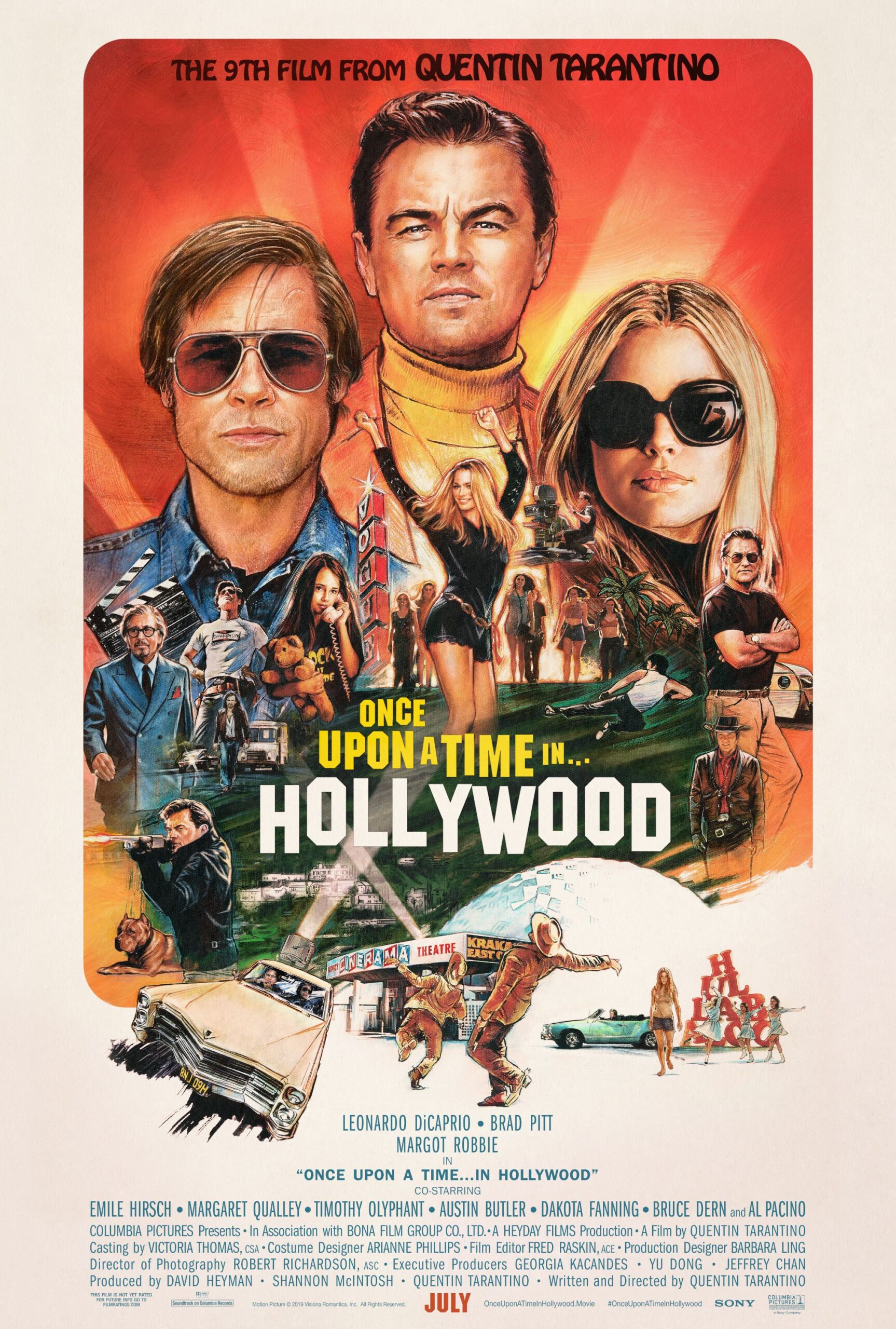
The world of Panem, with its stark contrasts between the impoverished districts and the opulent, totalitarian Capitol, is as much a character in “The Hunger Games” saga as Katniss Everdeen herself. It’s a universe that captivated millions, drawing them into a narrative where societal structures are visually hammered home through every detail of its environment. Behind this breathtaking, often terrifying, on-screen reality is the intricate vision of production designers like Philip Messina, who, through his work on all four films, meticulously crafted the visual language that would define an entire generation’s cinematic experience. His insights offer a rare, privileged glimpse into the architectural ingenuity and creative challenges involved in bringing Suzanne Collins’ literary masterpiece to life, shaping the very ground upon which its beloved cast performed their iconic roles.
Messina, a seasoned veteran with a career spanning decades and collaborations with esteemed directors like Steven Soderbergh and M. Night Shyamalan, found himself at the helm of an unprecedented visual undertaking with “The Hunger Games.” The task was not merely to build sets, but to construct an entire believable world – one that could convey the profound themes of war, social inequality, and the human spirit without overshadowing the intimate story at its core. This meant navigating a complex landscape of budgetary constraints, technological advancements, and the immense expectations of a global fanbase, all while ensuring that the visual environments resonated deeply with the emotional beats of the story. It was a monumental endeavor that required not just artistic talent, but an almost alchemical blend of practicality and imaginative flair, all of which contributed to the indelible mark the franchise left on the silver screen.
What truly sets Messina’s approach apart is his unwavering commitment to storytelling through physical space, even as digital effects became increasingly prevalent in modern filmmaking. His journey through Panem wasn’t just about constructing buildings; it was about defining an aesthetic that would make the cast’s struggle, resilience, and transformation feel tangible and immediate to the audience. By understanding the core design decisions, the contrasts, the subtle details, and the sheer scale of the vision, we can better appreciate the immersive world in which our favorite characters lived, fought, and inspired. Here, we delve into the initial blueprints and foundational design choices that brought Panem vividly to life, revealing the thoughtful artistry that underscored every frame.

1. **Translating Suzanne Collins’ Vague Descriptions: Embracing the Spirit of Panem**One of the most fascinating challenges in adapting “The Hunger Games” from page to screen was interpreting Suzanne Collins’ intentionally vague descriptions. Philip Messina shared that the books were constantly referenced in the art department, only to discover that what they remembered as vivid details were often quite open to interpretation. This wasn’t a flaw in the writing, but a testament to Collins’ skill in allowing readers to visually fill in the blanks, creating a personal connection to the world.
This vagueness meant the design team had significant creative leeway, but also a responsibility to capture the “spirit” of the books. Messina emphasized that the goal was to keep that spirit true, acting as a “steward of both her vision and the director’s vision.” This involved constant dialogue with Collins, especially in the early stages, to ensure the visual translation aligned with her core ideas. By the later films, a clear “template” had been established, allowing the team to operate within defined creative bounds.
This approach to interpretation highlights a crucial aspect of world-building: sometimes, less explicit detail allows for greater artistic freedom and a more powerful collective vision. Instead of a strict, prescriptive visual guide, Collins offered a framework that encouraged the production designers to imbue Panem with their own rich, detailed imagination. This collaborative process, where a novelist’s initial vision is nurtured and expanded by a team of artists, is often where the magic of adaptation truly happens, allowing for a fresh yet faithful interpretation that resonates deeply with audiences.
Ultimately, the deliberate ambiguity in the source material provided a unique opportunity to build a world that felt both familiar to readers and fresh on screen. It wasn’t about a literal recreation but an evocative one, drawing out the essence of inequality, struggle, and spectacle. This foundational understanding allowed Messina and his team to construct environments that, while perhaps not matching every reader’s internal image, undeniably captured the emotional and thematic core of Panem, giving the cast a powerfully defined backdrop against which to perform.

2. **The Architectural Duality: District 12’s Despair Versus The Capitol’s Decadence**The visual contrast between District 12 and the Capitol is central to “The Hunger Games” narrative, serving as a constant reminder of Panem’s extreme social inequality. Messina found this duality incredibly appealing, noting that he couldn’t remember any other film that so intertwined “what seems like the depression era and part set in science-fiction.” This unique blend meant he was constantly bouncing between designing environments that evoked gritty realism and those that plunged into high-tech fantasy.
District 12, Katniss’s home, was designed to convey a sense of poverty, struggle, and deprivation, echoing the aesthetics of the Great Depression. The visual language here spoke of scarcity, hard labor, and a life devoid of modern conveniences. This grounded, almost primitive setting served as a powerful counterpoint to the dazzling, yet sinister, opulence of the Capitol, making Katniss’s journey all the more impactful as she transitioned between these two extremes.
Conversely, the Capitol was envisioned as a place of excessive wealth, advanced technology, and totalitarian control. Its design aimed to impress and awe, but also to intimidate and frighten those from the districts. Messina described the experience of taking Katniss from the “starved for any modern conveniences” District 12 into the “excesses of the Capitol” as “great fun,” recognizing that Katniss effectively served as the audience’s visual proxy, experiencing the world as they would.
This deliberate visual dichotomy was crucial for establishing the socio-political themes of the films. The stark differences in architecture, technology, and overall aesthetic between the districts and the Capitol didn’t just provide pretty backdrops; they were integral to the storytelling, reinforcing the power imbalance and the dehumanizing conditions faced by most of Panem’s citizens. The immersive environments thus became a silent narrator, amplifying the cast’s performances and the urgency of their fight.

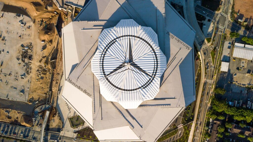
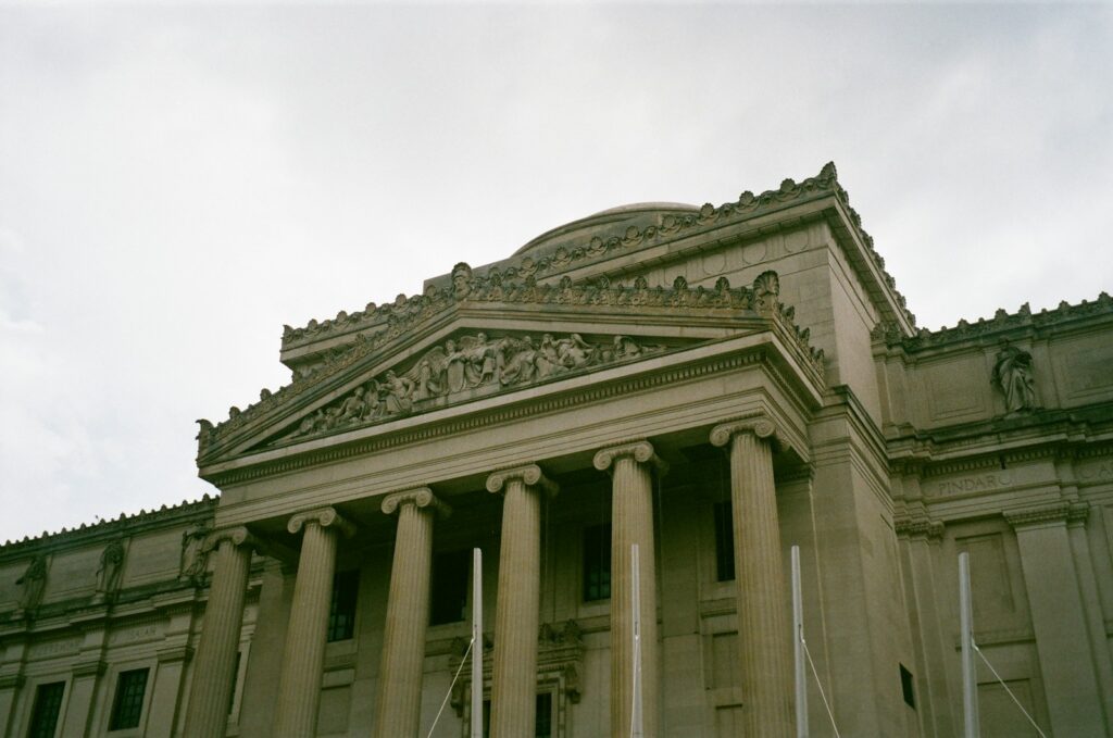
3. **Crafting Totalitarian Spaces: The Capitol’s Impressive Awe and Intimidation**The Capitol’s architecture was a masterclass in conveying power, control, and superficial grandeur. Philip Messina delved into historical and architectural inspirations to create spaces that would simultaneously impress the elite and instill fear in the oppressed. He looked extensively at “Soviet architecture from the ’50s through the ’70s,” while consciously trying to avoid direct “Nazi Germany references,” seeking a more universally understood language of totalitarianism.
Ultimately, Messina recognized that the architecture of power has ancient roots, stretching “back to the Roman Empire.” The fundamental principle was to “build things to impress,” a concept also found in “religious architecture where you try to convey power and awe to people.” This meant designing structures that were colossal, imposing, and meticulously crafted, often with a “brutalist environment” undertone that underscored their unyielding nature. The scale and materials chosen were vital in creating this imposing presence.
For those who lived within the Capitol’s gilded walls, the aesthetic was intended to be “kind of cool,” projecting an image of privilege and superiority. As Messina put it, “if you’re a member of the elite, is impressive.” However, for outsiders like Katniss, these same impressive structures were designed to be “very scary,” a visual manifestation of the oppressive regime. This dual perception was a key design objective, ensuring the environment served the narrative’s emotional and political weight.
The resulting visual language of the Capitol was one of overwhelming scale and intimidating design, from the grand plazas used for parades to the intricate detailing of its interior spaces. Every architectural choice reinforced the narrative of an all-powerful, all-seeing government, making the Capitol a character in itself. This carefully constructed environment provided the cast with a vivid and palpable sense of the forces they were up against, allowing their performances to be deeply rooted in their surroundings.
4. **The Evolution and Continuity of District 12’s Visuals: Navigating Production Shifts**Maintaining visual continuity across a sprawling franchise, especially one that underwent significant production changes, presented a unique challenge for Philip Messina. A notable instance was the relocation of the production from Charlotte to Atlanta between the first and second movies. This move necessitated recreating sets that had appeared in both films, all while managing different directorial visions.
District 12, despite being a touchstone location, “actually changed quite a bit” between films. Messina and his team focused on minimizing how much these changes were visually noticeable to the audience. This required a delicate balance of adapting to new locations and resources while preserving the established aesthetic. The Hall of Justice, for example, remained a recognizable landmark, even as the surrounding square transformed. “If you look at it again, [the square] looks completely different,” Messina noted, highlighting the subtle nature of these shifts.
Furthermore, the change in directors – Gary Ross for the first film, followed by Francis Lawrence for the subsequent three – introduced new ideas and interpretations. While Messina aimed to “establish a language” in the first movie that “stayed fairly true through all of them,” adapting to different creative directives while maintaining a cohesive look was a continuous process. He humorously acknowledged the pressure, stating, “You just hope you don’t get busted by the audience.”
This behind-the-scenes reality underscores the meticulous planning and artistic compromises inherent in large-scale film production. The goal was always to provide a consistent, believable world for the characters, ensuring that even as the production moved and evolved, the essence of District 12 remained intact. This commitment to continuity, despite logistical hurdles, allowed the cast to inhabit a familiar and emotionally resonant environment across the entire series, reinforcing the consistency of their characters’ origins.
5. **Designing Iconic Capitol Structures: The Avenue of the Tributes’ Enduring Language**Among the most iconic visual elements of the Capitol, the Avenue of the Tributes, with its grand parades featuring chariots, was a design born in the very first “Hunger Games” film and remained a consistent presence throughout the entire series. This vital location, representing the spectacle and intimidation of the Games, required a meticulous and enduring design that could stand the test of time and multiple adaptations.
Messina explained that the initial model for the Avenue was rudimentary, built by him in a computer with “tons of references and details.” This foundational model, once generated by the visual effects department, served as the “basis for the rest of the films.” This foresight in the initial design phase was crucial, as it allowed for a cohesive visual language to be established early on, minimizing later inconsistencies.
While the core design remained steadfast, Messina noted that “there were little changes here and there in the background and buildings in the distance.” These subtle adjustments allowed for evolution within the established framework without disrupting the audience’s perception of the familiar landscape. It was a testament to the robust initial design that it could accommodate these minor alterations while retaining its recognizable grandeur and imposing presence, a crucial visual anchor throughout the saga.
The Avenue of the Tributes perfectly encapsulates the Capitol’s ability to blend awe with terror, and its consistent presence provided a powerful visual marker for the cast’s journeys through the Games. From the first film’s introduction to its later appearances, the Avenue’s unchanging, yet adaptable, visual language underscored the enduring nature of the Capitol’s control and the spectacle it demanded, creating a highly memorable and impactful environment for key narrative moments.

6. **The Hall of Justice: A District 12 Touchstone Amidst Change**Even as District 12 underwent various transformations due to production moves and directorial changes, certain structures were deemed essential “touchstones” to maintain visual recognition and emotional resonance for the audience. The Hall of Justice stood out as one such vital landmark. Its distinctive appearance became synonymous with District 12’s identity, providing a sense of place and continuity amidst the broader visual evolution of the district.
Messina acknowledged that while “District 12 actually changed quite a bit,” the visual impact of the Hall of Justice was strategically preserved. This conscious effort ensured that despite changes in the surrounding square or other elements, this particular building remained a constant visual reference. It allowed viewers to instantly connect with the setting, grounding Katniss’s origins even when other parts of her environment shifted subtly.
This focus on specific, iconic structures demonstrates the art department’s understanding of audience perception and the importance of visual anchors in a sprawling narrative. By carefully selecting which elements to maintain and which to allow to evolve, Messina and his team ensured that the emotional weight tied to District 12 was not lost. The Hall of Justice, therefore, became more than just a building; it was a symbol of the district’s enduring character.
The consistency of the Hall of Justice’s look, even as other elements around it changed, was a quiet but powerful testament to the production design team’s skill in navigating logistical challenges without sacrificing narrative integrity. It provided the cast with a stable, recognizable backdrop for their most crucial scenes set in District 12, ensuring that the audience’s connection to their humble beginnings remained strong throughout the series.
7. **Grounding Fantasy in Reality: The Design of Panem’s Military Technology**The technological advancements showcased in “The Hunger Games,” particularly within the military and the Games themselves, required a careful design approach to ensure they felt believable rather than merely “magical.” Philip Messina and his team extensively discussed the technology, aiming to ground even the most futuristic elements in a sense of reality. This philosophy was crucial for creating a world that, despite its fantastical premise, remained relatable and impactful.
Messina specifically mentioned that the military’s advanced systems were “based on real technologies that are there, and a sort of forward thinking.” The design team tried to base the flying military machines on actual existing or conceptualized aircraft, ensuring that the armies were “dressed and housed in things that looked military.” This commitment to realism prevented the technology from becoming a mere plot device, instead making it an integral, believable part of Panem’s oppressive infrastructure.
The designer’s desire to “add realism to it, especially doing a fantasy movie,” highlights a key principle of effective world-building. By grounding the fantastical elements in a recognizable reality, the audience is better able to suspend disbelief and immerse themselves in the story. This blend was a source of great enjoyment for Messina, who found himself constantly oscillating between the “depression era” aesthetic of the districts and the “science-fiction” elements of the Capitol and its military.
This meticulous approach to designing technology, ensuring it felt like an extension of plausible advancements rather than pure fantasy, contributed significantly to the credibility of Panem as a whole. It meant that the threats posed by the Capitol’s forces felt more tangible, and the spectacle of the Games more menacing. The cast, therefore, operated within a technologically advanced world that, while frightening, felt genuinely possible, enhancing the gravity of their struggle against a well-equipped, oppressive regime.
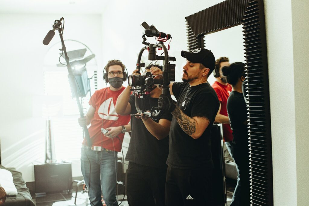
8. **Collaborative Dynamics: The Art of Working with Directors and Crew**Beyond individual artistic vision, the creation of Panem was deeply rooted in the collaborative spirit of filmmaking, a facet Philip Messina emphasizes as crucial to navigating the immense scale of “The Hunger Games” franchise. Working with the same director on multiple projects, whether it was Gary Ross or Francis Lawrence, allowed for a unique synergy to develop. Messina notes that such continuity fostered an environment where “you know people’s strengths and weaknesses,” leading to a more seamless creative process where individuals could anticipate and complement each other’s needs, turning potential hurdles into opportunities for innovation.
This trust and understanding became particularly vital as the series progressed, especially during the back-to-back production of “Mockingjay Parts 1 & 2.” The sheer volume of decisions required daily meant that a pre-existing “level of trust in knowing the pace and the decision-making process of the director and the cinematographer” was indispensable. Messina points out that attempting to “reinvent the wheel” with a new group of collaborators for such a monumental task “could’ve stopped us cold,” underscoring the efficiency and creative flow that established relationships brought to the table.
Indeed, Messina actively seeks out and cultivates relationships with directors he finds interesting, recognizing that this sustained collaboration is where the true “magic” of filmmaking often happens. When everyone involved – from the director to the cinematographer to the production designer – is able to put their best work forward, the collective effort transcends individual contributions, resulting in something “greater than the sum of its parts.” This dedication to fostering strong creative partnerships was instrumental in ensuring Panem’s visual consistency and narrative depth across all four films, despite inherent challenges.
The dynamic ebb and flow of creative ideas within such a seasoned team allowed for a constant, exciting evolution of the world, even within established parameters. This shared understanding of the story’s core and the director’s specific vision meant that every design choice, every constructed environment, was deeply embedded in a unified artistic direction. It’s a testament to how crucial human chemistry is in an industry often dominated by technology, proving that even in a world as stark and grand as Panem, genuine collaboration is the beating heart of its creation.

9. **The Digital Dilemma: Balancing CG and Physical Sets for Storytelling**In an era increasingly dominated by digital effects, Philip Messina’s approach to visual effects in “The Hunger Games” saga offers a nuanced perspective on integrating technology without losing the soul of the story. While acknowledging that “Digital is everywhere” and has “embedded themselves into the DNA of filmmaking,” Messina stresses the importance of not being “seduced by the technology for technology’s sake.” His philosophy dictates that visual effects must always serve the narrative, rather than becoming a spectacle unto themselves.
Messina finds working with digital effects artists rewarding when “everyone’s on the same page aesthetically,” enabling him to “paint with a broader brush” and “create more and build less,” ultimately achieving more within budget constraints and building a better world for the story. However, he also holds a healthy skepticism, noting that “CG world can take over in a film very quickly.” He celebrates the recent trend among many directors he works with to strive for more elements to be captured “in camera,” not as a “backlash” against CG, but as a “counterpoint” to its rampant use, seeking an authentic visual foundation.
This careful balance reflects Messina’s commitment to craftsmanship. He candidly admits to a “love-and-hate relationship” with digital tools, having witnessed the craft evolve since the early ’90s when visual effects were less prevalent. For him, the true challenge lies in using visual effects “to further the storytelling,” a mastery he feels many filmmakers are still working to achieve. He laments the ease of using green screens as a way of “deferring decisions” which, if made in the moment, could actually lead to a stronger film.
Ultimately, Messina’s insights highlight a crucial distinction: digital tools are incredibly powerful, but their application requires discipline and a clear artistic intention. “The Hunger Games” successfully navigated this digital dilemma by integrating advanced visual effects with practical design, ensuring that even the most fantastical elements remained grounded and served the emotional weight of the narrative. This thoughtful integration allowed the visual landscape of Panem to feel both epic and intimately real, a complex tapestry woven with both pixels and physical materials.
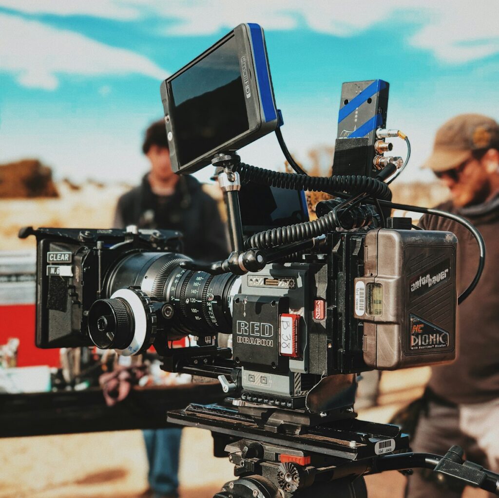
10. **The Tangible Impact: Why Physical Sets Matter for Performance**For a production designer like Philip Messina, the tactile reality of a physical set extends far beyond mere aesthetics; it provides an “unquantifiable” yet profoundly impactful effect on an actor’s performance. While acknowledging his natural bias as a designer, Messina articulates the immense gratification he feels when actors, directors, and crew step onto a set he has painstakingly created and immediately “see the story that I’m trying to tell.” These are stories conveyed through “walls and paint and furniture,” elements that resonate deeply with the human experience.
Messina eloquently contrasts this experience with walking onto a green screen. Despite having “all the illustrations and concept art on hand” to describe the final vision, the immediate, immersive impact of a completed set is simply unparalleled. The physical presence of the environment allows the cast to inhabit their characters more fully, providing tangible textures, depths, and spatial relationships that inform their movements and emotional responses, rooting their performances in a believable world.
The tools of a production designer are not abstract concepts, but the very real “wood and metal and furniture and wallpaper and paint and color.” When these elements coalesce into a physical space, it’s not just a backdrop; it’s a living, breathing component of the storytelling. The shared experience of the crew seeing the story visually unfold around them fosters a collective understanding and energy that green screens, no matter how detailed the conceptual art, cannot replicate in the moment of filming.
This emphasis on physicality underscores a vital aspect of “The Hunger Games” success: its ability to make the harsh realities of Panem palpable. From the grimy desolation of District 12 to the intimidating grandeur of the Capitol, the tangible environments allowed the cast, particularly Jennifer Lawrence as Katniss, to react authentically to their surroundings, immersing both performers and audience deeper into the narrative’s emotional core. Messina’s steadfast belief in the power of physical sets ensured that the world felt profoundly real, enhancing the urgency and impact of every scene.

11. **Strategic Choices: Deciding Between Physical Builds and Green Screen**Making the call on whether a set is physically built or created via green screen and post-production CG is a complex decision, driven by a confluence of factors beyond mere creative preference. Philip Messina details that this strategic choice hinges on “budget, time, and also the shot count,” alongside the inherent “difficulty” of the environment. Each element is carefully amortized against the cost and complexity of the required visual effects, a testament to the intricate financial and logistical planning involved in big-budget productions.
For Messina, certain scenarios naturally lend themselves to digital creation, such as crafting an entire “spaceship or something that is more obvious that makes sense, or if you’re in a fantasy city that doesn’t exist.” These are environments where physical construction would be either impossible, prohibitively expensive, or simply less efficient than a digital solution. However, even with existing locations, CG can be a surprisingly “gratifying way” to manage expenses and achieve period accuracy, as exemplified by the choice to digitally erase modern power lines for his Civil War film “Free State of Jones.”
Yet, Messina also champions the unique advantages of physical construction, particularly the phenomenon of “happy accidents.” These are the unplanned, serendipitous details that often emerge during the building process or on location, adding a layer of realism and texture that is difficult to pre-program. In the visual effects world, as Messina notes, “there are no happy accidents; you have to create them,” demanding meticulous planning to simulate the natural imperfections that make a scene feel authentic. The skill lies in how well those myriad “happy accidents” are digitally crafted.
“The Hunger Games” provides numerous examples of this balanced approach, from the physical builds of District 12’s sparse homes to the digitally enhanced panoramic views of the Capitol. Messina’s expertise allowed the production to leverage the strengths of both physical and digital environments, ensuring that resources were allocated effectively while maximizing visual impact and maintaining authenticity. This pragmatic yet artistic decision-making process was crucial in creating a world that felt both expansive and intimately detailed.
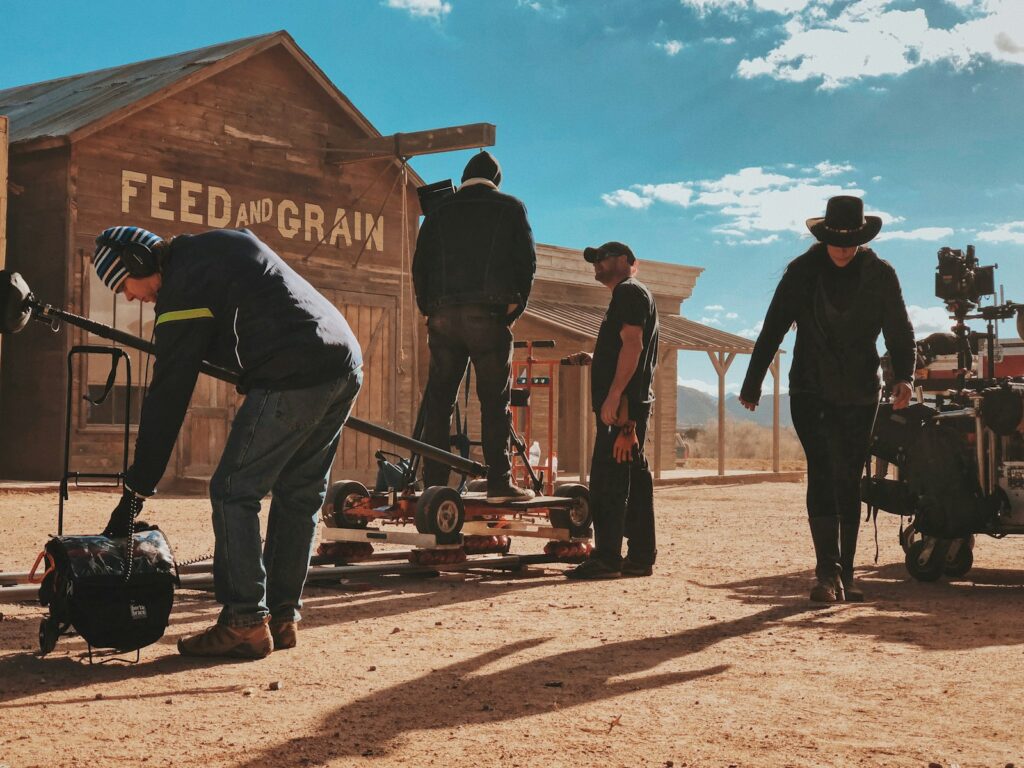
12. **Navigating Production Marathon: The Back-to-Back Shoot of Mockingjay Parts 1 & 2**The production of “The Hunger Games: Mockingjay Parts 1 & 2” presented Philip Messina and his team with an unprecedented logistical and creative marathon, a challenge he undertook not just for the material, but to test his own limits. Shooting two “fairly big movies as one extremely large one in 156 days of shooting with no break in between” was an immense undertaking, spanning locations in Atlanta, Paris, and Berlin. This compressed schedule, with the same prep time for both films as for a single previous installment, demanded an unparalleled level of endurance and ingenuity.
Messina’s anecdote about having “three art departments on two continents working simultaneously” vividly illustrates the extraordinary pressure. The time difference meant he felt “either always on stage with my current art department or on the phone with my two future art departments,” a testament to the constant, round-the-clock coordination required. This complex choreography ensured that sets were ready, designs were approved, and visual continuity was maintained across a global production pipeline, all while pushing the boundaries of what was logistically feasible.
This colossal effort underscores the ambitious storytelling at the heart of the “Mockingjay” films, which moved into “bigger themes of war and social inequality.” To effectively convey the sweeping scope of the rebellion and the stark realities of conflict, the production needed to seamlessly stitch together sequences shot months apart in vastly different locations. Messina recalls the “fun to stitch together” challenging scenes like the hospital bombing in “Mockingjay Part 1,” which involved transitioning between exterior and interior Atlanta locations, then to Berlin, and back again.
Such a grueling schedule, while intensely demanding, ultimately allowed for a sustained immersion in Panem’s evolving landscape, offering a unique opportunity to maintain a consistent artistic vision across the climactic chapters of the saga. Messina’s determination to meet this challenge head-on not only solidified his reputation as a master of large-scale production design but also ensured that the visual world of “The Hunger Games” remained robust and compelling through its powerful conclusion, giving the cast a monumental backdrop for their final struggle.
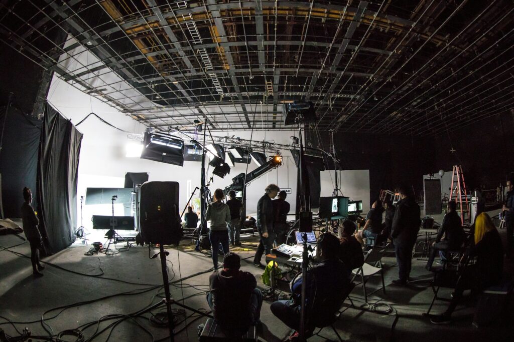
13. **Seamless Integration: Inserting President Snow’s Palace into an Established World**One of the specific production design feats that perfectly illustrates Philip Messina’s strategic thinking for visual continuity was the integration of President Snow’s Palace into the already iconic Avenue of the Tributes in “Mockingjay Part 2.” This was not a simple matter of adding a new building; it required meticulous planning to insert a pivotal structure into a familiar landscape without disrupting the established visual language that audiences had known since the very first film.
The challenge lay in ensuring that this new, crucial location felt like an organic part of the Capitol, rather than an arbitrary addition. Messina recounted how he and Francis Lawrence meticulously reviewed footage from the previous two films featuring the chariot parades on the Avenue. Their keen observation led to a discovery: “there was one angle on the Avenue that was never clearly seen – and that became President Snow’s” Palace. This clever solution allowed them to introduce a major new element by utilizing an existing blind spot, a testament to thoughtful visual storytelling and leveraging pre-established design.
This approach not only maintained the visual integrity of the Capitol but also underscored the enduring nature of the Avenue of the Tributes as a consistent visual anchor throughout the series. The initial, rudimentary computer model Messina had created for the first film, filled with “tons of references and details,” proved its worth by providing a flexible foundation. It was robust enough to accommodate such significant additions and subtle “changes here and there in the background and buildings in the distance” without losing its recognizable grandeur.
The successful integration of Snow’s Palace highlights how Messina’s foresight in establishing a clear design language early on allowed for ambitious expansions later in the franchise. It’s a prime example of specific production design feats contributing to a unified, evolving visual narrative, enriching the world of Panem while ensuring that every new detail seamlessly fit into the grand tapestry. This intricate planning provided the cast with a consistently compelling, and increasingly oppressive, visual environment to navigate.
14. **Designing for Every Screen: From Cinemas to Smartphones**In today’s multi-platform viewing landscape, a unique challenge for production designers is creating visuals that impress on the grand cinema screen but also hold up on the myriad smaller devices audiences now use. Philip Messina is acutely aware of this dichotomy, humorously noting his “sarcastic” jokes about what a huge, painstakingly built set would look like on “someone’s iPhone.” It’s a reality where “you put so much loving detail into something, and then you see someone on a bus watching it on their 2 inch screen!”
Despite this, Messina firmly believes that the ubiquity of smaller screens “doesn’t diminish what we do or how I approach my craft.” His dedication remains unwavering, driven by the ultimate gratification of seeing his work “on a big screen” during premieres with the cast and crew. This shared, immersive experience is still the pinnacle, reminding him and his team of the collective artistry involved in bringing Panem to life in its fullest, most detailed glory.
His reflection on re-watching “Ocean’s Eleven” years later, noticing sets he’d entirely forgotten, speaks to the ephemeral nature of production and the vastness of detail that goes into every frame. Yet, the core intention remains to tell a story with impact, regardless of how or where it’s viewed. “The Hunger Games,” with its sweeping landscapes and intricate Capitol details, was designed to immerse, whether through the grand scale of a cinema or the intimate window of a tablet.
Ultimately, this contemporary challenge reinforces the core principle of strong design: if the visual storytelling is compelling and the environment well-conceived, its essence will transcend the limitations of the display. While Messina might lament the term ‘content’ as a catch-all, his work ensures that “The Hunger Games” remains an art piece, engaging viewers with its powerful visuals and meticulously crafted world, regardless of screen size. The artistry endures, making the cast’s journey compelling whether seen on the biggest screen or the smallest handheld device.
From the meticulous translation of Suzanne Collins’ vague descriptions to the complex logistics of shooting a franchise across continents, Philip Messina’s work on “The Hunger Games” stands as a towering achievement in cinematic world-building. His dedication to grounding fantasy in reality, his strategic use of both physical and digital environments, and his unwavering commitment to storytelling through space provided the beloved cast with an indelible backdrop for their iconic performances. It’s a testament to how architectural ingenuity and profound collaborative spirit can elevate a narrative, creating a universe that not only captivated millions but also redefined the visual language of dystopian epics. The world of Panem, so vividly brought to life, remains a powerful testament to the transformative power of production design, showcasing how every detail, every structure, contributed to a saga that continues to resonate with audiences worldwide.


