
Remember when your phone had a literal antenna you could pull out? Or the satisfaction of swapping out a dead battery in seconds? It feels like just yesterday these seemingly indispensable features were defining our mobile experience, yet today, they’ve vanished from our flagship devices, often without a whisper of a goodbye. Our smartphones have evolved at a breakneck pace, morphing from clunky communication bricks into sleek, powerful pocket computers. But this relentless march of progress hasn’t just added new capabilities; it’s also quietly swept away a whole host of beloved — or at least memorable — functionalities.
We’re about to embark on a nostalgic journey, a digital archaeological dig into the recent past, to unearth the once-ubiquitous features that have mysteriously disappeared from the mobile landscape. This isn’t just a trip down memory lane; it’s a fascinating look at how technology adapts, what we value in our devices, and the sometimes-surprising reasons why certain innovations simply don’t make the cut in the long run. Prepare to feel a pang of nostalgia, and maybe a little bit of shock, as we revisit the first half of a dozen-plus iconic smartphone elements that are now relics of a bygone era.
From the tactile click of a physical button to the pixelated simplicity of an 8-bit game, these features shaped our early interactions with mobile technology. They were once cutting-edge, then commonplace, and now, for the most part, completely gone, replaced by more streamlined, integrated, or simply different solutions. So, buckle up, tech enthusiasts and casual phone users alike, as we uncover the first seven ghosts of smartphones past, sparking curiosity about the unexpected evolution of our pocket companions.

1. Retractable Antennas
Ah, the retractable antenna. If you were an early phone user, this wasn’t just a component; it was practically a ritual. Extending it while pacing around, often with a determined look on your face, was an almost universal gesture in the quest for better reception in those dreaded dead zones. It added a certain gravitas to phone calls, a physical declaration that you were actively trying to connect, transforming a simple phone call into a mini-adventure of signal acquisition.
More than just a signal booster, the pull-out antenna became a quirky status symbol. It visually telegraphed that you had a mobile device, a futuristic gadget in an era when cell phones were still a novelty for many. Its presence was a testament to the technological limitations of the time, a necessary evil that, in retrospect, possessed a unique charm. The act of extending it, feeling that satisfying slide, was a tactile experience utterly lost to today’s seamless designs.
Today, antennas are ingeniously hidden inside our devices’ sleek casings, making the old pull-out versions look like miniature radio towers from a forgotten age. This evolution highlights a fundamental shift in mobile design philosophy: from functional external components to integrated, invisible elements. While we enjoy the clean lines and uninterrupted surfaces of modern smartphones, there’s a certain nostalgia for the days when you could physically manipulate your phone’s connection to the world, even if it meant a fragile piece of plastic sticking out of the top.
Read more about: From Keys to Cassettes: 14 Once-Loved Car Features That Are Now Relics of the Past
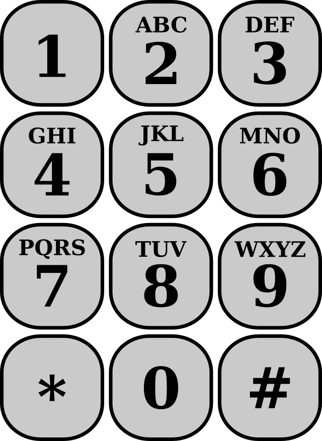
2. T9 Keypads
Typing out messages on a T9 keypad wasn’t just data entry; it felt like mastering a complex puzzle. The intricate dance of pressing a number key multiple times to cycle through letters until you landed on the right one made texting a genuine skill, a secret language shared among those who had dedicated the time to perfect it. It was a form of communication that demanded patience, precision, and an almost intuitive understanding of linguistic probabilities, particularly if you were trying to covertly text during class!
Today’s full QWERTY touchscreens and sophisticated predictive text make T9 keypads feel incredibly cumbersome, “like writing with mittens on,” as the context aptly puts it. Yet, for all its perceived inefficiencies, T9 laid critical groundwork for how we interact with text on mobile devices. It proved that compact keyboards could be efficient, pushing the boundaries of what was possible on small screens and paving the way for the virtual keyboards we now take for granted.
The predictive text system behind T9, while rudimentary by today’s standards, was revolutionary for its time. It learned your common words and phrases, offering suggestions that often sped up the process, making you feel like a texting savant when it accurately predicted your next word. This blend of manual input and algorithmic assistance created a unique user experience, one that fostered a deep connection between user and device as you “taught” your phone your personal vocabulary.
3. Black-and-White Displays
There was an undeniable, quiet charm in those early black-and-white LCD screens. Before the dazzling spectrum of RGB, phones simply showed the basics: crisp, clear text against a muted background. No vibrant wallpapers, no distracting animations – just essential information like battery bars, signal strength, and, if you were lucky, the time and a simple icon. It was minimalism long before minimalism became a widespread design philosophy, a stark contrast to the information-rich, vibrant interfaces we navigate today.
These monochromatic displays weren’t just an aesthetic choice; they were a practical necessity. Limited by the technology of the era, they excelled at efficiency. The lack of color meant less power consumption, contributing significantly to the legendary battery life of older phones – days, not hours, of usage. This focus on core functionality over visual frills underscored a different era of mobile use, where the primary purpose was communication, and everything else was secondary, or simply non-existent.
While modern color displays offer unparalleled richness and detail, allowing for immersive multimedia experiences, the simplicity of black-and-white screens holds a special place in our collective memory. They represented a straightforward, uncomplicated approach to mobile technology, a time when a phone’s primary function was crystal clear. The transition to color displays marked a pivotal moment, shifting phones from mere communication tools to multimedia hubs.
Read more about: Whispers on Wheels: Unveiling the Private Car Choices of Hollywood’s Elite for Their Personal Lives

4. Built-in Games (Snake)
Before Candy Crush and Fortnite dominated our screen time, there was Snake. More than just a simple game, Snake was a phenomenon, a time killer that transcended age and background, bonding everyone who owned a Nokia. The endless chase of that pixelated tail, gobbling up dots and growing longer with each one, was incredibly addictive. Every extra segment felt like a personal victory, a testament to quick reflexes and strategic maneuvering within the confines of a tiny, low-resolution screen.
Snake wasn’t just a game; it was a cultural touchstone. It provided universal entertainment during dull moments, from long commutes to waiting room lulls, proving that captivating experiences didn’t require high-fidelity graphics or complex narratives. Its ubiquitous presence on early mobile phones made it an instant classic, a simple yet profoundly engaging distraction that everyone understood and enjoyed. The sound of its primitive “beep-boop” sound effects is etched into the memories of millions.
Today, variations of Snake live on in app form, readily available on any app store. However, as the context rightly observes, “never with the same weird magic.” The original held a unique charm, perhaps because it was often the *only* game available, forcing us to embrace its simple genius. Its disappearance from built-in phone firmware signifies the shift towards app-store ecosystems, where choice reigns supreme, but arguably at the cost of the shared, singular, magical experience that games like Snake once offered.
5. IR File Transfers
Sharing files over infrared (IR) was a delicate, almost ceremonial affair. It meant precisely lining up two phones, typically top-to-top, and then standing perfectly still like statues, holding your breath, hoping for the best. The transfers themselves were agonizingly slow, often interrupted by the slightest nudge or a misplaced sneeze, which could instantly ruin the connection and force a restart. Despite these frustrations, there was an undeniable satisfaction, a feeling of genuine accomplishment when a file finally made its way from one device to another.
In an era before ubiquitous Bluetooth or lightning-fast Wi-Fi Direct, IR felt incredibly high-tech. The concept of “beaming” data through invisible light waves was futuristic, even if the practical execution was often clunky. It was a tangible representation of wireless communication, a precursor to the seamless, instant sharing we now take for granted. The sheer act of successfully completing an IR transfer, perhaps a contact card or a tiny image, felt like a small triumph against technological odds.
The decline of IR file transfers wasn’t surprising, given the advent of more robust and faster wireless technologies. Bluetooth quickly surpassed IR in speed and reliability, removing the need for precise alignment and allowing for greater distances between devices. Its disappearance from modern phones reflects the industry’s continuous push for efficiency and user convenience, relegating the once-futuristic IR port to the annals of forgotten tech, a quirky reminder of how far we’ve come in wireless data exchange.
Read more about: Jaw-Dropping Endorsement Deals That Absolutely Tanked Celebrity Careers (And Crushed Brands)
6. Swappable Batteries
Ah, swappable batteries – the ultimate expression of mobile phone freedom and practicality. There was something uniquely satisfying about the ability to pop open your phone’s back cover, yank out a dead battery, and slot in a fully charged spare. It felt like changing cartridges in a retro game console, quick, gratifying, and incredibly empowering. This feature was a godsend for long trips, extended workdays, or any situation where a power outlet was a distant dream; you simply packed a spare and kept going, no charger needed.
This design choice gave users unparalleled control over their device’s longevity. A failing battery didn’t necessitate a costly repair or a new phone; a simple, inexpensive replacement was all that was required. It fostered a sense of self-sufficiency and extended the usable lifespan of devices, making phones more sustainable in their own way. The ritual of swapping batteries was a tactile connection to our technology, a hands-on interaction that made us feel more in command of our digital lives.
Today’s sealed phones, with their sleek, unibody designs, certainly look cleaner and more premium. However, this aesthetic comes at a cost: we’re largely stuck with whatever charge we’ve got, relying heavily on power banks and fast charging to mitigate battery anxiety. The disappearance of swappable batteries reflects a shift towards integrated, non-user-serviceable components, prioritizing design aesthetics and perhaps planned obsolescence over repairability and user convenience. While we gain visual elegance, we lose a significant degree of practical autonomy.
Read more about: What Your Electric Commuter Bike Says About You: A Deep Dive Into 6 Custom Rides
7. Monophonic Ringtones
Before the era of streaming songs becoming custom ringtones, there was a different kind of auditory creativity: composing your own monophonic beepy tunes. This wasn’t about high-fidelity audio; it was about crafting a unique sequence of digital notes, often sounding like a charmingly simple digital xylophone or a retro video game soundtrack. Each melody, whether a custom composition or a pre-loaded jingle, was a personal statement, a way to make your phone distinctly “yours” in a subtle, musical fashion.
The challenge of creating or inputting these ringtones, often note by note, fostered a unique appreciation for their sound. You’d learn sequences, experiment with timing, and perhaps even share your creations with friends. These simple, often repetitive, tunes became instantly recognizable indicators of an incoming call or message, cutting through the ambient noise with their distinctive digital charm. They were a hallmark of early mobile communication, embedding themselves in our collective auditory memory.
Now, custom tones are far less common, and phone sounds are mostly muted, often set to vibrate or a generic chime that blends into the background. The transition to polyphonic and then full-fidelity ringtones, allowing for snippets of actual songs, made the monophonic era seem quaint. While modern ringtones offer sonic richness, they lack the quirky, handcrafted intimacy of their beepy predecessors. The demise of monophonic ringtones signals a broader shift: from personal digital crafts to readily available, high-quality media consumption.
Continuing our deep dive into the fascinating, sometimes baffling, world of vanished smartphone tech, we’re now moving past the physical quirks and basic software of yesteryear. This next batch of features, some of which were foundational to early Android experiences, truly paved the way for the sleek, interconnected mobile lives we lead today. Prepare for more moments of “I remember that!” as we revisit how communication, design, and even network capabilities have been reimagined, leaving behind some truly iconic, if a little quirky, predecessors.

8. 160-Character Limits
Remember when composing a text message was an exercise in linguistic gymnastics? We’re talking about the days when every single character counted, and exceeding that seemingly arbitrary 160-character limit meant your meticulously crafted message would be brutally chopped into weird, often confusing, fragments. It was like tweeting before Twitter was even a glimmer in anyone’s eye, forcing a ruthless efficiency and a surprising amount of creativity into every digital communiqué.
This tight constraint wasn’t just a challenge; it was the mother of necessity, giving birth to an entire subculture of texting lingo and abbreviations that felt like a secret language. LOL, BRB, ASAP – these weren’t just convenient shortcuts; they were essential tools for conveying maximum meaning in minimal space. Even our emojis were handcrafted masterpieces of punctuation, using colons, semicolons, and parentheses to express everything from a smiley face 🙂 to a winking 😉 or a surprised :O expression.
Today, with virtually limitless character counts in most messaging apps, the idea of agonizing over every letter seems archaic. We send paragraphs, attach endless media, and our predictive text is so good it practically writes the message for us. While modern communication is undoubtedly more fluid, there’s a certain nostalgia for the discipline and ingenuity that those restrictive character limits once demanded, a digital haiku challenge we all inadvertently participated in.

9. Dedicated Call Controls
There was an undeniable, almost primal, satisfaction in answering a call with a single, decisive press of a bright green button. And ending one? A glorious, definitive click of the red button, often performed with a flourish, without even needing to look at your screen. These weren’t just buttons; they were tactile anchors, providing an intuitive, no-guesswork experience that felt utterly reliable, a stark contrast to today’s often-ambiguous swipe gestures.
These dedicated controls were a hallmark of early mobile design, embodying the primary function of a phone: making and receiving calls. Their physical presence made them universally recognizable, even for a first-time user. The satisfying click or firm press provided instant feedback, confirming your action in a way that a silent swipe sometimes struggles to replicate, leaving you to wonder if the call actually connected or disconnected.
Today’s sleek, bezel-less designs have largely relegated these physical buttons to history, favoring on-screen prompts and elaborate swipe patterns. While swipe gestures certainly look cool and contribute to a cleaner aesthetic, they’ve arguably sacrificed that immediate, gratifying tactile connection. We’ve gained screen real estate and digital elegance, but perhaps lost a bit of the effortless, reassuring simplicity that those iconic green and red buttons once offered.
Read more about: Hold Up! 12 Electric Vehicles That Have Owners Wishing for a Do-Over
10. Removable Storage Cards
Remember the joy of never having to worry about running out of phone storage? That’s because, back in the day, phones relied on tiny memory cards you could simply pop in and out, much like swapping film in an old camera. When your phone started complaining about low space, the solution was straightforward: just slide in a new, empty card, and you were instantly back to snapping photos, recording videos, and downloading tunes without a second thought.
This feature was a godsend for anyone who loved multimedia or just couldn’t bear to delete old memories. It gave users unparalleled flexibility and a tangible sense of control over their digital archives. You could categorize your media across different cards – one for photos, one for music, one for important documents – or simply carry a stack of spares, ensuring that your phone’s capacity was virtually limitless, or at least as boundless as your collection of microSD cards.
Today, the landscape is dominated by massive amounts of built-in storage and the omnipresent cloud. While cloud backups offer convenience and accessibility from anywhere, they’ve also ushered in an era where physical storage management feels less hands-on and, for some, less secure. The ability to physically manage your storage, to literally hold your data in your hand and swap it as needed, is a forgotten tactile pleasure that modern, integrated designs have quietly taken away.
Read more about: Unveiling the Unseen: Masterful Hidden Messages and Ingenious Features, From Automotive Marvels to Clever Campaigns
11. Clamshell & Slider Designs
Before the reign of the ubiquitous flat smartphone slab, our devices came with personality and flair. Flip phones, or “clamshells,” offered that dramatic snap-open motion to answer a call, making you feel like a secret agent every single time. Then there were the sliders, which felt incredibly futuristic, revealing hidden physical keyboards beneath their screens with a satisfying, almost mechanical, glide. These designs weren’t just functional; they were statements.
The physicality of these designs added an extra layer of interaction that modern phones simply can’t replicate. The satisfying *thwack* of closing a flip phone to end a conversation, or the smooth, spring-loaded reveal of a full QWERTY keyboard on a slider, transformed mundane actions into engaging experiences. They offered a delightful sense of anticipation and engagement, turning the act of using your phone into a more dynamic and less passive interaction.
While today’s flat smartphones are undeniably practical, offering expansive touchscreens and streamlined aesthetics, they’ve certainly lost a bit of that “fun factor.” The constant pursuit of thinner, lighter, and more unified designs meant sacrificing the distinct shapes and interactive mechanics that made clamshells and sliders so endearing. We’ve moved towards uniformity, and in doing so, we’ve left behind a playful era of mobile design innovation that prioritized character as much as convenience.
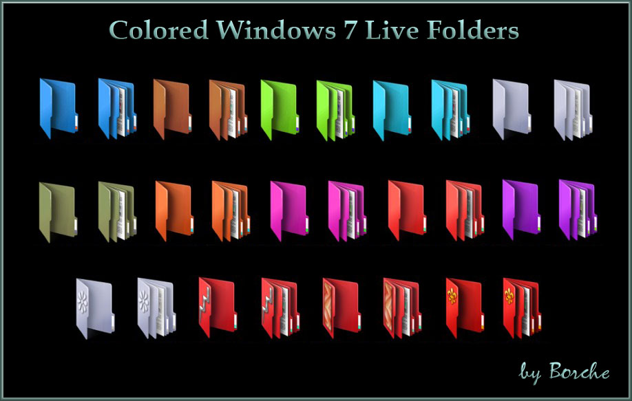
12. Live Folders
Way back in the early days of Android, specifically with version 1.5 (Cupcake), there was a clever feature called ‘Live Folders’. Imagine a folder on your home screen that wasn’t just a static container for apps, but a dynamic window into the data on your phone. These folders were designed to show you virtually any data – your contacts, your emails – right there on your home screen, without needing to launch a specific application.
The real magic of Live Folders was their ability to update in real time. If a new email landed in your inbox, its respective Live Folder would instantly reflect that change, giving you a quick glance at incoming information without the hassle of opening the email app. It was an innovative attempt to put vital, live information at your fingertips, anticipating the need for quick data access in an ever-busier digital world.
However, as Android evolved, particularly with Android 4 (Ice Cream Sandwich), Live Folders were phased out. The reason? Developers came up with an “even better solution” – widgets. Functionally, widgets perform the exact same tasks as Live Folders, but they are far more flexible, customizable, and visually appealing. So, while the ‘Live Folder’ name vanished, its core concept was less removed and more, as the saying goes, brilliantly reborn into the more robust and versatile widget system we know and love today.
Read more about: Beyond the Mic: A Deep Dive into Joe Rogan’s Epic and Eclectic Knife Collection

13. Android Beam
Near Field Communication, or NFC, is a small technological marvel that allows devices to share information just by tapping them together – it powers everything from contactless payments to Nintendo’s Amiibo. Back with Android 4.0, Google unveiled Android Beam, an exciting NFC-centric system that took this ‘tapping’ capability beyond just payments, allowing users to share a wide variety of data between devices.
Imagine tapping your phone to a friend’s and instantly sharing a map, contact information, or even a link to an app. With the subsequent Android 4.1 (Jelly Bean) update, the capabilities expanded even further, allowing for the seamless beaming of photos and videos. It was a revolutionary way to share content, eliminating the need for cumbersome cables or fiddly Bluetooth pairing processes; just tap and share, it felt incredibly futuristic.
Despite its initial promise, Google gradually neglected Android Beam, eventually deprecating it entirely in Android 10 (Quince Tart) from official Android and NFC APIs. While NFC remains a vital part of both Android and iPhone ecosystems for payments and other uses, Google stopped further development on Beam. Other companies had by then created more robust and user-friendly sharing programs, making Beam redundant. This isn’t a case of throwing the “NFC baby out with the bathwater,” but rather making way for more advanced and competitive sharing solutions.
Read more about: Beyond Instinct: 15 Cutting-Edge Vehicles for 2025 Designed to Shield You from Common Driving Pitfalls and Enhance Your Safety

14. Miracast Support
Wireless communication has dramatically changed how we interact with our devices, and streaming videos from our phones to our TVs is a prime example. Miracast, a protocol developed by the Wi-Fi Alliance, was one of the main technologies enabling this, letting you mirror your phone or computer screen directly onto your television. Google, recognizing its potential, built native Miracast support into Android 4.2.
This meant that, straight out of the box, your Android phone could seamlessly connect to any Miracast-compatible TV or display, allowing for instant screen sharing without the need for a router or an active Wi-Fi connection for the devices themselves. It offered a straightforward and powerful way to bring your mobile content to a larger screen, whether for presentations, watching videos, or showing off photos to a crowd.
However, Google eventually removed in-house Miracast functionality with Android 6 (Marshmallow), opting instead to promote its own proprietary wireless streaming protocol, Chromecast. The tech giant’s focus shifted, even leading to Chromecast itself being replaced by Google TV Streamer last year. While Miracast continues to be used in a vast number of devices (and you can still use it with Android phones via workarounds), its disappearance as a native, effortlessly integrated Android feature highlights the competitive nature of tech ecosystems and the industry’s constant drive to control and monetize its platforms.
Read more about: Your Ultimate Guide: Discovering the Top Streaming Devices to Revolutionize Your TV Experience
And so, our nostalgic journey through the digital graveyard of smartphone features comes to a close. From the once-ubiquitous 160-character limits that shaped our early texts to the dramatic flair of flip phones and the ingenious, albeit short-lived, Android-specific innovations like Live Folders, each vanished feature tells a story. They are not just relics; they are testament to a relentless pace of innovation, a constant balancing act between aesthetic elegance, raw functionality, and user convenience. As we embrace ever-smarter devices, it’s a valuable reminder that progress isn’t just about adding new capabilities, but also about the quiet, sometimes surprising, art of letting go, paving the way for the next generation of mobile magic. Who knows what beloved features of today will become the nostalgic vanished tech of tomorrow?


