

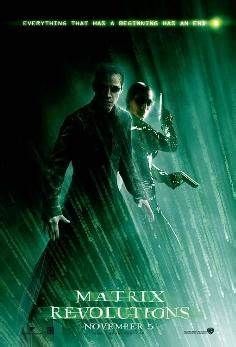
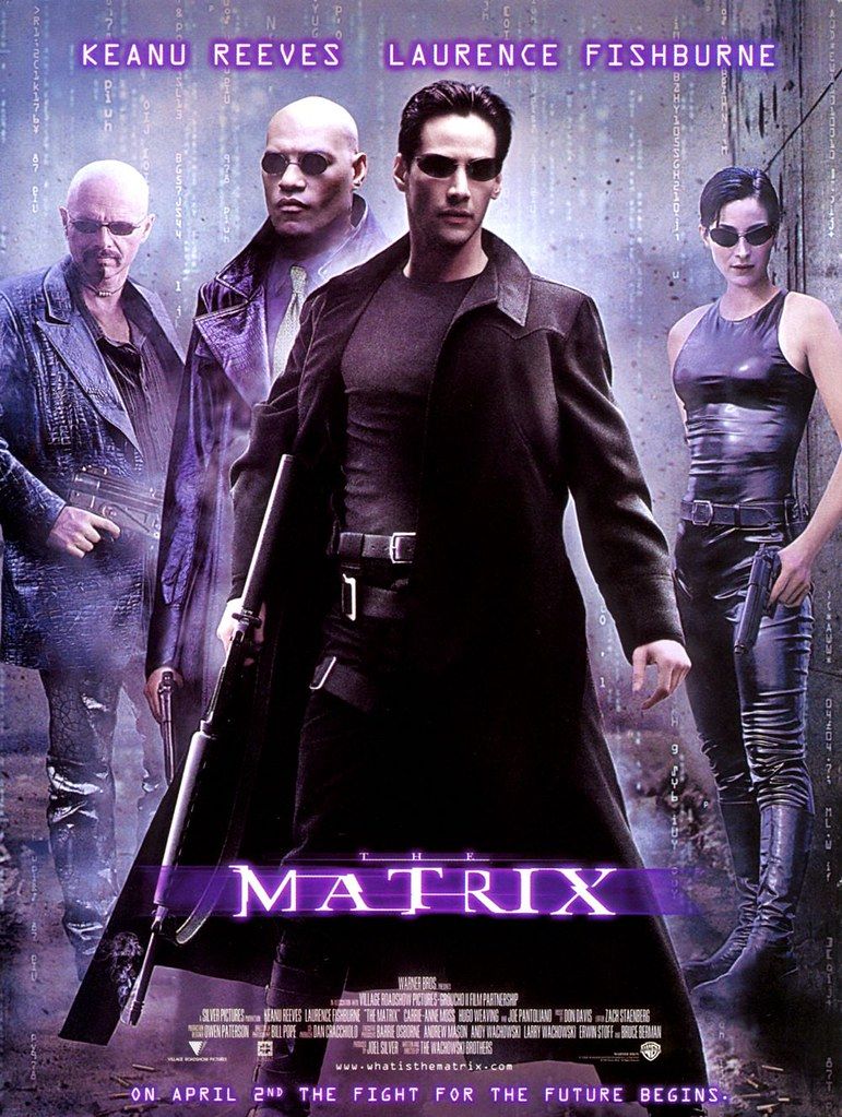
The 1999 science fiction action film *The Matrix*, written and directed by the Wachowskis, exploded onto the cinematic landscape, not just as a box office success, but as a cultural phenomenon that reshaped our understanding of reality, technology, and self-determination. Grossing over $460 million on a $63 million budget, it wasn’t merely the highest-grossing Warner Bros. film of 1999 or a four-time Academy Award winner; it was a deeply philosophical journey cloaked in groundbreaking visual effects and exhilarating action sequences. The film invited audiences to question everything, offering a dystopian future where humanity is unknowingly trapped within a simulated reality.
Beyond its thrilling narrative of computer hacker Neo’s awakening to his prophesied role as “the One,” *The Matrix* communicates profound ideas through a meticulously crafted visual language. Every design choice, from the pervasive color schemes to the innovative special effects and the stark distinctions between worlds, serves to underscore the film’s central themes. This deliberate aesthetic doesn’t just look cool; it’s a vital storytelling tool, subtly guiding our perception and deepening our engagement with its complex layers of meaning.
Indeed, the film’s genius lies in its ability to embed its core philosophical inquiries—about perception, truth, and liberation—directly into its visual fabric. The Wachowskis, with their insightful direction and a team of visionary artists, created a universe where colors and forms are not incidental but are essential keys to unlocking the hidden depths of its narrative. As we delve into the hidden meanings behind these visual choices, we begin to appreciate the masterful construction of a film that remains culturally, historically, and aesthetically significant, even decades after its release.

1. **The Red Pill and Blue Pill Choice**
One of the most potent and enduring visual symbols from *The Matrix* is Morpheus’s offer to Neo: the choice between a red pill and a blue pill. This moment is not merely a plot device but a profound philosophical juncture, instantly recognizable and widely referenced, popularizing the term “red pill” itself. Morpheus presents Neo with two distinct paths, encapsulated by these vividly colored capsules, each representing an entirely different engagement with reality and truth.
The blue pill offers oblivion, a return to blissful ignorance within the simulated reality. It signifies comfort, stability, and the perpetuation of an illusion, allowing Neo to “forget everything and return to his normal life.” This path avoids the painful truths of the dystopian future, offering the pacification that the machines designed for humanity. It’s an enticing prospect for anyone hesitant to confront a harsh, uncomfortable reality, representing the allure of the known, however false.
Conversely, the red pill is the gateway to awakening, to “uncover the truth about the Matrix.” It symbolizes a radical embrace of reality, however shocking or difficult that reality may be. Choosing the red pill initiates Neo’s dramatic awakening from the mechanical pod, witnessing countless inert humans similarly encased, and confronting the devastated ruin of Earth. This color choice, therefore, becomes the ultimate visual metaphor for cognitive dissonance, personal agency, and the harrowing, yet ultimately liberating, pursuit of truth.
The enduring impact of this visual binary underscores the film’s central philosophical query: how much do we truly want to know, and at what cost? The red pill isn’t just a physical object; it’s a commitment to an arduous journey, a willingness to dismantle one’s entire perceived reality for the sake of understanding. Its vibrant hue signifies danger, passion, and revolution, setting the stage for Neo’s role in the rebellion against the machines.
Read more about: The Enduring Symbol: A Comprehensive Examination of the Dollar Sign’s Origins, Evolution, and Modern Applications
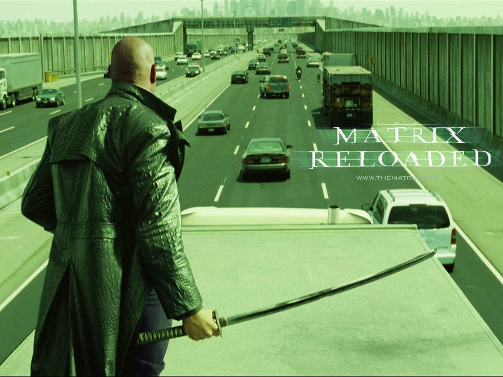
2. **The Dominant Green Hue of the Matrix**
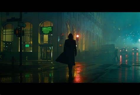
A pervasive and immediately recognizable visual cue within *The Matrix* is the distinct green tint that bathes scenes set inside the simulation. This isn’t just an aesthetic choice; it’s a deliberate, almost subliminal, method of differentiating the artificial world from the ‘real’ one. The production design team, led by Owen Paterson, intentionally placed a “bias towards the Matrix code’s distinctive green color in scenes set within the simulation,” ensuring viewers subconsciously register the unreality of Neo’s perceived environment.
This specific shade of green is not arbitrary. It “reflects the green tint commonly used on early monochrome computer monitors,” a subtle nod to the technological origins of the simulated reality itself. By invoking the visual language of old computer screens, the filmmakers instantly communicate the digital, constructed nature of this world. It’s a genius stroke of world-building, embedding the very essence of the Matrix—a vast computer program—into every frame.
Furthermore, the green tint contributes to the overall feeling of the Matrix environments. These sets were designed to be “slightly more decayed, monolithic and grid-like, to convey the cold, logical and artificial nature of that environment.” The green imbues this artificiality with a sickly, almost sterile quality, reinforcing the idea that this world, despite its convincing facade, is not organic or truly alive. It’s a system, a program, a control mechanism.
This omnipresent green creates a consistent visual identity for the Matrix, allowing the audience to implicitly understand where Neo and the crew are operating. It’s a constant reminder of the digital prison, subtly reinforcing the sense of being observed and controlled. The color becomes synonymous with the illusion, making any deviation from it a significant visual event that speaks to a shift in reality.
Read more about: Unpacking Your Pint: A Healthline Deep Dive into Beer’s Nutritional Profile and Dietary Implications
3. **The Understated Blue of the ‘Real World’**
In stark opposition to the Matrix’s pervasive green, scenes set in the “real world” — primarily aboard the Nebuchadnezzar and within the underground refuge of Zion — feature a deliberate “emphasis on the color blue.” This subtle yet significant shift in color palette immediately signals to the audience a different reality, one uncorrupted by the green digital tint of the simulation. This blue, rather than the vibrant, artificial green, speaks to a different kind of existence.
The choice of blue for the real world is multifaceted. Blue often connotes depth, seriousness, and sometimes coldness or harshness. The context describes Zion as an “underground refuge, living a harsh existence on scarce resources,” and the Nebuchadnezzar as having a “patched-up look” with “wires made visible to show the ship’s working internals.” This emphasis on blue visually aligns with this gritty, survivalist reality, contrasting sharply with the seemingly pristine, yet utterly fake, world of the Matrix.
Moreover, the real world’s visual treatment extends beyond just color. For scenes set outside the Matrix, “the actors’ hair was less styled, their clothing had more textile content, and the cinematographers used longer lenses to soften the backgrounds and emphasize the actors.” This visual realism, coupled with the blue tones, grounds these scenes in a sense of tangible, albeit difficult, reality. It’s a world of raw textures and unpolished existence, far removed from the smooth, deceptive surfaces of the simulation.
The blue serves as a visual anchor, a clear demarcation from the digital prison. It reinforces the idea that Morpheus and his crew are fighting for a tangible, if bleak, truth. It’s the color of liberation from the green lie, but also of the cold, hard facts of their struggle. This contrast is not just aesthetic; it is thematic, highlighting the profound difference between the false comfort of the Matrix and the arduous, yet authentic, freedom of Zion.
Read more about: From A-Listers to Awkward Phases: 15 Unforgettable Photos of Celebrities Before They Hit the Big Time
4. **The Cascading Green Matrix Code**
No visual element is more iconic and instantly identifiable with *The Matrix* than its cascading, downward-flowing green characters—the “Matrix digital rain.” This unique code, which composes the Matrix itself, is not merely an artistic flourish but a profound visual representation of the simulation’s underlying structure and pervasive control. Designed by Simon Whiteley, it employs a custom typeface that includes “mirror images of half-width kana characters and Western Latin letters and Arabic numerals.”
This code is the very language of the Matrix, constantly reminding the audience that everything Neo perceives within the simulation is, at its core, data. Whiteley himself offered an intriguing, if perhaps whimsical, insight into its origin, attributing the design to his Japanese wife and adding, “I like to tell everybody that The Matrix’s code is made out of Japanese sushi recipes.” While a charming anecdote, the visual effect transcends its literal components to symbolize the complex, alien system that holds humanity captive.
The continuous flow of green characters visually articulates the omnipresence of the machine’s control. It implies that the world is being constantly written, computed, and maintained by an unseen force. This visual is deeply ingrained in the film’s identity, appearing in the opening title sequence and throughout, serving as a constant reminder of the digital cage. Its portrayal even “resembles the opening credits of the 1995 Japanese cyberpunk film, *Ghost in the Shell*, which had a strong influence on the Matrix series,” underscoring its sophisticated cinematic heritage.
The “drop-down effect” of the code has become a cultural touchstone, even “reflected in the design of some posters for the Matrix series.” It’s a visual shorthand for the film’s central premise: that our reality is a construct, a stream of data. The green code is not just a background element; it’s a dynamic, living manifestation of the simulated world, forever signifying the hidden layers of reality that Neo endeavors to unravel.

5. **The Dystopian Visuals of the Simulated Reality**
Beyond the ubiquitous green tint, the overall visual design of the simulated reality within the Matrix is meticulously crafted to convey a specific, subtle form of dystopia. The production design team deliberately made the “Matrix scenes’ sets slightly more decayed, monolithic and grid-like,” a crucial detail that informs the audience about the true nature of this seemingly normal, late-20th-century world. This decaying, oppressive aesthetic is a visual manifestation of the simulation’s underlying artificiality and control.
The “monolithic” and “grid-like” qualities of the Matrix environments evoke a sense of rigid order and lack of organic life. Buildings often appear imposing and repetitive, reflecting a system designed for efficiency and control, not human flourishing. This visual language subtly communicates the cold, logical, and artificial nature of this environment, which is, after all, a program. It’s a world where individual freedom is an illusion, replaced by the meticulous, albeit deteriorating, calculations of machines.
Even in moments of perceived normalcy, a careful observer can discern the subtle visual cues hinting at the artificiality. The film achieves this without resorting to overtly futuristic or fantastical elements within the Matrix itself, which heightens the deceptive quality of the simulation. The decay isn’t overt destruction, but a creeping sense of weariness, a subtle suggestion that this reality is merely a façade, a program running on a vast, interconnected system.
This dystopian aesthetic is a powerful counterpoint to the vibrant, chaotic reality of human life. It’s a visual representation of humanity’s subjugation, a placid prison designed to keep its inhabitants “oblivious and pacified.” The drabness and structured repetition of the Matrix’s built environment contribute significantly to the film’s deeper themes about conformity, control, and the search for genuine existence.
Read more about: Decades Ahead: Unpacking the Sci-Fi Films That Eerily Predicted Our Modern Reality
6. **The Stark Contrast of the ‘Real World’ Aesthetics**
The visual distinction between the Matrix and the ‘real world’ is not only established through color but also through a radical shift in overall production design and aesthetic philosophy. Where the Matrix is characterized by its green tint, monolithic structures, and subtle decay, the real world, particularly the Nebuchadnezzar and the concept of Zion, is defined by an entirely different visual vocabulary. This contrast underscores the profound difference in existence, highlighting the gritty, harsh reality of human resistance.
The Nebuchadnezzar, Morpheus’s hovercraft, for instance, was intentionally “designed to have a patched-up look, instead of clean, cold and sterile space ship interior sets as used on productions such as *Star Trek*.” This choice immediately communicates the ship’s functional, utilitarian nature, a vessel of survival rather than luxury or advanced design. The visible “wires were made visible to show the ship’s working internals,” emphasizing transparency, practicality, and the ingenuity required to maintain a functional society in a ruined world.
This “marriage between Man and Machine” aesthetic for the Nebuchadnezzar is a powerful visual metaphor for humanity’s current state: reliant on technology, yet in a constant struggle against machine dominion. The visual chaos of exposed wiring and utilitarian design speaks to the scarcity of resources and the improvised nature of their existence in Zion, the “underground refuge” where remaining free humans live a “harsh existence on scarce resources.”
In the real world, the visual emphasis shifts from simulated perfection to tangible imperfection, from artificial order to organic struggle. When Neo awakens in a pod, it’s “constructed to look dirty, used and sinister,” further cementing the harshness of the true reality. This stark, unglamorous aesthetic is crucial for grounding the rebellion and giving weight to their fight for genuine freedom, making the stakes visually palpable and intensely real.
Read more about: Behind the Badge: What Cops Secretly Observe About Your Custom Chopper Ride
7. **The Iconic Bullet Time Effect**
One of *The Matrix*’s most indelible visual legacies is the “bullet time” effect, a groundbreaking cinematic technique that became synonymous with the film’s innovative spirit. Described as “a visual analogy for privileged moments of consciousness within the Matrix,” bullet time is far more than a mere special effect; it is a profound visual articulation of heightened perception and control over time and space, fundamentally linked to Neo’s awakening abilities within the simulation.
This effect, popularized by the film, allows “a shot to progress in slow motion while the camera appears to move through the scene at normal speed.” It’s a visceral representation of how characters, particularly Neo, can perceive and manipulate the laws of the Matrix. As visual effects supervisor John Gaeta explained, the artistic inspiration drew from “Otomo Katsuhiro, who co-wrote and directed *Akira*,” and director Michel Gondry’s music videos, yet *The Matrix*’s technique was “significantly different because we built it to move around objects that were themselves in motion, and we were also able to create slow-motion events that ‘virtual cameras’ could move around.”
The technical mastery behind bullet time involved an “expanded version of an old art photography technique known as time-slice photography,” using an array of cameras fired in rapid succession, “fractions of a second after each other.” This created a super slow-motion effect, reaching “a frame frequency of 12,000 per second,” allowing the camera to “orbit the scene” while the action unfolds with impossible grace. It’s a visual metaphor made tangible, demonstrating the breaking of perceived physical laws.
Throughout the film, “the effect is used to illustrate characters’ exertion of control over time and space.” It visually signifies Neo’s growing understanding that the Matrix is a program, and its rules can be bent, if not broken. The bullet time sequences are not just thrilling; they are crucial moments of visual exposition, showing rather than telling the audience about the limitless possibilities that open up to those who truly grasp the nature of their simulated reality. It’s the ultimate visual cue that within the green-tinged world, the rules are mere suggestions for those who possess the true vision.
Read more about: Beyond the Big Screen: A Deep Dive into Will Smith’s Elite and Eclectic Automobile Collection
8. **The Metamorphosis in Neo’s Wardrobe**
Neo’s journey from a disaffected computer programmer named Thomas Anderson to the prophesied “One” is meticulously charted not only through his actions but also through his evolving aesthetic. Costume designer Kym Barrett’s vision ensured that Reeves’s office costume for Thomas Anderson was deliberately crafted to make him look “uncomfortable, disheveled and out of place.” This initial attire immediately communicates his alienation and his subconscious awareness that something is profoundly wrong with his reality. It’s a subtle yet powerful visual cue, positioning him as an outsider even within the seemingly normal confines of his corporate life, subtly foreshadowing his impending break from the system.
As Neo awakens from the Matrix and begins his training in the real world, his physical appearance undergoes a dramatic transformation that complements his mental shift. To prepare for the scene where Neo wakes up in the pod, Reeves meticulously lost “15 pounds (7 kg) and shaved his whole body to give Neo an emaciated look.” This stark, vulnerable image emphasizes the brutal truth of humanity’s subjugation and his rebirth into a harsh reality. It strips away the pretense of his former life, revealing the raw, unadorned state of a human freed from the machine’s grasp.
Once fully immersed in the rebellion, Neo’s attire shifts again, embracing the iconic, sleek black aesthetic that becomes synonymous with his identity as “the One.” While the explicit details of his later costumes aren’t fully outlined in the provided context, the general principle of Barrett’s work—defining characters and their environment by their costume—suggests a deliberate progression. His leaner physique and more purposeful clothing reflect his newfound agency and acceptance of his destiny, visually completing his metamorphosis from the “uncomfortable” Thomas Anderson to the powerful, self-aware Neo. This careful progression in his visual identity underscores the film’s themes of self-discovery and liberation.
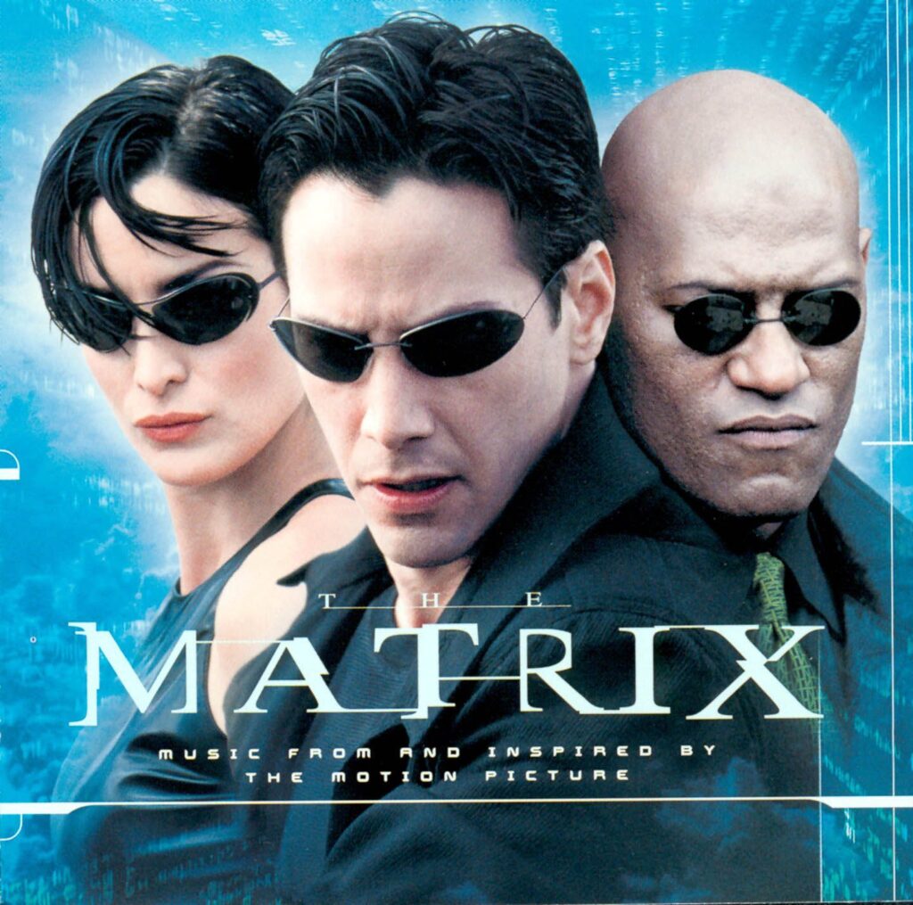
9. **Trinity’s Sleek, Functional Style**
Trinity, as one of Morpheus’s most capable and enigmatic crew members, embodies a compelling blend of strength, agility, and grace. Her iconic costume design is a masterclass in functional fashion, meticulously crafted by Kym Barrett to suit her unique character. Barrett experimented extensively with “how each fabric absorbed and reflected different types of light,” ultimately creating Trinity’s costume to appear “mercury-like and oil-slick.” This shimmering, almost liquid quality perfectly reflects her elusive, high-tech hacker persona and her ability to move with extraordinary speed and precision within the digital realm.
Beyond its striking aesthetic, Trinity’s attire was designed with extreme practicality in mind, a crucial consideration given the demanding physical requirements of her role. Barrett had to account for the actors needing “to perform martial art actions in their costume, hang upside-down without people seeing up their clothing, and be able to work the wires while strapped into the harnesses.” This focus on functionality is evident in every detail, allowing Carrie-Anne Moss to execute complex stunts, including her legendary wire stunts at the film’s beginning. Moss herself performed many of these sequences, underscoring the seamless integration of her performance with the costume’s design.
The sleekness of Trinity’s outfit also serves a deeper thematic purpose, visually aligning her with the cold, technological world she navigates, even as she fights to dismantle it. It’s a uniform of rebellion, one that grants her freedom of movement and a formidable presence. Her appearance is a powerful visual statement: she is a force to be reckoned with, both in style and in substance. The meticulous design ensures that her movements are unhindered, allowing her grace and deftness, as noted by choreographer Yuen Woo-ping who “designed Moss’s moves to suit her deftness and lightness,” to shine through, making her an unforgettable figure in cinematic history.
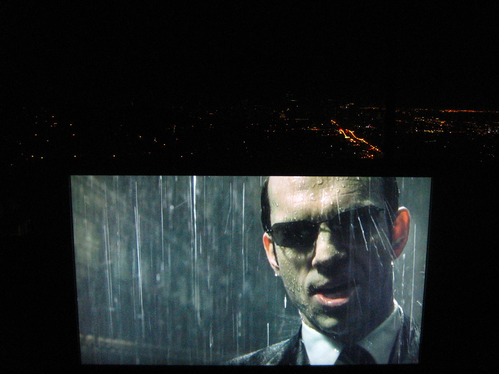
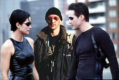
10. **The Agents’ Unsettling Uniformity**
The Agents in *The Matrix* represent the omnipresent, unyielding authority of the machine system, and their visual design is a chilling testament to their role as antagonists. Their costumes were conceived to create a “secret service, undercover look, resembling the film JFK and classic men in black.” This choice instantly communicates their clandestine power and their ability to blend seamlessly into the simulated reality, only to reveal their true, terrifying nature when they act as enforcers. The dark suits, white shirts, and ties are a uniform of impersonal, bureaucratic control, stripping them of individual identity and enhancing their collective menace.
Agent Smith, played by Hugo Weaving, stands out within this uniformity not by his attire, which remains consistent, but by his demeanor and vocalization. Weaving found the character “amusing and enjoyable to play” and developed “a neutral accent but with more specific character for the role.” He aimed for Smith to sound “neither robotic nor human,” a nuanced vocal performance that perfectly complements his visually sterile appearance. This subtle deviation in voice, amidst a visually identical ensemble, hints at Smith’s unique ambition to “free himself from his duties,” a nascent individuality that makes him a more complex and ultimately more dangerous antagonist.
The Agents are not merely henchmen; they are “sentient programs protecting the Matrix,” inherently superior to humans within the simulation. Their unwavering, emotionless expressions, coupled with their identical, imposing suits, project an image of cold, logical efficiency. This visual consistency underscores the idea that they are manifestations of the system itself, an unyielding force designed to maintain the illusion and suppress any rebellion. Their “men in black” aesthetic becomes a visual shorthand for the pervasive control exerted by the Matrix, making them instantly recognizable symbols of the oppressive system Neo fights to overcome.
11. **The Reflective Nature of Reality***
*The Matrix* is a film deeply concerned with perception and the nature of reality, themes subtly woven into its visual fabric through the pervasive use of mirrors and reflections. Don Davis, the film’s composer, astutely observed this recurring motif, noting that “mirrors appear frequently in the film.” These aren’t just incidental details; they are deliberate visual cues that underscore the film’s philosophical inquiries and the malleability of what characters perceive as real. Each reflection serves as a subtle reminder that reality itself can be distorted, fractured, or entirely fabricated.
Consider some of the key instances Davis highlights: “reflections of the blue and red pills are seen in Morpheus’s glasses,” visually doubling the monumental choice Neo faces and suggesting a deeper, perhaps subconscious, aspect of his decision. When “Neo’s capture by Agents is viewed through the rear-view mirror of Trinity’s motorcycle,” it immediately places a layer of mediation between the audience and the action, emphasizing the indirectness of perception within the Matrix. These moments are not just stylistic flourishes; they are visual allegories for the film’s central premise: that what we see might not be the truth, and that truth can be glimpsed in unexpected, often distorted, ways.
Further reinforcing this theme are moments like “Neo observ[ing] a broken mirror mending itself” and “reflections warp[ing] as a spoon is bent.” These are direct visual manifestations of the Matrix’s mutable rules, demonstrating that its physical laws are merely programs that can be rewritten or broken by those who understand its true nature. The bending spoon, in particular, is an iconic moment of “privileged consciousness,” a visual lesson from the Spoon Boy that true power lies in understanding that “there is no spoon.” These reflective surfaces become metaphorical portals, revealing glimpses into the underlying code and challenging the very foundations of perceived reality.
Read more about: The 10 Pop Culture Moments That Still Feel Like a Fresh Breakup

12. **The Sonic Landscape of Illusion and Reality**
Beyond its groundbreaking visuals, *The Matrix* crafts a distinct auditory experience that profoundly contributes to its world-building and thematic depth. Dane A. Davis, responsible for the film’s sound effects, meticulously designed sounds that amplify the distinction between the simulated reality and the harshness of the real world. This careful layering of audio cues ensures that the audience’s immersion is total, with sound playing a crucial role in defining environments and heightening dramatic moments, often in ways that subtly reinforce the film’s core messages about artificiality and authenticity.
The fight scenes, a hallmark of *The Matrix*, are endowed with a unique sonic signature. Davis created “the whipping sounds of punches… using thin metal rods and recording them, then editing the sounds.” This innovative approach results in combat audio that feels both visceral and otherworldly, emphasizing the superhuman abilities of characters within the Matrix. The distinct, almost supernatural crack and whoosh of these impacts contribute to the stylized, almost balletic quality of the wire-fu sequences, signaling that these battles transcend ordinary physical engagements, playing out within a programmed construct where rules can be bent.
Even the more subtle sound effects carry significant weight, enhancing the sense of dread and the underlying artificiality. The sound of “the pod containing a human body closing required almost fifty sounds put together.” This intricate sound design for a seemingly simple action underscores the complex, sinister nature of the machines’ operations and the horrifying reality of humanity’s entrapment. It’s a testament to the film’s overall production philosophy: no detail, visual or auditory, is left unconsidered in its masterful construction of a world where everything has a hidden meaning, and even silence can be deafening.
Read more about: Waylon Jennings: Riding the Storm, Forging an Outlaw Legacy in Country Music

13. **The Mechanical Terror of the Sentinels**
While the Agents pose a formidable threat within the Matrix, the ‘real world’ is haunted by an equally terrifying, and arguably more visceral, form of antagonist: the Sentinels. These menacing squid-like machines represent the raw, unadulterated power of the artificial intelligence that enslaved humanity. Manex Visual Effects was responsible for handling “creature effects, such as Sentinels and machines in real world scenes,” ensuring that their appearance and movements were both believable and profoundly disturbing. Their design as metallic, multi-tentacled organisms perfectly embodies the cold, inorganic, and relentless nature of the machines’ dominion.
The visual presentation of the Sentinels starkly contrasts with the human-like Agents inside the Matrix. They are not simulations but physical entities, harbingers of destruction in the devastated ruin of Earth. Their relentless pursuit of the Nebuchadnezzar and its crew in the real world provides a tangible, non-digital threat, grounding the stakes of the rebellion in a brutal, physical reality. The context describes the ‘real world’ as a place where humans live a “harsh existence on scarce resources,” and the Sentinels are the embodiment of the constant, overwhelming danger that defines this existence, a constant reminder of the war humanity lost.
The Sentinels are a crucial visual element in conveying the full scope of humanity’s predicament. They underscore that the fight is not just against code within a simulation, but against a technologically superior, physically imposing enemy in a desolate future. Their design, emphasizing sharp, mechanical forms and fluid, predatory movements, creates a sense of dread and urgency. They are a constant, metallic shadow looming over Zion and the rebel ships, a powerful visual representation of the machine world’s ultimate authority and its unyielding determination to crush any remaining vestiges of human freedom.
14. **The Oracle and Spoon Boy: Visuals of Prophecy and Potential**
Within the labyrinthine layers of the Matrix, certain characters serve as crucial guides and symbolic figures, offering glimpses into its true nature and the potential for its manipulation. The Oracle, a “prophet who still resides in the Matrix,” stands out not just for her foresight and wisdom, but for her visual presentation. While the context doesn’t detail her specific costume, her presence as an older, seemingly benign figure, operating within the very system the rebels fight, adds a layer of complexity to the perception of reality. She offers cryptic advice, implying “that Neo is not the One” initially, yet her guidance ultimately steers him towards his destiny, visually embodying the idea that even within the illusion, truth can be found and harnessed.
Equally significant is the character of “The Spoon Boy, a young prophet who has learnt how to manipulate the world of the Matrix.” His youthful appearance, coupled with his profound understanding, creates a striking visual paradox. He is “seemingly wise beyond his years,” and it is through his simple, yet profound, demonstration of bending the spoon that Neo receives a pivotal lesson in the malleability of the Matrix. The Spoon Boy’s existence visually reinforces the concept that the Matrix’s rules are not absolute, and that perception is key to bending reality. He teaches Neo “how to develop his powers and provides him with wisdom and motivation,” serving as a living example of awakened potential within the system.
These characters, through their distinct roles and implicit visual cues, underscore the film’s overarching theme of perception’s power. They are not warriors but facilitators of truth, their very existence within the Matrix suggesting that some aspects of the system can be leveraged or understood from within. The Oracle’s domestic setting, contrasting with the high-tech battles, and the Spoon Boy’s innocent demeanor juxtaposed with his profound insights, create powerful visual representations of how understanding and belief can warp and redefine the artificial boundaries of their world, guiding Neo and the audience toward a deeper comprehension of the Matrix’s true nature.
***
The hidden meanings behind the colors and visual designs in *The Matrix* extend far beyond mere aesthetics; they form a sophisticated language that speaks volumes about the film’s philosophical depths. From the stark color coding that delineates truth from illusion, to the meticulous costume designs that define character arcs, and the groundbreaking effects that shatter perceived reality, every visual choice is a deliberate stroke in a masterpiece of cinematic storytelling. The Wachowskis, alongside their visionary production team, didn’t just create a film; they constructed an entire universe where the visual is intrinsically linked to the conceptual, inviting audiences to continually peel back layers of meaning. *The Matrix* remains a testament to the power of thoughtful design, proving that sometimes, to truly understand the world, you just need to open your eyes to its hidden colors and forms.


