

The internet is awash with headlines proclaiming “Someone once paid over a billion dollars for a logo.” It’s a sensational claim, often pointing to the Symantec logo, a simple yellow circle with a checkmark, carrying a supposed price tag of $1,280,000,000. This kind of figure understandably sparks curiosity and disbelief, making us wonder what kind of digital art could possibly command such an astronomical sum. However, to truly grasp these numbers, we must first dispel a widespread misconception: no one pays a billion dollars for a JPEG. No board of directors signs off on a nine-figure invoice for a pretty picture. To believe that is to fundamentally misunderstand what a brand truly is.
This isn’t merely a list of expensive logos, nor is it about the aesthetic cost of a graphic design. Instead, this article is an in-depth breakdown of what that money actually bought for some of the world’s largest corporations. We’re going to delve beyond the astronomical figures to dissect the complex business decisions, strategic pivots, and colossal logistical challenges that often hide behind these seemingly exorbitant price tags. These investments reflect comprehensive branding efforts, not just simple design fees, underscoring that successful rebranding necessitates deep strategic thinking and market understanding.
For any entrepreneur or business owner, the real lesson here isn’t about the specific price paid, but rather the underlying purpose. Logos derive their immense value from sustained brand equity and the company’s actions over time, requiring scalability of design for effective implementation across diverse mediums. So, as we journey through the stories of these remarkably expensive logos, remember that we’re exploring the strategic investments in identity and market position that define global businesses, far beyond the initial sketch or final digital file.
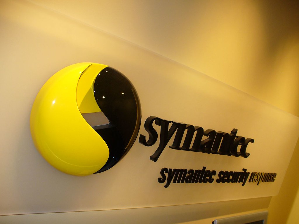
1. **Symantec – $1,280,000,000**
This figure often tops lists of “most expensive logos,” creating a lot of confusion and misunderstanding. Let’s get this one out of the way right upfront: Symantec did not pay a design agency a billion dollars for a mere graphic. This record-breaking sum comes from their strategic acquisition of Verisign in 2010, which was a monumental business transaction, not a logo design brief.
A significant portion of what Symantec bought was Verisign’s established brand recognition, its robust infrastructure, and, crucially, its widely trusted “check mark” logo. This symbol had come to signal security and trustworthiness to millions of online shoppers and businesses globally. The enormous price tag of $1.28 billion was therefore for brand equity, market position, and the profound trust already embedded in Verisign’s identity, making the claim that this was a logo design cost is “fundamentally dishonest.”
The integration of the VeriSign check mark into Symantec’s own logo was a strategic move to immediately symbolize trust and authenticity, especially in the critical field of online security. It highlights a core principle of branding: sometimes, the most effective way to acquire a powerful logo is to buy the entire business and the reputation it has painstakingly built over years. This example powerfully illustrates that logo costs, especially at this scale, are deeply intertwined with broader corporate strategy, acquisitions, and market dominance.
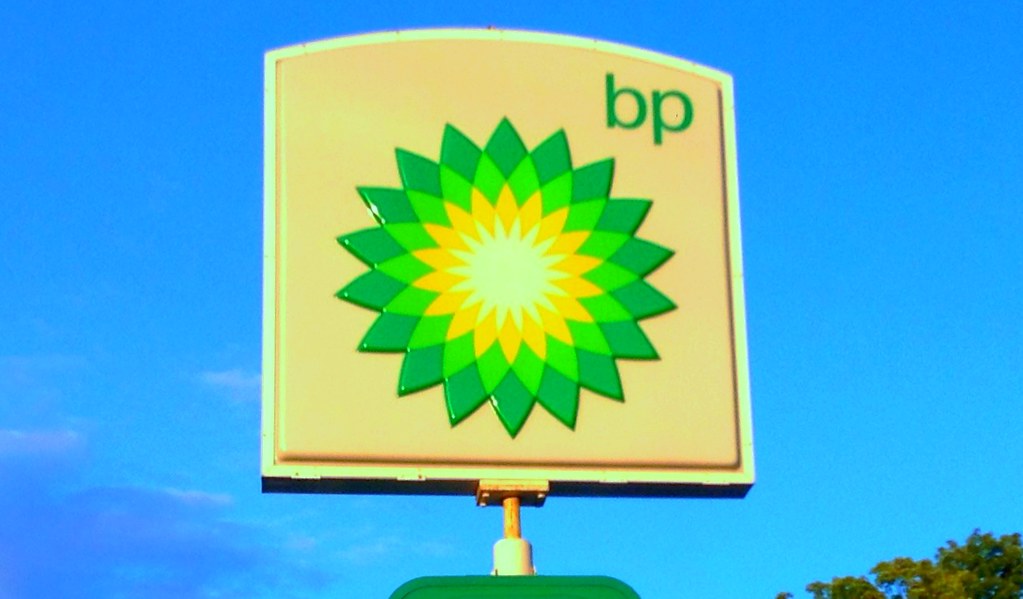
2. **BP (British Petroleum) – $211,000,000**
In 2000, BP undertook what is described as a “textbook example of a colossal rebranding effort,” investing $211 million to dramatically shift its corporate image. The company aimed to move away from being perceived solely as an oil and gas giant and instead position itself as a more “environmentally conscious energy company.” This ambitious transformation was reflected in their new visual identity: the “Helios” mark, a vibrant green and yellow flower-like design.
The $211 million cost was far from a simple design fee; it encompassed the comprehensive agency fees for Landor Associates, extensive market research to understand public perceptions and aspirations, and the truly staggering logistical challenge of rolling out this new identity globally. Imagine the sheer scale: rebranding across “more than 25,000 service stations, 100,000 employees, and an entire global infrastructure.” Every sign, uniform, document, and vehicle had to reflect the new “green” image.
Ironically, despite the massive investment and the logo’s intent to convey commitment to environmental care, the 2010 Deepwater Horizon oil spill profoundly impacted public perception. This catastrophic event made the green-focused logo a target of widespread public ridicule, serving as a stark reminder that a brand’s meaning is ultimately defined by its actions and company behavior, regardless of how meticulously designed or expensive its visual identity might be. The cost also represents approximately $400 million in 2026 US dollars, underscoring the enduring scale of this investment.

3. **EE (Everything Everywhere) – $150m – $250m+ (Estimated)**
The creation of the EE brand in the UK stands as a powerful testament to the massive investment required for “post-merger brand creation.” This new identity emerged in 2012 following the merger of two prominent mobile networks, Orange and T-Mobile. The overarching goal was to design a brand “from the ground up to be the UK’s leading 4G network,” a clear strategic objective for the newly combined entity.
The estimated cost, ranging from $150 million to over $250 million (equivalent to $211 million to $352 million in 2026), covers a colossal undertaking. This figure includes not only the design of the new logo and visual system but also the gargantuan task of launching a new national brand. This involved “massive advertising campaigns,” the physical “rebranding thousands of retail stores” across the country, and the critical need to “communicating the change to tens of millions of customers” who were previously subscribed to Orange or T-Mobile.
The investment reflects the complexity of unifying two distinct customer bases under a singular, powerful new identity, particularly in a highly competitive market like telecommunications. It’s a compelling example of how a new logo is often the tip of the iceberg, symbolizing an entire strategic overhaul and market repositioning that demands substantial financial commitment to execute successfully on a national scale. The “Everything Everywhere” name itself hints at the broad scope of this ambitious new brand.
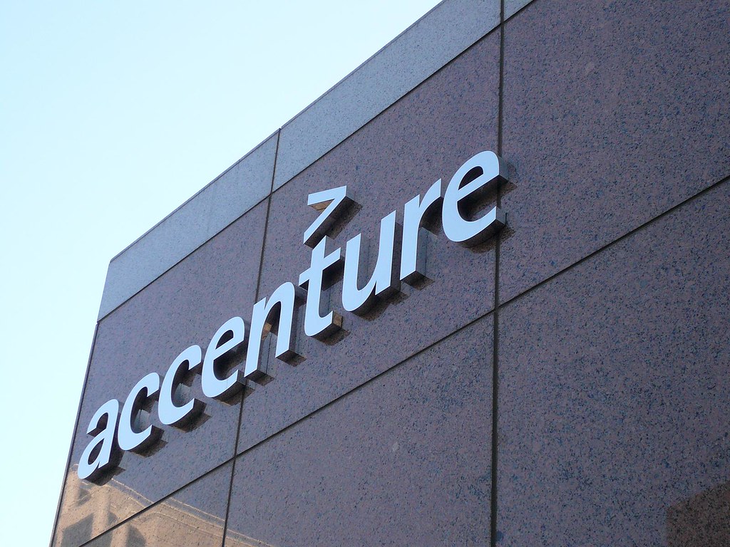
4. **Accenture – $100,000,000**
Accenture’s $100 million rebrand in 2000 was a direct consequence of a “bitter divorce” and an urgent need for a new identity. Formerly Andersen Consulting, the company was legally compelled to completely separate from its parent accounting firm, Arthur Andersen, and entirely change its name. This was a critical moment for the global management consulting and technology services firm, requiring a swift and decisive rebranding effort.
The new name, “Accenture,” was actually suggested by an employee in an internal competition, a portmanteau of “accent on the future.” The significant investment of $100 million (approximately $188 million in 2026) was channeled into building this “new global brand from absolutely nothing” under intense pressure and a tight deadline. This involved launching widespread advertising campaigns and systematically rolling out the new identity across an astonishing “47 countries.”
The objective was clear: to completely erase the legacy of the old name and firmly establish the new one in the minds of clients and the public worldwide. The logo itself, featuring the company name in lowercase letters with a distinctive greater-than sign (>) above the ‘t,’ subtly conveys a forward-looking, high-performance ethos. This case underscores that high logo costs are often tied to existential corporate needs, such as legal mandates or critical strategic differentiations, demanding rapid and comprehensive global deployment.
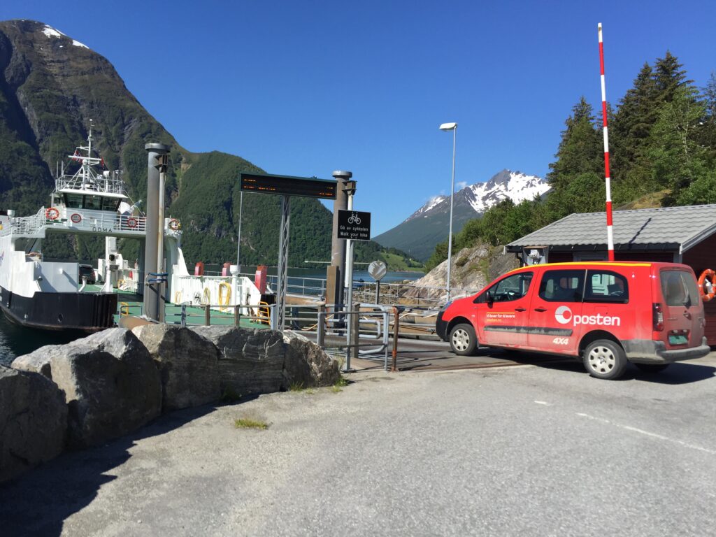
5. **Posten Norge (The Norwegian Post) – $55,000,000**
Rebranding a nation’s postal service is an undertaking of immense proportions, as demonstrated by Posten Norge, Norway’s national postal and logistics provider, which invested $55 million in its 2008 rebrand. The primary context for this project was a “national rebrand” aimed at modernizing its image and unifying its various service divisions under a cohesive identity. Founded in 1647, Posten Norge had grown significantly, and this rebrand was crucial to reflect its evolution into a leading modern logistics company.
The $55 million price tag (roughly $82 million in 2026) reflects the staggering physical and logistical task involved in this nationwide overhaul. Imagine the sheer scale of changing every single physical touchpoint: “rebranding every single postbox, truck, uniform, and office in an entire country.” This isn’t just about updating digital assets; it’s about a complete transformation of public infrastructure and personnel identity.
The result was a modern visual identity featuring a grey and red sphere alongside the lowercase name “posten” in red, designed to visually communicate its updated status as a sophisticated postal and logistics provider. This case clearly illustrates that when a brand is embedded in the fabric of a nation, the cost of rebranding extends far beyond design fees to massive operational and physical implementation challenges.
6. **Comcast (Xfinity) – $50,000,000 – $100,000,000 (Estimated)**
Comcast’s investment, estimated between $50 million and $100 million (equivalent to $75 million to $150 million in 2026), highlights a crucial motivation behind many high-cost rebrands: “reputation management.” Facing a consistent ranking as “one of America’s most hated companies,” Comcast strategically chose to rebrand its consumer services (internet, TV, phone) under a new name: Xfinity. This move was a classic “brand architecture play.”
By creating a new sub-brand, the company aimed to establish a significant distance from the “toxic reputation of the parent company.” The Xfinity logo itself is simple, but its underlying strategy is a multi-million-dollar attempt to effectively “wash away years of bad press” and cultivate a fresh perception among consumers. This demonstrates that a logo, in such contexts, functions as a signal for a deeper corporate strategy focused on perception rather than just aesthetics.
This substantial investment wasn’t just for the logo’s design; it covered extensive market research to understand consumer sentiment, developing the new brand narrative, and a massive advertising and communication campaign to introduce Xfinity as a distinct, improved offering. It’s a prime example of how companies are willing to spend tens of millions of dollars not just to introduce something new, but to strategically mitigate and rebuild trust in the face of negative public sentiment, proving that a brand’s value is deeply tied to its public image.
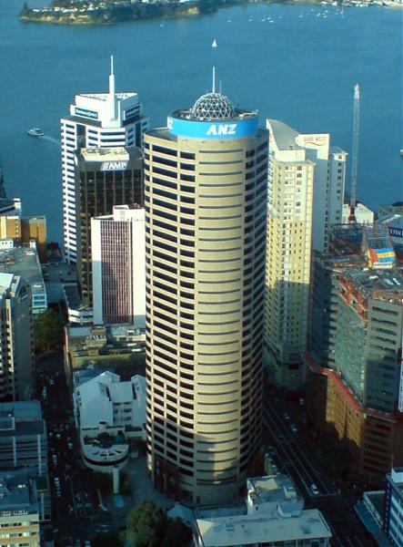
7. **ANZ Bank – $15,000,000**
The Australia and New Zealand Banking Group (ANZ) invested $15 million in a rebranding campaign that spanned two years, completed in 2010. The primary context for this substantial outlay was a “post-merger rebrand,” following a series of mergers and acquisitions that necessitated the creation of a unified brand identity and culture. The challenge was to consolidate multiple disparate brands into “one cohesive system across the Asia-Pacific region.”
The resulting logo features the abbreviated name “ANZ” alongside a stylized, blooming flower emblem rendered in a classic blue color. This blue has been a consistent part of ANZ’s brand identity since the 1950s, symbolizing stability and trust, and was retained to maintain continuity with its heritage. According to ANZ, the lotus symbol in the logo represents the company’s regional connection, with its two leaves and one flower acknowledging Australia, New Zealand, and the wider Asia Pacific.
The cost reflects not just the design work by M&C Saatchi, but the extensive strategic planning and implementation required to harmonize the brand across diverse markets and operational structures. This was a complex effort to foster a singular identity and culture post-merger, ensuring that all aspects of the banking group spoke with one visual and conceptual voice. The investment underscores the importance of a unified brand in solidifying identity and trust after significant corporate restructuring.
Continuing our exploration of significant rebranding investments, AOL’s rebrand in 2009, estimated between $10 million and $20 million (or $15 million to $30 million in 2026 US dollars), represents a strategic pivot. Following its spin-off from Time Warner, AOL sought to shed its legacy as a dated dial-up provider. The goal was to reposition the company as a modern, content-focused media entity, reflecting a fundamental shift in its business model.
The rebrand introduced a new, simplified wordmark, “Aol,” ingeniously designed as a “window” for constantly changing background imagery. This dynamic visual strategy aimed to convey relevance and a living platform, brimming with diverse content. It was a clear attempt to signal a fresh start and a forward-looking vision.
Despite the considerable investment and strategic intent, the rebrand ultimately proved unsuccessful in fundamentally altering AOL’s trajectory. This case is a stark reminder that even a multi-million-dollar logo cannot, in isolation, fix a flawed underlying business model. Successful rebranding requires deep alignment with a viable and robust corporate strategy, where the logo is merely a symbol of a greater change.
Read more about: The Top 14 Vehicles Built to Go the Distance: Your Guide to 350,000+ Mile Reliability

9. **Ogilvy & Mather – $5,000,000 – $15,000,000 (Estimated)**
In 2018, the renowned advertising agency Ogilvy & Mather embarked on a significant self-rebrand, an internal transformation estimated to cost between $5 million and $15 million ($6 million to $19 million in 2026 US dollars). This comprehensive undertaking was more than an aesthetic update; it was a fundamental redefinition of their business strategy for a new era. The core challenge for Ogilvy involved unifying its “sprawling, siloed structure into one entity.”
The rebrand streamlined its name to “Ogilvy,” signifying a move towards a more cohesive and singular identity. The new logo was a thoughtful integration of heritage and modernity, combining a contemporary wordmark with the signature of its legendary founder, David Ogilvy. This design aimed to honor the agency’s rich past while signaling its readiness for contemporary market demands.
This substantial investment showcased a high-stakes demonstration of their own branding principles. The Ogilvy rebrand serves as a classic illustration of “physician, heal thyself,” underscoring that even established industry leaders must continuously evolve to remain relevant. A strong, unified brand is crucial for both external perception and internal strategic clarity.
10. **BBC (British Broadcasting Corporation) – $1,800,000**
The British Broadcasting Corporation (BBC) invested $1.8 million in 1997 to update its logo, a sum equivalent to approximately $3.5 million in 2026 US dollars. This was a critical, forward-thinking decision driven by the burgeoning digital age, aimed at establishing a “unified and consistent identity” across its expanding media landscape. The motivation was deeply rooted in practical necessity.
The previous BBC logo, with its slanted boxes and colored stripes, posed significant challenges for consistent reproduction. It was often difficult and expensive to render uniformly across various media, particularly on digital screens where clarity and adaptability were paramount. This lack of versatility hindered the corporation’s ability to present a cohesive brand presence.
The resulting rebrand introduced the simple, block-letter logo, now globally recognized as three white letters on a black background. This minimalist design proved to be a masterstroke in “digital simplification,” creating a timeless and flexible mark. Its elegance lies in its effortless adaptability across platforms, ultimately saving the corporation millions in long-term implementation costs.
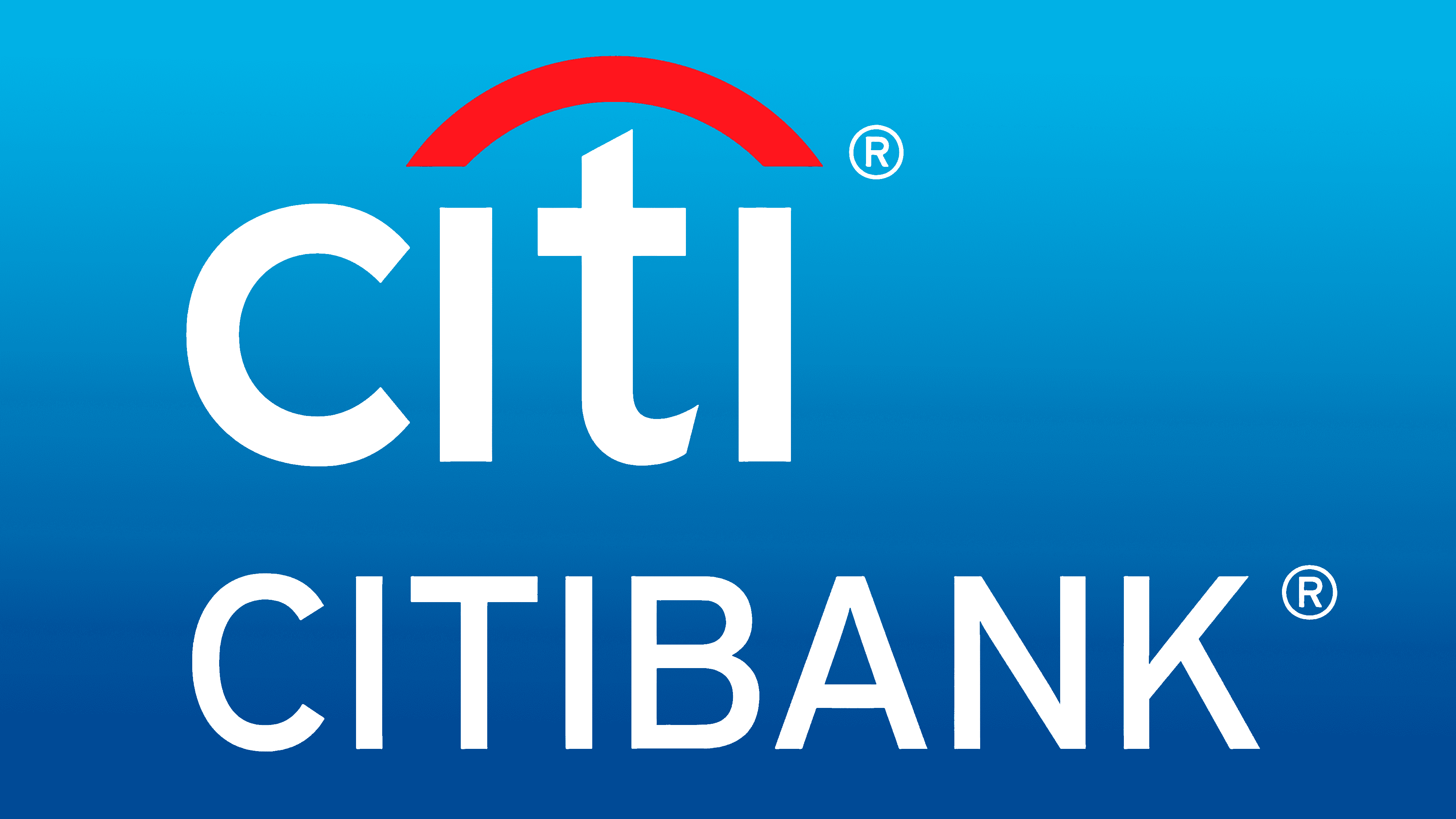
11. **Citibank – $1,500,000**
The Citibank logo, designed in 1998 by the celebrated Paula Scher of Pentagram, came with a price tag of $1.5 million, which translates to around $3 million in 2026 US dollars. This rebranding narrative is legendary in design circles, notably for its seemingly impromptu conception during an initial client meeting, where Scher famously sketched the core concept on a napkin.
The significant cost, despite the simplicity of the initial sketch, emphasizes that clients are not merely paying for the literal act of drawing. As the context clarifies, the investment reflects the “30 years of experience that enabled the insight” – the accumulated strategic brilliance and market understanding that distill complex corporate challenges into a singular, powerful symbol.
Beyond the initial creative spark, the substantial fee also covered the extensive work required to develop a “complete global identity system” to support the massive merger. This included crafting comprehensive brand guidelines and ensuring consistent application across countless touchpoints worldwide. Citibank’s rebrand is a powerful testament to the indispensable value of strategic design in unifying complex global entities.
Read more about: Taylor Swift’s $97 Million Cat: Unpacking the Lavish Lives of Celebrity Pets
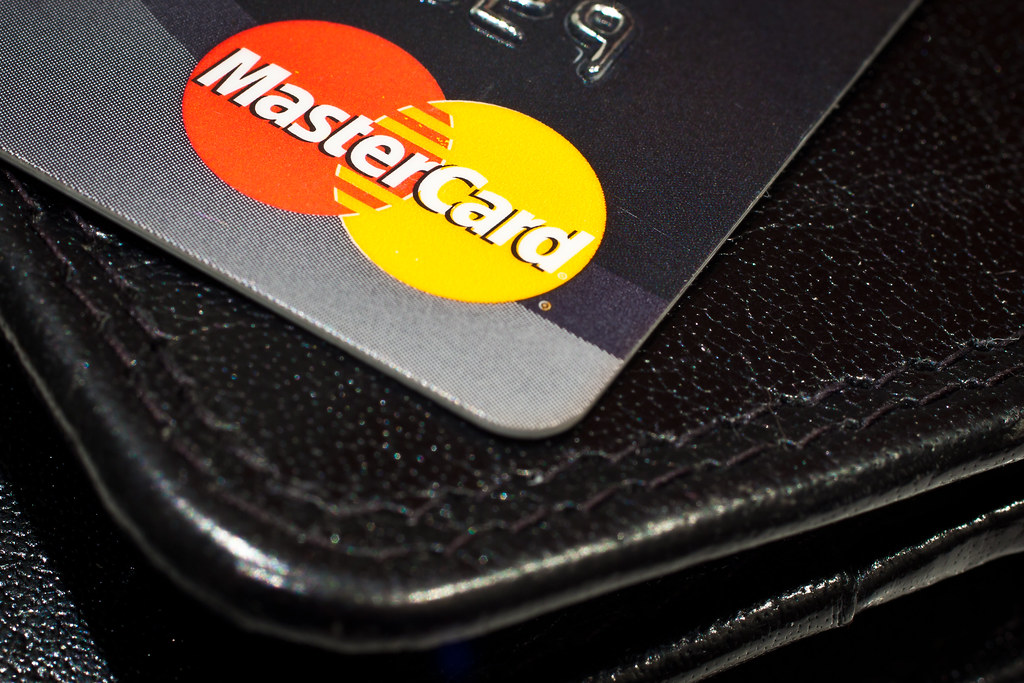
12. **Mastercard – $1,500,000**
In 2016, Mastercard invested $1.5 million in a significant rebrand spearheaded by Pentagram, an effort equivalent to $2 million in 2026 US dollars. The central challenge was monumental: how to modernize “one of the most recognisable marks in the world” for the digital age, without alienating a global audience. This project was a masterclass in calculated brand evolution, not a radical overhaul.
Pentagram’s approach focused on meticulous refinement and simplification. Instead of reinventing the iconic overlapping red and orange circles, they subtly streamlined them, enhancing the mark’s adaptability for contemporary digital interfaces. Crucially, they introduced a new, lowercase wordmark, which projected a more modern and approachable feel, preserving deep brand equity.
This investment extended well beyond just the updated logo; it encompassed the development of a comprehensive visual system designed for flawless consistency across every imaginable application. From tiny mobile app icons to expansive stadium banners, the new identity had to perform seamlessly, underscoring the immense value placed on heritage and recognition in a digitally-driven world.
Read more about: 13 Essential Life Hacks for US Online Casino Players in 2025: Maximize Your Wins & Experience

13. **Slack – $1,000,000 – $3,000,000 (Estimated)**
The popular messaging platform Slack underwent a significant rebrand in 2019, costing an estimated $1 million to $3 million, a project executed by Pentagram. While its original hashtag logo was beloved, it harbored critical technical flaws necessitating an overhaul due to rapid growth. This rebrand was primarily driven by urgent functional requirements, not just aesthetics.
The old logo’s complexity included “11 different colours,” making consistent reproduction across mediums difficult and costly. Its design also looked “terrible when placed on any background that wasn’t white,” severely limiting versatility and hindering brand coherence as Slack expanded. These technical limitations became unsustainable for a global enterprise.
The new “pinwheel” logo, developed by Pentagram, specifically addressed these challenges. Built from simpler shapes and fewer colors, its design immediately enhanced scalability and versatility. This simplification ensured the logo could be consistently displayed, from a tiny favicon to large promotional materials, proving design effectiveness isn’t about complexity.
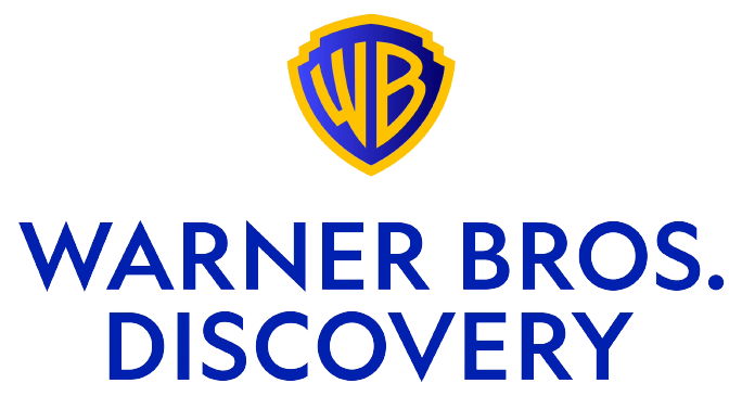
14. **Warner Bros. – $1,000,000 – $2,000,000 (Estimated)**
In 2019, anticipating its 100th anniversary, Warner Bros. invested an estimated $1 million to $2 million in modernizing its iconic “WB” shield logo, with Pentagram at the helm. This was a proactive, strategic effort to “future-proof a legendary brand,” ensuring its visual identity remained relevant and effective in an increasingly digital-first entertainment landscape.
The core challenge was to meticulously streamline and simplify the classic shield while rigorously retaining its immense brand equity and historical significance. Pentagram’s approach focused on subtle refinements, optimizing the mark for contemporary usage across a vast array of platforms. The aim was for the “shield to work as well as a tiny app icon as it does on the silver screen.”
This strategic investment recognized that even enduring symbols require careful adaptation for new technologies and viewing habits. The cost reflected deep strategic thinking and technical precision to evolve such a universally recognized mark without diluting its essence. It was an investment in enhancing versatility while preserving decades of accumulated cultural meaning and cinematic legacy.
15. **Pepsi – $1,000,000**
Pepsi’s 2008 rebrand, conceived by the Arnell Group, came with a design fee of $1 million. However, this figure represents only a fraction of the total cost, as the complete global rollout was estimated to be in the hundreds of millions of dollars. This case gained significant notoriety, or rather infamy, for reasons extending beyond its substantial financial outlay.
The rebrand became widely discussed due to a leaked 27-page design document, provocatively titled “Breathtaking,” which attempted to justify the new logo’s design with bizarre and pseudo-scientific concepts. It purportedly linked the new aesthetic to the “golden ratio, the earth’s magnetic fields, and other bizarre concepts,” eliciting widespread ridicule.
Despite the controversy, the new logo incorporated a more dynamic “smile” within its iconic red, white, and blue circular emblem. This update was strategically intended to inject a fresh, energetic feel into the brand, aiming to appeal to a younger demographic and reinforce Pepsi’s competitive stance. It was a bold attempt to modernize, albeit one overshadowed by its accompanying narrative.
Read more about: Shaquille O’Neal’s Epic Journey: Tracing the Colossal Footprints of a Legend’s Career, from High School Hardwoods to Championship Courts
As we conclude our deep dive into these landmark rebranding investments, a compelling truth crystallizes: the cost of a logo is rarely just about artistic rendering. It is a strategic outlay, a calculated gambit on market position, enduring reputation, and future scalability. These multi-million-dollar decisions signify profound business transformations, from expertly navigating mergers to boldly pivoting corporate missions in our digital age. They stand as powerful testaments to the complex, high-stakes arena of global branding. A single symbol can encapsulate decades of trust or be tasked with forging an entirely new legacy. The logos themselves are merely the visible tips of enormous strategic icebergs, each a powerful visual shorthand for monumental shifts in corporate identity and market ambition. True brand value isn’t purchased; it is meticulously built, fiercely defended, and continually redefined through every strategic action a company undertakes, resonating with customers long after the initial reveal.


